Blog: Reference box
From the reference box #9

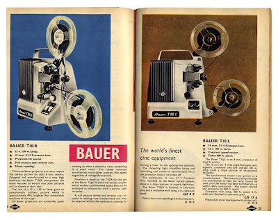
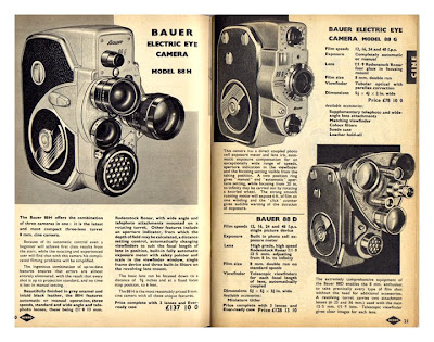

This was a carboot find a few years back and has been nestled in the reference box ever since. It's a 1961 Nebro Photographic Catalogue, mainly in black and white, but with a few colour pages. The product images and colour reproduction have a fantastic quality and there are some sweet little bits of type too.
There we have it #9 - 1961, Nebro Photographic Catalogue
https%3A%2F%2Fwww.deliciousindustries.com%2Ffrom-the-reference-box-9
Delicious+Industries%3A+From+the+reference+box+%239
From the reference box #8

We have a great collection of fruit labels here at Delicious - here are some of our favourites. The detail is fantastic and the bold graphics, bright colours and simple print give them a lovable charm - who wouldn't want to collect them?
#8 - Selection of fruit labels
https%3A%2F%2Fwww.deliciousindustries.com%2Ffrom-the-reference-box-8
Delicious+Industries%3A+From+the+reference+box+%238
From the reference box #7

You've got to love this - advertising in it's simplest form. Some kids in the local area started a car washing business last Summer and popped these on all the cars.
Exhibit #7 - Hand written car wash flyer
https%3A%2F%2Fwww.deliciousindustries.com%2Ffrom-the-reference-box-7
Delicious+Industries%3A+From+the+reference+box+%237
From the reference box #6

How great are these old Hoover Electric Washing Machine Instructions? We have a collection of vintage instruction cards and this is one of our favourites. The colour, the quality of the print and the detail of the illustrations are fantastic and for the amount of information on there, it is really well designed.
#6 then - Hoover, Electric Washing Machine Instruction Card
https%3A%2F%2Fwww.deliciousindustries.com%2Ffrom-the-reference-box-6
Delicious+Industries%3A+From+the+reference+box+%236
From the reference box #5

Something else from the depths of the Delicious Reference box - one of our vintage photos. This one is superb, it has such great contrast, unfortunately though we have no idea, what type of planes these are, what they are doing flying in a row so close together or who took the picture, but it's still one of our favourites. Enjoy!
So here we are, #5 - vintage, aeroplane photograph
https%3A%2F%2Fwww.deliciousindustries.com%2Ffrom-the-reference-box-5
Delicious+Industries%3A+From+the+reference+box+%235
From the reference box #4
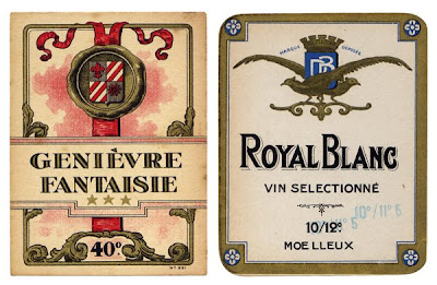
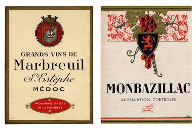
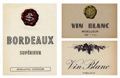
Here we have some vintage wine labels that have been in the Delicious reference box for quite a long time now. The quirky typography and great print quality make them far more interesting than most wine labels today. I am particularly fond of the very simple 'Bordeaux, Supérieur' and 'Vin Blanc, Moelleux' labels.
So here they are #4 - Vintage wine labels
https%3A%2F%2Fwww.deliciousindustries.com%2Ffrom-the-reference-box-4
Delicious+Industries%3A+From+the+reference+box+%234
From the reference box #3


We love collecting these old Photographic Studio cards, the typography and typesetting are always wonderful. They are printed in a single colour onto a smooth board with a portrait and usually some foil blocking on the front, and the studio's details on the reverse as shown above.
Here is #3 - Vintage Photographic Studio Cards
https%3A%2F%2Fwww.deliciousindustries.com%2Ffrom-the-reference-box-3
Delicious+Industries%3A+From+the+reference+box+%233
From the reference box #2

Just in case you didn't know!
Here is #2 - a very informative ticket
https%3A%2F%2Fwww.deliciousindustries.com%2Ffrom-the-reference-box-2
Delicious+Industries%3A+From+the+reference+box+%232
From the reference box #1

The Delicious reference box is busting at the seams with inspirational items bought, found, gathered and saved from everywhere and anywhere over the last 16 years.
Here is #1 - a not-so-lucky tombola ticket.
https%3A%2F%2Fwww.deliciousindustries.com%2Ffrom-the-reference-box-1
Delicious+Industries%3A+From+the+reference+box+%231
Welcome
Welcome to the Delicious Industries blog. We're an independent design studio based in Brighton, UK and this is our scrapbook packed full of design, illustration, photography & typography inspiration. Check out our work here.
Links
DELICIOUS FRIENDS
DELICIOUS FAVOURITES
- 50 Watts
- Acejet 170
- Grain Edit
- It's Nice That
- National Geographic Found
- Notcot
- Pretty Clever
- Retronaut
- So Much Pileup
- We Love Typography
- Another Mag

