art direction, design + typography
Blog: Illustration
More Saul Bass Matchbooks

It was a while back when I posted about a lucky blogger finding some of these wonderful Hunt-Wesson matchbooks, designed by Saul Bass on a flea market. Well I still haven't found any at my local boot sale, but design:related member Karen Horton has just found almost a full set (14 of the 16 and lots of doubles)...
"while rummaging the Chelsea Flea Market with no particular agenda, I had a hunch I recognized a few Saul Bass designs peering out of a randomly assorted box. What made the Saul Bass designs stand out instantly is that they were the only matchbook covers in a pile of hundreds sans advertising-related text or graphics."


Nice one Karen, that's a great collection - I'm not jealous in the slightest (well maybe a little!)
Via Notcot.
https%3A%2F%2Fwww.deliciousindustries.com%2Fmore-saul-bass-matchbooks
Delicious+Industries%3A+More+Saul+Bass+Matchbooks
Dutch Architecture Stamps


I saw this set of Dutch Architecture stamps on Design Related the other day and they reminded me of the Modern University Building set (1971) I posted about last week.
This set was released in 1969 and designed by Rein (R.J.) Draijer to celebrate 20th Century Dutch Architecture and Architects. They depict:
12 - Villa Huis Ter Heide Building, Utrecht - R. van 'T Hoff, 1915
15 - Woonhuis (Rietveld Schroëder House), Utrecht - G. Rietveld, 1924
20 - Eerste Openluchtschool (Open Air School), Amsterdam - J. Duiker, 1930
25 - Burgerweeshuis (Amsterdam Orphanage), Amsterdam - Aldo van Eyck, 1960
45 - The Congresgebouw's Building, Gravenhage (The Hague) - J. J. P. Oud, 1969
The stamps themselves are beautifully designed but look even better on the First Day cover postcards. The bold illustrations and blocks of colour really stand out against the black and white photographs of the actual buildings.


Stamp images copyright Design Related. First Day cover images copyright Frans van Vorstenbos.
Via Vintage Postage Stamps.
https%3A%2F%2Fwww.deliciousindustries.com%2Fdutch-architecture-stamps
Delicious+Industries%3A+Dutch+Architecture+Stamps
The Flour Art Museum


Who would have thought that flour bags could be so interesting and so well designed?
The images above are of The Flour Art Museum in Germany started by Volkmar Wywiol, the owner of Mühlenchemie, who after finding a washed-up flour sack in Dubai in 1998 has been collecting them ever since. His amazing collection boasts, "over 1,900 sacks from more than 115 countries".


The museum educates visitors on the history of flour and steam mills, flour mythology, flour sayings, flour facts and flour technology. Not to mention the exhibition rooms showcasing flour sacks from around the world in The World Room - illustrating the, "common language of the international Milling Family, that knows no linguistic or political boundaries", the symbolism of the sack illustrations in The Symbol Room - "the symbols on the sacks are by no means just decorative or a matter of chance. On the contrary: they are references to the great cultural significance of agriculture, corn, flour and bread" and of course the flour sacks themselves which can be seen in Sackotheque - the largest collection of flour sacks in the world stored alphabetically by country of origin.
There's also an exhibition catalogue in both English and German which looks like a great reference book available here.
Images copyright The Flour Art Museum.
An initiative of Mühlenchemie. A member of the Stern-Wywiol Gruppe.
Via NOTCOT.
https%3A%2F%2Fwww.deliciousindustries.com%2Fthe-flour-art-museum
Delicious+Industries%3A+The+Flour+Art+Museum
Vintage Atari Graphics


I love these (presumably 70's) Atari graphics from Minneapolis based designer, Joe Kral's Flickr.
They're the cover graphics from Atari game instruction manuals he's collected over the years. There are loads in the set, but these ones with the rainbow of movement are by far my favourites.
Images copyright Joe Kral.
https%3A%2F%2Fwww.deliciousindustries.com%2Fvintage-atari-graphics
Delicious+Industries%3A+Vintage+Atari+Graphics
Serie Waves Surfart - Tom Veiga


Serie Waves is a collection of work, “inspired by the sensations and feelings that the sea wind, the sun's heat and movement of the waves pass”. They bring together Veiga’s passion for design and his love of surfing, “each wave has a shape, color, a feature unique, and it all inspired me to reflect the beauty of the sea and the waves through the design”.
Check out the Serie Waves Blog for a sneaky peak at new work and information about future exhibitions.
If surf art is your thing, take a look at our surf photography posts here, here and here.
Images copyright Tom Veiga.
Via NotCot.
https%3A%2F%2Fwww.deliciousindustries.com%2Fserie-waves-surfart-tom-veiga
Delicious+Industries%3A+Serie+Waves+Surfart+-+Tom+Veiga
Great Valentine's Day Cards

There's still time to buy those Valentine's cards! To help you along, here are some of our favourites...
For our US friends, Hero Design Studio have some great hand-printed cards (above) in their Etsy store including a pack of 12 (4 designs, below) for those with more than one love in their life!

And for those in the UK, Soma Gallery have a large selection of fabulous Lisa Jones cards (below).


https%3A%2F%2Fwww.deliciousindustries.com%2Fgreat-valentines-day-cards
Delicious+Industries%3A+Great+Valentine%26%23039%3Bs+Day+Cards
Goodbye to Edie Harper

Samson and Delilah

Net Prophet
I've just discovered via Grain Edit the sad news that Edie Harper, widow of illustrator Charlie Harper passed away last week aged 87. Edie too was a fantastic illustrator - very similar in style to her husband, but often described as more whimsical. She was also a very talented painter and photographer.
Her work mostly focused on Biblical stories (above) and cats (below),"She loved cats forever and felt that stories from the Bible provided her with some good design ideas", said her son Brett, who runs the Harper Art Studio.

Peepkin
There is a full Memoriam for Edie Harper here which tells of her wonderful talents and her life with husband Charlie Harper.
Edie Harper prints can be seen and purchased here.
Images copyright Edie Harper / Harper Estate.
https%3A%2F%2Fwww.deliciousindustries.com%2Fgoodbye-to-edie-harper
Delicious+Industries%3A+Goodbye+to+Edie+Harper
Half price posters!

There's some great half price posters over on Bandito Design Co. in their Christmas sale. These are my favourites - $10 each - bargain!
Images copyright Bandito Design Co.
Via Stickers and Stuff.
https%3A%2F%2Fwww.deliciousindustries.com%2Fhalf-price-posters
Delicious+Industries%3A+Half+price+posters%21
From the reference box #63

#63 - Set of six Nederlandse Antillen stamps - 12c to 50c. I bought these stamps because I liked the simplicity of the illustrations and really loved the flamingos in my favourite colour combo (pink and brown) on the 50c one (above).
I knew nothing about Nederlandse Antillen (formerly known as the Netherlands West Indies), which I now know to be 2 groups of islands in the Caribbean Sea forming part of the Kingdom of the Netherlands. The 2 groups are the 'Leeward Islands', - Bonaire & Curacao and the 'Windward Islands' - Saba, Sint Eustatius and Sint Maarten.
This set of stamps includes one with 'Aruba' on it and 2 stamps of different face value for Sint Eustatius. I'm not convinced this is a full set and I wonder if each island had a different stamp for each denomination? - that would explain why there are 2 for St Eustatius here??


It's quite frustrating really. I've been able to find loads of information about the history of the islands, of which there is lots, including the fact that the Windward Islands were discovered by Christopher Colombus in 1493), but I haven't been able to source the designer/illustrator of any of these stamps or find a definitive issue date - one source suggests 1965 and another 1958. If I do find out any more information I'll be sure to post it up.
https%3A%2F%2Fwww.deliciousindustries.com%2Ffrom-the-reference-box-63
Delicious+Industries%3A+From+the+reference+box+%2363
The Orange Series


I think they'd make super Christmas presents and are available on their Etsy store.
Images copyright Popcorny.
Via Notcot.
https%3A%2F%2Fwww.deliciousindustries.com%2Fthe-orange-series
Delicious+Industries%3A+The+Orange+Series
MINDTHEGAP
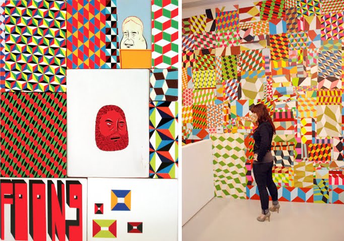
mindthegap is the inaugural exhibition of Prism, an architecturally designed three-storey exhibition space and bookshop (below right) located on Sunset Boulevard, LA.
"The mission of the project space is to become a cornerstone of artistic experimentation, carving a new niche for the arts here in Southern California. The long-term exhibition program, featuring national and international artists, promises to be vibrant and thought-provoking as it works with creative minds to cultivate a challenging and diverse aesthetic experience for the public."
mindthegap features the work of 2 exceptional artists; Barry McGee (above) - husband of the late Margaret Kilgallen, a San Francisco based artist, "first known as 'Twist', the moniker under which he attained cult status among his peers as a graffiti writer" and Philip Frost (below left) - a self-taught artist and sculptor, "who began his career in the early '90s by aggressively blanketing New York City's streets and doorways with strips of brightly colored wheat-pasted posters".

Both Mcgee and Frost create strikingly bold, bright pieces - together their work will make a stunning exhibition. I just wish it was a bit nearer to the UK!
mindthegap is running until 20 February 2010.
Images copyright the artists from Prism and Keep Left.
Via Keep Left.
https%3A%2F%2Fwww.deliciousindustries.com%2Fmindthegap
Delicious+Industries%3A+MINDTHEGAP
Enzo Mari's Nature Series


They're simple, graphic, bold and bright - typical of Mari's work. I saw them recently in a local design store and they are fantstic at full scale, but they can be bought online here.
Enzo Mari is an iconic product, furniture & puzzle designer, artist, writer and teacher born in Italy in 1932. To find out more about this wonderful Italian designer, there's a great biography here.
Images copyright Enzo Mari.
https%3A%2F%2Fwww.deliciousindustries.com%2Fenzo-maris-nature-series
Delicious+Industries%3A+Enzo+Mari%26%23039%3Bs+Nature+Series
Lydia Meiying

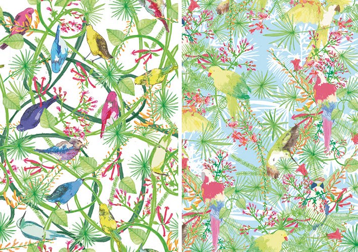
Surface pattern designer and illustrator Lydia Meiying has some gorgeous prints on her website and in her Etsy store. Most are bright, colourful and incredibly detailed with exotic birds, flora and fauna - they scream Summer, holidays and cocktails, but some like the berries one (below left) are more subtle and delicate with a wonderful retro feel.

Images copyright Lydia Meiying.
Lydia is represented by Juna Studio, New York.
https%3A%2F%2Fwww.deliciousindustries.com%2Flydia-meiying
Delicious+Industries%3A+Lydia+Meiying
From the reference box #61


#61 - 4 British stamps commemorating Racket Sports; Lawn tennis (8 1/2p), Table tennis (10p), Squash (11p), Badminton (13p). Issued on the 12 January 1977, this set was designed by Andrew Restall, but in a totally different, much bolder illustration style to this set he designed in 1983. I personally prefer this more graphic style with the silhouetted figures and bright, blocks of colour, although I'm not sold on the colour combinations.
The best thing about these stamps for me though, is how they show the paths of the balls and the shuttlecock - it's really interesting to track their movements throughout a game and to see which games are faster as their paths are more direct with less curves and more bounces.
Take a look at more reference box items here.
https%3A%2F%2Fwww.deliciousindustries.com%2Ffrom-the-reference-box-61
Delicious+Industries%3A+From+the+reference+box+%2361
Margaret Kilgallen aka META / Matokie Slaughter

A couple of weeks ago I watched Beautiful Losers, a short film by Aaron Rose documenting the NYC art and graffiti scene in early 90's and celebrating, "the spirit behind one of the most influential cultural moments of a generation".
There are many talented artists in the film including Shepard Fairey, Barry McGee, Jo Jackson and Mike Mills, but for me it was Margaret Kilgallen's work that really stood out. I had seen some of it before, but had no idea who was behind it. The giant, typographic murals really struck me, they're fantastic - the colours, the scale and the typefaces, I just love them.


Her work was heavily influenced by American folk art which can be seen in the illustrations and colour palettes. She valued craftmanship and loved old hand-painted shop signs, something that clearly inspired her murals.
"I like things that are handmade and I like to see people's hand in the world, anywhere in the world; it doesn't matter to me where it is. And in my own work, I do everything by hand. I don't project or use anything mechanical, because even though I do spend a lot of time trying to perfect my line work and my hand, my hand will always be imperfect because it's human. And I think it's the part that's off that's interesting, that even if I'm doing really big letters and I spend a lot of time going over the line and over the line and trying to make it straight, I'll never be able to make it straight. From a distance it might look straight, but when you get close up, you can always see the line waver. And I think that's where the beauty is."
Margaret did many colaborations with other artists in the film including her husband, Barry Mcgee. She was also a grafitti artist on the freight trains, influenced by Hobo tradition, she worked under the tags 'Meta' and 'Matokie Slaughter'.
Sadly in 2001 Margaret Kilgallen died aged 33 of breast cancer just weeks after giving birth to her daughter, Asha. She was a talented and inspirational artist and I'm so pleased to have found her work. I really want to see it in the flesh and retrospectives do pop up now and again, but until then this Flickr group has a great collection of her work.
Images copyright the authors - from the Margaret Kilgallen Flickr.
https%3A%2F%2Fwww.deliciousindustries.com%2Fmargaret-kilgallen-aka-meta-matokie-slaughter
Delicious+Industries%3A+Margaret+Kilgallen+aka+META+%2F+Matokie+Slaughter
Welcome

Welcome to the Delicious Industries blog. We're an independent design studio based in Brighton, UK and this is our scrapbook packed full of design, illustration, photography & typography inspiration. Check out our work here.
Links
DELICIOUS FRIENDS
DELICIOUS FAVOURITES
- 50 Watts
- Acejet 170
- Grain Edit
- It's Nice That
- National Geographic Found
- Notcot
- Pretty Clever
- Retronaut
- So Much Pileup
- We Love Typography
- Another Mag