Blog: Illustration
General Pattern Prints
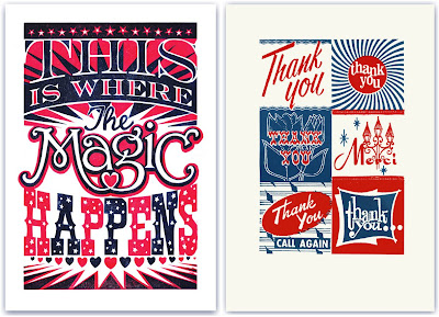
London based, General Pattern have some great linocuts and screen prints available from illustrator James Brown, that would liven up any studio or lounge.
All the prints are fun and quirky with gorgeous typography and lots of attention to detail, but unfortunately my favourite 2, the 'Thank You' (above right) and 'Tigers' (below left) have already sold out!
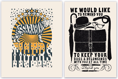
Keep up-to-date with the goings on at General Pattern and watch out for new prints on their blog.
Images copyright General Pattern.
https%3A%2F%2Fwww.deliciousindustries.com%2Fgeneral-pattern-prints
Delicious+Industries%3A+General+Pattern+Prints
Allan Sanders

I came across the work of Brighton based illustrator, Allan Sanders recently and just love his retro style. He describes it as being, "concerned with simple 'everyman' characters as they try to take on the world".
Allan's illustrations are packed full of detail and a sense of fun. They mix quirky typography and sophisticated illustrations which create that happy, nostalgic feel.


Although as a Lancashire lass myself I think I need to have words about this one - what are you trying to say Allan??

You can see more of Allan's great work over on Loopland, his lovely website, on his blog or on Flickr.
Images copyright Allan Sanders.
https%3A%2F%2Fwww.deliciousindustries.com%2Fallan-sanders
Delicious+Industries%3A+Allan+Sanders
From the reference box #43
I bought this purely for the cover, the rest of the publication is black & white and very editorial with a simple grid layout. The cover though is really great, I love it - the big bands of colour, the negative space creating the large wing/fuselage shape and the colourful graphics showing the different plane models. It's a very modern, clean design and totally different to the other issues that were also for sale, but unfortunately there is no mention of who designed or art directed it.
So there we have it #43 - the cover of 'The Aeroplane and Astronaughtics', 22nd Feb, 1962. Have a look at No's 1-42 here.
https%3A%2F%2Fwww.deliciousindustries.com%2Ffrom-the-reference-box-43
Delicious+Industries%3A+From+the+reference+box+%2343
Stefan Kanchev
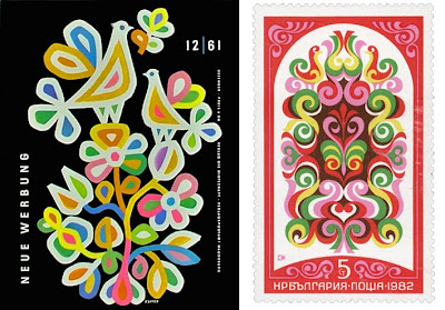
I came across the work of Bulgarian designer Stefan Kanchev through an image posted on Dropular. Once on his website I couldn’t believe how much of his work I was already familiar with from years of flicking through trademark and logo books.
Stefan Kanchev was born in Kalofer, Bulgaria in 1915. He initially studied classically as a mural painter, but throughout his career worked in many different areas of applied graphics. All Kanchev’s work draws inspiration from folk art and traditions - a flowing, organic feel, simple shapes and clean composition.

He is probably best known for his command of logo and trademark design, which was celebrated in 1994 when he was recognised at the 1st International Logo Conference, Ostend, Belgium as one of the ten best masters of logos in the world, ranking alongside the likes of Paul Rand and Saul Bass.
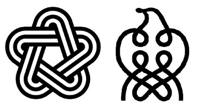

Stefan Kanchev died aged 86 in 2001 leaving behind a an amazing collection of work. There's a dedicated website of his life’s work, and although the English translation isn’t complete yet, there are lots and lots of images and graphics to look through.
Images copyright Stefan Kanchev.
https%3A%2F%2Fwww.deliciousindustries.com%2Fstefan-kanchev
Delicious+Industries%3A+Stefan+Kanchev
1956 Olivetti Advert
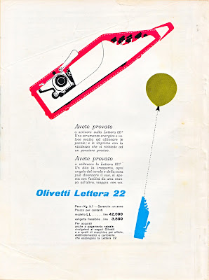
This Olivetti advert designed by Giovanni Pintori is for the portable, Olivetti Lettera 22. I love the dynamic of the illustrations demonstrating it's lightweight, 'portable' qualities.
I found it on the back cover of an Italian Science magazine, 'Scienza e Vita' from 1956 that I've had for years. Shame I didn't buy more of them!
https%3A%2F%2Fwww.deliciousindustries.com%2F1956-olivetti-advert
Delicious+Industries%3A+1956+Olivetti+Advert
New Andy Smith Prints

Andy Smith's newsletter hit my inbox this morning with a great selection of his new work, including some new screenprints now available on his website.
These two are my favourites, I love the giant arrow - it's brown and pink so definitely hits all the right buttons and the chicken, well who doesn't like a big - err - chicken?!
Images copyright Andy Smith.
https%3A%2F%2Fwww.deliciousindustries.com%2Fnew-andy-smith-prints
Delicious+Industries%3A+New+Andy+Smith+Prints
Dick Bruna Stamps

Dick Bruna has designed some fabulous stamps over the years, mainly for Japan and mostly of Miffy, but I really like these Nederland ones released in 1969.
From a little research I think they are either celebrating Childrens' songs or Child welfare. The use of colour in solid blocks is classic Bruna - I love the little red faces of the singing children, although they do look like they could explode at any minute!
More Dick Bruna loveliness here, here, here and here.
https%3A%2F%2Fwww.deliciousindustries.com%2Fdick-bruna-stamps
Delicious+Industries%3A+Dick+Bruna+Stamps
Derek Yaniger
Originally from Arkansas, Yaniger now lives in Georgia designing and printing his own work which is regularly published in Atomic, Barracuda and Car Kulture Deluxe. Over the years he's also created illustrations for companies like Marvel Comics and the Cartoon network.
The exciting news for us is that Yaniger's Wildsville exhibition, is coming to our favourite local gallery, Castor + Pollux on the 26 June and running until 20 July. The exhibition will contain a selection of old and new prints and will have signed copies of his new book, 'Wildsville; the art of Derek Yaniger' available too!
As the man himself says, "Should be a jolly big hoot! Be there if ya’ can, man".
Images copyright Derek Yaniger.
https%3A%2F%2Fwww.deliciousindustries.com%2Fderek-yaniger
Delicious+Industries%3A+Derek+Yaniger
Good Magazine - Info Graphic Archive

Good Magazine has created a Flickr group archive of all the great info graphics and diagrams they've published in past issues.
It's a great collection and a really useful resource.


Images copyright Good Magazine.
Via Notcot.
https%3A%2F%2Fwww.deliciousindustries.com%2Fgood-magazine-info-graphic-archive
Delicious+Industries%3A+Good+Magazine+-+Info+Graphic+Archive
International Labour Organisation Stamp

I found a strip of these stamps at the weekend and just loved the industrial graphic softened by the pink, violet and purple colour palate.
They're English stamps celebrating the 50th anniversary of the International Labour Organisation, 1919 - 1969.
"The ILO was founded in 1919, in the wake of a destructive war, to pursue a vision based on the premise that universal, lasting peace can be established only if it is based upon decent treatment of working people. The ILO became the first specialized agency of the UN in 1946".
In 1969, it's 50th anniversary year, the ILO also won the Nobel Peace Prize.
https%3A%2F%2Fwww.deliciousindustries.com%2Finternational-labour-organisation-stamp
Delicious+Industries%3A+International+Labour+Organisation+Stamp
English for Tiny Tots

I just saw these book illustrations over on kris's color stripes. They're from a Latvian book, English for Tiny Tots, Riga 1974 - one of Kris's latest finds.
The colours are really strong and make the illustrations really pop out of the background, teamed up with a lovely slab serif and what's not to like!
Images copyright kris's color stripes.
https%3A%2F%2Fwww.deliciousindustries.com%2Fenglish-for-tiny-tots
Delicious+Industries%3A+English+for+Tiny+Tots
Saul Bass designed Matchbooks

I love these matchbooks found at a flea market by the very lucky Mary & Matt. They were designed for US food company Hunt-Wessen by the wonderful Saul Bass Associates, who also created their company logo in 1964...
I saw the full set of matchbooks for the first time at the Design Museum's Saul Bass exhibition in 2004 and remember thinking how great it would be to find some at a carboot sale. It just goes to show it can happen!
Matchbook image copyright Mary & Matt.
Via Oh Joy!
https%3A%2F%2Fwww.deliciousindustries.com%2Fsaul-bass-designed-matchbooks
Delicious+Industries%3A+Saul+Bass+designed+Matchbooks
More Which? covers


Finally I got round to scanning in more of the Which? magazines I bought last year. For those that don't know Which? is the monthly publication of the Consumers’ Association, designed by great British design duo Colin Banks and John Miles (co-founders of Banks & Miles) between 1964 and 1993.
I've now scanned in covers up to 1975 - it's taken a while I know, but they're worth the wait. It's great to see the development over the years and from one decade to the next. They definitely illustrate a social history of product development and consumer habits. They'll be uploaded to the Flickr group later this evening.
Read the previous post about Which? Magazine here and find out more about designers Banks & Miles here.
https%3A%2F%2Fwww.deliciousindustries.com%2Fmore-which-covers
Delicious+Industries%3A+More+Which%3F+covers
Illustrator Jenn Ski

I love the colour palettes Jenn Ski uses in her work - they create a lovely nostalgic and retro feel. Her gorgeous illustrations and collages are inspired by her love of modern and mid century design and effortlessly combine bold colours, delicate illustration, patterns and textures. I particularly like the A B C giclée prints (above).
See more of Jenn's work here and check out her studio blog here.
Images copyright Jenn Ski.
https%3A%2F%2Fwww.deliciousindustries.com%2Fillustrator-jenn-ski
Delicious+Industries%3A+Illustrator+Jenn+Ski
From the reference box #40

Pretty new to the reference box is this 1973 guide to the Jungfrau railway in Interlaken, Switzerland. As you would expect from a piece of Swiss design of this era, it's packed full of wonderful logos, typography and adverts.
This centre spread map has the only colour print throughout and just look how slick their chosen palate works with the black & white graphics and illustrations.

Here are a selection of my favourites...


Click here to see what other delights are hiding in our reference box.
https%3A%2F%2Fwww.deliciousindustries.com%2Ffrom-the-reference-box-40
Delicious+Industries%3A+From+the+reference+box+%2340
Welcome
Welcome to the Delicious Industries blog. We're an independent design studio based in Brighton, UK and this is our scrapbook packed full of design, illustration, photography & typography inspiration. Check out our work here.
Links
DELICIOUS FRIENDS
DELICIOUS FAVOURITES
- 50 Watts
- Acejet 170
- Grain Edit
- It's Nice That
- National Geographic Found
- Notcot
- Pretty Clever
- Retronaut
- So Much Pileup
- We Love Typography
- Another Mag


