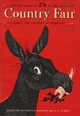
Blog: Illustration
Futurama - Ride into tomorrow!

This is a brochure produced in 1963 to stimulate interest in the General Motors-sponsored, 'Futurama' exhibit at the 1964/5 New York World's Fair.
It was actually Futurama II, an updated version of the popular 'Futurama' ride and exhibit at the 1939/40 event. It promised visitors a "ride into tomorrow" and portrayed what life would be like in 2004. I love the artists impressions of the exhibits and rides - I wonder if it actually looked this way when completed??
I found this on the wonderful Kickcan and Conkers, but if you fancy it for your ephemera collection it can be bought over at PaperHistory.


Images copyright PaperHistory.
Via Kickcan and Conkers.
https%3A%2F%2Fwww.deliciousindustries.com%2Ffuturama-ride-into-tomorrow
Delicious+Industries%3A+Futurama+-+Ride+into+tomorrow%21
Czech Matchbook Labels

I'm a sucker for matchbook labels and this Czechoslovakian set are just great - I really like the thick black outline on the vegetables. I think they translate to say, "The progress and preparing meals - don't cook too long, well but quickly wash vegetables and use stainless tools".
Via Found in Mom's Basement.
https%3A%2F%2Fwww.deliciousindustries.com%2Fczech-matchbook-labels
Delicious+Industries%3A+Czech+Matchbook+Labels
Country Fair: A monthly journal of the open air
I found these Country Fair magazines a couple of weeks ago at a boot fair and bought them purely for the bright coloured covers and sweet little illustrations. The lady selling them had about 30 issues and I'm now wishing I'd bought the whole lot!
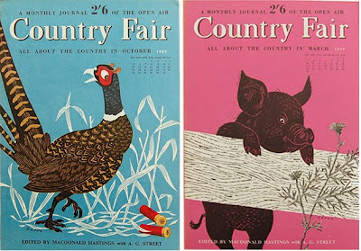
Out of the three I bought, one is from February 1954 (red donkey cover - illustration by John Hanna), one from August 1962 (orange pigeon cover - illustration by D Shannon) and one from May 1963 (pink bird cover - illustration by D Shannon). The pink one is my favourite - I love the illustration of the cherries and the little bird in his beret.
Here are a few more of the John Hanna illustrated covers I found over on Automatism:



If you like these you might also like my collection of Which? covers.
https%3A%2F%2Fwww.deliciousindustries.com%2Fcountry-fair-a-monthly-journal-of-the-open-air
Delicious+Industries%3A+Country+Fair%3A+A+monthly+journal+of+the+open+air
Harper Haute Couture!


French fashion house Celine, famous for their luxury clothing, handbags, accessories and footwear have created a 'resort wear' collection using the wonderful work of Charley Harper, as a tribute to the late illustrator.


Unfortunately the Celine website is under going a facelift at the moment, but I've found some of the items online here, here, here and here.
Images copyright Celine.
Via Charley Harper Blog.
https%3A%2F%2Fwww.deliciousindustries.com%2Fharper-haute-couture
Delicious+Industries%3A+Harper+Haute+Couture%21
Paul Thurlby Alphabet prints

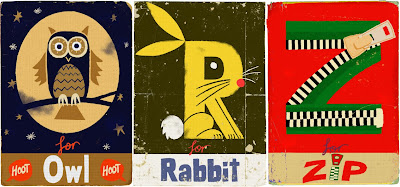
Remember our post about illustrator Paul Thurlby and his gorgeous alphabet prints? Well Paul has been in touch to tell us the alphabet is now complete. The new prints are every bit as good as the earlier ones - more great colour combos, the same vintage/retro feel and some fun typography!
Each print is a signed and numbered limited edition of 200, and at the minute you can get 3 for the price of 2, so check out the Alphabet Shop.
Images copyright Paul Thurlby.
https%3A%2F%2Fwww.deliciousindustries.com%2Fpaul-thurlby-alphabet-prints
Delicious+Industries%3A+Paul+Thurlby+Alphabet+prints
Richard Hogg: Of the Wall


Big thanks to Anna Fidalgo for letting us know about Richard Hogg's first solo show, Of the Wall at Concrete Hermit, London. The show opened last night and runs until the 29 August.
"Of the wall is a simple story about happiness, freedom, rebellion and its consequences, told across three pictures. Like a kind of triptych or a very simple comic. It forms the centerpiece of this show."
There will also be a large selection of new prints and drawings by Mr Hogg on display and a chance to get a sneaky peak at his forthcoming book, 'Car Boot Sale'.
https%3A%2F%2Fwww.deliciousindustries.com%2Frichard-hogg-of-the-wall
Delicious+Industries%3A+Richard+Hogg%3A+Of+the+Wall
Japanese Match Labels
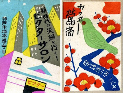
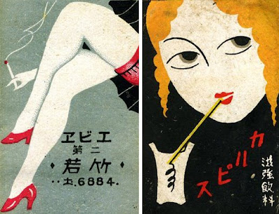
I came across these gorgeous 20's/30's Japanese Match Labels yesterday on Christian Northeast's blog, Lunch Tongue. He has a scapbook full of them and has posted a small selection. I really like them all as the illustration styles are great - but the legs have to be my favourite with the those tiny red heels.
Images copyright Christian Northeast.
https%3A%2F%2Fwww.deliciousindustries.com%2Fjapanese-match-labels
Delicious+Industries%3A+Japanese+Match+Labels
Seb Lester Prints
Seb originally studied graphic design at Central Saint Martin's, before specialising in typography and has created typefaces used by Dell, Intel and the New York Times. "Seb is passionate about letterforms which form the basis for his pieces. He brings letters to life with his animated illustration style and bold sense of humour." from the press release for his up and coming exhibition.
You can check out his work in person next month if you're in the Newcastle area as his new exhibition previews at the Electrik Sheep Gallery on 6 August. It should be a cracking show.
Images copyright Seb Lester.
https%3A%2F%2Fwww.deliciousindustries.com%2Fseb-lester-prints
Delicious+Industries%3A+Seb+Lester+Prints
Christian Northeast
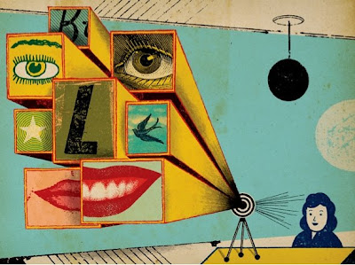

I love the quirky, retro style of Christian Northeast's illustrations and collages. They're a successful mix of strong composition, a touch of the surreal, bold graphics and bright colour. He's got a great collection of typography and lettering pieces in his portfolio too. Check it out here.
Images copyright Christian Northeast.
Via Notcot.
https%3A%2F%2Fwww.deliciousindustries.com%2Fchristian-northeast
Delicious+Industries%3A+Christian+Northeast
Paul Rand Book Covers

Paul Rand is one of my favourite designers of all time and I love looking at his work. The last time I ventured over to his commemorative website it was incomplete, but now it's all there in the gallery; logos, posters, advertising, packaging and book covers, there's almost too much to look at!
I love his book cover design and as I'm working on some myself at the minute I thought I'd share my inspiration...


The whole collection of Paul Rand's work can be seen here. It's constantly being updated as more and more examples are found and documented.
Images copyright Paul-Rand.com
https%3A%2F%2Fwww.deliciousindustries.com%2Fpaul-rand-book-covers
Delicious+Industries%3A+Paul+Rand+Book+Covers
From the reference box #46

#46 - Commemorative 'British Textiles' stamps celebrating great British textile designers, designed by Peter Hatch and released in July 1982.
The set of four stamps showcase prints from (left to right); William Morris - 'Strawberry Thief', Steiner & Co. - 'Untitled', Paul Nash - 'Cherry Orchard' and Andrew Foster - 'Chevron'.
Check out more reference box goodies here.
https%3A%2F%2Fwww.deliciousindustries.com%2Ffrom-the-reference-box-46
Delicious+Industries%3A+From+the+reference+box+%2346
Natsko Seki

Japanese illustrator Natsko Seki has some really great work on her website - it's wonderfully whimsical and a little surreal. I love how she combines illustration and collage to create a warm, nostalgic feel.

If you love Natsko's work as much as we do you'll be pleased to know that some of her limited edition prints are available over at Design Supremo.
Images copyright Natsko Seki.
https%3A%2F%2Fwww.deliciousindustries.com%2Fnatsko-seki
Delicious+Industries%3A+Natsko+Seki
Hobby Stamp Blocks at Present & Correct
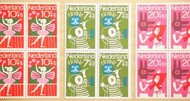

Present & Correct have these gorgeous Dutch stamps from the 70's available in blocks of 4. They have 3 different 'Hobby' themed designs left - painting, music and ballet.
Images copyright Present & Correct.
https%3A%2F%2Fwww.deliciousindustries.com%2Fhobby-stamp-blocks-at-present-correct
Delicious+Industries%3A+Hobby+Stamp+Blocks+at+Present+%26amp%3B+Correct
Secret Blisters 09 - Posters Now Online!

Print Club London have put the remaining Secret Blisters 09 posters in their online store and don't worry, all the artists have now been revealed!
Contributing artists include Anthony Burrill, Andy Smith, Si Scott, Jon Burgerman, Steve Wilson, Richard Hogg and Eine.
Above from left to right is work by Anthony Burrill, Abi Williams and Andy Smith.
Images copyright of the artists.
https%3A%2F%2Fwww.deliciousindustries.com%2Fsecret-blisters-09-posters-now-online
Delicious+Industries%3A+Secret+Blisters+09+-+Posters+Now+Online%21
Javier Mariscal: Drawing Life 2009

The Design Museum, London are currently exhibiting the first UK retrospective of Javier Mariscal - Spanish artist, designer, sculptor, illustrator, interior designer and furniture designer - "one of the world's most innovative and original designers of our time".
Javier Mariscal was born in Valencia in 1950, but moved to Barcelona to live and work in 1970 were he opened Estudio Mariscal in 1989. Throughout his career Mariscal has created mascots for the Barcelona Olympic Games in 1992 ('Cobi' - below) and for the Hanover 2000 Expo in 1995 ('Twipsy'), he created the now famous diary room chair for the second year of Channel 4's 'Big Brother' in 2001, designed the popular 'Alexandra Armchair' as part of the Amorosos Furniture Collection for Moroso and created identities for the Swedish Socialist Party 'Socialdemkraterna', Barcelona Zoo, and London post-production company, Framestore.

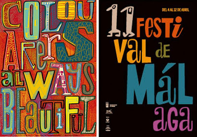
Mariscal has such a huge body of work that the exhibition should be fantastic - apparently there's an entrance tunnel displaying 640 examples of his work from the last 30 years (including typefaces) and on the exterior of the Design Museum he has created a giant typographic mural, "showcasing his unique vision and signature design style".

The exhibition runs until 1 November 2009 and has it's very own blog to keep everyone up-to-date with the goings on.
Images copyright Javier Mariscal.
https%3A%2F%2Fwww.deliciousindustries.com%2Fjavier-mariscal-drawing-life-2009
Delicious+Industries%3A+Javier+Mariscal%3A+Drawing+Life+2009
Welcome
Welcome to the Delicious Industries blog. We're an independent design studio based in Brighton, UK and this is our scrapbook packed full of design, illustration, photography & typography inspiration. Check out our work here.
Links
DELICIOUS FRIENDS
DELICIOUS FAVOURITES
- 50 Watts
- Acejet 170
- Grain Edit
- It's Nice That
- National Geographic Found
- Notcot
- Pretty Clever
- Retronaut
- So Much Pileup
- We Love Typography
- Another Mag


