Blog: Illustration
Mexico Exporta


I love these stamps over on the wonderful, So Much Pileup. They were issued in 1975 to celebrate Mexico's exports.
I love the simple illustration style and single colour print - I always think single and 2 colour print is more effective than full colour and these stamps demonstrate that beautifully.
Images copyright So Much Pileup.
https%3A%2F%2Fwww.deliciousindustries.com%2Fmexico-exporta
Delicious+Industries%3A+Mexico+Exporta
Bruno Munari's Più e meno [Plus and minus]

I saw this great game, Pié e Meno or Plus and Minus, in a local design shop this week. It's a reprint of a Bruno Munari and Giovanni Belgrano collaborative game originally produced in 1970.
The game consists of 72 cards, 48 of which have transparent backgrounds. The cards can be superimposed to create new images and, "stimulate the child’s creative capacities" - the more the layers, the more complex the image. I know lots of adults that would enjoy this game as much as any child though - me for one!


It's available to buy online from the publisher, Corraini and also here.
Images copyright Corraini.
https%3A%2F%2Fwww.deliciousindustries.com%2Fbruno-munaris-piu-e-meno-plus-and-minus
Delicious+Industries%3A+Bruno+Munari%26%23039%3Bs+Pi%C3%B9+e+meno+%5BPlus+and+minus%5D
The Visual Miscellaneum

I can't wait to get my hands on a copy of this info graphics book from Harper Collins, it looks fantastic.
The Visual Miscellaneum: A colourful guide to the world's most consequential trivia (or Information is Beautiful as it will be known in the UK) is the baby of London based author, writer, blogger and designer, David McCandless, a self-confessed fan of, "anything strange and interesting".
Here are some preview pics from Information is Beautiful. It's definitely my kind of book - loads of big graphics and very little text.
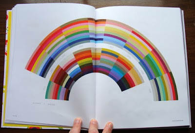

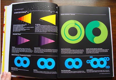
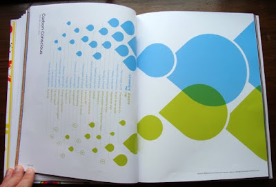
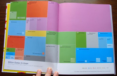
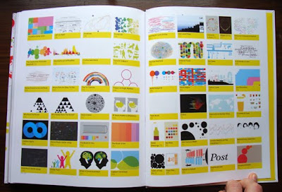
It was released in the states yesterday and can be bought here, but in the UK we have to wait until 4 February 2010! It can be pre-ordered here though.
Images copyright David McCandless.
Via Notcot.
https%3A%2F%2Fwww.deliciousindustries.com%2Fthe-visual-miscellaneum
Delicious+Industries%3A+The+Visual+Miscellaneum
From the reference box # 60
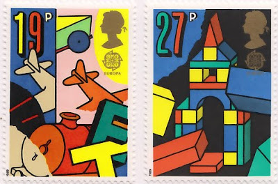

#60 - Europa, Games and Toys - set of 4 commemorative, Royal Mail Stamps first issued on 16 May 1989.
I know, more stamps, but they are very nice ones. I seem to have been buying loads of them recently - I can't help myself!
This bold and colourful set were designed by Dan Fern. Each stamp celebrates a different types of toys or games; 19p - ToyTrains & Airplanes, 27p - Building Blocks, 32p - Dice & Board Games, 35p - Toy Robots & Doll's Houses.
I really love the geometric illustration style combined with the really bright colours and thick black outlines - how cute is the robot face peeking out of the last one?
One thing on these stamps that I haven't come across before is the 'Europa' graphic under the Queen's head. It turns out that 'Europa' stamps are produced once every year and have been since 1956. They are stamps designed around a common theme in a number of countries at the same time. Originally they represented the 6 founding members of the European Coal and Steel Community (ECSC), then from 1959 the European Conference of Postal and Telecommunications Administrations (CEPT) and since 1993, PostEurop. Occassional issues, have seen all the countries involved issue the same stamp design, for example in 1984 to celebrate the 25th Anniversary of CEPT and in 2000 to celebrate the new millenium.
More stamps and wonderful pieces of ephemera can be found here.
https%3A%2F%2Fwww.deliciousindustries.com%2Ffrom-the-reference-box-60
Delicious+Industries%3A+From+the+reference+box+%23+60
Let Children Learn

Why are UK stamps never as gorgeous as this set from the Netherlands? I love everything about them - the type, the colours and the illustration style.
Designed and illustrated by Christian Borstlap these fun, colourful stamps are entitled, 'Laat kinderen leren' or 'Let Children Learn'. The campaign also includes a sweet animation by Paul Postma (can be seen here) and a postcard booklet, both using Christian's stamp illustrations...


For more of Christian's great work check out his website.
Images copyright Christian Borstlap.
Via the fabulous Stickers and Stuff.
https%3A%2F%2Fwww.deliciousindustries.com%2Flet-children-learn
Delicious+Industries%3A+Let+Children+Learn
Autumn print from Hero
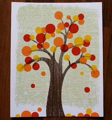
I love this new Autumn print from Hero Design Boutique, I think it totally captures the spirit of the season.
Beth at Hero says, "Autumn is my favorite season of them all. I love all the colors, the brisk air and the smell of the drying leaves. Every year I find myself in the most wonderful mood come mid October! This year I finally decided to capture that feeling in a print".
The prints are limited edition 5 color, 8" x 10" screen prints, printed on Accent Opaque Smooth White 100# and signed by the lovely folk over at Hero.
This print, and other great silk screen posters from Hero are available here and here.
Image copyright Hero Design Boutique.
https%3A%2F%2Fwww.deliciousindustries.com%2Fautumn-print-from-hero
Delicious+Industries%3A+Autumn+print+from+Hero
From the reference box #59
Issued on 5 October 1983, they're not very old, but the illustration style and colours really caught my eye. They were designed by Andrew Restall DA to illustrate the different kinds of local 'fairs'; Merry-go-round (16p), Big wheel, Helter skelter and Performing animals (20 1/2p), Sode-shows (28p) and Early produce fairs (31p).
The contrast between the 3 fairground/circus style ones in the bright oranges and pinks and the produce fairs one in natural greens and browns is great, but it's the details I'm drawn to in these particular stamps - the little cat in the foreground of the 31p one and the little pelican in the foreground of the 20 1/2p one.
For more wonderful stamps and items of vintage ephemera you might like to have a dig around in here.
https%3A%2F%2Fwww.deliciousindustries.com%2Ffrom-the-reference-box-59
Delicious+Industries%3A+From+the+reference+box+%2359
Vintage Reading Posters
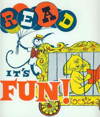
I have a thing about vintage circus posters - the colours, the graphics, the type - what's not to like! These posters, particularly the top one have all the same elements, so I'm now on a mission to find some of my own.
Images copyright doe-c-doe.
https%3A%2F%2Fwww.deliciousindustries.com%2Fvintage-reading-posters
Delicious+Industries%3A+Vintage+Reading+Posters
Andy Smith's Blue Inks
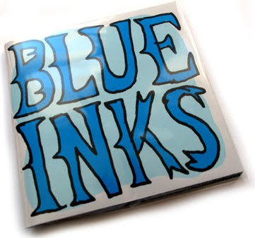
Big thanks to illustrator Andy Smith for sending us a copy of 'Blue Inks', his new limited edition screen printed book, we're very honored and we love it!
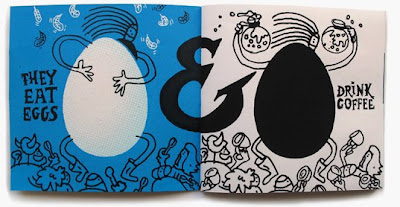

The 30 page book is packed with fantastic typography and illustration throughout as it, "follows the exploits of a gang of colour specific creatures" - very niche, but very funny. My favourite scene has to be the blue inks' fight with some magentas (below)!

'Blue Inks' and loads more of Andy's wonderful illustrations are available here. Also check out the work he's just completed with our friends Sell! Sell! for Fish4 here.
Images copyright Andy Smith.
https%3A%2F%2Fwww.deliciousindustries.com%2Fandy-smiths-blue-inks
Delicious+Industries%3A+Andy+Smith%26%23039%3Bs+Blue+Inks
Yee-Haw Industries at Chelsea Market

Tennessee letterpress studio, Yee-Haw Industries have taken over Chelsea Market in the meat-packing district of Manhattan with their wonderful prints and posters until January 2010.
"Over 100 letterpress pieces all hand-printed from wood cuts & antique type", are said to "adorn the vast and cavernous Chelsea Market".
These sneak peak images from Design:Related show how great the exhibition sits in this urban, industrial space against the bare-brick walls and exposed columns. I really need a trip to NYC!


Images copyright Design:Related.
VIa Notcot.
https%3A%2F%2Fwww.deliciousindustries.com%2Fyee-haw-industries-at-chelsea-market
Delicious+Industries%3A+Yee-Haw+Industries+at+Chelsea+Market
From the reference box #55


#55 - Set of 4 UK postage stamps commemorating the ‘Centenary of the first Telephone call by Alexander Graham Bell’, issued 10 March 1976 and designed by Philip Sharland.
Each stamp depicts a different kind of person in society using the telephone - a Housewife (8 1/2p), Policeman (10p), District Nurse (11p) and an industrialist (13p).
The bright, blocks of colour and simplified graphic illustrations make these stamps really pop. I love the fact that they’ve put a mini in the background of the nurse one – such a stereotype!
My set, particularly the policeman, are covered in postmarks, the set below doesn't have any so you can really see how great the designs are.
To see what other wonders the reference box holds look here.
https%3A%2F%2Fwww.deliciousindustries.com%2Ffrom-the-reference-box-55
Delicious+Industries%3A+From+the+reference+box+%2355
Polish Book Covers


I found this great collection of Polish book covers over on the wonderful A Journey Round My Skull. The graphics, typography and colours are fantastic. I love the 'KASK' type (it reminds me a bit of A Clockwork Orange) and the swallow illustration which reminds me of Charley Harper's style.
Images copyright A Journey Round My Skull.
https%3A%2F%2Fwww.deliciousindustries.com%2Fpolish-book-covers
Delicious+Industries%3A+Polish+Book+Covers
Designer Wood Blocks

If It's Hip, It's Here have rounded up a great selection of designer, wood blocks from architectural building blocks, to the more traditional typographic alphabet style.
It's not too surprising that the typographic ones appeal to me the most. The ones above especially caught my eye with their winning combination of simple graphic illustrations and eclectic mix of typestyles. They're available from notNeutral, the fabulous online store from LA based, Rios Clementi Hale Studios.
Another set that I hadn't seen before was this Neutraface Slab one from House Industries showcasing the different weights of their Neutraface font on each face.

Top images copyright notNeutral. Bottom images copyright House Industries.
Via Notcot.
https%3A%2F%2Fwww.deliciousindustries.com%2Fdesigner-wood-blocks
Delicious+Industries%3A+Designer+Wood+Blocks
From the reference box #54


#54 - Centenary of the Universal Postal Union (1874 - 1974) commemorative stamps issued on the 12th June 1974.
They set was designed by illustrator Rosalind Dease. Each stamp celebrates a different service; 3 1/2p - P&O packet steamer Peninsular 1888, 5 1/2p - First official airmail Coronation 1911 (Farman H.F III biplane), 8p - Airmail blue van and postbox 1930, 10p - Imperial Airways flyingboat (Short S.21 Flying Boat Maia) 1937.
The simplicity of the silhouette style illustrations on the white backgrounds is refreshing and creates a fresh, clean look. I also like how the miniature postmarks add a flash of contrasting colour to brighten up the designs.
For more great stamp designs and other gorgeous items of ephemera take time to sift through the rest of our reference box.
https%3A%2F%2Fwww.deliciousindustries.com%2Ffrom-the-reference-box-54
Delicious+Industries%3A+From+the+reference+box+%2354
Alan Heighton

These wonderful illustrations are the work of the very talented, Doncaster based illustrator and designer Alan Heighton.
Since graduating from the University of Salford in 2001 he has produced work for Dazed & Confused, The Arctic Monkeys, Arkitip, Financial TImes and is a regular contributor to The Guardian.
Alan describes his work as, "between a childs, an adult and the fashion world, often with mixed messages peppered with wit". I love the fun, playful feel to his illustrations, they make you smile at a glance, but make you smile more the longer you look and the more details you take in.


Follow the 'life and times' of Alan and his work on his great blog.
Images copyright Alan Heighton.
https%3A%2F%2Fwww.deliciousindustries.com%2Falan-heighton
Delicious+Industries%3A+Alan+Heighton
Welcome
Welcome to the Delicious Industries blog. We're an independent design studio based in Brighton, UK and this is our scrapbook packed full of design, illustration, photography & typography inspiration. Check out our work here.
Links
DELICIOUS FRIENDS
DELICIOUS FAVOURITES
- 50 Watts
- Acejet 170
- Grain Edit
- It's Nice That
- National Geographic Found
- Notcot
- Pretty Clever
- Retronaut
- So Much Pileup
- We Love Typography
- Another Mag


