Blog: Ephemera
From the reference box #64


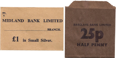
#64 - Banking Money bags/pockets for Barclays Bank Ltd., Lloyds Bank Ltd. and Midland Bank Ltd. (now HSBC). I picked these up at the weekend from a local flea market. They came in a bundle with a few of each one, most of which are unused.
I think they're from the early 70's as here in the UK we went decimal in 1971, losing the pound, shilling and pence in favour of just pounds and pence with an 18 month change-over period. This bundle of bags includes both decimal and pre-decimal nominations so I'm guessing they are from this change-over period.
The little 25p one at the bottom is my favourite, partly becasue of the big, thick black number 25 and partly because I miss 1/2 pence pieces!
Check out more wonderful items in the reference box here.
https%3A%2F%2Fwww.deliciousindustries.com%2Ffrom-the-reference-box-64
Delicious+Industries%3A+From+the+reference+box+%2364
Educational Stamps - Israel 1972


I found these gorgeous Israeli stamps on a great blog, Words and Eggs. They were issued in 1972 to celebrate the countries rise in educational standards and illustrate stages of education (above - top to bottom):
Elementary school - "The beginning of wisdom is this: get wisdom..." (Proverbs 4:7)
Secondary school - "Train upon a child in the way he should go..." (Proverbs 22:6)
Vocational training - "... but all study of the law without labor comes to naught at the last..." (Pirkei Aboth 2)
Academic training - "...but you shall meditate on it day and night..." (Joshua 1:8)
Big thanks to Kickcan & Conkers for pointing us to this great blog.
Images copyright The Israel Philatelic Federation (IPF).
https%3A%2F%2Fwww.deliciousindustries.com%2Feducational-stamps-israel-1972
Delicious+Industries%3A+Educational+Stamps+-+Israel+1972
Letterheady

Letterheady is a great website run by Shaun Usher showcasing interesting letterhead designs, mainly it seems from famous people, offices and corporations. Shaun describes it as, "an online homage to offline correspondence; specifically letters. However, here at Letterheady we don't care about the letter's content. Just its design." What a wonderful resource for ephemera geeks and designers.
There's a good range too- some of the designs are simple and to the point whilst others like the Barnum's one (above) are fantastically elaborate. Here are my favourites:


Images copyright Letterheady.
Via our friends at Sell! Sell!
https%3A%2F%2Fwww.deliciousindustries.com%2Fletterheady
Delicious+Industries%3A+Letterheady
A Collection a Day, 2010


Artist and illustrator Lisa Congdon has started A Collection a Day 2010, a blog showcasing random objects from her personal or imagined collections. Lisa is going to post a collection everyday for exactly one year - quite a task!
"Since I was a young girl, I have been obsessed both with collecting and with arranging, organizing and displaying my collections. This is my attempt to document my collections, both the real and the imagined".
It's a great idea for a blog - I love collections. There are already some interesting items up there, so hopefully it will become a good source of inspiration on a daily basis.
Images copyright A Collection a Day, 2010.
Via the wonderful Kickcan and Conkers.
https%3A%2F%2Fwww.deliciousindustries.com%2Fa-collection-a-day-2010
Delicious+Industries%3A+A+Collection+a+Day%2C+2010
December Which? Covers


Well Christmas is almost upon us, so here are some December Which? covers, 1965 to 1974 from my collection for a bit of seasonal design inspiration.
See more Which? covers on Flickr or checkout these posts for more information:
Which? Magazine
More Which? Covers
Banks & Miles
Q&A with John Miles
https%3A%2F%2Fwww.deliciousindustries.com%2Fdecember-which-covers
Delicious+Industries%3A+December+Which%3F+Covers
From the reference box #63

#63 - Set of six Nederlandse Antillen stamps - 12c to 50c. I bought these stamps because I liked the simplicity of the illustrations and really loved the flamingos in my favourite colour combo (pink and brown) on the 50c one (above).
I knew nothing about Nederlandse Antillen (formerly known as the Netherlands West Indies), which I now know to be 2 groups of islands in the Caribbean Sea forming part of the Kingdom of the Netherlands. The 2 groups are the 'Leeward Islands', - Bonaire & Curacao and the 'Windward Islands' - Saba, Sint Eustatius and Sint Maarten.
This set of stamps includes one with 'Aruba' on it and 2 stamps of different face value for Sint Eustatius. I'm not convinced this is a full set and I wonder if each island had a different stamp for each denomination? - that would explain why there are 2 for St Eustatius here??
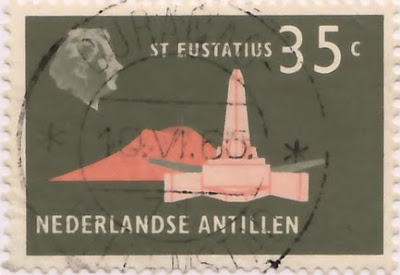
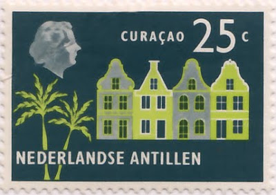
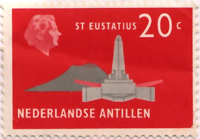


It's quite frustrating really. I've been able to find loads of information about the history of the islands, of which there is lots, including the fact that the Windward Islands were discovered by Christopher Colombus in 1493), but I haven't been able to source the designer/illustrator of any of these stamps or find a definitive issue date - one source suggests 1965 and another 1958. If I do find out any more information I'll be sure to post it up.
https%3A%2F%2Fwww.deliciousindustries.com%2Ffrom-the-reference-box-63
Delicious+Industries%3A+From+the+reference+box+%2363
From the reference box #62

#62 - Vintage 90th Birthday photograph. I love vintage photography and collect old photos of cats and Volkswagens, but whilst searching through stacks of photos in antique stores and boot sales I often come across images with a story, either visible in the image or written on the reverse - a date, a shopping list, a message - something that gives a little peak into that persons life and I love that even more than the images themselves.
This is one of my favourite non vw or cat related ones found amongst a batch I bought at a bootsale. On the back it reads, in really shaky handwriting:
"This was taken on my 90th birthday June 1/43 with the bake Ida made for me with 90 candles on it which I had to blow out - M.L.Rose"
Such a lovely note, and how big is that cake - I hope she had lots of friends to share it with!
There's more vintage photography based items in the reference box here, here and here.
https%3A%2F%2Fwww.deliciousindustries.com%2Ffrom-the-reference-box-62
Delicious+Industries%3A+From+the+reference+box+%2362
From the reference box #61
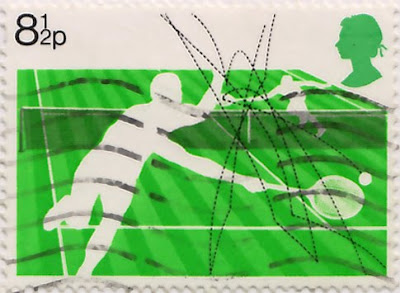

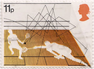

#61 - 4 British stamps commemorating Racket Sports; Lawn tennis (8 1/2p), Table tennis (10p), Squash (11p), Badminton (13p). Issued on the 12 January 1977, this set was designed by Andrew Restall, but in a totally different, much bolder illustration style to this set he designed in 1983. I personally prefer this more graphic style with the silhouetted figures and bright, blocks of colour, although I'm not sold on the colour combinations.
The best thing about these stamps for me though, is how they show the paths of the balls and the shuttlecock - it's really interesting to track their movements throughout a game and to see which games are faster as their paths are more direct with less curves and more bounces.
Take a look at more reference box items here.
https%3A%2F%2Fwww.deliciousindustries.com%2Ffrom-the-reference-box-61
Delicious+Industries%3A+From+the+reference+box+%2361
Mexico Exporta


I love these stamps over on the wonderful, So Much Pileup. They were issued in 1975 to celebrate Mexico's exports.
I love the simple illustration style and single colour print - I always think single and 2 colour print is more effective than full colour and these stamps demonstrate that beautifully.
Images copyright So Much Pileup.
https%3A%2F%2Fwww.deliciousindustries.com%2Fmexico-exporta
Delicious+Industries%3A+Mexico+Exporta
60's Porsche Service Books


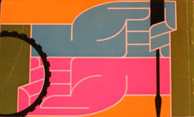
I'm loving the colour palettes and graphics on these Porsche Service Books from the 60's - such an unexpected source of inspiration!
In fact most of the Porsche marketing materials from this era were really well designed. Grain Edit recently posted these fantastic Porsche posters designed by Erich Strenger and Volz...
Service Book images from Old Auto Radio.
Top poster from AUSmotive all other posters from VP Racing - via Grain Edit.
https%3A%2F%2Fwww.deliciousindustries.com%2F60s-porsche-service-books
Delicious+Industries%3A+60%26%23039%3Bs+Porsche+Service+Books
From the reference box # 60
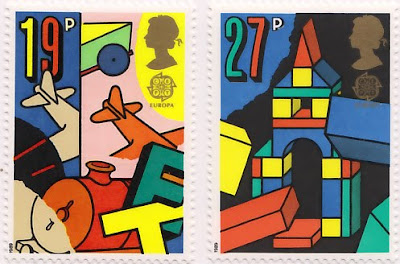

#60 - Europa, Games and Toys - set of 4 commemorative, Royal Mail Stamps first issued on 16 May 1989.
I know, more stamps, but they are very nice ones. I seem to have been buying loads of them recently - I can't help myself!
This bold and colourful set were designed by Dan Fern. Each stamp celebrates a different types of toys or games; 19p - ToyTrains & Airplanes, 27p - Building Blocks, 32p - Dice & Board Games, 35p - Toy Robots & Doll's Houses.
I really love the geometric illustration style combined with the really bright colours and thick black outlines - how cute is the robot face peeking out of the last one?
One thing on these stamps that I haven't come across before is the 'Europa' graphic under the Queen's head. It turns out that 'Europa' stamps are produced once every year and have been since 1956. They are stamps designed around a common theme in a number of countries at the same time. Originally they represented the 6 founding members of the European Coal and Steel Community (ECSC), then from 1959 the European Conference of Postal and Telecommunications Administrations (CEPT) and since 1993, PostEurop. Occassional issues, have seen all the countries involved issue the same stamp design, for example in 1984 to celebrate the 25th Anniversary of CEPT and in 2000 to celebrate the new millenium.
More stamps and wonderful pieces of ephemera can be found here.
https%3A%2F%2Fwww.deliciousindustries.com%2Ffrom-the-reference-box-60
Delicious+Industries%3A+From+the+reference+box+%23+60
From the reference box #59
Issued on 5 October 1983, they're not very old, but the illustration style and colours really caught my eye. They were designed by Andrew Restall DA to illustrate the different kinds of local 'fairs'; Merry-go-round (16p), Big wheel, Helter skelter and Performing animals (20 1/2p), Sode-shows (28p) and Early produce fairs (31p).
The contrast between the 3 fairground/circus style ones in the bright oranges and pinks and the produce fairs one in natural greens and browns is great, but it's the details I'm drawn to in these particular stamps - the little cat in the foreground of the 31p one and the little pelican in the foreground of the 20 1/2p one.
For more wonderful stamps and items of vintage ephemera you might like to have a dig around in here.
https%3A%2F%2Fwww.deliciousindustries.com%2Ffrom-the-reference-box-59
Delicious+Industries%3A+From+the+reference+box+%2359
From the reference box # 58
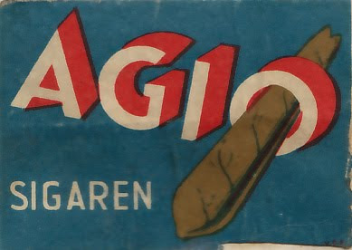
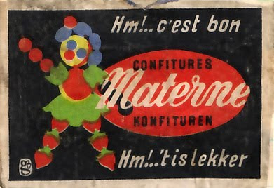
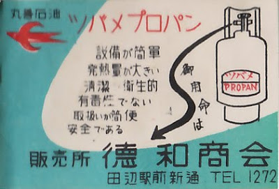
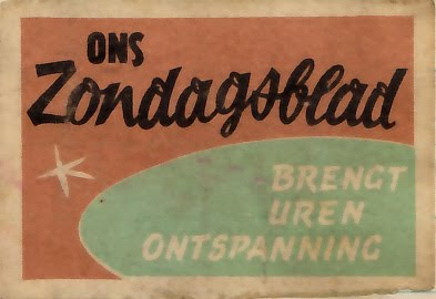

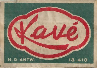

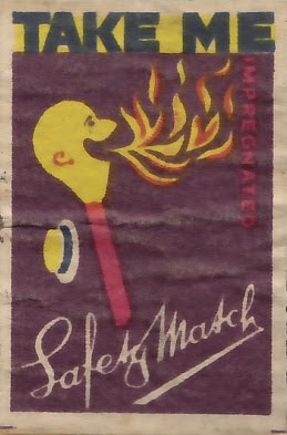
#58 - Vintage matchbook covers. These are a selection from the collection I bought a couple of weeks ago. They're a great mixture, originating from the UK, Germany, Norway, France and China - it's really interesting how similar the styles are.
The best type for me is the 'AGIO' on the first one and the number '8' on the 'Darcy' one, but they've all got charm in their own way, be it their colour palate, typography, design or illustration style. I never get bored of looking at them.
https%3A%2F%2Fwww.deliciousindustries.com%2Ffrom-the-reference-box-58
Delicious+Industries%3A+From+the+reference+box+%23+58
Vintage Reading Posters
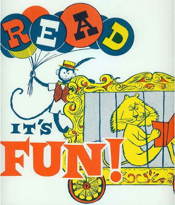
I have a thing about vintage circus posters - the colours, the graphics, the type - what's not to like! These posters, particularly the top one have all the same elements, so I'm now on a mission to find some of my own.
Images copyright doe-c-doe.
https%3A%2F%2Fwww.deliciousindustries.com%2Fvintage-reading-posters
Delicious+Industries%3A+Vintage+Reading+Posters
From the reference box # 57
I don't know the exact date of this set, but I suspect they're from the mid 60's. "UPRAWIAJ SPORT" translates to read, "I DO SPORTS", so I wonder if they're some kind of government campaign encouraging exercise and sports (ironic I know on a matchbox, probably used by a smoker).
Whatever their reason for being, I'm drawn to the simplicity of the single colours and the strength of the shapes created by the bold silhouettes. It's the little things that I really love though, like the visible crop marks in some of the corners.
I'll post the rest of the collection over the next few weeks, meanwhile check out my other posts about matchbook labels:
From the reference box #11
From the reference box #23
From the reference box #39
From the reference box #42
Czech Matchbook Labels
Japanese Match Labels
Matchbook Covers
Mystery Parcel
Saul Bass Designed Matchbooks
Volkswagen Matchbooks
https%3A%2F%2Fwww.deliciousindustries.com%2Ffrom-the-reference-box-57
Delicious+Industries%3A+From+the+reference+box+%23+57
Welcome
Welcome to the Delicious Industries blog. We're an independent design studio based in Brighton, UK and this is our scrapbook packed full of design, illustration, photography & typography inspiration. Check out our work here.
Links
DELICIOUS FRIENDS
DELICIOUS FAVOURITES
- 50 Watts
- Acejet 170
- Grain Edit
- It's Nice That
- National Geographic Found
- Notcot
- Pretty Clever
- Retronaut
- So Much Pileup
- We Love Typography
- Another Mag


