Blog: Ephemera
International Labour Organisation Stamp

I found a strip of these stamps at the weekend and just loved the industrial graphic softened by the pink, violet and purple colour palate.
They're English stamps celebrating the 50th anniversary of the International Labour Organisation, 1919 - 1969.
"The ILO was founded in 1919, in the wake of a destructive war, to pursue a vision based on the premise that universal, lasting peace can be established only if it is based upon decent treatment of working people. The ILO became the first specialized agency of the UN in 1946".
In 1969, it's 50th anniversary year, the ILO also won the Nobel Peace Prize.
https%3A%2F%2Fwww.deliciousindustries.com%2Finternational-labour-organisation-stamp
Delicious+Industries%3A+International+Labour+Organisation+Stamp
From the reference box #42

#42 - Czech matchbook covers.
I think they're celebrating something on the 1st May - Karviná II? or is that the brand name?? who knows. What I love about them is how wonderfully Constructivist they look. The 2 colours and the bold graphics of machinery and tools are fantastic.
Does anyone know if there are more in this set?
https%3A%2F%2Fwww.deliciousindustries.com%2Ffrom-the-reference-box-42
Delicious+Industries%3A+From+the+reference+box+%2342
From the reference box #39


A cool Air Europe matchbook from the 70's - "It's nice to fly with friends."
Loving the red and orange combo, especially the stripes!
Have a look through the rest of our reference box here.
https%3A%2F%2Fwww.deliciousindustries.com%2Ffrom-the-reference-box-39
Delicious+Industries%3A+From+the+reference+box+%2339
From the reference box #38
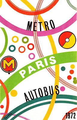
I love how the map graphics and colour coding have been used to create this funky cover. As you can see it's a Paris Metro & Autobus map from 1972.
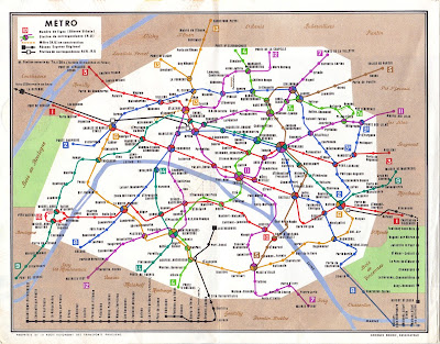
Inside it has 3 maps; a metro map of the full region...
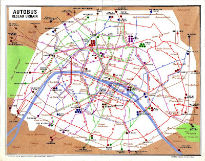
... an Autobus map of the central city...
... and a night Autobus map, again of the inner city area...
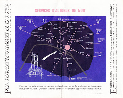
I also really like the unexpected use of the script font (used to mark the different areas within the city) it's a pleasant surprise.
All-in-all a nice little addition to the reference box. Have a delve in the box yourself here for a little Friday inspiration.
https%3A%2F%2Fwww.deliciousindustries.com%2Ffrom-the-reference-box-38
Delicious+Industries%3A+From+the+reference+box+%2338
Vintage Ephemera on Flickr

These cool bits of ephemera are from HA! Designs Flickr group - Vintage Ephemera. A collection of items discovered whilst clearing out their Grandpa's house.
There are loads of random items; tins, adverts, playing cards, packaging, coupons, instruction booklets and greetings cards. It's interesting to see what their Grandpa thought was worth keeping for all these years.


Images copyright HA! Designs.
https%3A%2F%2Fwww.deliciousindustries.com%2Fvintage-ephemera-on-flickr
Delicious+Industries%3A+Vintage+Ephemera+on+Flickr
Mystery parcel

It's always nice to get an unexpected parcel in the post, but even more exciting when it's full of vintage ephemera - especially matchbooks! So a very big thank you to Jack Hooker for sending us a great selection.
Here are a few of my favourites. I especially like the Air India one and it's actually made of wood, the P&O one has different destinations stamped into the bottom of each match (which can just be made out in the pic) and I love the VIA one with 'Bon Voyage!' printed on the inside.


They will all be added to my Flickr group asap.
https%3A%2F%2Fwww.deliciousindustries.com%2Fmystery-parcel
Delicious+Industries%3A+Mystery+parcel
From the reference box #36

#36 - Carriageway markings: Do you know them?
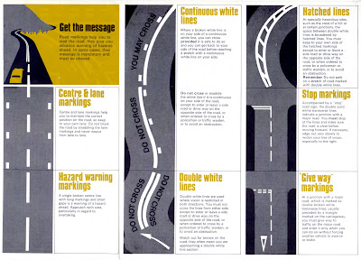
This highway code supplement is a new addition to the reference box. I love how the lines of the road markings create really graphic illustrations and how they've used only the colours of the black tarmac and the road marking colours - bold yellow and white.
When I bought it I found this smaller leaflet, 'Stop Accidents' tucked away inside sporting a bit of great Saul Bass-esque type.
So there we have it, #36 - Highway Code supplement. Have a look through the other reference box items here.
https%3A%2F%2Fwww.deliciousindustries.com%2Ffrom-the-reference-box-36
Delicious+Industries%3A+From+the+reference+box+%2336
From the reference box #35

Disque de controle de stationnement - a French parking control probably from the early 50's for 'Zone Bleue', which according to the very detailed map included part of the Champs-Élysée.
It has 'Matin' (Morning) 'Heure d'arrivee' (arrival time) and 'stationnement autorisé' (parking authorised till) times on one side of the dial and 'Apres -Midi' (afternoon) times on the reverse.
All the 'Heure d'arrivee' are in blue type and some have either a blue or red dot screen behind them, I'm not sure what that is indicating, but it looks good. The 'stationnement autorisé' are all in bold, red type that's much bigger than the arrival times.
I'm not sure if it's sponsored by Citroën, whether they produced them or whether they are just advertising on it, but I really like the old logo and graphic on there.
I love this little piece of ephemera, it's a great addition to the reference box and to my moving dial/wheel collection - #35 - Disque de controle de stationnement
Checkout the rest of the reference box items here.
https%3A%2F%2Fwww.deliciousindustries.com%2Ffrom-the-reference-box-35
Delicious+Industries%3A+From+the+reference+box+%2335
The Color Helm

I bought this a couple of weeks ago, purely to go in my moving wheel/dial collection. Little did I know it had so much history.
The Color Helm: Guide to correct color combinations was produced by Ostwald Color Standards in the 1940’s. It was available in Professional, Spectrum, Student (which is the one I have), Womens’s Wearing Apparel and Interior Decorator’s models. Promising to be “Your answer to every color problem”!

It’s based on Ostwald’s Color System developed by Wilhelm Ostwald and “presents the fundamental laws of color and demonstrates them”. It basically shows a full spectrum of colour combinations with tints and darks in the exact percentage chosen. I haven’t quite figured out everything it does yet, but it came in the original box with it’s instructions, so it shouldn’t be too hard to figure out.
It turns out Wilhelm Ostwald has quite a history too... He was a Latvian/German Physical Chemist and natural philosopher, who won the Nobel Prize in 1909 for work on catalysis and chemical equilibrium and originated the process for preparing Nitric Acid.
However he also did outstanding work systemising colour and developed the Ostwald Colour System’. His colour circle consisted of a sequence of 24 hues, divided into 8 groups of 3 (yellow, orange, red, purple, blue, turquoise, seagreen and leaf green) and was first published in 1916 as ‘Die Farbenfibel’ – The Colour Primer. He also published a periodical, 'Die Farbe', which translates simply as, ‘Colour’.
Ostwald tried to standardise colour schemes through measurement and hoped to establish laws of colour harmony that would be adopted by schools, factories and art institutions worldwide.
His colour system was widely used for a few decades, but eventually proved too rigid to incorporate new colours as pigments and dyes of greater saturation were introduced onto the market.
The hunt's now on to find more of the Color Helm models!
https%3A%2F%2Fwww.deliciousindustries.com%2Fthe-color-helm
Delicious+Industries%3A+The+Color+Helm
Vintage Valentines

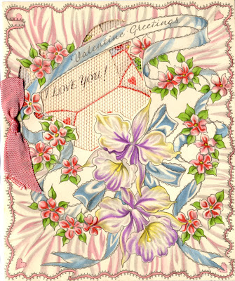

Getting you all in the mood for tomorrow, here are some vintage Valentine's Day cards. They're so delicate, and beautifully decorated with lace, foil and ribbon - I'm guessing they are from the 30's or 40's but not really sure.
I bought them in a little box at a boot sale, along with a couple of handmade cards, and the engagement card and gift tag (below) from the same era.
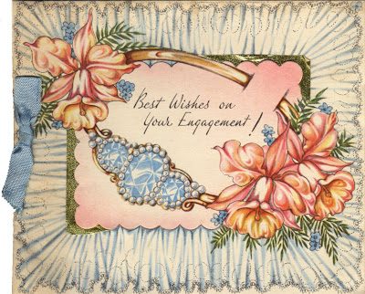

For more vintage design and ephemera have a look through our Reference Box!
https%3A%2F%2Fwww.deliciousindustries.com%2Fvintage-valentines
Delicious+Industries%3A+Vintage+Valentines
From the reference box #33

From the reference box #33 - War-time grocery bag and Motor Fuel Ration Book. The grocery bag (above) would have been used in local shops to hold small individual items. It's in really good condition and I love the text:
In "War Time" as in "Time of Peace", We aim to give Quality, Service, Satisfaction. The private trader considers you all the time.
It's funny how even back then value and importance of independent shops was being promoted.
In "War Time" as in "Time of Peace", We aim to give Quality, Service, Satisfaction. The private trader considers you all the time.
It's funny how even back then value and importance of independent shops was being promoted.

This Motor Ration Book is not quite as old as the grocery bag and from 1957. Booklets like this were given to customers when they bought a new vehicle and had to be transferred to the new owner if the vehicle was sold.
This booklet contains vouchers to receive free fuel for a motor car with an engine size of 2201cc and over. It has 42 x N vouchers and 21 x L vouchers which were meant to last for 6 months.
I wish I knew what car this originally came with - all I know is that the registration plate was TKL 400 and the booklet was issued on 27 April 1957 in Horsham, UK!
https%3A%2F%2Fwww.deliciousindustries.com%2Ffrom-the-reference-box-33
Delicious+Industries%3A+From+the+reference+box+%2333
From the reference box #32

From the reference box #32 - a Shell 'Signs of Welcome' tag. I'm not sure where these tags would have been found; maybe in hotels or at service stations, but I'm guessing it originated in the UK during the 60's.
It gives a list of European countries selling Shell Gasoline & Motor Oil and provides the brand name in each of those regions, "many miles from home, you will never be far from a Shell Service Station".
I like it for the little car graphic and the lovely big, rounded corners!
Check out more Reference Box items here.
https%3A%2F%2Fwww.deliciousindustries.com%2Ffrom-the-reference-box-32
Delicious+Industries%3A+From+the+reference+box+%2332
Space Travel Guide

I wish this was in my reference box! I found it on Ebay yesterday but unfortunately it has a buy-it-now of $99.99 (£73.15) which is a little steep, even though it would be a great addition to my vintage moving dial collection.
It's a Space Travel Guide from 1958. It must have been a free giveaway with something and has an ad for Dellwood Milk & Dairy Products on the reverse. However, it's the dial I love - the wheel turns to reveal each planet one at a time, giving it's relative size and diameter compared to Earth. The illustrations are great too with really bold and vibrant colours.
Hopefully I'll find a much cheaper version at a boot sale some time soon!
Images from Ebay auction - copyright Designartistic.
https%3A%2F%2Fwww.deliciousindustries.com%2Fspace-travel-guide
Delicious+Industries%3A+Space+Travel+Guide
From the reference box #30

It's been a while since I've delved into the reference box, but finally here we have #30, a Practical Householder freebie from the 50's (I think) - Cost & Quantity Guide for Paints and Wallpapers.
Not only is the cover great, but inside it has 2 movable paper charts/calculators. This lovely dial is to help calculate the number of wallpaper rolls, border rolls and ceiling rolls for the given room size...

... and this sliding chart helps estimate the cost and required amount of paint for the average room. The sliding card is printed on both sides giving ceiling and indoor woodwork guides on one side and wall, external wood and ironwork guides on the other.

The back page gives preparation instructions along with hints and tips for perfect decorating...

So there we have it, #30 - Practical Householder Cost & Quantity guide for Paints and Wallpapers
Have a look at previous Reference box exhibits here!
https%3A%2F%2Fwww.deliciousindustries.com%2Ffrom-the-reference-box-30
Delicious+Industries%3A+From+the+reference+box+%2330
Beetle Drive
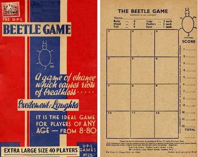
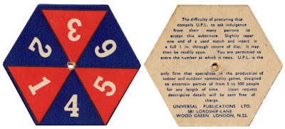
On the theme of old games, this is a late 50's (?) version of the great British game - Beetle. The Beetle game was massive in the 60's with 'Beetle Drives', an evening of playing Beetle with food and drink, often done as a fundraiser. The game can be played individually or in teams by all ages.
The aim is the first person to draw a full beetle on their card. A throw of the dice dictates which part you can draw. In this version a roll of 6 lets you draw the body, 5 - the head (which you must have before being allowed to draw the eyes or feelers), 4 - the tail, 3 - one leg, 2 - one feeler and finally 1 - an eye. The first person to complete their beetle is the winner of that game. At a Beetle Drive the winner is the person who wins the most games out of 12 and often the players switch tables for each game to make more of a social evening.
I'm not sure it sounds like, "riots of breathless excitement & laughter", but maybe after a good few drinks!
The best thing about this version is the card 'dice'. You put a matchstick through the middle and spin it, apparently due to the, "difficulty in procuring dice" at that time - or is it really because a dice wouldn't fit in the box??
https%3A%2F%2Fwww.deliciousindustries.com%2Fbeetle-drive
Delicious+Industries%3A+Beetle+Drive
Welcome
Welcome to the Delicious Industries blog. We're an independent design studio based in Brighton, UK and this is our scrapbook packed full of design, illustration, photography & typography inspiration. Check out our work here.
Links
DELICIOUS FRIENDS
DELICIOUS FAVOURITES
- 50 Watts
- Acejet 170
- Grain Edit
- It's Nice That
- National Geographic Found
- Notcot
- Pretty Clever
- Retronaut
- So Much Pileup
- We Love Typography
- Another Mag


