Blog: Ephemera
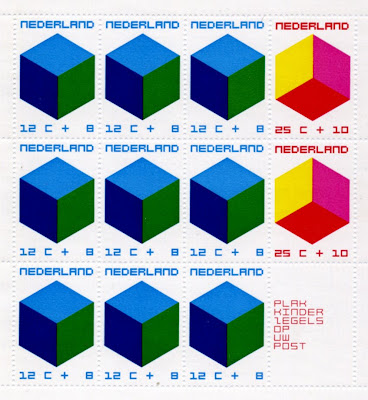
Cube stamps

I bought these a couple of weeks ago. I love the pink, red and yellow one - it could be a club poster or album cover, with those colours and the square type.
https%3A%2F%2Fwww.deliciousindustries.com%2Fcube-stamps
Delicious+Industries%3A+Cube+stamps
From the reference box #27

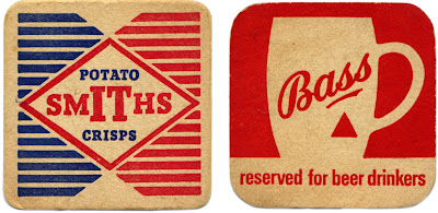
Two great beermats for two great British products; Bass Brewery and Smiths Potato Crisps.
Smiths Potato Crisps Company Ltd was a family business, formed in 1920 to bring crisps to the British masses. Mrs Smith washed, cut and fried the potatoes in the couple's North London garage. Frank Smith packaged them in greaseproof paper bags, added a twist of salt to flavour and then sold them from his pony and trap around London.
It's rumoured that during World War II, the women packing the blue sachets of salt in the crisps would sometimes pack little pieces of paper with their names and addresses on to draw the attention of any lonely soldiers!
Bass Brewery
The Bass & Co Brewery was established by William Bass in 1777 and was one of the first breweries in Burton upon Trent, UK - a town that became so popular with breweries over the years, that it is now known as a 'brewing town'. Bass was also one of the original FT 30 companies on the London Stock Exchange when the listing was established in 1935!
Not many people know that the Bass Red Triangle is one of the world's oldest logos and was the first trademark to be registered in Britain. The 1875 Trademarks Registration Act came into effect on 1 January 1876 and that New Year's Eve, a Bass employee waited overnight outside the registrar's office, in order to be the first to register a trademark the next morning. Bass actually got the first two registrations; the first was for the Bass Red Triangle (for their pale ale) and the second for the Bass Red Diamond (for their strong ale).
#27 - Bass and Smiths Potato Crisp beermats
https%3A%2F%2Fwww.deliciousindustries.com%2Ffrom-the-reference-box-27
Delicious+Industries%3A+From+the+reference+box+%2327
The missing letters!


So (drumroll) here's the full set...

Big thanks to Ryan at Sell! Sell! for pointing us in their direction.
https%3A%2F%2Fwww.deliciousindustries.com%2Fthe-missing-letters
Delicious+Industries%3A+The+missing+letters%21
Cuban stamps


Some Cuban Stamps celebrating the Munich 1972 Olympics. I love the pictograms against the bright colours and the Mexico68-esque type. I'm thinking there was probably a stamp for each letter in Munich, being as though we have here an 'I', 'M' and an 'N' - anyone have any of the others?
If you want to see more stamps check out these posts:
Stamp Inspiration
Stamps at Present & Correct
More Stamps
https%3A%2F%2Fwww.deliciousindustries.com%2Fcuban-stamps
Delicious+Industries%3A+Cuban+stamps
From the reference box #26


These luggage tags are from the 70's and came in the lot of free ephemera I got from the carboot sale the other week. I love the dense black type and the lovely red numbers on the first one and on the second it's the little, very detailed, plan of the plane that does it for me. If only the baggage handler had been more considerate all those years ago and not stuck a super sticky label over it!!
#26 - 70's luggage flight tags.
https%3A%2F%2Fwww.deliciousindustries.com%2Ffrom-the-reference-box-26
Delicious+Industries%3A+From+the+reference+box+%2326
Free Ephemera!


I like to visit a carboot sale at the weekend, but on Saturday I overslept and arrived quite late. It turns out though, that some of the stall holders, don't like to take anything away with them and towards the end of the sale they give everything away! Imagine my delight when one of those stalls had loads of ephemera tucked away in the bottom of the boxes - good job I had a spare bag to hand!
Above is a selection of the travel related items, I think from the mid 70's judging by some of the other paperwork. There was also quite a few old photos, photo wallets, the odd flight ticket, maps, a fuel ration book and various tickets for events throughout the 50's and 60's. I'm sure you will see it all soon enough.
https%3A%2F%2Fwww.deliciousindustries.com%2Ffree-ephemera
Delicious+Industries%3A+Free+Ephemera%21
From the reference #21

One of 'The Practical Motorist, Care & Safety Check Charts', my favourite movable chart. It was presumably a free gift with The Practical Motorist, I'm guessing in the late 50's or early 60's.
It's double sided and gives helpful 'remedies' for minor car 'symptoms'; lining up the arrow on the symptom, gives you the suggested 'remedy' for steering, light or braking issues. For example, the front (above left) shows 'wheel Tramp' as the symptom and 'Balance wheels; renew faulty hydraulic dampers; equalise tyre pressures' as the remedy. There is also a cool stopping distance chart/graphic on the reverse.
#21 - The Practical Motorist, Care & Safety Charts
https%3A%2F%2Fwww.deliciousindustries.com%2Ffrom-the-reference-21
Delicious+Industries%3A+From+the+reference+%2321
From the reference box #19

I'm not exactly sure what this is - I think it's a sales tag that would have been attached to purchased typewriters, but I love the 'Low's' type it's great. The red disc is weighted and engraved on it's metal centre with, '3 in 1 velus quality. The world over. Made in England. N0.100' on both sides. There is a postage stamp on the reverse with a date of 15.06.35 so I'm guessing it originates around that time.
So, #19 - Typewriter sales tag. Circa 1935.
https%3A%2F%2Fwww.deliciousindustries.com%2Ffrom-the-reference-box-19
Delicious+Industries%3A+From+the+reference+box+%2319
Do not disturb

It never occurred to me that 'Do not Disturb' door hangers could be interesting and well designed, until I stumbled upon Michael Lebowitz's fantastic collection on the equally fantastic Grain Edit.
Lebowitz found the collection on the wall of his late grandfather's study - he was a foreign service man and during his travels had collected the door hangers, brought them home and stuck them on the wall of his study, eventually filling the whole wall!
They are really great, all different shapes, sizes and languages. Some are simple and well designed, some have humour and others are just functional, but they are all great pieces of ephemera - thank you Michael for sharing!
Via Grain Edit.
https%3A%2F%2Fwww.deliciousindustries.com%2Fdo-not-disturb
Delicious+Industries%3A+Do+not+disturb
From the reference box #16


"Tour Holland by motor car" is a wonderful 1950's leaflet about touring this 'land of broad horizons'. It gives you the legal requirements for driving in their country, a low down of the road signs, a brief highway code, parking & car washing charges, touring routes, hotel & tourist information contacts and best of all it opens out into a map of the countries 2 main roads, in a kind of tube map style.
The map shows the towns and villages like tube stops along a simplified road and has places of interest; windmills, galleries, museums etc... marked on with simple icons. It's a superb piece of design and still looks really modern over 50 years later - the true test of good design!
#16 - 1950's travel leaflet - Holland.
https%3A%2F%2Fwww.deliciousindustries.com%2Ffrom-the-reference-box-16
Delicious+Industries%3A+From+the+reference+box+%2316
Wish you were here…

According to figures released by the Royal Mail yesterday, the humble postcard is making a comeback after a 10 year decrease in popularity. Mobile phones and texting are thought to have caused the decline, as it's easier to send a text than buy, write and post a card, but it seems holiday makers are once again sending 'Wish you were here' messages back home in the traditional way.
I always send home postcards from my hols and find great enjoyment in picking out the tackiest, most inappropriate and sometimes the dullest ones possible, even if it only gives the postman a chuckle. Here are a couple of my favourites.
https%3A%2F%2Fwww.deliciousindustries.com%2Fwish-you-were-here
Delicious+Industries%3A+Wish+you+were+here%26%238230%3B
From the reference box #15

Picked up this little beauty yesterday, a single Oxo cube box - I have only ever seen the Oxo tins before, but this little box is great.
So then, #15 - Oxo Cube packaging
https%3A%2F%2Fwww.deliciousindustries.com%2Ffrom-the-reference-box-15
Delicious+Industries%3A+From+the+reference+box+%2315
From the reference box #14


Lots of photography based ephemera from the 30s', 40's & 50's. The second red 'Kodak' one had images in it marked 1938 on the back, but I would say the first 2 are much older than that one. The last one is a really tiny, holiday souvenir photo card form 'Margate' - this is my personal favourite.
So quite a few items for #14 - Photograph/enlargement wallets and cards.
https%3A%2F%2Fwww.deliciousindustries.com%2Ffrom-the-reference-box-14
Delicious+Industries%3A+From+the+reference+box+%2314
From the reference box #13


Another little bit of ephemera fresh from the reference box are these 'Sorry we missed you' cards from a 1950/60's Dry Cleaners in Leamington Spa. I love the 'vanman' character on the pink one - he really is sad that they're not in!
# 13 - Dry cleaning, calling cards. 1950/60.
https%3A%2F%2Fwww.deliciousindustries.com%2Ffrom-the-reference-box-13
Delicious+Industries%3A+From+the+reference+box+%2313
From the reference box #11


New to the reference box is this collection of matchbook covers. A great carboot find at the weekend and a snip at £3! After discovering Grain Edit's Flickr group last week I decided to keep a look-out for some of my own, but never expected to find so many and so soon.
They are fantastic and from all over the world, someone has obviously spent a lot of time on this collection and I intend to keep it growing.
So, a new addition, #11 - Collection of Matchbook Covers
https%3A%2F%2Fwww.deliciousindustries.com%2Ffrom-the-reference-box-11
Delicious+Industries%3A+From+the+reference+box+%2311
Welcome

Welcome to the Delicious Industries blog. We're an independent design studio based in Brighton, UK and this is our scrapbook packed full of design, illustration, photography & typography inspiration. Check out our work here.
Links
DELICIOUS FRIENDS
DELICIOUS FAVOURITES
- 50 Watts
- Acejet 170
- Grain Edit
- It's Nice That
- National Geographic Found
- Notcot
- Pretty Clever
- Retronaut
- So Much Pileup
- We Love Typography
- Another Mag

