art direction, design + typography
Blog: Reference box
From the reference box #144
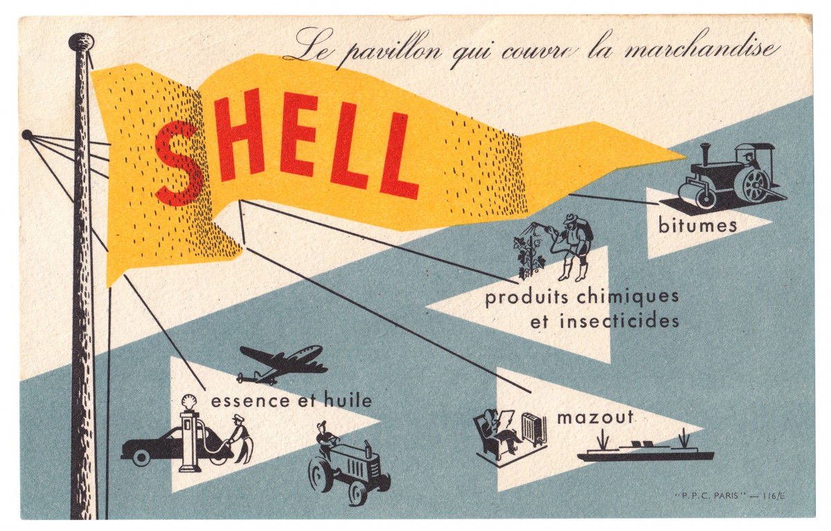
#144 - Shell promotional card, circa 1950s. Another gem from Paris.
It's advertising Shell's portfolio of products; so as well as the obvious petrol and oil, they supplied fuel oil, chemicals, insecticides and bitumen (asphalt).
I love everything about this little card; the colours, the pulpy uncoated stock that the ink has sunk into, the illustrations, the way the shading has been illustrated and the way they left the 'S' of Shell under the black layer of print to make it slightly darker too. The type and illustrations remind me of the instructional and educational charts from the same era. Shame I don't know who the illustrator/designer was.
Have a dig around in our reference box for more delicious ephemera...
https%3A%2F%2Fwww.deliciousindustries.com%2Ffrom-the-reference-box-144
Delicious+Industries%3A+From+the+reference+box+%23144
From the reference box #143
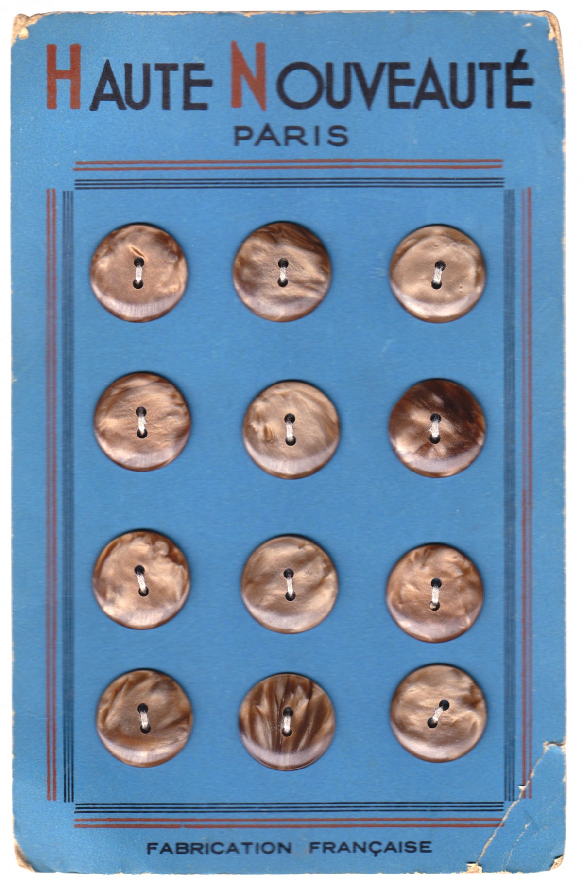
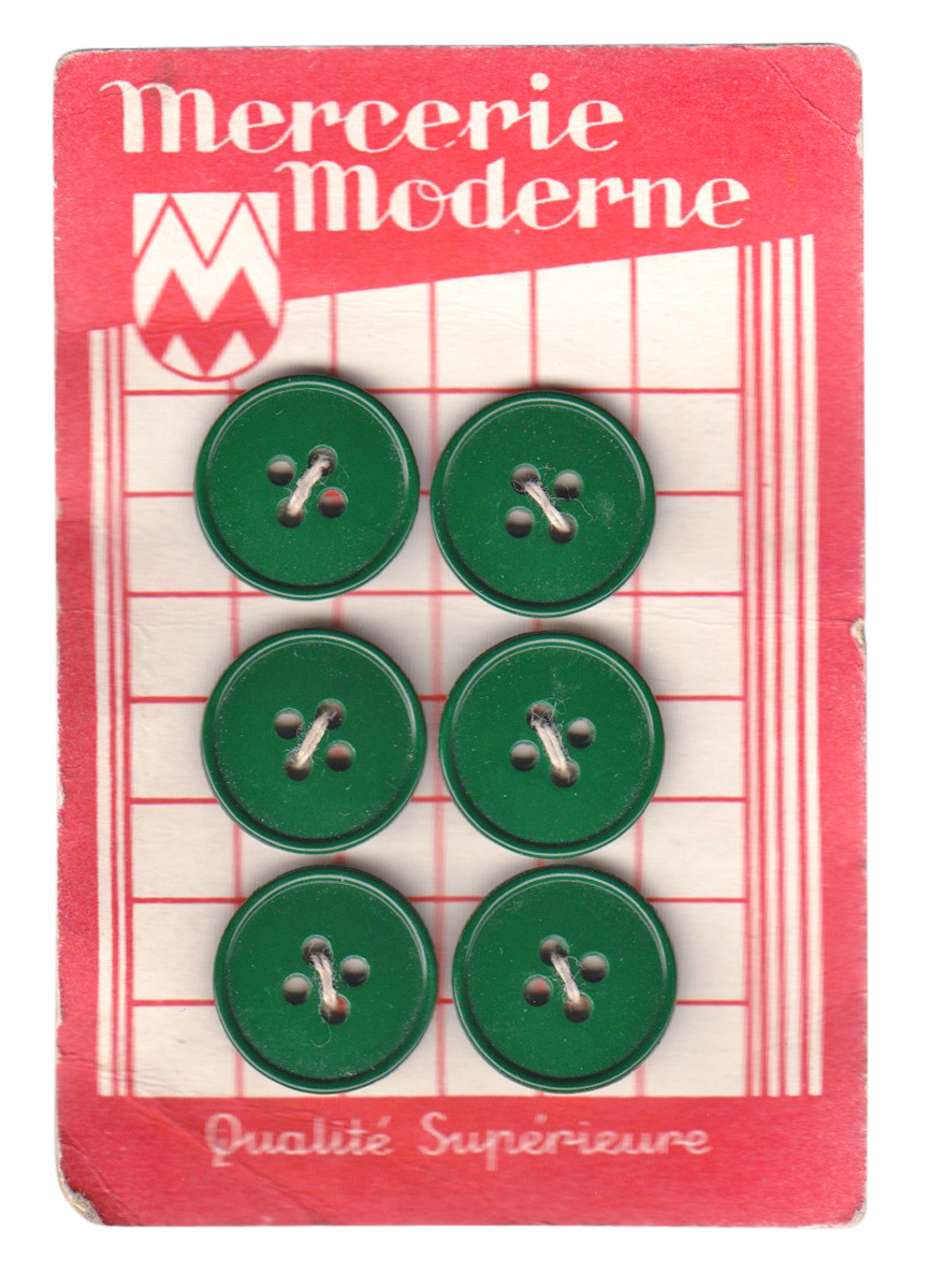
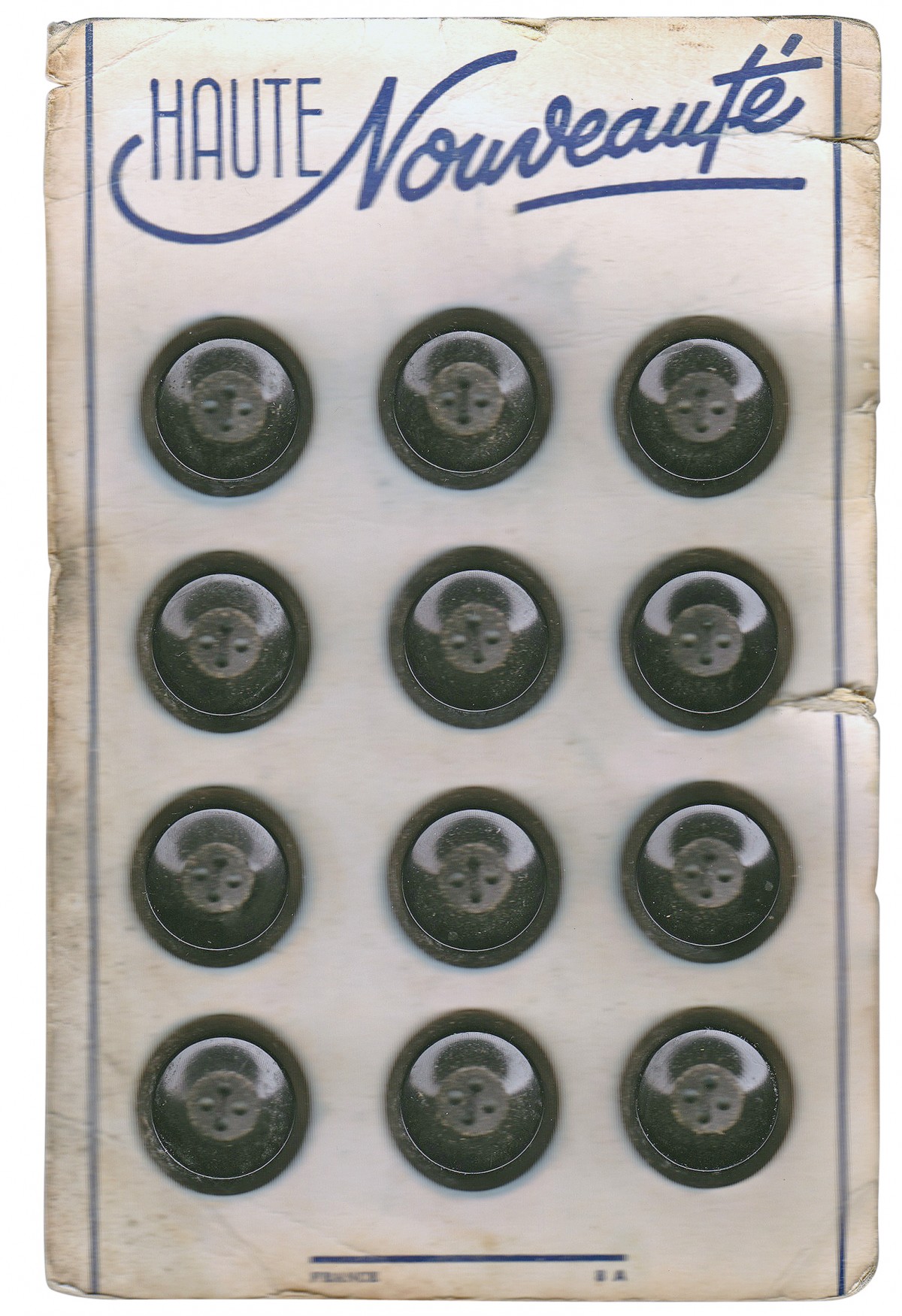
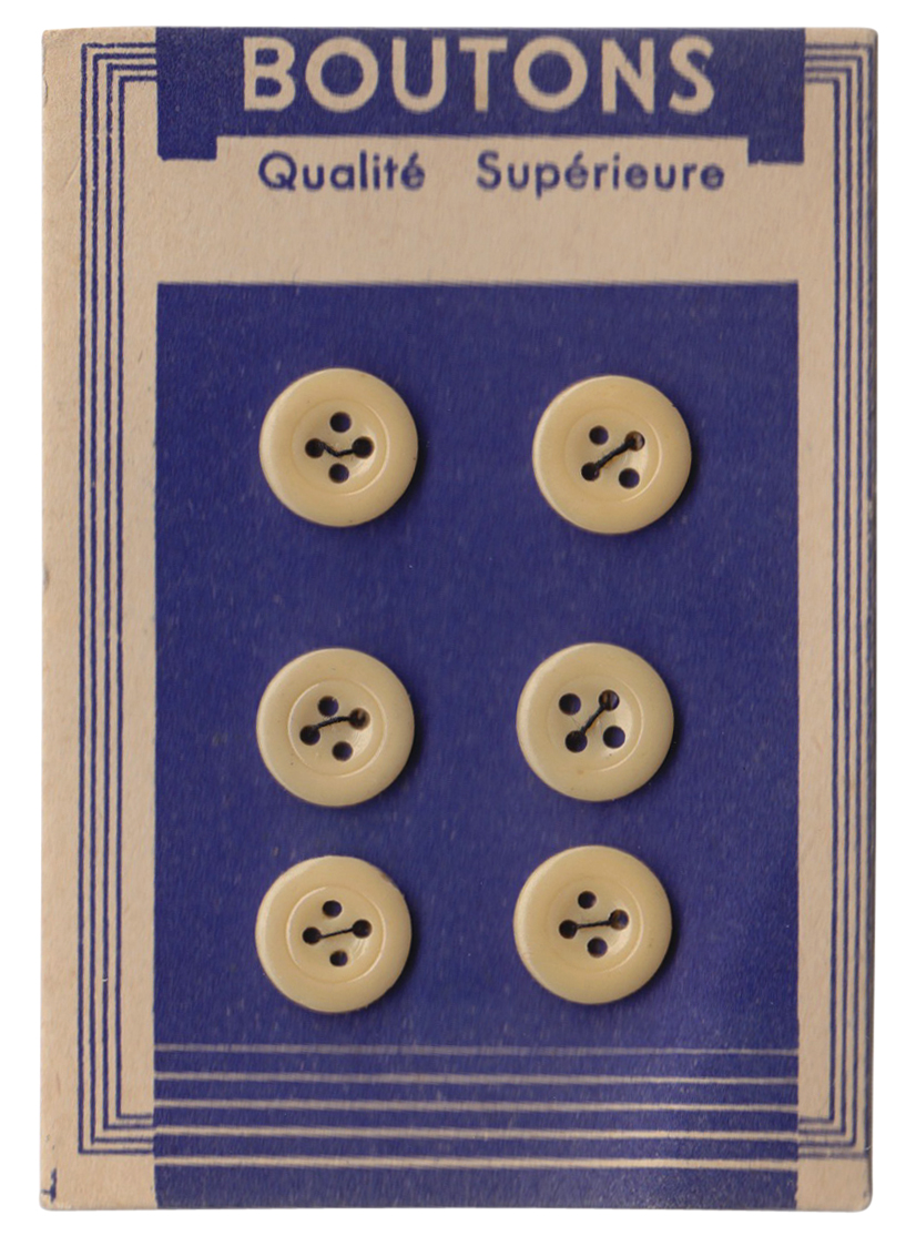
#143 - French Button display cards, circa 1940/1950. These lovely vintage button cards are from the Brighton street market and only £1 per card!
The lettering is fantastic and I bought them for that alone - I love the scripty 'Nouveauté' on the white card (third from top), it has such a Parisian feel as does the 'Haute Nouveauté' on the blue card (top) with it's ascending A's and quirky E's.
I feel another collection starting!
https%3A%2F%2Fwww.deliciousindustries.com%2Ffrom-the-reference-box-143
Delicious+Industries%3A+From+the+reference+box+%23143
From the reference box #142
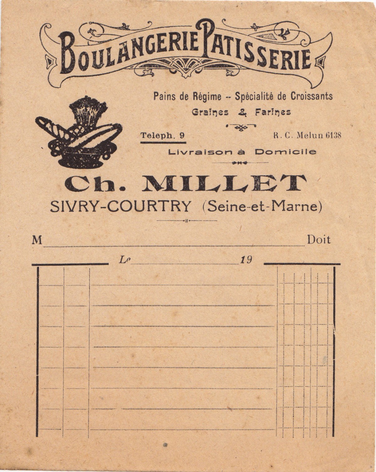
#142 - Vintage Boulangerie Patisserie receipt, "Pains de Régime - Specialité de Croissants, Graines & Farines".
A new addition to the reference box - this is the first of my Paris ephemera haul from the Marché aux Puces (flea markets).
It's a letter-pressed receipt probably from around the early 1900s. If only receipts were this elaborate today, shopping would be much more fun!
https%3A%2F%2Fwww.deliciousindustries.com%2Ffrom-the-reference-box-142
Delicious+Industries%3A+From+the+reference+box+%23142
From the reference box #141
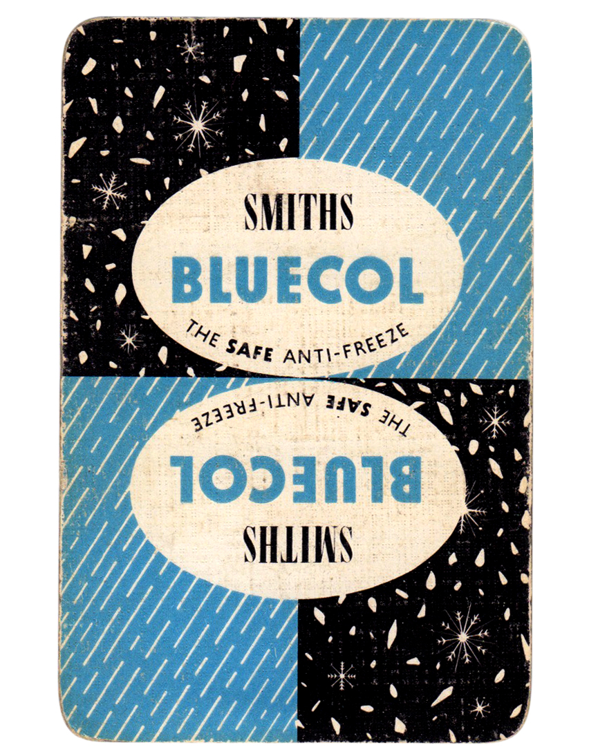
#141 - Smiths Bluecol playing card, circa 1950.
Not sure why an anti-freeze company would produce playing cards, but I'm glad they did. The sleet and snow illustrations are beautiful - the snowflakes are so fine and delicate.
Check out the other 140 pieces of ephemera stashed away in our reference box here.
https%3A%2F%2Fwww.deliciousindustries.com%2Ffrom-the-reference-box-141
Delicious+Industries%3A+From+the+reference+box+%23141
From the reference box #140
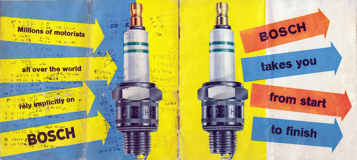
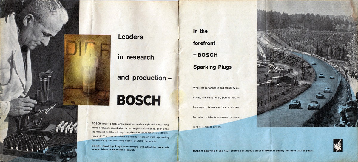
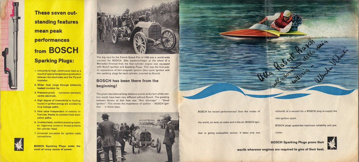
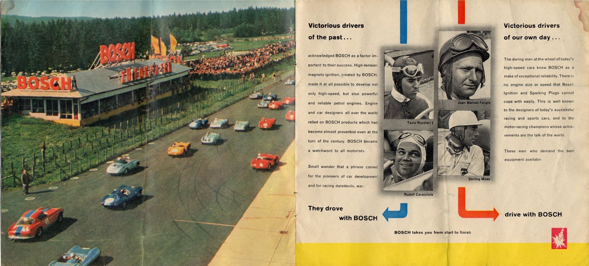
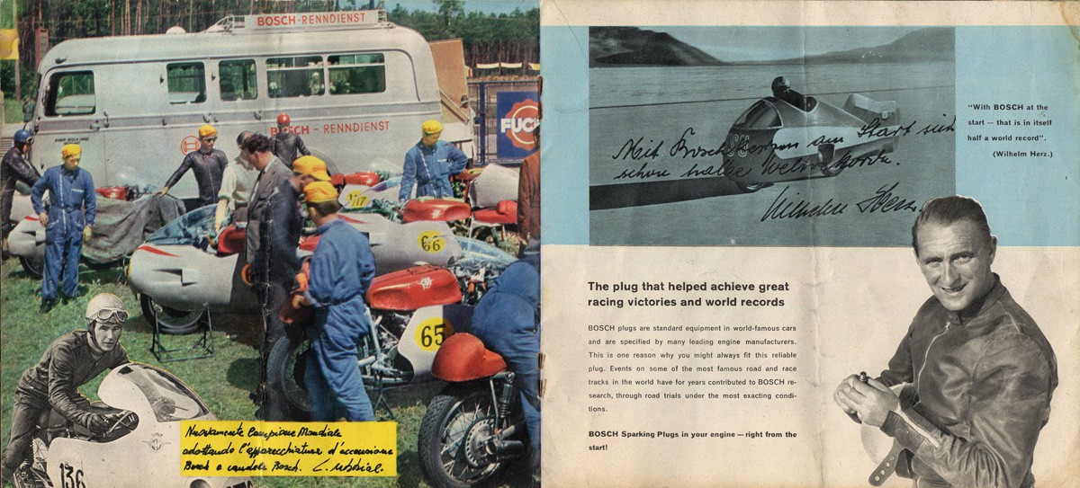
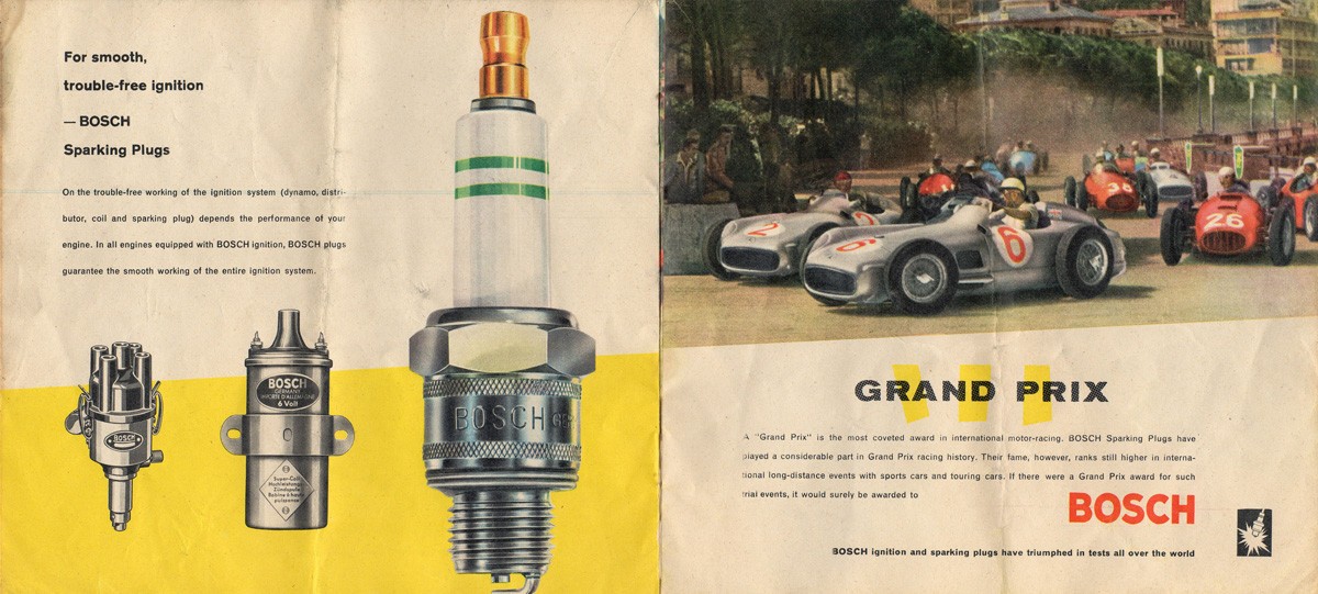
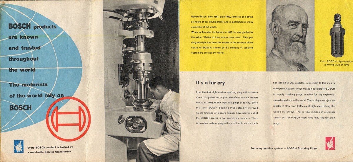
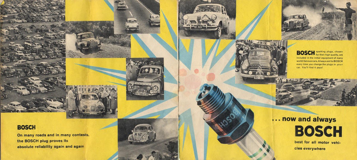
#140 - A rather gorgeous 1960s Bosch spark plug brochure - 'Bosch takes you from start to finish'.
This 16pp brochure highlights the advantages of Bosch spark plugs and backs it up with examples of motorsport success from Grand Prix winning vehicles to land speed records.
There are some amazing illustrations throughout, but some very questionable typesetting with an abundance of hyphens.
I love finding little notes on ephemera that tell you something extra about the item and this brochure has a whole host of figures and calculations on the back cover which seem to refer to a vehicles mileage & maintenance - length (in time) of journeys taken, mileage covered, dates and quantities of oil added and mileage at service points. It was clearly kept either in the car or close by used as a constant reference. Wish I knew what car it related to.
There's loads more ephemera and vintage packaging tucked away in our reference box, have a look and see what you can find.
https%3A%2F%2Fwww.deliciousindustries.com%2Ffrom-the-reference-box-140
Delicious+Industries%3A+From+the+reference+box+%23140
From the reference box #139
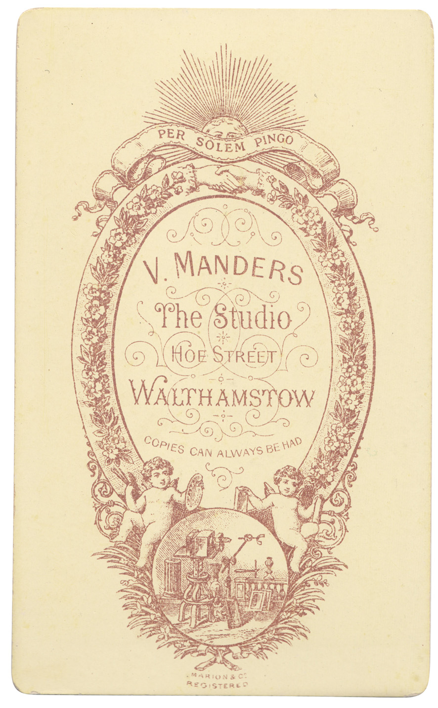
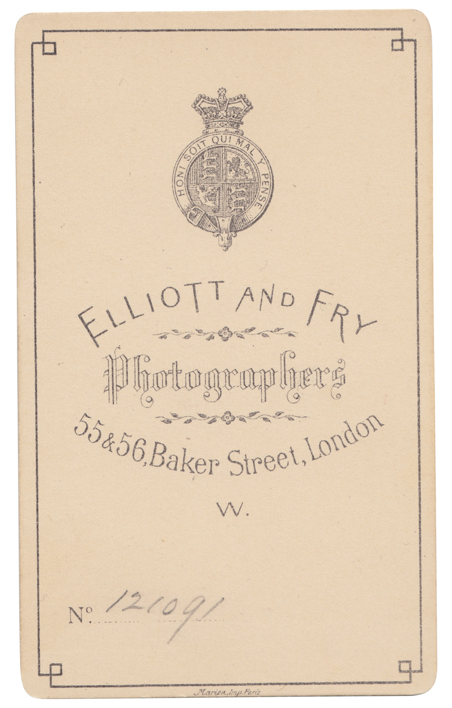
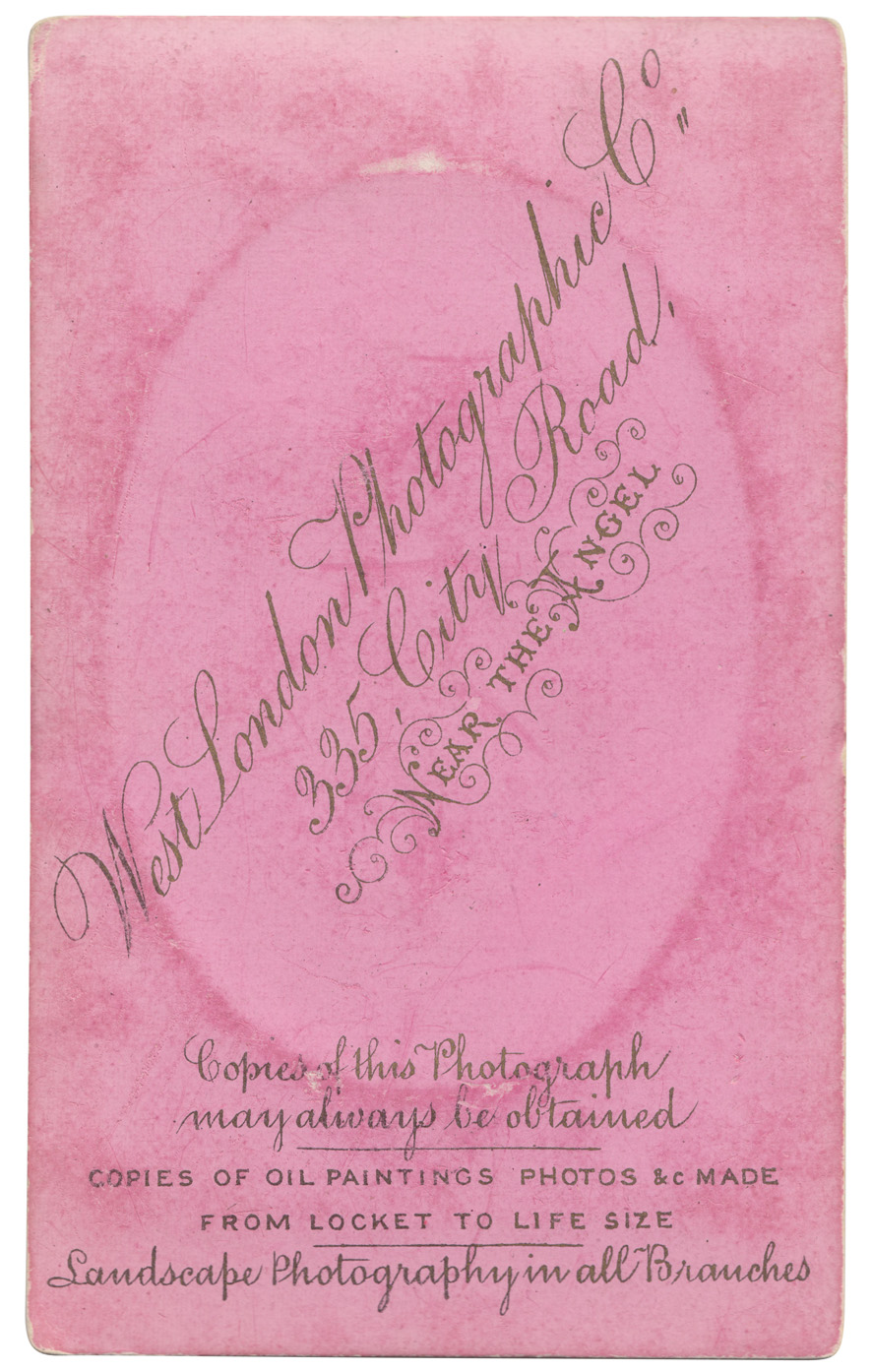
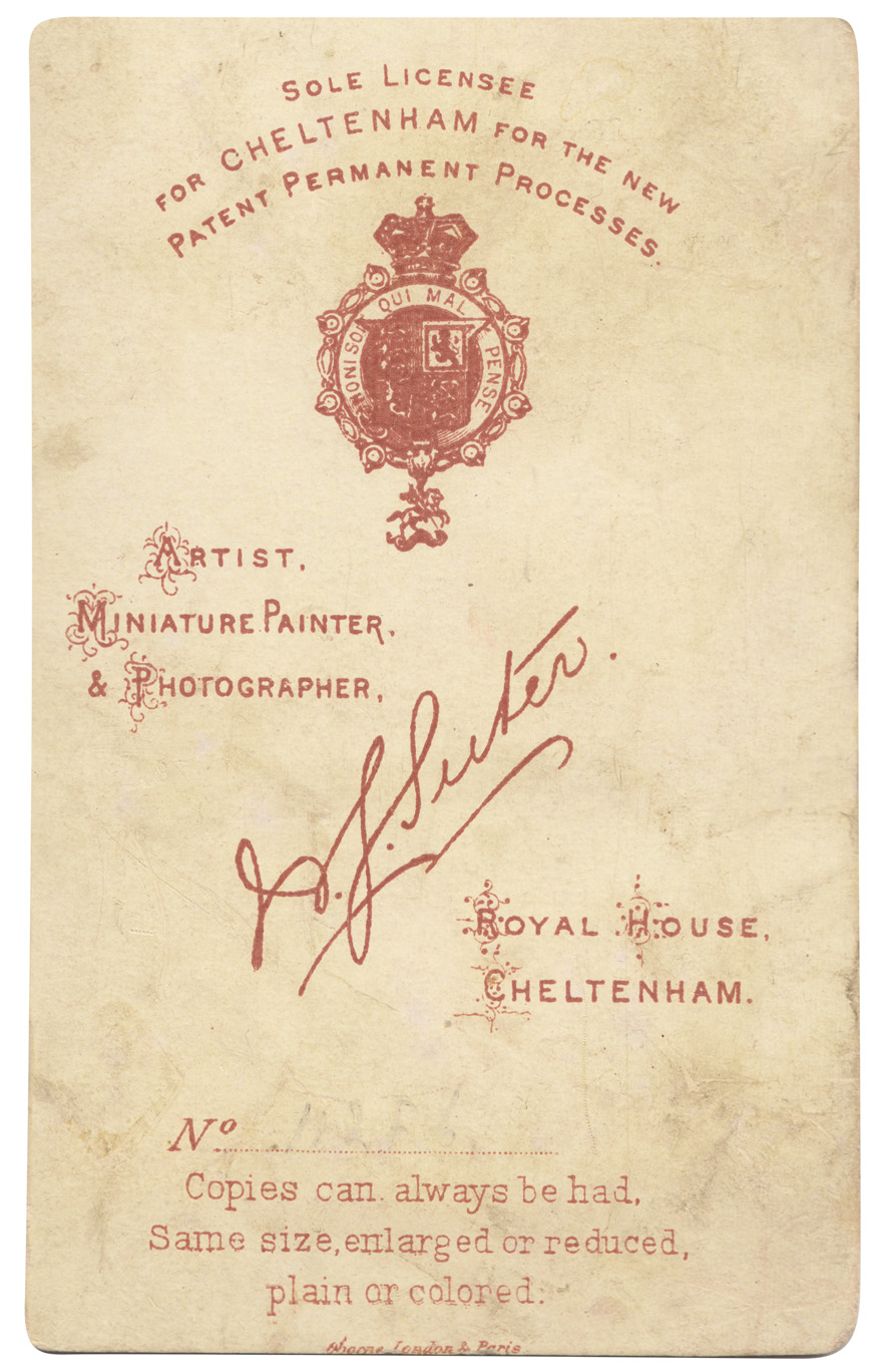
# 139 - Some new additions to the reference box, and to my Carte-de-Visite collection. Cards from four different photographic studios / photographers in the South of England, all beautifully lettered and detailed.
Quite a few of the cards in my collection have 'Marion Imp Paris' or 'Marion & Co Registered' which I assumed to be the printer of the cards, and I was correct. I found this great website all about Carte-de- Visite with a whole section about Marion & Co and how to use their marks to date the cards (and photographs). Check it out here.
See our whole collection here and previous posts about Carte-de-Visite here, here and here. You can find out more about Carte-de-Visite here, an article written by Graham Hudson from the Ephemera Society.
https%3A%2F%2Fwww.deliciousindustries.com%2Ffrom-the-reference-box-139
Delicious+Industries%3A+From+the+reference+box+%23139
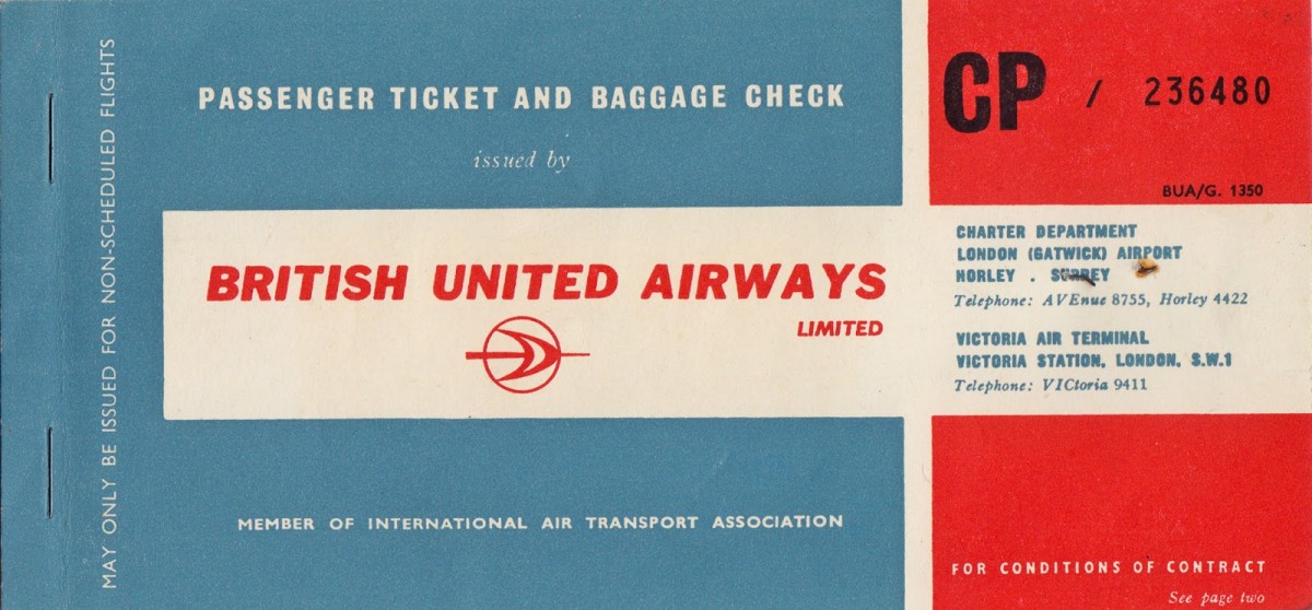
From the Reference Box #138
#138 - British United Airways passenger ticket and baggage check, 1963. I love to see a classic logo on an original bit of print so I couldn't leave this behind at the boot sale.
This lucky person, a Miss MV Dickinson travelled from London Gatwick to Venice on what was then the UK's largest independent airline, largely owned by British & Commonwealth Shipping (B&C) and the largest unsubsidised airline outside the US.
Have a delve into the rest of our reference box for more ephemera and vintage design goodies.
https%3A%2F%2Fwww.deliciousindustries.com%2Ffrom-the-reference-box-138
Delicious+Industries%3A+From+the+Reference+Box+%23138
From the reference box #137


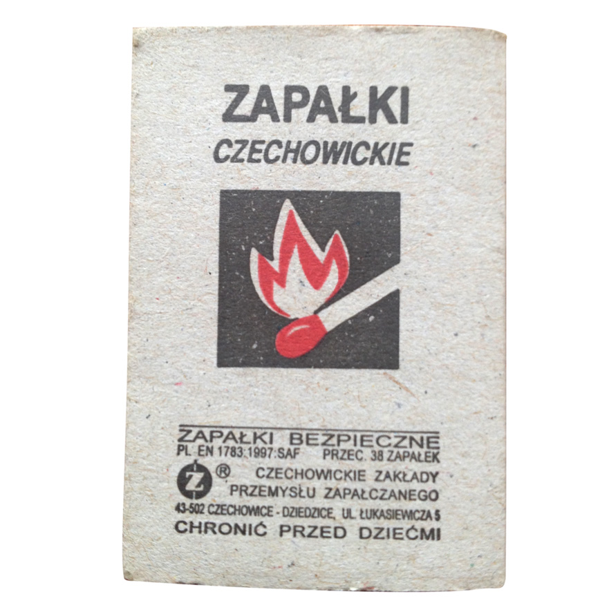
 #137 - Matchbooks & matchbook covers. This little lot were in a collection of souvenir match books I was given recently. The majority of the covers are uninspiring design-wise, but there's something about the ones above, be it their tacky charm or giant graphics that jumped out at me - especially the flame graphic!
We have many more matchbook covers in the reference box and on our blog, take a look here.
https%3A%2F%2Fwww.deliciousindustries.com%2Ffrom-the-reference-box-137
Delicious+Industries%3A+From+the+reference+box+%23137
From the reference box #136


https%3A%2F%2Fwww.deliciousindustries.com%2Ffrom-the-reference-box-136
Delicious+Industries%3A+From+the+reference+box+%23136
From the reference box #135


It covers current and proposed land use residential and commercial (this was immediately after the war and much of the city needed re-development), looks at traffic & public transport solutions, population density problems and shows plans for the Thames riverside re-development. All of which are illustrated with these wonderful infographics...


For more delightful ephemera have a dig around the rest of our reference box here.
https%3A%2F%2Fwww.deliciousindustries.com%2Ffrom-the-reference-box-135
Delicious+Industries%3A+From+the+reference+box+%23135
From the reference box #134


I think it's Russian and it is definitely a programme of events for a show of some kind, I'm guessing a circus or music concert purely from the illustrations so please correct me if I'm way off!
https%3A%2F%2Fwww.deliciousindustries.com%2Ffrom-the-reference-box-134
Delicious+Industries%3A+From+the+reference+box+%23134
From the reference box #133

#133 - Monotype Newsletter 90, November 1971. I completely forgot buying a few 70's copies of the Monotype Newsletter last Summer, so it was a pleasant surprise to find them hidden away in the reference box.
Here's No. 90, the first of the new format newsletters which includes a selection of pangrams on the inside covers, a list of London Monotype machine typesetters, an article on Michelin Guides, some metric conversions and a little history of Times Condensed...


https%3A%2F%2Fwww.deliciousindustries.com%2Ffrom-the-reference-box-133
Delicious+Industries%3A+From+the+reference+box+%23133
From the reference box #132

The booklet itself isn't anything to write home about, apart from a spattering of little illustrations (I'm assuming by the same artist) and a wonderful map on the inner back cover.
The cover is signed 'Pešić 61', but unfortunately I can't find anything out about him/her which is a shame as I'm a real fan of their style. If anyone knows more about Pešić and where I can see more of their work please let me know.


The reference box is quite full these days, so if you want an inspirational break from the grind, make a cuppa and dive in.
https%3A%2F%2Fwww.deliciousindustries.com%2Ffrom-the-reference-box-132
Delicious+Industries%3A+From+the+reference+box+%23132
From the reference box #131

Daphne Padden (1927 - 2009) was a freelance designer who throughout her career created gorgeously illustrated posters, marketing material, packaging and menus for the British Transport Commission, the Post Office Savings Bank, the British Diabetic Society, P&O and BEA.
See more posts about Daphne Padden here and here.
https%3A%2F%2Fwww.deliciousindustries.com%2Ffrom-the-reference-box-131
Delicious+Industries%3A+From+the+reference+box+%23131
From the reference box #130

Unfortunately there's no designer or artist credit for this gorgeous cover so if anyone knows who illustrated it, please let me know.
If you want to brighten up this rainy Monday, make a cuppa and have a rummage through the rest of our reference box.
https%3A%2F%2Fwww.deliciousindustries.com%2Ffrom-the-reference-box-130
Delicious+Industries%3A+From+the+reference+box+%23130
Welcome

Welcome to the Delicious Industries blog. We're an independent design studio based in Brighton, UK and this is our scrapbook packed full of design, illustration, photography & typography inspiration. Check out our work here.
Links
DELICIOUS FRIENDS
DELICIOUS FAVOURITES
- 50 Watts
- Acejet 170
- Grain Edit
- It's Nice That
- National Geographic Found
- Notcot
- Pretty Clever
- Retronaut
- So Much Pileup
- We Love Typography
- Another Mag