art direction, design + typography
Blog: lettering
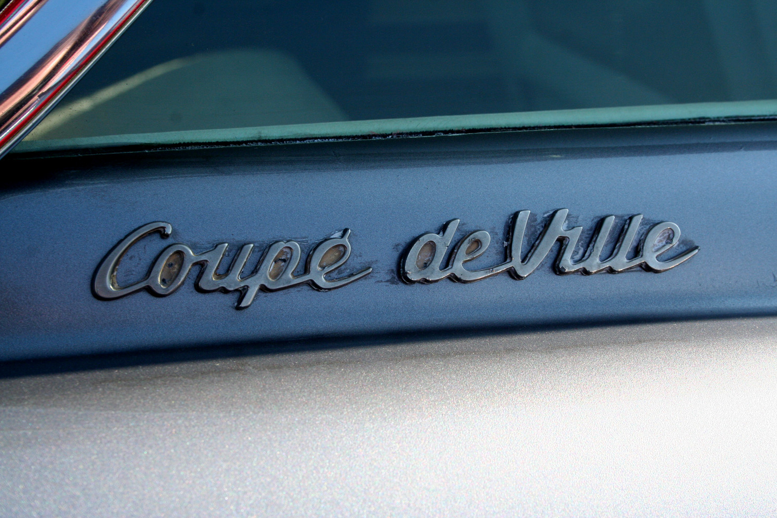
Auto Type XXII


You can see our full collection of Auto Type here and if classic cars get your blood pumping, check out our sister blog Super Ninety for some beauties.
https%3A%2F%2Fwww.deliciousindustries.com%2Fauto-type-xxii
Delicious+Industries%3A+Auto+Type+XXII
Auto type XXI


I think the Mercedes Unimog has got to be the favourite of this bunch, it's not everyday you see that and I really like the type.
Roll on Summer car shows, to re-stock the Auto Type vaults. In the meantime, check out the rest of my collection here and here.
https%3A%2F%2Fwww.deliciousindustries.com%2Fauto-type-xxi
Delicious+Industries%3A+Auto+type+XXI
Auto Type XX


It's been a long, long Winter of no car shows, so I'm already looking forward to the new season!
See our previous Auto Type posts here or check out our full collection on Flickr.
https%3A%2F%2Fwww.deliciousindustries.com%2Fauto-type-xx
Delicious+Industries%3A+Auto+Type+XX
Auto Type XVIV


https%3A%2F%2Fwww.deliciousindustries.com%2Fauto-type-xviv
Delicious+Industries%3A+Auto+Type+XVIV
Auto Type XVIII


There's plenty more to see in my Auto Type Flickr collection or see previous Auto Type posts here.
https%3A%2F%2Fwww.deliciousindustries.com%2Fauto-type-xviii
Delicious+Industries%3A+Auto+Type+XVIII
Auto Type XVII


It's Goodwood Revival this weekend - 3 days of classic racing, so stand by for lots more auto type in the coming weeks!
If you can't wait to see more, take a look at our previous Auto Type posts here or check out our Flickr set.
https%3A%2F%2Fwww.deliciousindustries.com%2Fauto-type-xvii
Delicious+Industries%3A+Auto+Type+XVII
Auto Type XVI


As ever, some wonderfully rare examples with many Italian marques today.
See our full Auto Type collection on Flickr here or look through other Automobilia posts here.
https%3A%2F%2Fwww.deliciousindustries.com%2Fauto-type-xvi
Delicious+Industries%3A+Auto+Type+XVI
Auto Type XV


See the full collection here.
https%3A%2F%2Fwww.deliciousindustries.com%2Fauto-type-xv
Delicious+Industries%3A+Auto+Type+XV
Auto Type XIIII


These are only half the auto type pics I took in one day - more to come later in the week!
View our full collection here and if you're a bit of a petrol head on the quiet, check out the beauties over on Super Ninety.
https%3A%2F%2Fwww.deliciousindustries.com%2Fauto-type-xiiii
Delicious+Industries%3A+Auto+Type+XIIII
Store Front: The Disappearing Face of Old New York


I love these pics over on How to be a Retronaut. They're taken from Store Front: The Disappearing Face of Old New York by James and Karla Murray, the result of years of photographing and "faithfully documenting the generations-old stores and shop windows of New York's neighbourhoods".
When it was published in 2009 the Murray's estimated that a third of the stores photographed had already closed, so I wonder how many are still open now, or even still standing? It's sad to think of those beautiful old signs being torn down as they add such character to a street, so much nicer than the bland plastic signage we see so much of today.
It's not just in New York either, it's the same story in every city - regeneration, redevelopment it's a never-ending cycle and I know it boosts the local economies, creates jobs and is good for the community, but I like the faded glory.
Two of my favourite places are Manchester and Blackpool, UK - purely for the charm and character of the old buildings and abandoned signage hidden in the back streets.
All images taken from Store Front:The Disappearing Face of Old New York. Copyright James & Karla Murray.
Published by Gingko Press.
https%3A%2F%2Fwww.deliciousindustries.com%2Fstore-front-the-disappearing-face-of-old-new-york
Delicious+Industries%3A+Store+Front%3A+The+Disappearing+Face+of+Old+New+York
Auto Type XIII


See our full collection here and if autos are your thing, check out our sister blog Super Ninety.
https%3A%2F%2Fwww.deliciousindustries.com%2Fauto-type-xiii
Delicious+Industries%3A+Auto+Type+XIII
Sanborn Fire Insurance Map Lettering


After completing a successful commission preparing insurance maps for the Aetna Insurance Company, surveyor D. A. Sanborn saw their value to the fire insurance industry and established D. A. Sanborn National Insurance Diagram Bureau in New York City,1867.
The lettering above shows how each town/city had a uniquely designed heading, title page or legend. They remind me of the very elaborate Carte-de-Visite reverses of the same period. I find it interesting that in the late 1800's, companies here in the UK and in the US were producing similar style lettering designs.
Reading some of the typographers comments on BibliOdyssey, I learned the difference between Lettering (hand-lettering created a purpose, not using pre-designed fonts), Typography (arranging pre-designed fonts) and Calligraphy (hand-lettering with a pen or brush). I did know the calligraphy definition but had never really given much thought to what was defined as 'lettering' or 'typography' - you learn something new everyday!
Images copyright BibliOdyssey.
Via FFFFound.
https%3A%2F%2Fwww.deliciousindustries.com%2Fsanborn-fire-insurance-map-lettering
Delicious+Industries%3A+Sanborn+Fire+Insurance+Map+Lettering
Vintage typewriter logo decals


He has the most amazing typewriter based Flickr sets I've seen - vintage typewriters, their marketing materials, instruction booklets, advertising as well as collections of British, American and German typewriter ribbon tins.
A real feast of graphics that will keep you staring at your screen for hours!
Images copyright Georg Sommeregger.
Via @shelfappeal
https%3A%2F%2Fwww.deliciousindustries.com%2Fvintage-typewriter-logo-decals
Delicious+Industries%3A+Vintage+typewriter+logo+decals
Paul Thurlby's Alphabet Book


Well, his illustrated Alphabet has taken on a life of it's own since we last posted. The lovely letters are now available as signed/numbered, limited edition Giclee prints, as greeting cards and have just been made into a children's ABC book (below)!

Pre-order your copy here for only £8.69!
Images copyright Paul Thurlby.
https%3A%2F%2Fwww.deliciousindustries.com%2Fpaul-thurlbys-alphabet-book
Delicious+Industries%3A+Paul+Thurlby%26%23039%3Bs+Alphabet+Book
Dana Tanamachi's Chalk Lettering


This fantastic chalk lettering is the handy work of Brooklyn based graphic designer, Dana Tanamachi. Her chalky masterpieces have adorned the walls of The Ace Hotel, NY, The Wes Anderson, Brooklyn and Google's NYC offices among many more.
I love her type choices and I'm amazed at the amount of detail and definition she can get from a piece of chalk! As you can see in these time-lapse films she works completely freehand, sketching and re-sketching to get the desired design (see below).
I would be terrified of smudging it right at the end, or of someone else smudging it! Although that vulnerability does add to their charm.


https%3A%2F%2Fwww.deliciousindustries.com%2Fdana-tanamachis-chalk-lettering
Delicious+Industries%3A+Dana+Tanamachi%26%23039%3Bs+Chalk+Lettering
Welcome

Welcome to the Delicious Industries blog. We're an independent design studio based in Brighton, UK and this is our scrapbook packed full of design, illustration, photography & typography inspiration. Check out our work here.
Links
DELICIOUS FRIENDS
DELICIOUS FAVOURITES
- 50 Watts
- Acejet 170
- Grain Edit
- It's Nice That
- National Geographic Found
- Notcot
- Pretty Clever
- Retronaut
- So Much Pileup
- We Love Typography
- Another Mag