art direction, design + typography
Blog: lettering
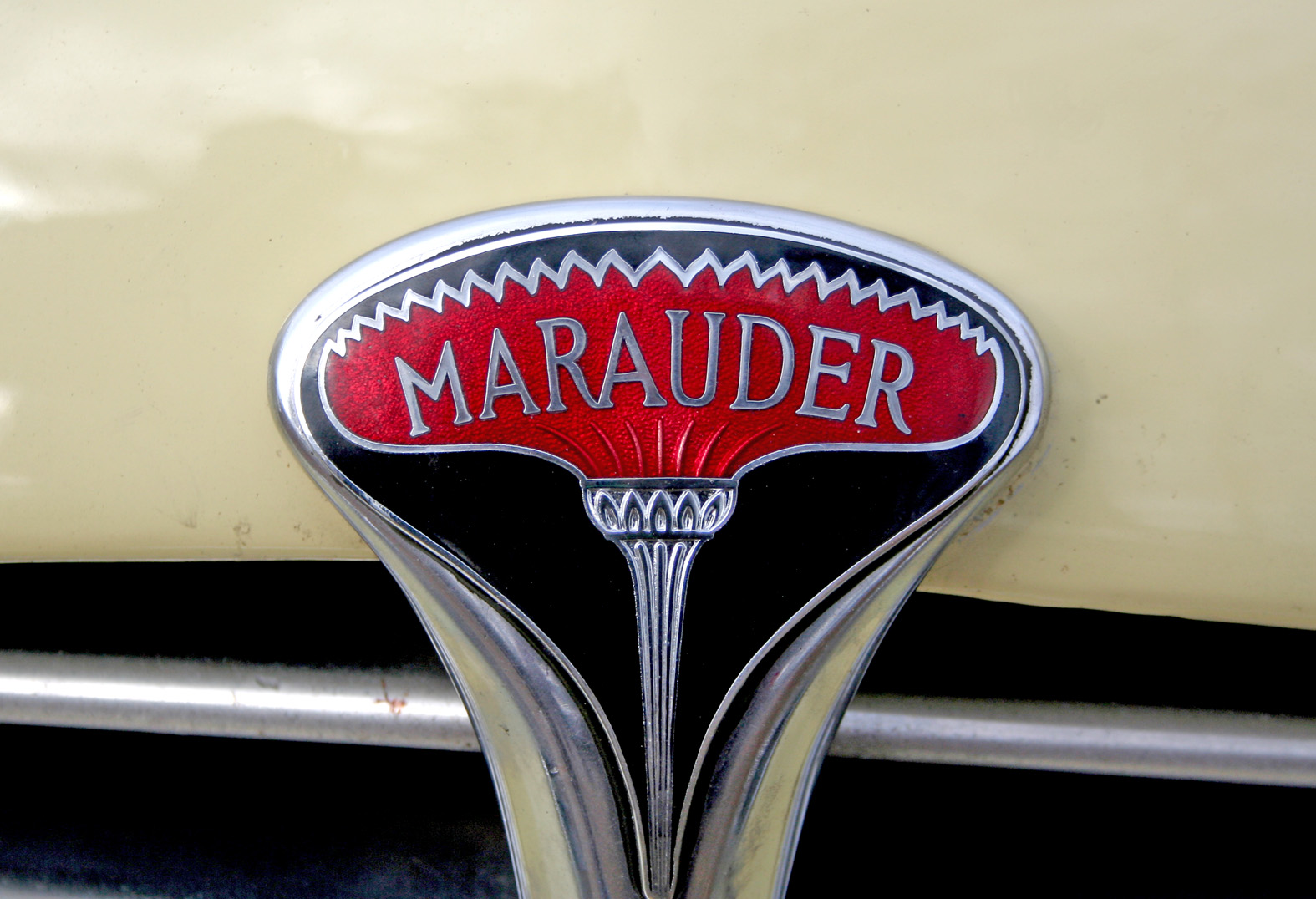
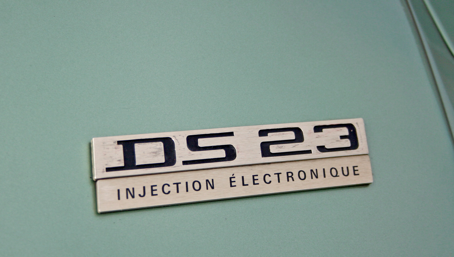
Auto Type XII


Auto Type XII - Some fine new additions to our collection - loving the quirky Corsair typeface (top).
We've now got quite a collection - if Auto Type does it for you check out the full set here or if the cars themselves are more your bag, hop over to our sister blog Super Ninety.
https%3A%2F%2Fwww.deliciousindustries.com%2Fauto-type-xii
Delicious+Industries%3A+Auto+Type+XII
The Movie Title Stills Collection


The Movie Title Stills Collection is a fantastic online resource for movie titles and end frames. Collated by designer Christian Annyas, the collection ranges from the early 1920's to the present day and can be viewed by decade or by 'Western' and 'Film Noir' genres.
There's plenty to look through - some are old classics, others are more obscure, some are bold and minimal, others are charmingly ornate, but they all have great typography. Enjoy.
Via our friends, Sell! Sell!
Images copyright The Movie Title Stills Collection.
https%3A%2F%2Fwww.deliciousindustries.com%2Fthe-movie-title-stills-collection
Delicious+Industries%3A+The+Movie+Title+Stills+Collection
Auto Type XI


Auto Type XI - more fabulous Auto Type, taken on Sunday at the first Goodwood Breakfast Club of the year. The sun was shining and as you can see it brought out some mighty fine automobiles.
See lots more Auto Type and Automobilia here.
https%3A%2F%2Fwww.deliciousindustries.com%2Fauto-type-xi
Delicious+Industries%3A+Auto+Type+XI
Auto Type X


Happy New Year!
What better way to kick off 2011 than with some fabulous Auto type taken at the Brooklands' New Year's Day meet.
Brooklands Museum stands on part of the historic Brooklands Motor Course - the first purpose built race track in Britain, constructed in 1907 by Hugh Locke King. They have some really good Motorsport and Aviation exhibits including a full size Concorde complete with an onboard flight simulator.
Check out all our Auto Type and Automobilia posts here.
https%3A%2F%2Fwww.deliciousindustries.com%2Fauto-type-x
Delicious+Industries%3A+Auto+Type+X
Auto Type IX


Goodwood Breakfast Clubs are always a great place to find fabulous auto type and this morning didn't disappoint. I give you Auto Type part IX!
See more Auto Type here.
https%3A%2F%2Fwww.deliciousindustries.com%2Fauto-type-ix
Delicious+Industries%3A+Auto+Type+IX
Auto Type VIII


A few lovely additions to my Auto Type collection, taken at Goodwood Revival last weekend. I love the mix of the super rare and the more everyday cars - the 'Tourino Superleggera Milano' crest and badge has to be a favourite.
To see more Auto Type, check out previous posts here or view our Flickr set here.
https%3A%2F%2Fwww.deliciousindustries.com%2Fauto-type-viii
Delicious+Industries%3A+Auto+Type+VIII
Auto Type VII


Auto Type VII - more fabulous typography and graphics from a selection of very worthy vehicles.
See Auto Type I-VI here or check out our Flickr set here.
https%3A%2F%2Fwww.deliciousindustries.com%2Fauto-type-vii
Delicious+Industries%3A+Auto+Type+VII
Vintage Milk Bottles
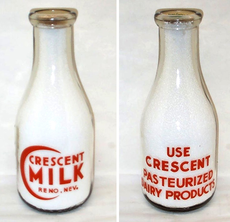


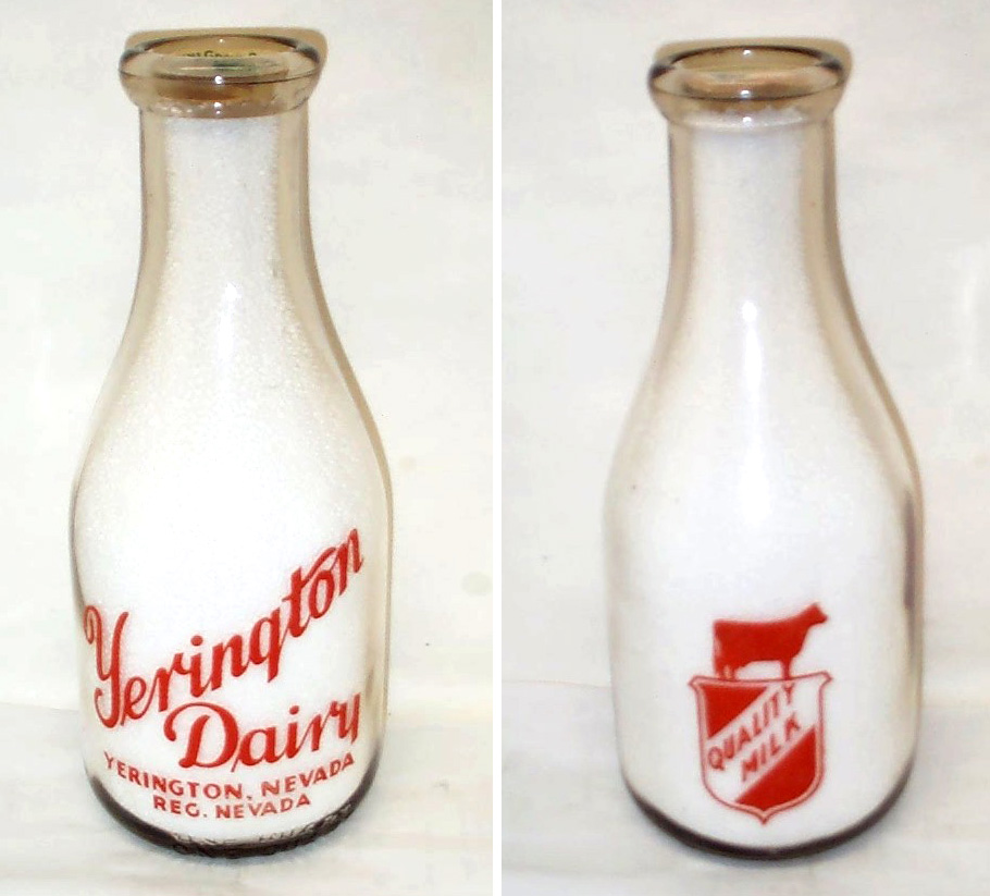


Who knew milk bottles could be so gorgeous, this lovely collection belongs to milk bottle collector and member of The National Association of Milk Bottle Collectors, Bill Kaiser. He has pages of bottles, the ones above are just a selection.
All the bottles have great graphics and decorative type, my personal favourites are the Crescent Milk graphic and the United Dairy type. It must have been lovely to start the day with one of these fine bottles on the table and don't forget how fabulous the bottle tops also used to be.
All the bottles above are available for sale on Got Milk Bottles. There is no mention of date, but my guess would be that they're from the 40's and 50's (I could however be very wrong!).
All images copyright Bill Kaiser.
https%3A%2F%2Fwww.deliciousindustries.com%2Fvintage-milk-bottles
Delicious+Industries%3A+Vintage+Milk+Bottles
PROSIGN - traditional signwriters


I've known of Prosign (Neil and Mandy Melliard) for a few years now and even been lucky enough to have my car signwritten by Neil! They're renowned in car and racing circles for their amazing work hand painting and pinstriping hot rods, race cars and promotional vehicles (above).
But I wasn't aware until today when I checked out their blog that they also do shop facias and window signage. In fact Neil has been working on window signage for Adidas in their Carnaby Street store earlier this month.
There's something lovely about a real hand-painted sign that other more modern techniques can never replicate. Here are some of the fabulous shops he's painted recently...


All images copyright Prosign.
https%3A%2F%2Fwww.deliciousindustries.com%2Fprosign-traditional-signwriters
Delicious+Industries%3A+PROSIGN+-+traditional+signwriters
Made by Cows


It's not very often I look at an advert and think the typography is good, in fact it's extremely rare, but I saw the new 'Made by Cows' Anchor Butter campaign this morning and was pleasantly surprised. The type is researched, considered and well composed - a refreshing change.
The ads created by CHI are reminiscent of the late 1800's/early 1900's ads which were painted directly onto the sides of buildings. Alison Carmichael was commissioned by the agency to replicate the hand-painted type of this era, which explains the good type!
From the information I've seen it's hard to know whether the ads were painted on a wall and then photographed and the photos are been used as the 48 sheets (which I suspect will be the case) or if they've actually been painted onto walls in a few locations across the country which would make for a much more impressive campaign and add to the authenticity.
It just shows what can be achieved when designers and typographers are part of the process!
Via CR Blog.
https%3A%2F%2Fwww.deliciousindustries.com%2Fmade-by-cows
Delicious+Industries%3A+Made+by+Cows
Auto Type VI


I warned you the Auto Type posts would be more frequent now the show season has started! So here is #VI, a selection taken at the fabulous Goodwood Festival of Speed.
See Auto Type posts I-V and more Automobilia here.
https%3A%2F%2Fwww.deliciousindustries.com%2Fauto-type-vi
Delicious+Industries%3A+Auto+Type+VI
Carte-de-Visite

Whilst browsing the Ephemera Society website yesterday I discovered a great article about 'carte-de-visite' written by their secretary, Graham Hudson. I've collected carte-de-visite (example shown above) for years and always referred to them as photographer's cards - I had no idea they had an official name!
Graham has very kindly given his permission for me to post his article, so here it is. Make a cup of tea and get the biscuits, because it's much longer than my usual posts, but it's well worth a read...
Among collectors the term passes without comment - carte-de-visite. At antiques fairs and collectors’ markets they are ubiquitous, these little photographs, on the one side perhaps a fashionable young man in elegant topper or young woman in voluminous crinoline, or (less commonly) a small family group: on the other the elaborately presented studio address of the photographer. As records of costume they are invaluable, but as more personal records they are not without poignancy. In old shoe boxes amid the pots and pans of the boot fair, divested now of the family context that once brought them into being, we buy them at 50p a card. Who are these people whose eyes now touch ours across the years? We cannot know.
But why carte-de-visite, literally ‘visiting card’? In an article in Antiques Journal Lou McCulloch noted ‘The mounted card was approximately 2½ by 4 inches, slightly larger than a calling card, and, correspondingly received the French equivalent for a visiting card as its 'nom de plume’, McCulloch thus assuming the term adopted through simple association of scale. Yet if one puts a carte-de-visite photograph actually side by side with a range of nineteenth-century calling cards, then the difference in the simple look of them makes such a transference of nomenclature unlikely.
The great populariser of the carte-de-visite was André Disdéri, who in 1854 was granted patent for a means whereby several smaller images could be exposed on to a single 10 x 8in plate, thus reducing overall processing costs. It is not clear however on what Disdéri’s patent was based, for central to the process must have been the camera, and the camera Disdéri first used was one invented by Antoine Claudet, and shown by him at the Great Exhibition in 1851. Claudet’s instrument, the ‘multiplying camera-obscura’, had a plate holder "Which could be mechanically moved both across and down to allow different areas of the emulsion to be covered by successive exposures through the same lens, to represent on the same surface a number of different pictures, or the same in various aspects, the portraits of several persons, & c".
Later cameras adopted by carte-de-visite photographers included those with four independent lenses which, working with a simple shift mechanism, could double up to take the usual set of eight images on the one plate, and those of the London manufacturer Routledge, which worked on the Claudet principle but with which no fewer than twelve cartes could be taken.
The great period for the carte-de-visite was from 1859 to the later 1860s. It was in May 1859 that Napoleon III riding at the head of his troops, actually halted the French army en route to the war in Austria whilst he called at Disdéri’s Paris studio. The Emperor had shrewdly realised how effective as personal publicity such cheap portraits would be among the populace; and what the Emperor did the whole of fashionable Paris was quick to emulate. Disdéri made a fortune, opening studios in Toulon, Madrid and London. At the height of the craze, in 1866, it was estimated that between three and four hundred million of the small-scale photographs were sold in England alone. But after that year the fashion went into quick decline, though the carte-de-visite as the accepted format for run-of-the-mill family record was to last well into the century. Ergo those countless little sepias we find today in every fleamarket.
They are worth collecting, and not least for the sake of their often richly decorated backs, photographers in effect turning their very products into tradesman’s cards for the businesses that produced them. Most frequently the backs were printed by lithography, exploiting the freedom and intricacy in design afforded by the process, and rich in invention though they were it is not uncommon for the collector to come across the same basic imagery employed on the photo backs of quite different establishments. The designs were created of course not by the photographers but by commercial printers, who had access to ready-drawn imagery in the form of stock litho transfers in the same way that letterpress printers had the facility of stock blocks, and it is these stock motifs that one finds recurring.
Though photography was in very essence part and parcel of the science and technology of the period - collodion, silver nitrate, anastigmatic lenses et al - the theme of photo-back imagery is essentially that of ‘Art’. There is scarce a chemical in sight. The underlying art theme of A & G Taylor’s photo-back illustrated here, with its flowers, birds, abstract patterning and one little putto actually creating a picture by drawing is not untypical, and that the imagery in this case does include an incidental camera is sufficiently uncommon to put this example into a distinct sub-category known to collectors as a ‘camera-back’. Rare indeed is a design such as that of Lambert Partington of Southport showing the whole paraphernalia - camera, dark slide, developing dish, retouching brushes and even painted studio backcloth-virtually the complete kit.
But still, ‘visiting card’? Could these little photographs ever actually have been so used? I had this question in mind for a long time. Helmut and Alison Gernsheim in their History of Photography quote Ernest Lacan, editor of La Lumiére writing in the issue of 28 October 1854 regarding two Parisian amateurs E Delessert and Count Aguado who, it appears had at least the idea of photographic calling cards: "For formal calls, the visitor should be represented wearing gloves, the head bowed in greeting, as social etiquette requires; in bad weather he should be shown with an umbrella under his arm; for farewell visits, a portrait should be furnished in travelling costume." The Gernsheims take this at face value, without further comment, but there is a hint of tongue-in-cheek they overlook. Shown with an umbrella in bad weather indeed!

However, in 1857, photographer T. Bullock of Macclesfield was actually advertising address cards ‘with a splendid photograph on the reverse side’ (have any surviving examples been located, one wonders?) and a chance find at an Ephemera Society bazaar was the carte of Charles Tomlinson, of New Britain, Connecticut (above), where, with its combination of tasteful engraver’s black-letter and discreet script, the back has all the appearance of a gentleman’s calling card rather than the up-front display of the photographer.

The clincher though must be the Punch cartoon of 1862 (above), only recently noticed. There is your young man about town, young Tomkins, card case in hand, attempting to leave his undoubted carte-de-visite. The joke is that the little photograph, scarce glanced at by the flunkey, is taken for a mere tradesman’s card and Tomkins peremptorily dismissed. Evidently the fashion of the carte as card was uncommon even then.
Thus a little light is thrown on a forgotten and ephemeral fashion. How briefly must those cartes have manifested on the card trays of those who made and received calls, to have left so little impression on the historic record and in the collections of the ephemerist.
As for Disdéri, reputed in 1861 to have been the richest photographer in the world, money ran through his fingers. With the decline in the carte-de-visite craze his fortunes too went into decline and he ended his career as a beach photographer in Nice, dying in the poor house there in 1890.
© Graham Hudson 2003. All Rights reserved.
https%3A%2F%2Fwww.deliciousindustries.com%2Fcarte-de-visite
Delicious+Industries%3A+Carte-de-Visite
Auto Type V


I thought it was about time we saw some more fabulous Auto type, so here we have Auto Type V. These are the most recent additions to my collection, but as the show season really starts to kick in I'm sure I'll have more to share very soon!
If you missed our previous Auto Type posts you can see them here, here, here and here or check out our Flickr set. If race numbers are more your thing you'll definitely like these too.
https%3A%2F%2Fwww.deliciousindustries.com%2Fauto-type-v
Delicious+Industries%3A+Auto+Type+V
International Exhibition of Calligraphy


These beautiful examples of calligraphy are part of the International Exhibition of Calligraphy. An exhibition started in St. Petersburg, 2008 by MVK (International Exhibition Company) aiming to, "reveal the cultural and educational value of calligraphy pursuing a personality intellectual development".
Last year saw a second exhibition held in Moscow and this year (September 10-12th, 2010) it will be showcased in Velikiy Novgorod - quite a symbolic venue for Russian calligraphy.
"The chronicled history of Velikiy Novgorod dates back to the origin of Old Rus. The script culture arose with arrival of Christianity. Novgorod Psalter is the oldest book of Rus’. It is a tiny script book consisting of bound wooden tablets created between old 900’s and early 1000’s. It was Veliky Novgorod where the birchbark manuscripts (the written records of XI-XV centuries) testifying to the high literacy of the Novgorod population were found."
The exhibition organisers are then hoping to initiate the International Exhibition of Calligraphy in all the major cities of the world starting with Paris, New York and Jerusalem. Fingers crossed it will make it to the UK at some point.
Images copyright the International Exhibition of Calligraphy.
Via Ephemera Assemblyman.
https%3A%2F%2Fwww.deliciousindustries.com%2Finternational-exhibition-of-calligraphy
Delicious+Industries%3A+International+Exhibition+of+Calligraphy
The Bottle Cap Man


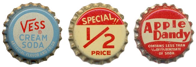
Doing some research yesterday I came across The Bottle Cap Man a website devoted to, you guessed it - bottle caps or crowns. The site, run by Kenny Yohn in Kansas City is a great resource for collectors and an amazing source of inspiration.
Kenny has an absolutely massive collection of beer and soda caps dating back to the 50's, the ones above are only a tiny selection from one of the soda sections. I haven't even looked through the beer ones yet - there literally are hundreds.
I feel a new collection coming on!
Images copyright The Bottle Cap Man.
https%3A%2F%2Fwww.deliciousindustries.com%2Fthe-bottle-cap-man
Delicious+Industries%3A+The+Bottle+Cap+Man
Welcome

Welcome to the Delicious Industries blog. We're an independent design studio based in Brighton, UK and this is our scrapbook packed full of design, illustration, photography & typography inspiration. Check out our work here.
Links
DELICIOUS FRIENDS
DELICIOUS FAVOURITES
- 50 Watts
- Acejet 170
- Grain Edit
- It's Nice That
- National Geographic Found
- Notcot
- Pretty Clever
- Retronaut
- So Much Pileup
- We Love Typography
- Another Mag