art direction, design + typography
Blog: Inspiration
Steve Jobs (1955 - 2011)

https%3A%2F%2Fwww.deliciousindustries.com%2Fsteve-jobs-1955-2011
Delicious+Industries%3A+Steve+Jobs+%281955+-+2011%29
Own Label: Sainsbury's Design Studio


This era of Sainsbury's packaging has always been a good source of inspiration for designers - it's modernist style, simple graphics and bright colours are a winning combination. "Their striking modernity pushed the boundaries, reflecting a period full of optimism. They also helped build Sainsbury’s into a brand giant, the first real ‘super’ market of the time. This book examines and celebrates this paradigm shift that redefined packaging design, and led to the creation of some of the most original packaging ever seen."
Images copyright Fuel Design & Publishing.
Via CR Blog.
https%3A%2F%2Fwww.deliciousindustries.com%2Fown-label-sainsburys-design-studio
Delicious+Industries%3A+Own+Label%3A+Sainsbury%26%23039%3Bs+Design+Studio
Boston Sign Project


The Boston Sign Project is a growing collection of Instagram photos by pantone356 (aka Keith Sliney, Creative Director for the Boston Celtics) celebrating the signage in and around Boston. From bright neon, to faded 'ghost' signs they're all gorgeous and I love reading the descriptions and history of each one. Luckily he's only up to #59 of his 100 target, so there's still lots to look forward to.
Follow pantone356 on Instagram to see the rest of the project (while you're at it, check deliciousind out too!) or view the full collection and lots more lovely signage here.
All images copyright pantone 356/ Keith Sliney.
https%3A%2F%2Fwww.deliciousindustries.com%2Fboston-sign-project
Delicious+Industries%3A+Boston+Sign+Project
Smells I Like by Gordon Stowell


Illustrator and cartoonist Gordon Stowell sadly died in 2003. He sold his first cartoon to a newspaper in 1942 aged only 14. Throughout his very long career he wrote and illustrated many children's books (including the one above published by AR Mowbray & Co Ltd. in 1969) and had his cartoons published regularly in the likes of Private Eye and Punch magazines - he believed, "cartoons could put over serious subjects".
There are 8 more books in this range, so the search is on - not sure how many of them I'll be able to pick up for 20p though!
https%3A%2F%2Fwww.deliciousindustries.com%2Fsmells-i-like-by-gordon-stowell
Delicious+Industries%3A+Smells+I+Like+by+Gordon+Stowell
Daphne Padden Original Sketches


They discovered she did quite a lot of packaging design in the 70's, mainly for M&S (or St Michael as it was back then) and kept the original design sketches as well as the finished packaging which is really great to see.
I love seeing the original sketches more than the finished design - they have so much more character. So thanks Quad Royal for sharing your bounty!
Quad Royal have been researching and championing Daphne Padden's design work for some time, so there's lots more to read see here and here.
Images copyright Quad Royal.
https%3A%2F%2Fwww.deliciousindustries.com%2Fdaphne-padden-original-sketches
Delicious+Industries%3A+Daphne+Padden+Original+Sketches
Sanborn Fire Insurance Map Lettering


After completing a successful commission preparing insurance maps for the Aetna Insurance Company, surveyor D. A. Sanborn saw their value to the fire insurance industry and established D. A. Sanborn National Insurance Diagram Bureau in New York City,1867.
The lettering above shows how each town/city had a uniquely designed heading, title page or legend. They remind me of the very elaborate Carte-de-Visite reverses of the same period. I find it interesting that in the late 1800's, companies here in the UK and in the US were producing similar style lettering designs.
Reading some of the typographers comments on BibliOdyssey, I learned the difference between Lettering (hand-lettering created a purpose, not using pre-designed fonts), Typography (arranging pre-designed fonts) and Calligraphy (hand-lettering with a pen or brush). I did know the calligraphy definition but had never really given much thought to what was defined as 'lettering' or 'typography' - you learn something new everyday!
Images copyright BibliOdyssey.
Via FFFFound.
https%3A%2F%2Fwww.deliciousindustries.com%2Fsanborn-fire-insurance-map-lettering
Delicious+Industries%3A+Sanborn+Fire+Insurance+Map+Lettering
MOMA's Department of Advertising & Graphic Design

MOMA's Department of Advertising and Graphic Design (their in-house design team) have launched a portfolio site showcasing a selection of their recent exhibition design, advertising and print.
It's really interesting to see how they use the gallery space for each exhibition and how well they design the info graphics/signage to enhance the visitor experience and compliment each artists work. I also love that they've commissioned traditional billboard artists too!


I've always wanted to visit MOMA, but after seeing these pics I want to go even more.
Images copyright Museum of Modern Art.
Via Swissmiss.
https%3A%2F%2Fwww.deliciousindustries.com%2Fmomas-department-of-advertising-graphic-design
Delicious+Industries%3A+MOMA%26%23039%3Bs+Department+of+Advertising+%26amp%3B+Graphic+Design
Vintage typewriter logo decals


He has the most amazing typewriter based Flickr sets I've seen - vintage typewriters, their marketing materials, instruction booklets, advertising as well as collections of British, American and German typewriter ribbon tins.
A real feast of graphics that will keep you staring at your screen for hours!
Images copyright Georg Sommeregger.
Via @shelfappeal
https%3A%2F%2Fwww.deliciousindustries.com%2Fvintage-typewriter-logo-decals
Delicious+Industries%3A+Vintage+typewriter+logo+decals
Erik Nitsche for General Dynamics


I saw a great collection of General Dynamics posters over on Words & Eggs created by late Erik Nitsche - graphic designer/art director for the General Dynamics in the late 50's.
Nitsche was responsible for all General Dynamics brand communication from 1953 - 1960. He brought an optimistic, modern dynamic to the brand and produced bold, graphic designs which can be seen in the selection of posters (above), in these adverts...


Copyright held by image owners.
https%3A%2F%2Fwww.deliciousindustries.com%2Ferik-nitsche-for-general-dynamics
Delicious+Industries%3A+Erik+Nitsche+for+General+Dynamics
Draplin's Show and Tell


It's reassuring to know I'm not the only person with drawers full of what most people would call 'old crap', but that I call 'design reference'.
The images above are stills from Level Mag's Show and Tell with Portland's renowned graphic designer, Aaron Draplin of Draplin Design Co.
Filmed by Jared Sourney whilst video-documenting Draplin for a snowboard website, the clip shows, "a guided peak into the big man’s drawers of dirty delights"!
Watch the full video here.
Stills/footage copyright Level Mag.
Via Notcot.
https%3A%2F%2Fwww.deliciousindustries.com%2Fdraplins-show-and-tell
Delicious+Industries%3A+Draplin%26%23039%3Bs+Show+and+Tell
Qantas Travel Posters


Here's some fabulous Monday inspiration in the form of 50's and 60's Qantas Travel Posters designed by William F Schey and Harry Rogers.
The full range can be seen here.
Images copyright GMJames.
Via Stickers and Stuff.
https%3A%2F%2Fwww.deliciousindustries.com%2Fqantas-travel-posters
Delicious+Industries%3A+Qantas+Travel+Posters
More Vintage Packaging


There's nothing better on a Monday morning than some vintage packaging! This wonderful selection is from Neato Coolville's Vintage Packaging Flickr set.
My favourite is the little 1960's box for Rediplete Pediatric Syrup (above) made by Merck Sharp & Dohme - it's such a clever, fun design.
It's a great collection, which is definitely worth a look. Here are a few more that caught my eye...
My favourite is the little 1960's box for Rediplete Pediatric Syrup (above) made by Merck Sharp & Dohme - it's such a clever, fun design.
It's a great collection, which is definitely worth a look. Here are a few more that caught my eye...


https%3A%2F%2Fwww.deliciousindustries.com%2Fmore-vintage-packaging
Delicious+Industries%3A+More+Vintage+Packaging
Otl Aicher's Munich 1972 Olympic Graphics


What a lovely way to start the week - looking through a collection of Otl Aicher's, Munich 1972 Olympic graphics!
We're all familiar with the bright and colourful Munich 1972 Olympic branding, but it's rare to see so much of it in one place. This website has a huge range of items designed by Aicher and his team including memorabilia, posters, programmes, pin badges, match books, medals, publications and stationery. It really is a fantastic resource, the items above are only a small selection.
All images copyright 1972 Munich Olympics.
Via Wanken.
https%3A%2F%2Fwww.deliciousindustries.com%2Fotl-aichers-munich-1972-olympic-graphics
Delicious+Industries%3A+Otl+Aicher%26%23039%3Bs+Munich+1972+Olympic+Graphics
Vintage coupons
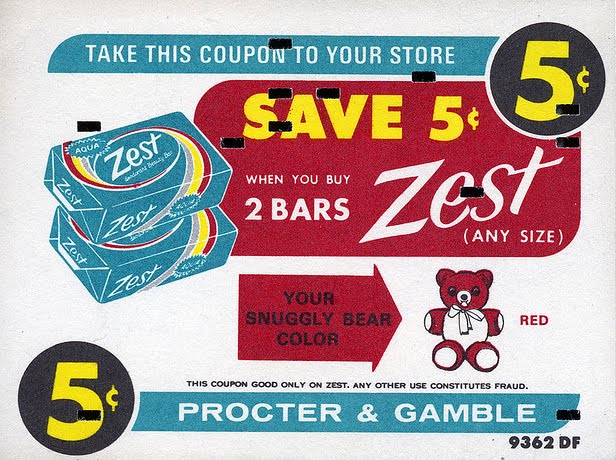


This is what I love about blogs - turning the computer on in morning and being greeted with gorgeous images. These fabulous 50's and 60's coupons are from Roadsidepictures 'Vintage Coupon' Flickr set. Such a great collection and just the inspiration I need on a miserable Monday morning!
Via the wonderful Words & Eggs.
https%3A%2F%2Fwww.deliciousindustries.com%2Fvintage-coupons
Delicious+Industries%3A+Vintage+coupons
Citroen Ephemera


Really loving these 60's Citroen promotional booklets designed by Parisian studio, Delpire over on Grain Edit. They were created by the father of Francois-Charles (iconomaque) who worked at the studio in the 60's and were discovered whilst he was sorting through his father's studio.
What a great bit of ephemera to start the day with!
Via Sell! Sell!
Images copyright iconomaque.
https%3A%2F%2Fwww.deliciousindustries.com%2Fcitroen-ephemera
Delicious+Industries%3A+Citroen+Ephemera
Welcome

Welcome to the Delicious Industries blog. We're an independent design studio based in Brighton, UK and this is our scrapbook packed full of design, illustration, photography & typography inspiration. Check out our work here.
Links
DELICIOUS FRIENDS
DELICIOUS FAVOURITES
- 50 Watts
- Acejet 170
- Grain Edit
- It's Nice That
- National Geographic Found
- Notcot
- Pretty Clever
- Retronaut
- So Much Pileup
- We Love Typography
- Another Mag