Blog: Design
Transforming Tate Modern

Architects, Herzog & de Meuron have been working for the last 2 years on,'Transforming Tate Modern' - a project to develop the Tate Modern site and surrounding areas.
The pyramid-style extension will add over 5000m2 of extra gallery space, creating flexible exhibition spaces that will open into a large, column-free space to accommodate large-scale sculpture, seminar & learning space and areas of contemporary visual culture.
The development will also utilise the redundant oil tanks of the former Power Station by creating a unique environment for performance art, film and multi-media works.
Work will start mid 2009 and completion is scheduled in time for the 2012 London Olympics. I hope it's worth the wait! Tate Modern is one of my favourite London buildings and this development is going to make it even more spectacular.
Images copyright Hayes Davidson and Herzog & de Meuron. From Tate Modern website.
Via Mooch.
https%3A%2F%2Fwww.deliciousindustries.com%2Ftransforming-tate-modern
Delicious+Industries%3A+Transforming+Tate+Modern
From the reference box #16


"Tour Holland by motor car" is a wonderful 1950's leaflet about touring this 'land of broad horizons'. It gives you the legal requirements for driving in their country, a low down of the road signs, a brief highway code, parking & car washing charges, touring routes, hotel & tourist information contacts and best of all it opens out into a map of the countries 2 main roads, in a kind of tube map style.
The map shows the towns and villages like tube stops along a simplified road and has places of interest; windmills, galleries, museums etc... marked on with simple icons. It's a superb piece of design and still looks really modern over 50 years later - the true test of good design!
#16 - 1950's travel leaflet - Holland.
https%3A%2F%2Fwww.deliciousindustries.com%2Ffrom-the-reference-box-16
Delicious+Industries%3A+From+the+reference+box+%2316
Wish you were here…

According to figures released by the Royal Mail yesterday, the humble postcard is making a comeback after a 10 year decrease in popularity. Mobile phones and texting are thought to have caused the decline, as it's easier to send a text than buy, write and post a card, but it seems holiday makers are once again sending 'Wish you were here' messages back home in the traditional way.
I always send home postcards from my hols and find great enjoyment in picking out the tackiest, most inappropriate and sometimes the dullest ones possible, even if it only gives the postman a chuckle. Here are a couple of my favourites.
https%3A%2F%2Fwww.deliciousindustries.com%2Fwish-you-were-here
Delicious+Industries%3A+Wish+you+were+here%26%238230%3B
Blisters on my Fingers posters, now on-line!
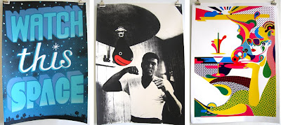 As promised the very nice people over at Print Club have just put all the remaining posters from the weekends exhibition, 'Blisters on my Fingers' into their on-line shop for £35 each plus postage. There are some really nice ones left too including the ones above by Andy Smith, Seif Alhasani and Steve Wilson.
https%3A%2F%2Fwww.deliciousindustries.com%2Fblisters-on-my-fingers-posters-now-on-line
Delicious+Industries%3A+Blisters+on+my+Fingers+posters%2C+now+on-line%21
Print Club presents 'Blisters on my Fingers'

35 Illustrators. 35 Edition and hand signed prints. 35 Pounds each.
Blisters on my fingers runs from the 11th to 13th July 2008
at MC Motors, Millers Avenue off Arcola Street, Dalston, E8 2DS.
Friday night opening 6 to 10pm (Please RSVP)
Saturday 12 to 5pm - Afternoon Print off
Sunday 12 to 5pm - Closing show BBQ
Print Club is a water-based, screen printing club providing it's members with the facilities to produce their own screen prints. They have some amazing illustrators and designers as members including one of our favourite illustrators, Andy Smith (remember the 'I Pretend to Work poster'?) so it really should be a cracking show. Fingers crossed there will be some prints left to go in their shop for those of us that can't go!
Via Dirty Mouse.
https%3A%2F%2Fwww.deliciousindustries.com%2Fprint-club-presents-blisters-on-my-fingers
Delicious+Industries%3A+Print+Club+presents+%26%23039%3BBlisters+on+my+Fingers%26%23039%3B
From the reference box #13


Another little bit of ephemera fresh from the reference box are these 'Sorry we missed you' cards from a 1950/60's Dry Cleaners in Leamington Spa. I love the 'vanman' character on the pink one - he really is sad that they're not in!
# 13 - Dry cleaning, calling cards. 1950/60.
https%3A%2F%2Fwww.deliciousindustries.com%2Ffrom-the-reference-box-13
Delicious+Industries%3A+From+the+reference+box+%2313
Illustrators, Gary Taxali & Roman Klonek

Just saw this post on the Sell Sell blog about illustrator Gary Taxali. I love his work, it's fantastic - full of quirky characters and bright colours, and as Sell Sell say, it does have a look of vintage advertising/propaganda posters. Some of his signed, limited edition screenprints are available to buy here.
And if this quirky, nostalgic illustration is your thing then check out the work of Polish, illustrator Roman Klonek, whose woodcuts are similarly reminiscent of Eastern European propaganda posters, and also filled with wild and crazy looking characters in bright colours. The full collection of woodcuts can be seen on his website (which is a pretty cool site), and if you want to see them in the flesh, there is normally a selection on display/for sale at Castor & Pollux in Brighton.

https%3A%2F%2Fwww.deliciousindustries.com%2Fillustrators-gary-taxali-roman-klonek
Delicious+Industries%3A+Illustrators%2C+Gary+Taxali+%26amp%3B+Roman+Klonek
70 AMAZING BUSINESS CARDS

Fubiz have put together a selection of '70 Amazing business cards' they find inspirational. Well, I'm not sure I would describe them all as amazing from a design point-of-view, but there are some really nice pieces of print so it's worth a little look.
Pics from Fubiz.
https%3A%2F%2Fwww.deliciousindustries.com%2F70-amazing-business-cards
Delicious+Industries%3A+70+AMAZING+BUSINESS+CARDS
Olympic logo Retrospective


The 60's and 70's ones really define the design of the time and for me, the Moskow 1980 was the last great Olympic logo, as subsequent years started to look very similar and all have the feel of an 80's tourist board logo, that is until the London 2012 logo. This has definitely broken the mold of recent games branding, although it does still have the 80's feel (maybe that's just the fluro pink & yellow), which I have nothing against, but how will it work when the Olympic rings are in their correct colours; blue, black, red, yellow and green?
Images and research gathered by Hitesh Mehta.
https%3A%2F%2Fwww.deliciousindustries.com%2Folympic-logo-retrospective
Delicious+Industries%3A+Olympic+logo+Retrospective
Found Typography #2


A few pics of distressed type; a mini cab office in Kings Cross London, Litter bin in Chester Zoo, 'Station' sign in Brighton and a TV/Radio rental & repair hand-painted mural on the side of a building in Brighton. All seen better days, but all the more interesting because of it.
https%3A%2F%2Fwww.deliciousindustries.com%2Ffound-typography-2
Delicious+Industries%3A+Found+Typography+%232
Fifty Designers' Current Favourite Typefaces
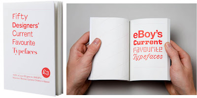
'Fifty Designers' Current Favourite Typefaces' is exactly that, compiled into a neat little book by James West of Create/Reject to raise money for UNICEF's Myanmar (Burma) Cyclone Children's Appeal in the wake of Cyclone Nargis that hit Myanmar on 2nd May 2008.
Contributors include some of the design world's elite; Farrow, Stefan Sagmeister, The Chase, North, Pentagram and The Designers Republic.
You can buy it from Koenig Books in Charing Cross Road, Artwords Bookshop in Shoreditch or here. Cover price is £3, all of which goes to the charity, so for a bit of good Karma, why not sacrifice your latte & muffin on Monday morning and buy this book instead.
Via Reform & Revolution.
https%3A%2F%2Fwww.deliciousindustries.com%2Ffifty-designers-current-favourite-typefaces
Delicious+Industries%3A+Fifty+Designers%26%23039%3B+Current+Favourite+Typefaces
From the reference box #12

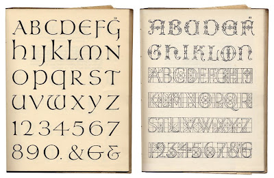
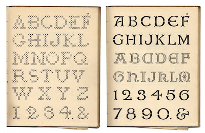
Another new item in the reference box (actually it's on the shelf, but it's still reference) is 'A Book of Lettering' published by A&C Black Ltd. in 1929. It's only 18 pages, but it has some great typefaces that were all hand drawn by Albert Field. Each typeface has with it a description and it's ideal usage, ie. for posters, embroidery, appliqúe, everyday use, woodwork, leather work, carving or printing.
The best thing about this book though, is that it had a couple of hidden extras folded away inside; a hand drawn map of the world showing exports and British colonies and a tea cosy design/pattern - how random!
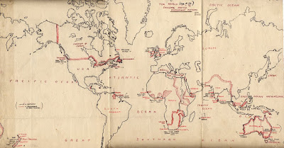

#12 - A Book of Lettering, 1929.
https%3A%2F%2Fwww.deliciousindustries.com%2Ffrom-the-reference-box-12
Delicious+Industries%3A+From+the+reference+box+%2312
Charles & Ray Eames Commemorative Stamps

A commemorative sheet of 16 stamps honoring Charles and Ray Eames has been issued in Santa Monica, California. Designed by Derry Noyes, they represent the many iconic pieces of design created by the husband and wife team throughout their careers.
The stamp sheets are available to buy from The Postal Store at $6.72 plus postage.
Via Cool Hunting.
https%3A%2F%2Fwww.deliciousindustries.com%2Fcharles-ray-eames-commemorative-stamps
Delicious+Industries%3A+Charles+%26amp%3B+Ray+Eames+Commemorative+Stamps
A Delicous day out - part 2
Richard Rogers is the influential architect behind the Pompidou Centre in Paris, the Lloyds Building and the Millennium Dome, both in London. His work is dynamic, experimental and always pushing the boundaries. The scale models are fantastic. I love the miniature cars and people - there is always one doing something weird, I guarantee it!


It was the Tim Walker exhibition though, that stole the afternoon, it was wonderful. Tim Walker is a renowned fashion photographer whose images regularly grace the pages of Vogue.
His images are fascinating. They are conceptual and imaginative, some are dreamy and elegant while others are beautiful, but chaotic. My favourites are the pastel animals, in particular the cats. The exhibition also displayed some of the over-sized props from the photoshoots, as well as some of Walker's sketchbooks, showing his thought processes, ideas, references and inspirations which give a real insight into his work.


https%3A%2F%2Fwww.deliciousindustries.com%2Fa-delicous-day-out-part-2
Delicious+Industries%3A+A+Delicous+day+out+-+part+2
A Delicious day out - part 1


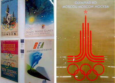
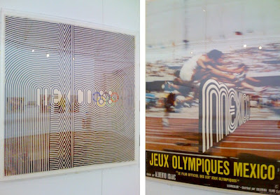

Every now and again I like to take a day off to take in some culture, so yesterday I visited the Museum of Childhood to see the 'Century of the Olympic Poster' exhibition (see my original post about this exhibition here). The posters are fantastic, the exhibition takes you chronologically through the collection, from 1851, to the London bid posters and then finally to the London 2012 logo. Most can be dated by the design alone, in particular the David Hockney and Roy Lichtenstein ones for the Los Angeles 1984 Olympics, as they are sooo 80's.
For me, the best by far is the Mexico'68 Olympic logo and poster. It is one of my all-time favourite pieces of design and it was great to see it in the flesh and especially to see the fluro pink and green version which I had never seen before.
What I found really interesting is the mixture of poster designs for each Games, some Games had 2 or 3 totally different styled posters, as though a different person had designed each one with no consideration of the others, whereas the best years had a very obvious style, even though different artist and designers had been invited to create them.
I hope that the organisers of London 2012 have seen this exhibition and understand that getting a branding company or a big name ad agency is not necessarily the best way to create a successful and memorable Games marketing campaign. Instead inviting people like, Damien Hirst, Banksy, Martin Parr or Bridget Riley - world renowned artists, designers and photographers to create a truly British campaign would create enormous media interest and create a campaign, modern and true to the diversity & creativity of the UK. Because at the moment the 2012 logo would look right at home on the 1984 LA Games posters and does not inspire anything vaguely British or modern.
https%3A%2F%2Fwww.deliciousindustries.com%2Fa-delicious-day-out-part-1
Delicious+Industries%3A+A+Delicious+day+out+-+part+1
Welcome
Welcome to the Delicious Industries blog. We're an independent design studio based in Brighton, UK and this is our scrapbook packed full of design, illustration, photography & typography inspiration. Check out our work here.
Links
DELICIOUS FRIENDS
DELICIOUS FAVOURITES
- 50 Watts
- Acejet 170
- Grain Edit
- It's Nice That
- National Geographic Found
- Notcot
- Pretty Clever
- Retronaut
- So Much Pileup
- We Love Typography
- Another Mag

