art direction, design + typography
Olympic logo Retrospective


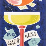
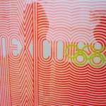
The 60's and 70's ones really define the design of the time and for me, the Moskow 1980 was the last great Olympic logo, as subsequent years started to look very similar and all have the feel of an 80's tourist board logo, that is until the London 2012 logo. This has definitely broken the mold of recent games branding, although it does still have the 80's feel (maybe that's just the fluro pink & yellow), which I have nothing against, but how will it work when the Olympic rings are in their correct colours; blue, black, red, yellow and green?
Images and research gathered by Hitesh Mehta.
https%3A%2F%2Fwww.deliciousindustries.com%2Folympic-logo-retrospective
Delicious+Industries%3A+Olympic+logo+Retrospective
Welcome

Welcome to the Delicious Industries blog. We're an independent design studio based in Brighton, UK and this is our scrapbook packed full of design, illustration, photography & typography inspiration. Check out our work here.
Links
DELICIOUS FRIENDS
DELICIOUS FAVOURITES
- 50 Watts
- Acejet 170
- Grain Edit
- It's Nice That
- National Geographic Found
- Notcot
- Pretty Clever
- Retronaut
- So Much Pileup
- We Love Typography
- Another Mag