Blog: Design
Rabbit Garbage Bags


How fab are these garbage (or rubbish) bags?? created to help prevent littering and encourage people to take their rubbish away with them. I love them - they're genius!
They are designed by Japanese company, MAQ Inc. and can be bought from Mottainai along with loads of other really cool bags for your rubbish. This rabbit one is by far the best though.
Via Trend Hunter.
https%3A%2F%2Fwww.deliciousindustries.com%2Frabbit-garbage-bags
Delicious+Industries%3A+Rabbit+Garbage+Bags
From the reference #21

One of 'The Practical Motorist, Care & Safety Check Charts', my favourite movable chart. It was presumably a free gift with The Practical Motorist, I'm guessing in the late 50's or early 60's.
It's double sided and gives helpful 'remedies' for minor car 'symptoms'; lining up the arrow on the symptom, gives you the suggested 'remedy' for steering, light or braking issues. For example, the front (above left) shows 'wheel Tramp' as the symptom and 'Balance wheels; renew faulty hydraulic dampers; equalise tyre pressures' as the remedy. There is also a cool stopping distance chart/graphic on the reverse.
#21 - The Practical Motorist, Care & Safety Charts
https%3A%2F%2Fwww.deliciousindustries.com%2Ffrom-the-reference-21
Delicious+Industries%3A+From+the+reference+%2321
We heart infographics


I picked up a copy of the International Designers Network (Vol.15 No.4) at the weekend and it's a great issue with a really good article on infographics (Signs of the Times) featuring 10 designers who specialise in this area, enjoying the challenge, and ultimately, the satisfaction in this type of design; Catalogtree, Dave Bowker, Nicholas Felton, Lamosca, Number27, Plusminus, Polar, SPVZ, Timm Kekeritz and Troikart.
It's not a publication I normally buy, but I will definitely be seeking it out again. The print quality is really good - this issue has a matt laminate, spot varnish and a foil on the cover which is extravagant, but looks good. Inside it uses a few different kinds of paper which gives it a really nice feel, has fold out pages to accomodate some of the larger infographics and is packed with interesting and up-to-date content. To top it all, the design throughout is great, not all to my taste, but interesting, experimental and relevant to the content. Oh, and this issue came with a free DVD of goodies including, the Diesel 'Liquid' Fashion Show and some behind the scenes footage of Bjork's Wonderlust video.
https%3A%2F%2Fwww.deliciousindustries.com%2Fwe-heart-infographics
Delicious+Industries%3A+We+heart+infographics
Public Lettering in Central London


Public Lettering: A walk in Central London is a website outlining a walk around Central London taking in large examples of public lettering as prepared by Phil Baines for the ATypI Conference in 1997.
The site pinpoints key buildings (ie. ones containing lettering of note) like the British Library, The Coliseum and Parsons' Library, gives a brief history and shows detailed pics (as shown above). It does not mention, what it calls. 'incidentals' en route, such as stop-cocks, manhole covers, building dates or builders marks, nor does it mention corporate signage or advertising hoarding, as, "the pleasure of this kind of walk, is finding things yourself".
What a brilliant reference for public signage and lettering - I love the idea of taking in a walk with such rich typographic interest. It's a great idea and something I would like to do in other cities too.
Images copyright Phil Baines, 1997, 2002.
https%3A%2F%2Fwww.deliciousindustries.com%2Fpublic-lettering-in-central-london
Delicious+Industries%3A+Public+Lettering+in+Central+London
Banks & Miles


I didn’t know when I bought them, but the Consumers’ Association, Which? Magazines were designed by Colin Banks and John Miles, co-founders of Banks & Miles, and designers of some great British design.
Colin Banks studied at both Rochester & Maidstone Schools of Art, and it was at Maidstone that he first met John Miles, “amidst a sea of printers”. Banks was passionate about typography and went on to freelance at London Typographical Designers and work as an assistant to Ernest Hoch, who had a great influence on his future work. He set up his own business in 1956 for 2 years before joining with Miles to found Banks & Miles in 1958.
John Miles was also passionate about typography. He has been quoted saying, "We took up typography because we thought we'd make the world a better place". On leaving Maidstone School of Art, Miles became assistant to Hans Schmoller at Penguin Books until the start of Banks & Miles.
Banks & Miles built its reputation early on with their work for the Zoological Society London and on the Consumers’ Association, Which? Magazine, that they worked on for 29 years, between 1964 and 1993. It had it’s heyday in the 70’s and 80’s, with blue chip clients like the Royal Mail, British Telecom and the London Underground. The duo designed the familiar Royal Mail/ Post Office double-lined typeface and identity in 1972, a project which ran for 11 years, the British Telecom ‘T’ logo after it was instituted in 1981, logos for Her Majesty's Stationery Office, City & Guilds and Lancaster University. Along with employee, Eiichi Kono they restyled the UK telephone directories in 1989 saving forests of paper and winning numerous accolades from environment groups and re-designed, Johnston, Edward Johnston’s underground typeface, to create New Johnston.
In 1996 Banks & Miles disbanded their joint venture to persue individual projects. John Miles was adviser to the Dutch banknote printers Enschedé, The Monotype Corporation and HMSO and is still a practising designer today. Colin Banks traveled India and Europe teaching his socially responsible approach to design, which earned him some significant commissions and awards, but sadly in 2002 he died after a long battle with cancer, leaving behind a great legacy of work.
Both together and individually they have created some of the most ground-breaking and most iconic work of the 20th Century, and as Banks often said, “good design doesn't date” and I couldn’t agree more.
BT Van pics copyright David Cott.
https%3A%2F%2Fwww.deliciousindustries.com%2Fbanks-miles
Delicious+Industries%3A+Banks+%26amp%3B+Miles
Seven Hundred Penguins
 There are some classic covers in this book, can't believe I haven't seen it before. Check out more here.
Via the super Sell Sell.
https%3A%2F%2Fwww.deliciousindustries.com%2Fseven-hundred-penguins
Delicious+Industries%3A+Seven+Hundred+Penguins
1972 Munich Olympics Design Exhibition


'Spiele: Olt Aicher's Olympic Graphic design' is currently showing at the Natalie and James Thompson Art Gallery in the San Jose State University. The exhibition includes posters, signage systems, brochures and uniforms, in fact all the design elements of the event designed by Otl Aicher. I'm not sure this body of work has been seen together since the actual 1972 Olympics.
The Munich Olympic design, 'perfectly embodies his philosophy and is the definitive example for today's graphic identity and branding programs'.
If you are lucky enough to live in the area, get over here and see it, it might be your only chance to see them together - I am so jealous!
Images from the Natalie and James Thompson Art Gallery website.
Found via the wonderful, Grain Edit.
https%3A%2F%2Fwww.deliciousindustries.com%2F1972-munich-olympics-design-exhibition
Delicious+Industries%3A+1972+Munich+Olympics+Design+Exhibition
Auto Type


https%3A%2F%2Fwww.deliciousindustries.com%2Fauto-type
Delicious+Industries%3A+Auto+Type
Paul Rand: A Tribute
How good was Paul Rand! This tribute is a nice little reminder of his work and his design philosophy. If this has got you yearning to see more check out the Paul Rand website which is packed full of all his work; identities, advertising, posters and books etc... as well as an extensive biography, lots of interviews and articles and some of his best quotes/philosophies;
"Simplicity is not the goal. It is the by-product of a good idea and modest expectations".
For those of you stateside, you lucky people are going to have the opportunity to see this iconic design in the flesh at the 'Paul Rand: Modernist Design in Context' exhibition, October 16 - December 13 2008, in the Center for Art, Design and Visual Culture at the University of Maryland Baltimore County. The exhibition curator is Franc Nunoo-Quarcoo, author of 'Paul Rand: Modernist Design' and Professor & Chair of Visual Arts at UMBC. Somebody please bring it to the UK, pretty please!!
I couldn't let this post go, without posting some of his amazing work...


Tribute created by J Neeley, found on Rubbishcorp.
Images copyright Paul Rand.
https%3A%2F%2Fwww.deliciousindustries.com%2Fpaul-rand-a-tribute
Delicious+Industries%3A+Paul+Rand%3A+A+Tribute
Which? Magazine


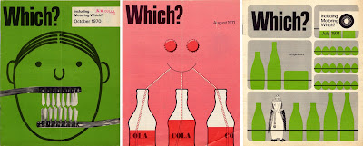
I had a great find at the car boot sale on Saturday - a big box of Which? magazines from 1960 to 1981. There are a couple of years missing and quite a few of the 'Money Which?' and 'Motoring Which?' supplements are missing, but as a collection they are well worth the £10 I paid!
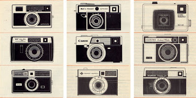
Above are a selection of the covers, they are really great, I personally prefer the more graphic ones, but there are some more photographic and also some which are more illustrative. They are quite text heavy inside, but remain clean and un-cluttered, with some lovely typography. Also because of all the comparisons and tests that they run, almost every issue has a really well-designed chart, graph, diagram or illustration making them valuable reference.


I will eventually scan in all the covers and create a 'Which? Covers' Flickr group, so watch this space!
https%3A%2F%2Fwww.deliciousindustries.com%2Fwhich-magazine
Delicious+Industries%3A+Which%3F+Magazine
Intrastate Commerce


'Intrastate Commerce' is a great Flickr set from Society in Decline that has pages of roadside signs from across America. It's fantastic reference, but there are so many, it takes a while to click through them all!
Via The Serif.
https%3A%2F%2Fwww.deliciousindustries.com%2Fintrastate-commerce
Delicious+Industries%3A+Intrastate+Commerce
From the reference box #19

I'm not exactly sure what this is - I think it's a sales tag that would have been attached to purchased typewriters, but I love the 'Low's' type it's great. The red disc is weighted and engraved on it's metal centre with, '3 in 1 velus quality. The world over. Made in England. N0.100' on both sides. There is a postage stamp on the reverse with a date of 15.06.35 so I'm guessing it originates around that time.
So, #19 - Typewriter sales tag. Circa 1935.
https%3A%2F%2Fwww.deliciousindustries.com%2Ffrom-the-reference-box-19
Delicious+Industries%3A+From+the+reference+box+%2319
Do not disturb

It never occurred to me that 'Do not Disturb' door hangers could be interesting and well designed, until I stumbled upon Michael Lebowitz's fantastic collection on the equally fantastic Grain Edit.
Lebowitz found the collection on the wall of his late grandfather's study - he was a foreign service man and during his travels had collected the door hangers, brought them home and stuck them on the wall of his study, eventually filling the whole wall!
They are really great, all different shapes, sizes and languages. Some are simple and well designed, some have humour and others are just functional, but they are all great pieces of ephemera - thank you Michael for sharing!
Via Grain Edit.
https%3A%2F%2Fwww.deliciousindustries.com%2Fdo-not-disturb
Delicious+Industries%3A+Do+not+disturb
From the reference box #18

This is a Gleem Toothpaste sample pack from the 50's. I didn't know much about Gleem when I bought it, I just like the print and the overlapping to get the brown/dark red colour - very simple, but effective.
I have since found out (through the fountain of knowledge that is Wikipedia) that Gleem was made by Procter & Gamble and was first introduced in 1952 (in the packaging above). 'Compton Advertising Inc.' (now part of Saatchi & Saatchi NY) co-ordinated the advertising for the first Gleem campaign (Ads 1 + 2 below) which was included in the 'League Against Obnoxious TV Commercials' list of 'terrible 10' in May 1963. Needless to say by 1969 the brand was flagging, so the advertising account was moved to 'Wells, Rich, Greene' (Ad 3 below) where it remained until 1976 when it was transferred to 'Leo Burnett', Chicago (Ad 4 below).

As far as I am aware Gleem is still available from some stores in the US, but it never seemed to really hold a big share of the toothpaste market, which is a shame because it packaging at least was great. Below is another sample pack found on Flickr (I think from the 60's) along with the packaging as it stands today.

#18 - 1950's Gleem toothpaste sample pack
https%3A%2F%2Fwww.deliciousindustries.com%2Ffrom-the-reference-box-18
Delicious+Industries%3A+From+the+reference+box+%2318
ART-O-MART

Art-O-Mart is our new sister blog, focused on great art, design & photography - inspirational work from established artists & fresh new talent, must-see exhibitions and info on where to buy great stuff.
The Art-O-Mart online store will soon be opening for business too, selling limited edition prints, photography, vintage posters and specialist magazines.
If you are a photographer, designer, printmaker or artist and would like your work showcased on the Art-O-Mart blog send samples of your work to featureme [at] art-o-mart.com
https%3A%2F%2Fwww.deliciousindustries.com%2Fart-o-mart
Delicious+Industries%3A+ART-O-MART
Welcome

Welcome to the Delicious Industries blog. We're an independent design studio based in Brighton, UK and this is our scrapbook packed full of design, illustration, photography & typography inspiration. Check out our work here.
Links
DELICIOUS FRIENDS
DELICIOUS FAVOURITES
- 50 Watts
- Acejet 170
- Grain Edit
- It's Nice That
- National Geographic Found
- Notcot
- Pretty Clever
- Retronaut
- So Much Pileup
- We Love Typography
- Another Mag

