Blog: Design
Type Tea Towels

I love these Tea Towels, they're so nice I want to frame the big 't' and put it on the wall!
Via SwissMiss.
https%3A%2F%2Fwww.deliciousindustries.com%2Ftype-tea-towels
Delicious+Industries%3A+Type+Tea+Towels
Cube stamps
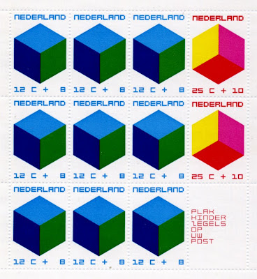
I bought these a couple of weeks ago. I love the pink, red and yellow one - it could be a club poster or album cover, with those colours and the square type.
https%3A%2F%2Fwww.deliciousindustries.com%2Fcube-stamps
Delicious+Industries%3A+Cube+stamps
Vintage Packaging
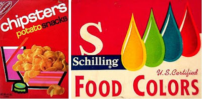

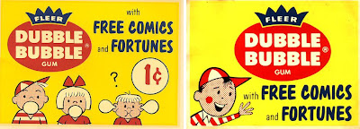
Today I found a fantastic website jam packed with vintage packaging, advertising and store displays, mainly for food and drink products. It's a brilliant resource and must have taken years to compile.
I love the product ranges that have characters - which seem to be mainly drink sachets...

There's a whole section on Funny Face Drink Mix packages showing the development of the characters and design from the early 60's through to the late 70's...

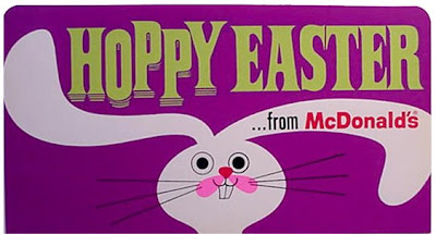
These McDonalds signs from the 60's, were my favourite find, they're really well designed with fun typography and great illustrations - not at all what I imagined!
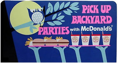

All images copyright The Imaginary World and Tick Tock Toys.
Via the wonderful Found in Mom's Basement.
https%3A%2F%2Fwww.deliciousindustries.com%2Fvintage-packaging
Delicious+Industries%3A+Vintage+Packaging
Dick Bruna Memory Game

Forget Nintendo DS this is all you need to give your memory a workout - the Dick Bruna edition of the Ravensburger Memory game.
There are 36 pairs of cards, each with a gorgeous illustration in the wonderful Bruna style. The game is copyright 1981, but the illustrations used range from 1959 - 1980 and yes, there are a few Miffy cards!


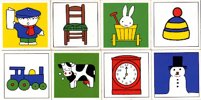
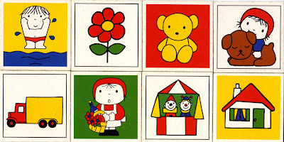

Even the instruction booklet has a lovely illustration:

All illustrations copyright Dick Bruna.
https%3A%2F%2Fwww.deliciousindustries.com%2Fdick-bruna-memory-game
Delicious+Industries%3A+Dick+Bruna+Memory+Game
Jon Burgerman Wallpaper


How great is this colour-in wallpaper by Jon Burgerman? I think it's a fantastic idea and actually looks great even before it's been coloured-in. It's available in 1000 x 52cm rolls from Nineteenseventythree along with is colour-in greetings cards!
Via Notcot.
https%3A%2F%2Fwww.deliciousindustries.com%2Fjon-burgerman-wallpaper
Delicious+Industries%3A+Jon+Burgerman+Wallpaper
From the reference box #27
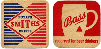
Two great beermats for two great British products; Bass Brewery and Smiths Potato Crisps.
Smiths Potato Crisps Company Ltd was a family business, formed in 1920 to bring crisps to the British masses. Mrs Smith washed, cut and fried the potatoes in the couple's North London garage. Frank Smith packaged them in greaseproof paper bags, added a twist of salt to flavour and then sold them from his pony and trap around London.
It's rumoured that during World War II, the women packing the blue sachets of salt in the crisps would sometimes pack little pieces of paper with their names and addresses on to draw the attention of any lonely soldiers!
Bass Brewery
The Bass & Co Brewery was established by William Bass in 1777 and was one of the first breweries in Burton upon Trent, UK - a town that became so popular with breweries over the years, that it is now known as a 'brewing town'. Bass was also one of the original FT 30 companies on the London Stock Exchange when the listing was established in 1935!
Not many people know that the Bass Red Triangle is one of the world's oldest logos and was the first trademark to be registered in Britain. The 1875 Trademarks Registration Act came into effect on 1 January 1876 and that New Year's Eve, a Bass employee waited overnight outside the registrar's office, in order to be the first to register a trademark the next morning. Bass actually got the first two registrations; the first was for the Bass Red Triangle (for their pale ale) and the second for the Bass Red Diamond (for their strong ale).
#27 - Bass and Smiths Potato Crisp beermats
https%3A%2F%2Fwww.deliciousindustries.com%2Ffrom-the-reference-box-27
Delicious+Industries%3A+From+the+reference+box+%2327
Nesbitt's Poster

How great is this Nesbitt's poster. I had forgotten all about it until So Much Pileup posted some 70's Nesbitt's packaging. I think it's from the late 50's / early 60's judging by the print quality and design. I love the Nesbitt's logotype and just how graphic the whole thing is.
While I was trying to find out more about Nesbitt's I came across this site which has masses of memorabillia, posters and information about the company and there products:
The Nesbitt Fruit Products Company was founded in 1924 by Hugh S. Nesbitt and produced syrups to be used in soda fountains.
Nesbitt's Orange was first bottled for distribution in 1938-39, distinguished from it's competition by the fact it was made from 10% California orange juice.
Marilyn Monroe was a model for Nesbitt's Orange in 1946.
Nesbitt's Orange was the "Official Orange Drink" for Disneyland from the time it opened in 1955 into the 1960's. It was the only orange drink sold in the Park.
In 1957, the "Nesbitt's Orange Special" dragster set 1/4 Mile speed Record of 9.445 seconds (159.02 mph). It is believed that this was the first "commercially sponsored" dragster.
How cool is that?!
https%3A%2F%2Fwww.deliciousindustries.com%2Fnesbitts-poster
Delicious+Industries%3A+Nesbitt%26%23039%3Bs+Poster
The missing letters!


So (drumroll) here's the full set...

Big thanks to Ryan at Sell! Sell! for pointing us in their direction.
https%3A%2F%2Fwww.deliciousindustries.com%2Fthe-missing-letters
Delicious+Industries%3A+The+missing+letters%21
Cuban stamps


Some Cuban Stamps celebrating the Munich 1972 Olympics. I love the pictograms against the bright colours and the Mexico68-esque type. I'm thinking there was probably a stamp for each letter in Munich, being as though we have here an 'I', 'M' and an 'N' - anyone have any of the others?
If you want to see more stamps check out these posts:
Stamp Inspiration
Stamps at Present & Correct
More Stamps
https%3A%2F%2Fwww.deliciousindustries.com%2Fcuban-stamps
Delicious+Industries%3A+Cuban+stamps
SIGNS by Mark Pawson

An Exhibition of 12 New Limited Edition Ready To Hang Signs and some Jewellery is Mark Pawson's latest exhibition that runs from 7 November - 23 December at Tatty Devine's Brick Lane store.
The signs are perspex, laser-cut and etched at Tatty Devine then glued together by Pawson. They have a great nostalgic feel that Pawson attributes to the, "curious, limited sort of retro colour palette" that the perspex/acrylic is available in.
He has also been bust making 12 invitational 'ready-to-hang' signs which have been sent out to press and magazines promoting the exhibition:

Via and images from Creative Review.
https%3A%2F%2Fwww.deliciousindustries.com%2Fsigns-by-mark-pawson
Delicious+Industries%3A+SIGNS+by+Mark+Pawson
Dick Bruna Squeeze 'n' Squeak Toys


These little cuties have been sat on my shelf for about 6 years now, but it was only today I realised that those simple lines and bold colours are the fabulous work of illustrator, Dick Bruna!
They're Playcraft, Squeeze 'n' Squeak toys - the pig from 1967 and the cow from 1972. The cow still has some squeak, but the pig, not so much. I love them both regardless and I especially love how the pigs tail looks like a little 'p'!
https%3A%2F%2Fwww.deliciousindustries.com%2Fdick-bruna-squeeze-n-squeak-toys
Delicious+Industries%3A+Dick+Bruna+Squeeze+%26%23039%3Bn%26%23039%3B+Squeak+Toys
Great Beermats / Coasters

Love this beermat on Sell! Sell!, they've posted some of their fine collection, and question - Are beermats under-exploited?
I think they have a good point, because although almost every bar has beermats or coasters, they're rarely designed well and I can't remember the last time I saw one that I wanted to keep.
Anyway at least we can still find gorgeous, vintage ones!
https%3A%2F%2Fwww.deliciousindustries.com%2Fgreat-beermats-coasters
Delicious+Industries%3A+Great+Beermats+%2F+Coasters
Food Wheels

How cool are these food wheels? They're made by Chew On This a New York company started by chef, Carlin Greenstein and designer, Annie Stranger to educate people on the benefits of eating locally grown produce.
The top left wheel is an Illustrated Guide to Forty Culinary Herbs, designed to help the user identify the most commonly used herbs and gives tips on the reverse for storage and recipes.
The top right wheel is The New York Area Food Wheel, a guide to the best and most widely available, locally grown produce (local to NY that is) at different times of the year.
I absolutely love moving diagrams and charts, so hopefully the kind people at Chew On This will mail to the UK. Not sure the NY Area wheel will be much use to me over here, but it will look great!
Images copyright Chew On This.
Via SwissMiss.
https%3A%2F%2Fwww.deliciousindustries.com%2Ffood-wheels
Delicious+Industries%3A+Food+Wheels
1950's Automotive Industry logos




The Chilton's Motor Age publications not only have great covers but they are packed with great adverts and typography for automotive companies and parts manufacturers. I love how 50's they all are and how great the typography is - above are my favourites, but if I had to only pick one, it would be the top one (Wix).
https%3A%2F%2Fwww.deliciousindustries.com%2F1950s-automotive-industry-logos
Delicious+Industries%3A+1950%26%23039%3Bs+Automotive+Industry+logos
Chilton's Motor Age Covers


Whoo hoo! These arrived today - I bought them a few weeks ago and actually forgot about them, so it was a very nice surprise when they arrived this morning.
They are Chilton's Motor Age covers from 1958. The designs are really modern and graphic. I especially like the gauges on the November cover and the giant 59's used for December's.
Reading some of the articles and seeing no cover price, I get the impression it was a trade publication sent out to mechanics and car dealers (I could be wrong about this so if you know different please let me know).
https%3A%2F%2Fwww.deliciousindustries.com%2Fchiltons-motor-age-covers
Delicious+Industries%3A+Chilton%26%23039%3Bs+Motor+Age+Covers
Welcome
Welcome to the Delicious Industries blog. We're an independent design studio based in Brighton, UK and this is our scrapbook packed full of design, illustration, photography & typography inspiration. Check out our work here.
Links
DELICIOUS FRIENDS
DELICIOUS FAVOURITES
- 50 Watts
- Acejet 170
- Grain Edit
- It's Nice That
- National Geographic Found
- Notcot
- Pretty Clever
- Retronaut
- So Much Pileup
- We Love Typography
- Another Mag

