Blog: automobilia
Auto Type X


Happy New Year!
What better way to kick off 2011 than with some fabulous Auto type taken at the Brooklands' New Year's Day meet.
Brooklands Museum stands on part of the historic Brooklands Motor Course - the first purpose built race track in Britain, constructed in 1907 by Hugh Locke King. They have some really good Motorsport and Aviation exhibits including a full size Concorde complete with an onboard flight simulator.
Check out all our Auto Type and Automobilia posts here.
https%3A%2F%2Fwww.deliciousindustries.com%2Fauto-type-x
Delicious+Industries%3A+Auto+Type+X
Auto Type IX


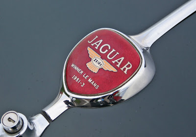


Goodwood Breakfast Clubs are always a great place to find fabulous auto type and this morning didn't disappoint. I give you Auto Type part IX!
See more Auto Type here.
https%3A%2F%2Fwww.deliciousindustries.com%2Fauto-type-ix
Delicious+Industries%3A+Auto+Type+IX
Auto Type VIII


A few lovely additions to my Auto Type collection, taken at Goodwood Revival last weekend. I love the mix of the super rare and the more everyday cars - the 'Tourino Superleggera Milano' crest and badge has to be a favourite.
To see more Auto Type, check out previous posts here or view our Flickr set here.
https%3A%2F%2Fwww.deliciousindustries.com%2Fauto-type-viii
Delicious+Industries%3A+Auto+Type+VIII
From the reference box # 88

#88 - Getaway Peak Miles Check. It's been a while since I've bought a vintage dial, but I found this beauty at the weekend and couldn't resist.
It was produced by National (a petrol station chain) and BP as a useful conversion guide. On the front the yellow dial helps drivers calculate the average speed required to achieve a certain number of miles in a specific time. Whilst on the reverse it gives a 'see-at-a-glance' list of conversions from metric and English stocking sizes to Gallons and Litres, to help you 'cruise your way through the metric system'.
I'm not sure of the exact date, but an educated guess would be late 70's when the UK announced it was to drop the use of non-metric measures. Although it wasn't mandatory until the mid 90's I imagine the announcement created widespread panic with companies using it to their advantage for their marketing.
If vintage dials and auto ephemera are your cup of tea, there are lots more examples nestled away in our reference box - check it out here.
https%3A%2F%2Fwww.deliciousindustries.com%2Ffrom-the-reference-box-88
Delicious+Industries%3A+From+the+reference+box+%23+88
Auto Type VII


Auto Type VII - more fabulous typography and graphics from a selection of very worthy vehicles.
See Auto Type I-VI here or check out our Flickr set here.
https%3A%2F%2Fwww.deliciousindustries.com%2Fauto-type-vii
Delicious+Industries%3A+Auto+Type+VII
Auto Type VI

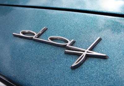


I warned you the Auto Type posts would be more frequent now the show season has started! So here is #VI, a selection taken at the fabulous Goodwood Festival of Speed.
See Auto Type posts I-V and more Automobilia here.
https%3A%2F%2Fwww.deliciousindustries.com%2Fauto-type-vi
Delicious+Industries%3A+Auto+Type+VI
Auto Type V
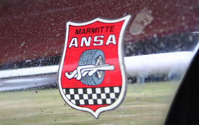
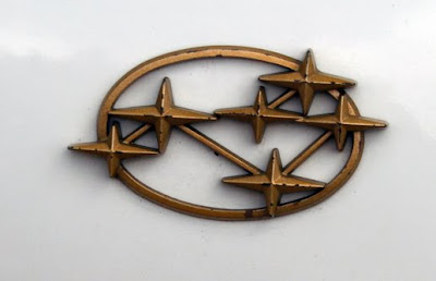
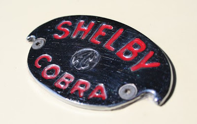
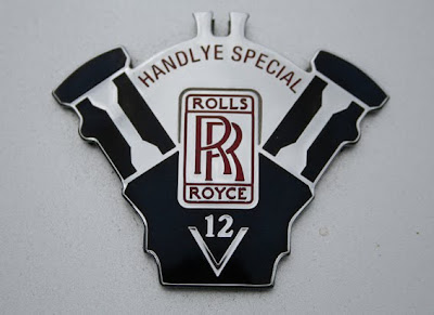

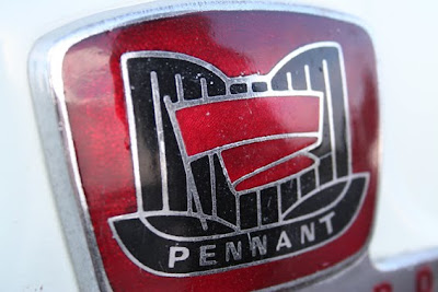
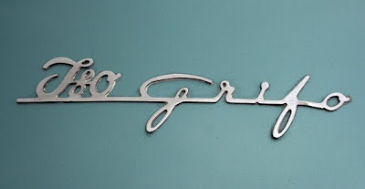
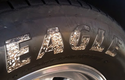

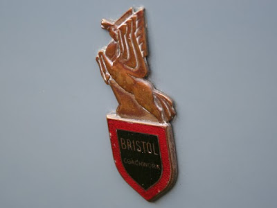
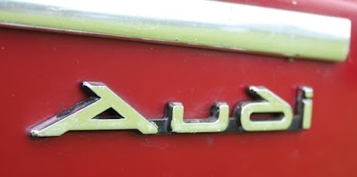
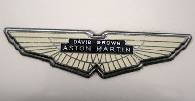

I thought it was about time we saw some more fabulous Auto type, so here we have Auto Type V. These are the most recent additions to my collection, but as the show season really starts to kick in I'm sure I'll have more to share very soon!
If you missed our previous Auto Type posts you can see them here, here, here and here or check out our Flickr set. If race numbers are more your thing you'll definitely like these too.
https%3A%2F%2Fwww.deliciousindustries.com%2Fauto-type-v
Delicious+Industries%3A+Auto+Type+V
Vintage Auto Posters


These gorgeous posters are from the wonderful Vintage Auto Posters, "Since 1980, Everett Anton Singer has been supplying international collectors with the most diverse and highest quality selection of authentic vintage automotive posters".
There are hundreds of posters on the site from general 50's, 60's and 70's auto event posters to posters advertising specific marques including Porsche, Mercedes and Ferrari.
The best thing about this site is that all the posters are for sale. Prices are available on request though, which probably means they're out of my current budget - but I can dream!
Check out more posts full of automobilia here.
Images copyright Vintage Auto Posters.
https%3A%2F%2Fwww.deliciousindustries.com%2Fvintage-auto-posters
Delicious+Industries%3A+Vintage+Auto+Posters
From the reference box # 78

#78 - Newton Oils sign. I've had this sign for years, it's not very big (24cm diameter) and only cardboard but I love it! It's the very pointy arrow, which seems quite ornate for an oil sign and the orange outlined type that do it for me.
I'd always thought it was from the late 50's, but after a bit of research it seems Newton Oils was only established in 1961, so I'm guessing it's probably from around that time.
There are lots more interesting items in the reference box - have a rummage here.
https%3A%2F%2Fwww.deliciousindustries.com%2Ffrom-the-reference-box-78
Delicious+Industries%3A+From+the+reference+box+%23+78
Spring clean!
These gorgeous polishing dusters/mops for use on cars and furniture are from the 50's and part of my growing Automobilia collection. The 'mop' heads are inside the tins to protect them (they're impregnated with polish) and the wooden handles stick out of the top.
The type is very 50's, especially the 'Handimop' font and I love the illustrations of the man cleaning his car and the woman polishing the table!
For more fabulous Automobilia have a look here, here and here.
https%3A%2F%2Fwww.deliciousindustries.com%2Fspring-clean
Delicious+Industries%3A+Spring+clean%21
Vintage Castrol Tins

Remember this post about a vintage oil can Flickr group? Well since then I've been on a look out for some of my own - so far I've found these little beauties. I love the old scripted Castrol logo on the middle and right tins.
According to Castrol this logo was introduced in 1946 and used until 1958 when the one on the left tin replaced it. Here's the Castrol logo evolution, I think it's a shame they didn't stick with the 50's/60's branding as it has much more impact than the ultra-modern (yet already dated looking) ones in use since 2001.

1917 and 1929

1946 and 1958

1968 and the 100 year celebration logo in 1999

2001 and 2006
Check out more vintage oil loveliness here, here and here.
All logo images copyright Castrol.
https%3A%2F%2Fwww.deliciousindustries.com%2Fvintage-castrol-tins
Delicious+Industries%3A+Vintage+Castrol+Tins
60's Porsche Service Books


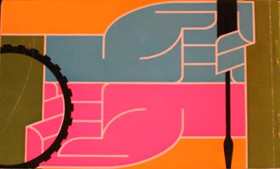
I'm loving the colour palettes and graphics on these Porsche Service Books from the 60's - such an unexpected source of inspiration!
In fact most of the Porsche marketing materials from this era were really well designed. Grain Edit recently posted these fantastic Porsche posters designed by Erich Strenger and Volz...
Service Book images from Old Auto Radio.
Top poster from AUSmotive all other posters from VP Racing - via Grain Edit.
https%3A%2F%2Fwww.deliciousindustries.com%2F60s-porsche-service-books
Delicious+Industries%3A+60%26%23039%3Bs+Porsche+Service+Books
Auto Type IV
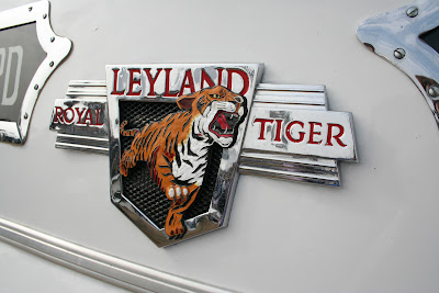

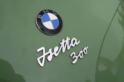
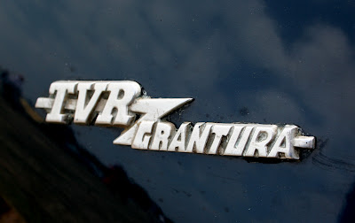
More lovely car emblems and graphics to add to my collection. The top one is particularly significant for me as Leyland is my home town - a town built on the success of vehicles like this old bus. Shame they don't make bus logos (or in fact buses) like this anymore!
If Auto type is your thing, check out previous posts here, here and here or take a look at my dedicated Flickr group.
https%3A%2F%2Fwww.deliciousindustries.com%2Fauto-type-iv
Delicious+Industries%3A+Auto+Type+IV
Oil!


Who would of thought that a mundane object like an oil can could be so cool?
The cans above are from '83's Flickr group, Oil! A collection of vintage oil cans belonging to his dad. The typography, graphics and colours on each can are great and together they make a really interesting collection. This is only a portion of the full collection too, so I'm looking forward to seeing this set grow.
Images copyright '83.
Via Bad Banana.
https%3A%2F%2Fwww.deliciousindustries.com%2Foil
Delicious+Industries%3A+Oil%21
Auto Type III


More auto type - emblems, badges and signwriting from the 1066 Cruisers, Mid-Summer Picnic yesterday. I really like the 'Futura' badge from a 1964 Ford Falcon, especially the 'F'. I'll be uploading them to the Flickr group asap.
More auto type here and here. And some automotive industry logos from the 50's here.
https%3A%2F%2Fwww.deliciousindustries.com%2Fauto-type-iii
Delicious+Industries%3A+Auto+Type+III
Welcome
Welcome to the Delicious Industries blog. We're an independent design studio based in Brighton, UK and this is our scrapbook packed full of design, illustration, photography & typography inspiration. Check out our work here.
Links
DELICIOUS FRIENDS
DELICIOUS FAVOURITES
- 50 Watts
- Acejet 170
- Grain Edit
- It's Nice That
- National Geographic Found
- Notcot
- Pretty Clever
- Retronaut
- So Much Pileup
- We Love Typography
- Another Mag


