Blog: October 2008
The Medium is the Massage
I saw it for the first time a few weeks ago on Acejet and loved it's big type, the bold graphics and experimental layouts.


It reminded me of my favourite Paul Arden books; "It's not how good you are, but how good you want to be" and "Whatever you think, think the opposite" - inspiring and wonderful books that also experiment with the use of large type, photography and graphics to make their point.
Anyway, Acejet kindly pointed to an available copy, I snapped it up and now it's mine for ever - Don't you just love a happy ending, especially on a Friday!
All book content copyright Bantam Books Inc., 1967.
https%3A%2F%2Fwww.deliciousindustries.com%2Fthe-medium-is-the-massage
Delicious+Industries%3A+The+Medium+is+the+Massage
From the reference box #25

“There’s a promise in a glass of Mackeson” beermat, I’m guessing from the 60’s. I really like the colours and the quality of the print, but it’s the type that stands out for me - it’s really dynamic and creates quite a modern looking layout. The unusual thing about it too is that the brand name does not appear in full on either side!
Mackeson's XXX is a dark sweet beer, known in the UK as a sweet stout or a milk stout as it is derived from milk and contains lactose and sugar.
According to Wikipedia, the Mackeson recipe has been around since 1801, long before milk stout was given a patent in 1875 and was originally brewed by Mackeson’s Brewery in Hythe, Kent, until it was purchased by Whitbread in the 1920’s.
Whitbread gave the brand the distribution and marketing it deserved turning it into the market leader for low alcohol content sweet dark beer - which seems like a very select category, but who am I to judge!
In 1950 a Mackeson tv ad showed Bernard Miles delivering one of the most long-lasting and memorable straplines of the time, informing viewers that Mackeson, “looks good, tastes good and, by golly it does you good”. Just how true that is, I’m not sure but they didn’t seem to worry too much about that back then.
These days Mackeson is owned by Whitbread, but brewed in 3 varieties by Young’s in their Ram Brewery, London ‘under supervision’ of Inbev; a 3.75% abv version for the UK, XXX version - 5% abv for the US market (brewed in Cincinnati, Ohio) and a XXX 4.9% abv version brewed by Carib Brewery, Trinidad for the local market, where it is marketed with the slogan "Take it to the Max" (at least they didn’t say - Macks!) to fitness conscious young men that enjoy socializing - still on the “it does you good” theme it seems.
Who would have guessed - all that from one tiny beermat!
#25 - Mackeson Beermat
https%3A%2F%2Fwww.deliciousindustries.com%2Ffrom-the-reference-box-25
Delicious+Industries%3A+From+the+reference+box+%2325
Hatch Show Prints


How gorgeous are these prints from Hatch Show Print? I'm a big fan, and love their book, but had never ventured onto their website until now that is, and I don't think it will be the last time.
It gives a brief history of this fantastic print shop, introduces the people behind it and has a great selection of monoprints (created by Jim Sherraden), original show posters and some 'restrikes' of older posters, all for sale and all as great as the ones above.
Images copyright Hatch Show Print.
https%3A%2F%2Fwww.deliciousindustries.com%2Fhatch-show-prints
Delicious+Industries%3A+Hatch+Show+Prints
More stamps

Loving stamps at the minute, especially the Czech ones. These little beauties are from 1974 - you just can't beat big numbers and simple graphics!
https%3A%2F%2Fwww.deliciousindustries.com%2Fmore-stamps
Delicious+Industries%3A+More+stamps
Soda Pops of the World


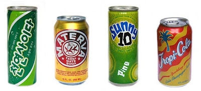
I stumbled upon this great source of inspiration at the weekend and although at first glance the website doesn't look very inspiring, it contains some fantastic packaging imagery.
The site reviews soft drinks around the world, categorised by country and type of drink (ie. Energy drink, fruit drink, malt bevergage etc...), but the most interesting part for me is that every drink reviewed has a lovely big pic of the product and some of them are just great - above are my favourites.
Images copyright Delicious Sparkling Temperance Drinks.
https%3A%2F%2Fwww.deliciousindustries.com%2Fsoda-pops-of-the-world
Delicious+Industries%3A+Soda+Pops+of+the+World
I Love Your Blog Award!

Big thanks to Kate at Make Do & Mend, who nominated us for an, 'I Love Your Blog' award, we are very honoured!
We've given it a bit of a facelift for the design fraternity and in the spirit of the award would like to give it to fellow bloggers: Dirty Mouse, Grain Edit, Inspire Me Now, Sell Sell , Swissmiss, The Serif and last, but not least, Ultimate Deluxe.
https%3A%2F%2Fwww.deliciousindustries.com%2Fi-love-your-blog-award
Delicious+Industries%3A+I+Love+Your+Blog+Award%21
Stamps at Present & Correct

Animal Stamp Block, 1967, Amsterdam

Fairytale Stamp Block, 1973, Amsterdam

Beetroot Stamp Block, 1971, Holland
These beautiful sheets of stamps are available to buy over at Present & Correct. I'm loving the bright colours and bold graphics.
Images copyright Present & Correct.
https%3A%2F%2Fwww.deliciousindustries.com%2Fstamps-at-present-correct
Delicious+Industries%3A+Stamps+at+Present+%26amp%3B+Correct
Stamp inspiration


Inspired by the wonderful Grain Edit and So Much Pileup who are always posting their beautiful stamps, I ventured into the deep and dark storage cupboard to dig out my childhood stamp collections. It really is years since these have seen the light of day, but I was pleasantly surprised by the number of great designs and graphic illustrations.
The ones above are a sweet little set from Czechoslovakia in the early 70's. Unfortunately they all have postmarks across them (it seems I wasn't very selective about what did and didn't go in), but the illustrations can still be admired.
https%3A%2F%2Fwww.deliciousindustries.com%2Fstamp-inspiration
Delicious+Industries%3A+Stamp+inspiration
Stunning Eastern Design


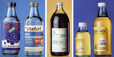
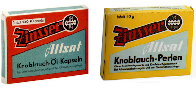
Now normally I spend my book budget on out-of-print books, but this caught my eye the other day, "Stunning Eastern Design 1949 - 1989" by Ralf E Ulrich and Ernst Hedler and I just had to have it. It's published by Taschen as part of their 25th Anniversary collection, so a bargain at £7.99!
It's packed full of fantastic products and some really wonderful packaging. Above are some of my favourites; I particularly like the tablet boxes at the top - so clean and minimal with nice use of colour accross the range.
The products formed part of an exhibition in 1989, "SED - Schöchnes Einheitsdesign" at the Galerie Habernall, Dreieich, near Frankfurt giving an insight into the consumer culture of former East Germany. Unfortunately though after the fall of the Berlin Wall and the currency union many of these products could not compete in a worldwide market and fell by the wayside. Collections like this are the only places they can still be seen.
Images taken from the book and copyright Ernst Hedler.
https%3A%2F%2Fwww.deliciousindustries.com%2Fstunning-eastern-design
Delicious+Industries%3A+Stunning+Eastern+Design
Advertising Greatness

I'm loving the series of Advertising Greatness over on the Sell Sell blog - this week it's the David and Goliath story of Avis, the car rental company and last week it was all about the adorable Nauga. Looking forward to the next one already!
https%3A%2F%2Fwww.deliciousindustries.com%2Fadvertising-greatness
Delicious+Industries%3A+Advertising+Greatness
MAD branding in NY


Pentagram have designed the new identity for the Museum of Arts and Design (formerly the American Craft Museum) in New York which has just re-opened in its new location at 2 Columbus Circle.
The MAD graphic is from a typeface created specifically for the Museum, based on the geometric shapes of the building and its environment, “the circles and squares present in the building’s shape; its location, on Columbus Circle; and the building’s iconic “lollipop” columns retained in the redesign”.
The MAD monogram is simple and fun, it looks modern and at the same time reminds me of the pattern and illustration found in arts and crafts, which is where the origins of the Museum lie. The bold shapes of the letters look great on the advertising and promotional material because they stand out, not only due to the density of the letters, but also because of the bright colours on black backgrounds.
It’s refreshing to see a creative identity, one that has reason behind it and has been created through good research. I’m not saying that taking the counters out of letters hasn’t been done before, but in this case it works and creates an identity system that is versatile and can be manipulated to work in any way the Museum requires.
You can read more about the development of the MAD branding here and find out more about MAD here.
Images copyright Pentagram.
Via Aisle One.
https%3A%2F%2Fwww.deliciousindustries.com%2Fmad-branding-in-ny
Delicious+Industries%3A+MAD+branding+in+NY
Welcome

Welcome to the Delicious Industries blog. We're an independent design studio based in Brighton, UK and this is our scrapbook packed full of design, illustration, photography & typography inspiration. Check out our work here.
Links
DELICIOUS FRIENDS
DELICIOUS FAVOURITES
- 50 Watts
- Acejet 170
- Grain Edit
- It's Nice That
- National Geographic Found
- Notcot
- Pretty Clever
- Retronaut
- So Much Pileup
- We Love Typography
- Another Mag

