Richard Hogg: Of the Wall


Big thanks to Anna Fidalgo for letting us know about Richard Hogg's first solo show, Of the Wall at Concrete Hermit, London. The show opened last night and runs until the 29 August.
"Of the wall is a simple story about happiness, freedom, rebellion and its consequences, told across three pictures. Like a kind of triptych or a very simple comic. It forms the centerpiece of this show."
There will also be a large selection of new prints and drawings by Mr Hogg on display and a chance to get a sneaky peak at his forthcoming book, 'Car Boot Sale'.
https%3A%2F%2Fwww.deliciousindustries.com%2Frichard-hogg-of-the-wall
Delicious+Industries%3A+Richard+Hogg%3A+Of+the+Wall
Oil!


Who would of thought that a mundane object like an oil can could be so cool?
The cans above are from '83's Flickr group, Oil! A collection of vintage oil cans belonging to his dad. The typography, graphics and colours on each can are great and together they make a really interesting collection. This is only a portion of the full collection too, so I'm looking forward to seeing this set grow.
Images copyright '83.
Via Bad Banana.
https%3A%2F%2Fwww.deliciousindustries.com%2Foil
Delicious+Industries%3A+Oil%21
Alexey Brodovitch Spreads
Anyway, I came accross these Harper's Bazaar spreads art directed by Alexey Brodovitch and was totally shocked by how dynamic and experimental they are. I'm familiar with the covers he art directed, as they're probably his most famous works, but I've never before seen his page layouts which really show the true depths of his talent.
Carmel Snow the editor-in-chief who hired Brodovitch, hoped his unique design style would refresh the magazine and set it apart from it's rivals, "I saw a fresh, new conception of layout technique that struck me like a revelation: pages that "bled" beautifully cropped photographs, typography and design that were bold and arresting". Taken from 'The world of Carmel Snow'' by Carmel Snow & Mary Louise Aswell, McGraw-Hill, 1962.
It's a shame fashion mags these days don't aspire to this level of design. They seem to achieve great heights with photography, but they leave little room for design with almost every inch of the page plastered in content. I think these spreads really show the value of white space and composition - less is more, people!
Images taken from Iconofgraphics.
https%3A%2F%2Fwww.deliciousindustries.com%2Falexey-brodovitch-spreads
Delicious+Industries%3A+Alexey+Brodovitch+Spreads
BLUE

Brighton gallery, Crane Kalman has a great Summer exhibition running at the minute on the theme 'BLUE'. It incorporates work from some really great photographers; Slim Aarons, Rob Carter, Karine Laval, Christopher Morlinghaus, Wendy Pye and Morgan Silk (above), as well as a couple of our personal favourites, Hugh Holland (below top) and Jeff Divine (below bottom)...


The exhibition runs until 30 August, so if you are down at the seaside over the next few weeks take a detour and check it out!
Images copyright (top to bottom): Morgan Silk, Hugh Holland, Jeff Divine.
https%3A%2F%2Fwww.deliciousindustries.com%2Fblue
Delicious+Industries%3A+BLUE
Pigeon Pilfer by Michael Stevenson
Pigeon Pilfer from Michael Stevenson on Vimeo.
Pigeons are great, they're so funny! I love sitting at my local cafe on the seafront watching them terrorise tourists - trying to literally steal their food off their plates, it's hilarious!Michael Stevenson's stop motion film, Pigeon Pilfer captures their characteristics brilliantly. Created at San Francisco State University as part of his course, it took 4 months to make and used 60lbs of clay! It was all worthwhile though as it cam Runner up in Animation at the Sundial Film festival 2009 and was an official selection of the San Francisco United Film Festival 2009 and the Animation Block Party 2009.
Visit Pigeon Pilfer for more information about the making of the film.
Via Notcot.
https%3A%2F%2Fwww.deliciousindustries.com%2Fpigeon-pilfer-by-michael-stevenson
Delicious+Industries%3A+Pigeon+Pilfer+by+Michael+Stevenson
Auto Type III


More auto type - emblems, badges and signwriting from the 1066 Cruisers, Mid-Summer Picnic yesterday. I really like the 'Futura' badge from a 1964 Ford Falcon, especially the 'F'. I'll be uploading them to the Flickr group asap.
More auto type here and here. And some automotive industry logos from the 50's here.
https%3A%2F%2Fwww.deliciousindustries.com%2Fauto-type-iii
Delicious+Industries%3A+Auto+Type+III
From the reference box #48

#48 - Sunlight Soap Packaging. This Sunlight Soap packaging has unfortunately been opened out and the ends of the box are missing which is a shame. But the pic below shows how the complete pack should look...

When I bought it I estimated it was probably from the 50’s, however after a bit of research it seems it is much older. According to the Unilever timeline they introduced ‘Sunlight Flakes’ in 1899 and then changed their name to ‘LUX Flakes’ in 1900. This box advertises the ‘NEW Sunlight Flakes’ (in the yellow sash) and therefore must be from 1899!
Sunlight Soap was originally produced in 1884 by Lever Brothers, UK. It was designed for general household use and in particular washing clothes, making it “one of the first examples of a cleaning product being produced as a consumer commodity”, says Wikipedia. It was also one of the earliest internationally-marketed branded products!
These days Sunlight Soap has been replaced by man-made detergents in the laundry business, but it’s still available as a hand-wash soap in some European countries and is still a leading brand of dish-washing soap in Canada!
Complete package images from Advertising Antiques.
https%3A%2F%2Fwww.deliciousindustries.com%2Ffrom-the-reference-box-48
Delicious+Industries%3A+From+the+reference+box+%2348
Japanese Match Labels

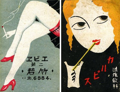
I came across these gorgeous 20's/30's Japanese Match Labels yesterday on Christian Northeast's blog, Lunch Tongue. He has a scapbook full of them and has posted a small selection. I really like them all as the illustration styles are great - but the legs have to be my favourite with the those tiny red heels.
Images copyright Christian Northeast.
https%3A%2F%2Fwww.deliciousindustries.com%2Fjapanese-match-labels
Delicious+Industries%3A+Japanese+Match+Labels
From the reference box #47

#47 - a Swiss letterhead from the 60's. I'm terrible at languages but I think the letter is in German and I'm pretty sure the 'V+S' is a tourist board logo. However I could be totally wrong, so if you have any info please get in touch.
I found it nestled amongst some bits of ephemera I bought a few weeks ago and really loved the logo, it's such a funny choice of typeface for such an official looking letter, but I think it's great. I especially like how the '+' has been reversed out of the 'V' to create the national flag - simple but effective!
If vintage design and ephemera do it for you, check out what else is in our reference box here.
https%3A%2F%2Fwww.deliciousindustries.com%2Ffrom-the-reference-box-47
Delicious+Industries%3A+From+the+reference+box+%2347
Seb Lester Prints
Seb originally studied graphic design at Central Saint Martin's, before specialising in typography and has created typefaces used by Dell, Intel and the New York Times. "Seb is passionate about letterforms which form the basis for his pieces. He brings letters to life with his animated illustration style and bold sense of humour." from the press release for his up and coming exhibition.
You can check out his work in person next month if you're in the Newcastle area as his new exhibition previews at the Electrik Sheep Gallery on 6 August. It should be a cracking show.
Images copyright Seb Lester.
https%3A%2F%2Fwww.deliciousindustries.com%2Fseb-lester-prints
Delicious+Industries%3A+Seb+Lester+Prints
Christian Northeast


I love the quirky, retro style of Christian Northeast's illustrations and collages. They're a successful mix of strong composition, a touch of the surreal, bold graphics and bright colour. He's got a great collection of typography and lettering pieces in his portfolio too. Check it out here.
Images copyright Christian Northeast.
Via Notcot.
https%3A%2F%2Fwww.deliciousindustries.com%2Fchristian-northeast
Delicious+Industries%3A+Christian+Northeast
Vintage Playing Cards
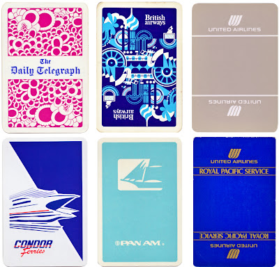
I've just uploaded my fledgling collection of playing cards to Flickr. I've not been collecting them very long so there are only 20, but they've got some great graphics.

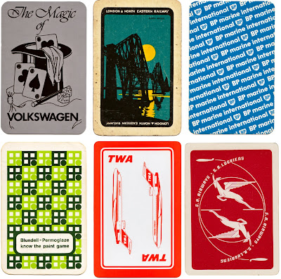
If playing cards are your thing check out older posts here and here.
https%3A%2F%2Fwww.deliciousindustries.com%2Fvintage-playing-cards
Delicious+Industries%3A+Vintage+Playing+Cards
Ephemera Assemblyman

Ephemera Assemblyman has some great vintage posters, photography and ephemera on his blog. There's loads to look at, but be warned once you start trawling through the collections it's hard to stop! Here are a few of my favourites...


Images copyright Ephemera Assemblyman.
https%3A%2F%2Fwww.deliciousindustries.com%2Fephemera-assemblyman
Delicious+Industries%3A+Ephemera+Assemblyman
Another Color Helm!

Remember The Color Helm I posted about a while ago, based on Wilhelm Ostwald's Colour system? Well I've finally come across another one - Mr Bluehaunt of The Haunted Lamp has the one above.
They originally came in Professional, Spectrum, Student, Womens’s Wearing Apparel and Interior Decorator’s models. Mine is the Student version, but this one is different and seems a lot more complicated - I wonder if it's the professional one?
Here's mine again for comparison:

Top image copyright The Haunted Lamp.
https%3A%2F%2Fwww.deliciousindustries.com%2Fanother-color-helm
Delicious+Industries%3A+Another+Color+Helm%21
Paul Rand Book Covers

Paul Rand is one of my favourite designers of all time and I love looking at his work. The last time I ventured over to his commemorative website it was incomplete, but now it's all there in the gallery; logos, posters, advertising, packaging and book covers, there's almost too much to look at!
I love his book cover design and as I'm working on some myself at the minute I thought I'd share my inspiration...


The whole collection of Paul Rand's work can be seen here. It's constantly being updated as more and more examples are found and documented.
Images copyright Paul-Rand.com
https%3A%2F%2Fwww.deliciousindustries.com%2Fpaul-rand-book-covers
Delicious+Industries%3A+Paul+Rand+Book+Covers
Welcome
Welcome to the Delicious Industries blog. We're an independent design studio based in Brighton, UK and this is our scrapbook packed full of design, illustration, photography & typography inspiration. Check out our work here.
Links
DELICIOUS FRIENDS
DELICIOUS FAVOURITES
- 50 Watts
- Acejet 170
- Grain Edit
- It's Nice That
- National Geographic Found
- Notcot
- Pretty Clever
- Retronaut
- So Much Pileup
- We Love Typography
- Another Mag


