From the reference box #46

#46 - Commemorative 'British Textiles' stamps celebrating great British textile designers, designed by Peter Hatch and released in July 1982.
The set of four stamps showcase prints from (left to right); William Morris - 'Strawberry Thief', Steiner & Co. - 'Untitled', Paul Nash - 'Cherry Orchard' and Andrew Foster - 'Chevron'.
Check out more reference box goodies here.
https%3A%2F%2Fwww.deliciousindustries.com%2Ffrom-the-reference-box-46
Delicious+Industries%3A+From+the+reference+box+%2346
Bauhaus-Era Postcard

Had to post this, it's a Bauhaus-era postcard found by jp of Amass Blog on Ebay! The '3' is just gorgeous - the geometric shapes and the orange, I just love it.
Image copyright Amass Blog.
https%3A%2F%2Fwww.deliciousindustries.com%2Fbauhaus-era-postcard
Delicious+Industries%3A+Bauhaus-Era+Postcard
Great giveaways from our lovely friends!

It seems to be the week for great giveaways - our friends over at Sell! Sell! are giving away some of their exclusive(ish) 'F*ck off Jonathan from Spotify' tees. All you have to do is finish the sentence "I need a Sell! Sell! Fuck off Jonathan from Spotify tee shirt because..." and email it to them with your tee size. Simple! Now what's Spotify and who's Jonathan??

Meanwhile our friends across the pond at Hero Design Studio & Boutique are having a Modern Housewares Contest, giving away some great iconic pieces including an Eames Hang-it-All Rack! All you have to do is tell them which homeware you couldn't live without or which of the giveaway items you really NEED! Unfortunately for us though, this ones for US residents only.
https%3A%2F%2Fwww.deliciousindustries.com%2Fgreat-giveaways-from-our-lovely-friends
Delicious+Industries%3A+Great+giveaways+from+our+lovely+friends%21
Natsko Seki

Japanese illustrator Natsko Seki has some really great work on her website - it's wonderfully whimsical and a little surreal. I love how she combines illustration and collage to create a warm, nostalgic feel.

If you love Natsko's work as much as we do you'll be pleased to know that some of her limited edition prints are available over at Design Supremo.
Images copyright Natsko Seki.
https%3A%2F%2Fwww.deliciousindustries.com%2Fnatsko-seki
Delicious+Industries%3A+Natsko+Seki
Hobby Stamp Blocks at Present & Correct
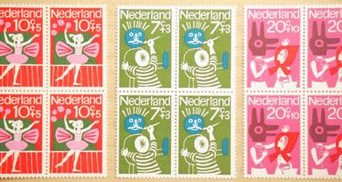

Present & Correct have these gorgeous Dutch stamps from the 70's available in blocks of 4. They have 3 different 'Hobby' themed designs left - painting, music and ballet.
Images copyright Present & Correct.
https%3A%2F%2Fwww.deliciousindustries.com%2Fhobby-stamp-blocks-at-present-correct
Delicious+Industries%3A+Hobby+Stamp+Blocks+at+Present+%26amp%3B+Correct
Typographic jewellery

I just came across the work of Berdene du Toit on The Ampersand and I love it - type and jewellery - what's not to like?
Canadian based Berdene handcrafts each letterform out of MDF, sands it down and then sprays or paints it to give the desired finish. Her pieces vary from single letterform earings/necklaces to elaborate multi-piece designs (as above). These long chains (below) are my favourite though, particularly the yellow one with the little dangling 'i'.
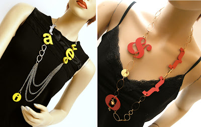
Checkout the full range of Berdene's fabulous jewellery here.
Images copyright Berdene du Toit.
Via The Ampersand.
https%3A%2F%2Fwww.deliciousindustries.com%2Ftypographic-jewellery
Delicious+Industries%3A+Typographic+jewellery
Festival of Britain Guide, 1951
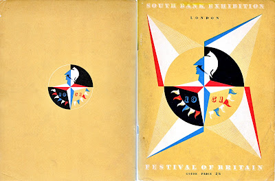
I've seen loads of these Festival of Britain guides for sale in the past, but for some reason they've always had pages or bits of pages hacked out of them. Finally though, I found this one in perfect condition.
The cover's my favourite part of the guide. It's a natural coloured, thick paper with a 4-colour print including white. White litho must have been quite unusual in the early 50's, but it looks great and really helps showcase the Festival logo - an iconic Britannia emblem designed by offical war poster artist, Abram Games (seen above on the cover).
The Festival of Britain was a national festival launched in May 1951 to promote better British design, construction and engineering, to create a national feeling of progress and to boost British moral. It was also a centenary celebration of the Great Exhibition held in 1851.
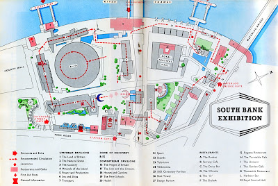
Exhibitions were held throughout the country, but the main venue was on the South Bank in London at a specially designed site developed by architect Hugh Casson and his appointed team. The team aimed to introduce the idea of urban design and showcase the principles intended to be used in the re-building of London; elevated walkways, modernist style architecture and multi-level buildings. Sadly though, only The Royal Festival Hall still remains.
Here's a plan of the South Bank Centre site:
Here's a selection of the adverts throughout the guide - the BOAC/BEA (below) is really great.
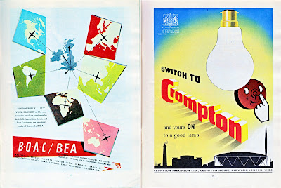
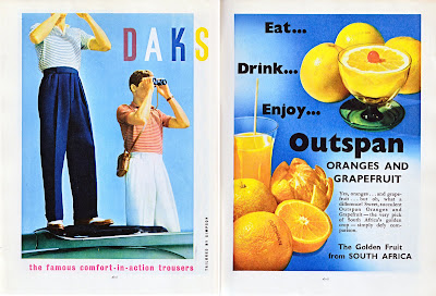
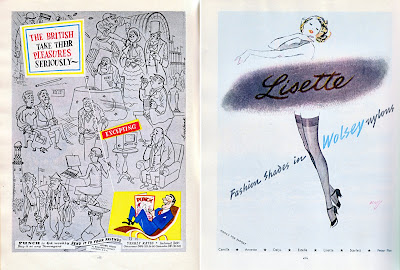
FInd out more about the festival here.
https%3A%2F%2Fwww.deliciousindustries.com%2Ffestival-of-britain-guide-1951
Delicious+Industries%3A+Festival+of+Britain+Guide%2C+1951
Secret Blisters 09 - Posters Now Online!

Print Club London have put the remaining Secret Blisters 09 posters in their online store and don't worry, all the artists have now been revealed!
Contributing artists include Anthony Burrill, Andy Smith, Si Scott, Jon Burgerman, Steve Wilson, Richard Hogg and Eine.
Above from left to right is work by Anthony Burrill, Abi Williams and Andy Smith.
Images copyright of the artists.
https%3A%2F%2Fwww.deliciousindustries.com%2Fsecret-blisters-09-posters-now-online
Delicious+Industries%3A+Secret+Blisters+09+-+Posters+Now+Online%21
Dark Zoo

Dark Zoo is the latest series from french photographer, Nicolas Evariste. The images are black and white portraits of captive animals in zoos. They're beautiful, but at the same time quite haunting and somber. Check out the full collection here.


Images copyright Nicolas Evariste.
Via Notcot.
https%3A%2F%2Fwww.deliciousindustries.com%2Fdark-zoo
Delicious+Industries%3A+Dark+Zoo
From the reference box # 45

#45 - Vintage photographic studio cards. Photographic studios in the late 19th and early 20th century would hand these out as a kind of business card to advertise their work and show clients their proofs.
They're a thick board with rounded corners and often have gold, printed edges. Intricately designed studio details are printed on the reverse and a photographic image (usually a very serious portrait) is glued to the front - a contrast I just love. Some cards also had foil blocking and debossing on the fronts to embellish the studio name.
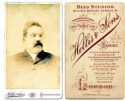
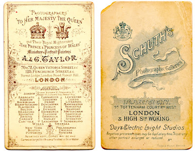
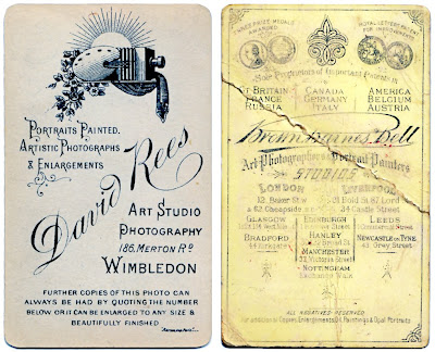
If you like these, check out our other reference box items here!
https%3A%2F%2Fwww.deliciousindustries.com%2Ffrom-the-reference-box-45
Delicious+Industries%3A+From+the+reference+box+%23+45
Javier Mariscal: Drawing Life 2009

The Design Museum, London are currently exhibiting the first UK retrospective of Javier Mariscal - Spanish artist, designer, sculptor, illustrator, interior designer and furniture designer - "one of the world's most innovative and original designers of our time".
Javier Mariscal was born in Valencia in 1950, but moved to Barcelona to live and work in 1970 were he opened Estudio Mariscal in 1989. Throughout his career Mariscal has created mascots for the Barcelona Olympic Games in 1992 ('Cobi' - below) and for the Hanover 2000 Expo in 1995 ('Twipsy'), he created the now famous diary room chair for the second year of Channel 4's 'Big Brother' in 2001, designed the popular 'Alexandra Armchair' as part of the Amorosos Furniture Collection for Moroso and created identities for the Swedish Socialist Party 'Socialdemkraterna', Barcelona Zoo, and London post-production company, Framestore.

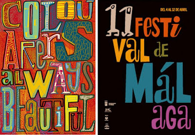
Mariscal has such a huge body of work that the exhibition should be fantastic - apparently there's an entrance tunnel displaying 640 examples of his work from the last 30 years (including typefaces) and on the exterior of the Design Museum he has created a giant typographic mural, "showcasing his unique vision and signature design style".

The exhibition runs until 1 November 2009 and has it's very own blog to keep everyone up-to-date with the goings on.
Images copyright Javier Mariscal.
https%3A%2F%2Fwww.deliciousindustries.com%2Fjavier-mariscal-drawing-life-2009
Delicious+Industries%3A+Javier+Mariscal%3A+Drawing+Life+2009
Penguin Group Logo Develpment
It's really interesting seeing the development over the 70 years of such iconic logos, so I’ve put them in chronological order to make it easier to see the changes. Amongst them is the initial Penguin logo created by office junior, Edward Young in 1935 taken from his penguin sketches at London Zoo and the versions created by the legendary Jan Tschihold (Head of Design, 1946-49). Enjoy...

1. Penguin, 1935. 33. Penguin, 1935. 26. Pelican, 1937. 48. Penguin, 1937. 18. Pelican, 1937. 8. Penguin, 1938. 31. Penguin, 1938. 45. King Penguin, 1939. 10. Puffin, 1940. 4. Puffin, 1941.

15. Puffin, 1941. 28. Penguin, 1944. 40. Penguin, 1945. 32. Penguin, 1945. 27. Ptarmigan, 1945. 3. Penguin, 1946. 6. Penguin, 1946. 12. Penguin, 1947. 37. Penguin, 1947. 41. Penguin, 1947.

7. Porpoise, 1948. 9. King Penguin, 1948. 11. Pelican, 1948. 17. Pelican, 1948. 20. Penguin, 1948. 34. King Penguin, 1948. 35. Puffin, 1948. 36. Penguin, 1948. 43. Penguin, 1948. 46. Pelican, 1948.

13. Penguin, 1949. 24. Penguin, 1949. 30. Pelican, 1949. 14. Penguin, 1950. 25. Pelican History of Art, 1953. 22. Puffin, c.1959. 44. Peregrine, 1962. 42. Peacock, c.1963. 21. Penguin Education,1967. 5. Allen Lane, 1967.

39. Puffin, 2003. 2. Puffin, 1968. 19. Kestrel, 1970. 47. Kestrel, 1970. 16. Penguin, c.1987. 23. Allen Lane, 2003. 29. Penguin, 2003. 38. Puffin, 2003.
Logos/Trademarks copyright Penguin Group.
https%3A%2F%2Fwww.deliciousindustries.com%2Fpenguin-group-logo-develpment
Delicious+Industries%3A+Penguin+Group+Logo+Develpment
Clothing Labels

There's a fun collection of clothing labels over on World Famous Design Junkies. Inspired by Kindra Murphy's collection they have searched the internet and put together a virtual collection of their own.
The type has a great quality to it which I really love and although the designs might not be amazing, they all have a certain charm.


Images from World Famous Design Junkies.
Via Notcot.
https%3A%2F%2Fwww.deliciousindustries.com%2Fclothing-labels
Delicious+Industries%3A+Clothing+Labels
General Pattern Prints
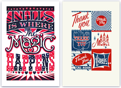
London based, General Pattern have some great linocuts and screen prints available from illustrator James Brown, that would liven up any studio or lounge.
All the prints are fun and quirky with gorgeous typography and lots of attention to detail, but unfortunately my favourite 2, the 'Thank You' (above right) and 'Tigers' (below left) have already sold out!
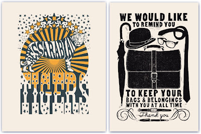
Keep up-to-date with the goings on at General Pattern and watch out for new prints on their blog.
Images copyright General Pattern.
https%3A%2F%2Fwww.deliciousindustries.com%2Fgeneral-pattern-prints
Delicious+Industries%3A+General+Pattern+Prints
From the reference box #44

#44 - British Gas 'Mr Therm' playing cards.
Mr Therm was designed in 1932 by Eric Fraser, I'm not sure what year these cards are from though. They say, 'Mr.Therm greets you warmly' and he does - I love the little glowing smiley face. A bargain for 50p!
Have a look at other reference box items here.
https%3A%2F%2Fwww.deliciousindustries.com%2Ffrom-the-reference-box-44
Delicious+Industries%3A+From+the+reference+box+%2344
Welcome
Welcome to the Delicious Industries blog. We're an independent design studio based in Brighton, UK and this is our scrapbook packed full of design, illustration, photography & typography inspiration. Check out our work here.
Links
DELICIOUS FRIENDS
DELICIOUS FAVOURITES
- 50 Watts
- Acejet 170
- Grain Edit
- It's Nice That
- National Geographic Found
- Notcot
- Pretty Clever
- Retronaut
- So Much Pileup
- We Love Typography
- Another Mag

