art direction, design + typography
Blog: Inspiration
More Country Fair Magazines


Remember the Country Fair Magazines I posted about last year, well this weekend I was lucky enough to find a few more!
These new issues also have beautifully illustrated and graphic covers. There are four Jonny Hanna covers (October 1956, July 1957, November 1957 and June 1958) and one by children's book illustrator, John Lobban (the orange bat one - April 1958).
I can't wait to find more of these - fingers crossed I'll be lucky again soon.
If you liked these you may also like my collection of Which? Magazine covers and Do It Yourself Annuals.
https%3A%2F%2Fwww.deliciousindustries.com%2Fmore-country-fair-magazines
Delicious+Industries%3A+More+Country+Fair+Magazines
International Exhibition of Calligraphy


These beautiful examples of calligraphy are part of the International Exhibition of Calligraphy. An exhibition started in St. Petersburg, 2008 by MVK (International Exhibition Company) aiming to, "reveal the cultural and educational value of calligraphy pursuing a personality intellectual development".
Last year saw a second exhibition held in Moscow and this year (September 10-12th, 2010) it will be showcased in Velikiy Novgorod - quite a symbolic venue for Russian calligraphy.
"The chronicled history of Velikiy Novgorod dates back to the origin of Old Rus. The script culture arose with arrival of Christianity. Novgorod Psalter is the oldest book of Rus’. It is a tiny script book consisting of bound wooden tablets created between old 900’s and early 1000’s. It was Veliky Novgorod where the birchbark manuscripts (the written records of XI-XV centuries) testifying to the high literacy of the Novgorod population were found."
The exhibition organisers are then hoping to initiate the International Exhibition of Calligraphy in all the major cities of the world starting with Paris, New York and Jerusalem. Fingers crossed it will make it to the UK at some point.
Images copyright the International Exhibition of Calligraphy.
Via Ephemera Assemblyman.
https%3A%2F%2Fwww.deliciousindustries.com%2Finternational-exhibition-of-calligraphy
Delicious+Industries%3A+International+Exhibition+of+Calligraphy
Vintage Luggage Labels


I love these vintage luggage labels from rosiesnumberoneboy's Flickr set, especially the BOAC one - such lovely designed items, "from the great days of travel"!
Images copyright rosiesnumberoneboy.
https%3A%2F%2Fwww.deliciousindustries.com%2Fvintage-luggage-labels
Delicious+Industries%3A+Vintage+Luggage+Labels
Another Sellotape tin!

This weekend I found another Sellotape® tin (full of vintage cream and pearl buttons which was a bonus!) at a boot sale. This one seems slightly later than the other two I have (below) as it has metric measurements as the main dimensions rather than in brackets as previously.
Metrication started formally here in the UK in 1965, so this tin is probably from the mid to late 60's. I actually now think the other tins are likely to be from the early 60's as I first thought, and not the late 50's.
Have you spotted the slight change on the new tin too? A very small detail, but they've added a hyphen to 'self-adhesive' and have also rounded down the millimeter measurement from 25.4mm to 25mm on the 1" x 72 yds tins.


Check out my earlier post on Sellotape® tins, a bit of Sellotape® history and a selection of old adverts here.
https%3A%2F%2Fwww.deliciousindustries.com%2Fanother-sellotape-tin
Delicious+Industries%3A+Another+Sellotape+tin%21
From the reference box #71

#71 - Mapa de communicaciones, Espana or Map of Spain. I was surprised to see this was printed in 1984. I would definitely have guessed at mid 70's with it's black background and bold graphic.
I have no idea what the graphic is meant to be, but I like it all the same!
There are 70 other wonderful items in the reference box - have a root here.
I have no idea what the graphic is meant to be, but I like it all the same!
There are 70 other wonderful items in the reference box - have a root here.
https%3A%2F%2Fwww.deliciousindustries.com%2Ffrom-the-reference-box-71
Delicious+Industries%3A+From+the+reference+box+%2371
The Bottle Cap Man


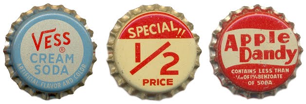
Doing some research yesterday I came across The Bottle Cap Man a website devoted to, you guessed it - bottle caps or crowns. The site, run by Kenny Yohn in Kansas City is a great resource for collectors and an amazing source of inspiration.
Kenny has an absolutely massive collection of beer and soda caps dating back to the 50's, the ones above are only a tiny selection from one of the soda sections. I haven't even looked through the beer ones yet - there literally are hundreds.
I feel a new collection coming on!
Images copyright The Bottle Cap Man.
https%3A%2F%2Fwww.deliciousindustries.com%2Fthe-bottle-cap-man
Delicious+Industries%3A+The+Bottle+Cap+Man
More Saul Bass Matchbooks

It was a while back when I posted about a lucky blogger finding some of these wonderful Hunt-Wesson matchbooks, designed by Saul Bass on a flea market. Well I still haven't found any at my local boot sale, but design:related member Karen Horton has just found almost a full set (14 of the 16 and lots of doubles)...
"while rummaging the Chelsea Flea Market with no particular agenda, I had a hunch I recognized a few Saul Bass designs peering out of a randomly assorted box. What made the Saul Bass designs stand out instantly is that they were the only matchbook covers in a pile of hundreds sans advertising-related text or graphics."


Nice one Karen, that's a great collection - I'm not jealous in the slightest (well maybe a little!)
Via Notcot.
https%3A%2F%2Fwww.deliciousindustries.com%2Fmore-saul-bass-matchbooks
Delicious+Industries%3A+More+Saul+Bass+Matchbooks
Mac Fisheries


If you remember our post about Hans Schleger then you will hopefully recall his wonderful work for Mac Fisheries. During the mid 50's he created most of the marketing and promotional items for the company.
The photomontage style he used for their poster campaigns still looks really fresh and I love how the logo is incorporated into the lobster and salmon posters.
I had no idea though just how huge Mac Fisheries were and that they not only sold fish, but also poultry, frozen and tinned foods. There's a great website all about the company which includes a 'paraphernalia' section with loads of Schleger designed items including these great poultry posters...


food packaging...


and weirdly, some round playing cards?!...

The site was compiled and is run by Colin French. It's a great resource and well worth a look. Thanks Colin for sharing all this information!
Images copyright Mac Fisheries.
Via the great Quad Royal.
https%3A%2F%2Fwww.deliciousindustries.com%2Fmac-fisheries
Delicious+Industries%3A+Mac+Fisheries
Alice in Wonderland Adaptations


Everyone seems Alice in Wonderland crazy at the minute with the release of Tim Burton's long awaited 3D version of this Lewis Caroll classic and The British Film Institute are no exeption.
To celebrate the Tim Buton release at IMAX, The British Film Institute are showing the following adaptations; the 1933 Paramount version, Dennis Potter's 'Alice' (1965), Jonathan Miller's BBC adaptation (1966), 'Dreamchild' (1985 - made using Jim Hensen's Creature Shop creations) and Jan Svankmajer’s 'Alice' (1988).
They have also released the recently restored, footage of the very first Alice in Wonderland film from 1903 (screen grabs above) created just 37 years after the the novel was written. Donated to the BFI in the early 60's the film was in a very poor condition, but it's still really interesting to watch...
"Directed by Cecil Hepworth and Percy Stow, and was based on Sir John Tenniel's original illustrations. With a running time of just 12 minutes (eight of which survive), this 1903 film was the longest produced in England at that time and it represented a major investment for the pioneering Hepworth Studios that produced it. Some might venture to say it was the Avatar of its day."
There was no sound on the original film, so the piano accompaniment, 'Jill in the Box' was added after restoration to compliment the story. Read more about the restoration here.
All images and film copyright The British Film Institute.
Via Notcot and Cakehead Loves Evil.
https%3A%2F%2Fwww.deliciousindustries.com%2Falice-in-wonderland-adaptations
Delicious+Industries%3A+Alice+in+Wonderland+Adaptations
Cover Me Badd Fake Book Cover Competition


Our friends over at Sell! Sell! are running a design competition to create the final cover in their Cover Me Badd set of fake book covers.
"Reading the latest Dan Brown, or Ukrainian Tractor Drivers Go Bananas? Or perhaps Confessions Of A Shopaholic, or something like Gareth Gates' Autobiography (is there such a thing?)? Worry not about being looked down upon by your snooty fellow travelers for your populist or hurredly chosen reading matter. Simply slip a Cover Me Badd over your book and read happily."
The set so far includes covers to make you look intellectual (War & Peace Translated Into Mandarin), clever (Space Science 4, An Expert's Textbook), down right scary (Serial Killing For The Intermediate, A Hands On User Guide) and a little bit weird (Mummy's the Word, Living with the Oedipus Complex).
It's a great idea and if you want to be part of it, here are the competition details:
DESIGN A COVER ME BADD, WIN FRIENDS AND HARD CASH
Packs of our Cover Me Badd fake book covers will be hitting the stores later this year. But first, we'd thought we'd offer the chance to you, our dear reader to enter your own. Simply come up with an idea for a name, or even design a fake book cover, and send it to us at doubles[at]sellsell[dot]co[dot]uk - The chosen entry will be included in our launch pack, and of course the winner will not only garner massive fame and what the Americans call Kudos (aftershave, I think), but also a share of what we are cautiously estimating to be an obscene amount of profit. So get your designing and writing fingers out. The closing date is March 31st.
Read more about Cover Me Badd covers here.
Images copyright Sell! Sell!
https%3A%2F%2Fwww.deliciousindustries.com%2Fcover-me-badd-fake-book-cover-competition
Delicious+Industries%3A+Cover+Me+Badd+Fake+Book+Cover+Competition
The Flour Art Museum


Who would have thought that flour bags could be so interesting and so well designed?
The images above are of The Flour Art Museum in Germany started by Volkmar Wywiol, the owner of Mühlenchemie, who after finding a washed-up flour sack in Dubai in 1998 has been collecting them ever since. His amazing collection boasts, "over 1,900 sacks from more than 115 countries".


The museum educates visitors on the history of flour and steam mills, flour mythology, flour sayings, flour facts and flour technology. Not to mention the exhibition rooms showcasing flour sacks from around the world in The World Room - illustrating the, "common language of the international Milling Family, that knows no linguistic or political boundaries", the symbolism of the sack illustrations in The Symbol Room - "the symbols on the sacks are by no means just decorative or a matter of chance. On the contrary: they are references to the great cultural significance of agriculture, corn, flour and bread" and of course the flour sacks themselves which can be seen in Sackotheque - the largest collection of flour sacks in the world stored alphabetically by country of origin.
There's also an exhibition catalogue in both English and German which looks like a great reference book available here.
Images copyright The Flour Art Museum.
An initiative of Mühlenchemie. A member of the Stern-Wywiol Gruppe.
Via NOTCOT.
https%3A%2F%2Fwww.deliciousindustries.com%2Fthe-flour-art-museum
Delicious+Industries%3A+The+Flour+Art+Museum
Vintage Atari Graphics


I love these (presumably 70's) Atari graphics from Minneapolis based designer, Joe Kral's Flickr.
They're the cover graphics from Atari game instruction manuals he's collected over the years. There are loads in the set, but these ones with the rainbow of movement are by far my favourites.
Images copyright Joe Kral.
https%3A%2F%2Fwww.deliciousindustries.com%2Fvintage-atari-graphics
Delicious+Industries%3A+Vintage+Atari+Graphics
Vintage Firework Packaging

I'd never realised how fantastic firework packaging was until I found the Firework Heritage Museum - a wonderful site by Steve Johnson devoted to 60's, 70's and 80's fireworks, "Original Pains, Brocks, Astra, Rainbow, Standard, Wilders, and Wells Fireworks, Labels and Boxes".
It's not just the bold, bright and somewhat lo-fi graphics that are great either - some of the names are brilliant...


Images copyright Steve Johnson / Firework Heritage Museum.
https%3A%2F%2Fwww.deliciousindustries.com%2Fvintage-firework-packaging
Delicious+Industries%3A+Vintage+Firework+Packaging
How to Work Better

*We just been informed that this was written by Fischli and Weiss and designed by James Goggin - thanks Dick.
Via Inspiration Resource.
Via Inspiration Resource.
https%3A%2F%2Fwww.deliciousindustries.com%2Fhow-to-work-better
Delicious+Industries%3A+How+to+Work+Better
Goodbye to Edie Harper

Samson and Delilah

Net Prophet
I've just discovered via Grain Edit the sad news that Edie Harper, widow of illustrator Charlie Harper passed away last week aged 87. Edie too was a fantastic illustrator - very similar in style to her husband, but often described as more whimsical. She was also a very talented painter and photographer.
Her work mostly focused on Biblical stories (above) and cats (below),"She loved cats forever and felt that stories from the Bible provided her with some good design ideas", said her son Brett, who runs the Harper Art Studio.

Peepkin
There is a full Memoriam for Edie Harper here which tells of her wonderful talents and her life with husband Charlie Harper.
Edie Harper prints can be seen and purchased here.
Images copyright Edie Harper / Harper Estate.
https%3A%2F%2Fwww.deliciousindustries.com%2Fgoodbye-to-edie-harper
Delicious+Industries%3A+Goodbye+to+Edie+Harper
Welcome

Welcome to the Delicious Industries blog. We're an independent design studio based in Brighton, UK and this is our scrapbook packed full of design, illustration, photography & typography inspiration. Check out our work here.
Links
DELICIOUS FRIENDS
DELICIOUS FAVOURITES
- 50 Watts
- Acejet 170
- Grain Edit
- It's Nice That
- National Geographic Found
- Notcot
- Pretty Clever
- Retronaut
- So Much Pileup
- We Love Typography
- Another Mag