Blog: signage
From the reference box # 78

#78 - Newton Oils sign. I've had this sign for years, it's not very big (24cm diameter) and only cardboard but I love it! It's the very pointy arrow, which seems quite ornate for an oil sign and the orange outlined type that do it for me.
I'd always thought it was from the late 50's, but after a bit of research it seems Newton Oils was only established in 1961, so I'm guessing it's probably from around that time.
There are lots more interesting items in the reference box - have a rummage here.
https%3A%2F%2Fwww.deliciousindustries.com%2Ffrom-the-reference-box-78
Delicious+Industries%3A+From+the+reference+box+%23+78
Mullard Valves Tested

This wonderful 50's sign makes me smile every morning, so I thought I'd share it with you guys for some Monday inspiration.
It's the printed glass from the front of an illuminated, Mullard's advertising sign given to me by my uncle when he closed his old electrical shop. I just love everything about it - especially the 'Valves Tested' type and the little man's quiff!
https%3A%2F%2Fwww.deliciousindustries.com%2Fmullard-valves-tested
Delicious+Industries%3A+Mullard+Valves+Tested
Hobo Symbology


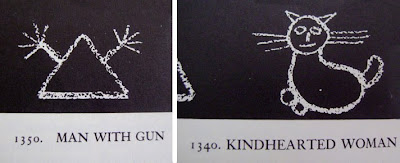
I love these hobo symbols, they form such a basic signage system, simple and effective. It was developed by hobos in the 1950's who communicated with each other by drawing these images on the street in chalk.
You may remember a reference to them in Mad Men when a Hobo drew the 'Dishonest Man' symbol on the gate of the young Don Draper's house in a flashback scene.
The whole set can be seen over on World Famous Design Junkies.
Images copyright World Famous Design Junkies.
Via Notcot.
https%3A%2F%2Fwww.deliciousindustries.com%2Fhobo-symbology
Delicious+Industries%3A+Hobo+Symbology
Neon Boneyard

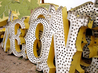


Neon Boneyard is a great collection of images by photographer Pam Sattler over on Icon-ology of the old, decaying signs that once lit up the strip and casinos in Vegas. I'm sure I've posted about the neon graveyard in the past, but I can't find it!
Pam's photos show the shabby chic beauty of the signs and their faded glory really well - they look amazing. See the full collection here.
Images copyright Pam Sattler.
Via Notcot.
https%3A%2F%2Fwww.deliciousindustries.com%2Fneon-boneyard
Delicious+Industries%3A+Neon+Boneyard
Great signage

I saw this over on On Aime Se Promener and love it - a wonderfully simple, well executed idea for an Opticians (Dunscombe Opticians, Bristol, UK).
Image copyright On Aime Se Promener.
Via Inspire me, now!
https%3A%2F%2Fwww.deliciousindustries.com%2Fgreat-signage
Delicious+Industries%3A+Great+signage
Steve Lambert's - Everything you want, right now!

Steve Lambert's solo show, Everything you want, right now! is currently running at LA's Charlie James Gallery until 6 June.
"Lambert takes on the vernacular of commercial signage, with a regional emphasis unique to Los Angeles. Visually, he is interested in what makes certain styles of signage feel so innately familiar, and in the methods that signage employs to grab our attention".
I love the look of the fairground style signs with their flashing light bulbs and quirky messages...


Images copyright Steve Lambert and Charlie James Gallery.
Via SwissMiss.
https%3A%2F%2Fwww.deliciousindustries.com%2Fsteve-lamberts-everything-you-want-right-now
Delicious+Industries%3A+Steve+Lambert%26%23039%3Bs+-+Everything+you+want%2C+right+now%21
Buchstabenmuseum - The Museum of Letters

These fabulous letters and many, many more can be seen at Buchstabenmuseum, the Museum of Letters in Berlin - they've been salvaging used letters and signage for the last 4 years.

To view the full collection book an appointment the next time you are in Berlin, or take a look at Core77's wonderful, sneak preview pics.
Images copyright Core77.
Via Sell!Sell!
https%3A%2F%2Fwww.deliciousindustries.com%2Fbuchstabenmuseum-the-museum-of-letters
Delicious+Industries%3A+Buchstabenmuseum+-+The+Museum+of+Letters
Branding in Arabic
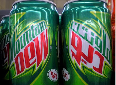
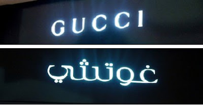
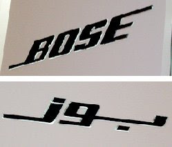
I saw these yesterday on Graphicology, they are photos taken in Dubai of products branded in both English and Arabic. The packaging designs are nothing to write home about, they are just your regular, cheesy supermarket packages, but I find the way some of them have translated their branding into Arabic really interesting. Of course Arabic is a phonetic language and I think the best of these packages are the ones were the branding has been mirrored to reflect this.
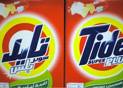
There are also some pics of store signage, which are equally as interesting. I really like the look of the Arabic GUCCI with all the dots.
Images copyright Graphicology.
Via Notcot.
https%3A%2F%2Fwww.deliciousindustries.com%2Fbranding-in-arabic
Delicious+Industries%3A+Branding+in+Arabic
SIGNS by Mark Pawson

An Exhibition of 12 New Limited Edition Ready To Hang Signs and some Jewellery is Mark Pawson's latest exhibition that runs from 7 November - 23 December at Tatty Devine's Brick Lane store.
The signs are perspex, laser-cut and etched at Tatty Devine then glued together by Pawson. They have a great nostalgic feel that Pawson attributes to the, "curious, limited sort of retro colour palette" that the perspex/acrylic is available in.
He has also been bust making 12 invitational 'ready-to-hang' signs which have been sent out to press and magazines promoting the exhibition:

Via and images from Creative Review.
https%3A%2F%2Fwww.deliciousindustries.com%2Fsigns-by-mark-pawson
Delicious+Industries%3A+SIGNS+by+Mark+Pawson
Public Lettering in Central London


Public Lettering: A walk in Central London is a website outlining a walk around Central London taking in large examples of public lettering as prepared by Phil Baines for the ATypI Conference in 1997.
The site pinpoints key buildings (ie. ones containing lettering of note) like the British Library, The Coliseum and Parsons' Library, gives a brief history and shows detailed pics (as shown above). It does not mention, what it calls. 'incidentals' en route, such as stop-cocks, manhole covers, building dates or builders marks, nor does it mention corporate signage or advertising hoarding, as, "the pleasure of this kind of walk, is finding things yourself".
What a brilliant reference for public signage and lettering - I love the idea of taking in a walk with such rich typographic interest. It's a great idea and something I would like to do in other cities too.
Images copyright Phil Baines, 1997, 2002.
https%3A%2F%2Fwww.deliciousindustries.com%2Fpublic-lettering-in-central-london
Delicious+Industries%3A+Public+Lettering+in+Central+London
Intrastate Commerce


'Intrastate Commerce' is a great Flickr set from Society in Decline that has pages of roadside signs from across America. It's fantastic reference, but there are so many, it takes a while to click through them all!
Via The Serif.
https%3A%2F%2Fwww.deliciousindustries.com%2Fintrastate-commerce
Delicious+Industries%3A+Intrastate+Commerce
Wall Letters

These metal letters from Urban Outfitters are fantastic. They are quite large at 6 x 10 x 1" and are available in some cool colours for only $14 each + postage. The have a built-in bracket on the reverse for hanging and the website says they come in different styles, although there is only one style shown.
Now I can find them on the US website, but not on the Uk site?? So maybe they are only available in Uk stores and not online?
You could always have a look in antique shops and on car boot sales to try and find some secondhand signage. Used letters generally have a nice patina which adds character, the only downside is that you can't always get the letters you want in the same style. Here are a couple of mine...

https%3A%2F%2Fwww.deliciousindustries.com%2Fwall-letters
Delicious+Industries%3A+Wall+Letters
Eureka Tower Carpark signage


This has to be the best signage I have seen for a long time. It is a way-finding system developed by designer, Axel Peemoeller for Melbourne Carpark, 'Eureka Tower'.
The system works by having giant letters painted on the walls and floor, that appear distorted close up, but when seen from a distance, as you are driving through the carpark, they are perfectly legible. The perspective is carefully calculated to produce the largest, most legible sign from the correct angle.
It reminded me of pavement drawings by Julian Beever I saw a while ago which use perspective and distance in the same way, but in his case to create 3D illusions.


Eureka Tower images copyright Axel Peemoeller
Pavement art images copyright Julian Beever
https%3A%2F%2Fwww.deliciousindustries.com%2Feureka-tower-carpark-signage
Delicious+Industries%3A+Eureka+Tower+Carpark+signage
Vintage Tube & Routemaster Signage

Pedlars is wonderful online shop, with an equally fabulous Notting Hill store. They sell prints, clothing, cool pieces of homeware and vintage paraphernalia. At the moment they have a great selection of vintage tube and Routemaster signs, which are definitely worth a look.
Now I love signs and they don't come much more iconic than the London underground signs - they are a classic piece of design. The ones above were used as temporary signage during maintenance works until about 30 years ago, but are now framed and ready to hang on your studio wall - now how cool would it be to own a genuine tube sign?
Likewise, the type on the old Routemaster bus signs was fantastic, so simple and classic looking. Now that the Routemasters are redundant, the familiar number & destination blinds have been rescued and given a new lease of life, framed or made into light boxes by the lovely people at Pedlars.
Images from the Pedlars online store.
https%3A%2F%2Fwww.deliciousindustries.com%2Fvintage-tube-routemaster-signage
Delicious+Industries%3A+Vintage+Tube+%26amp%3B+Routemaster+Signage
Found Typography #2


A few pics of distressed type; a mini cab office in Kings Cross London, Litter bin in Chester Zoo, 'Station' sign in Brighton and a TV/Radio rental & repair hand-painted mural on the side of a building in Brighton. All seen better days, but all the more interesting because of it.
https%3A%2F%2Fwww.deliciousindustries.com%2Ffound-typography-2
Delicious+Industries%3A+Found+Typography+%232
Welcome
Welcome to the Delicious Industries blog. We're an independent design studio based in Brighton, UK and this is our scrapbook packed full of design, illustration, photography & typography inspiration. Check out our work here.
Links
DELICIOUS FRIENDS
DELICIOUS FAVOURITES
- 50 Watts
- Acejet 170
- Grain Edit
- It's Nice That
- National Geographic Found
- Notcot
- Pretty Clever
- Retronaut
- So Much Pileup
- We Love Typography
- Another Mag

