Record Centre Labels - part 1
Part one of my record centre label collection.
Most range from the 50s to 70s with the odd later one thrown in for good measure.
When I buy vinyl it's always exciting to see the label - I enjoy the labels almost as much as the music and always more than the covers.
Watch out for part two next week.
Vintage Cigar Labels
These beautifully detailed and lettered cigar labels are from a collection over on Letterology. It's an interesting post showing the elaborate designs introduced to establish more sophisticated looking brand styles and prevent counterfeits being easily produced. Check out the full post here.
Images copyright Letterology.
Abstract City Maps
I do like a map and these abstract city maps by Jazzberry Blue are no exception with their blocks of colour and graphic shapes they're definitely ticking all the right boxes.
It's really interesting to see the street plans in such a simple form. I love how crazy and random the London streets are compared to the others and the New York one is grid heaven.
Jazzberry Blue have a great body of illustration work, including more maps for New Delhi, LA and Jerusalem all available as Giclee art prints here.
Images copyright Jazzberry Blue.
Via Colossal.
Sicilian Fruit Tissue Wrap
Colourful illustrations, charming but lo-fi print and wonderful lettering all come together on these Sicilian fruit wrappers to turn an unremarkable, everday item into something beautiful.
I'm always amazed at the level of detail on packaging like this, that for the most part goes totally unnoticed.
Images copyright Italian Ways
Via FFFFound!
Dover Books
When the Dover Book shop closed it's doors last year we worried that was the end of a great resource, but it's back (well in virtual form anyway).
Their website is now up and running, taking orders of their fabulous copyright free books and cds 24hrs a day. How have we managed without them?!
Auto Type XXVXIII
Auto Type XXVXIII - some more fabulous automobile lettering from New Years Day at Brooklands Museum. My particular favourite has to be the Leyland bus (top), not only because it reminds me of my home town, but I love how the letters are deeper at the top to work against the curved bodywork. Looks very 70s.
There's lots more of the same over in our Flickr set or here.
From the Reference Box #138
#138 - British United Airways passenger ticket and baggage check, 1963. I love to see a classic logo on an original bit of print so I couldn't leave this behind at the boot sale.
This lucky person, a Miss MV Dickinson travelled from London Gatwick to Venice on what was then the UK's largest independent airline, largely owned by British & Commonwealth Shipping (B&C) and the largest unsubsidised airline outside the US.
Have a delve into the rest of our reference box for more ephemera and vintage design goodies.
Buy a proper cola…
Those clever boys at Sell! Sell! are helping Fentimans take on the might of the big boys with a cheeky new advertising campaign for Curiosity Cola. Genius, we love it...
Vintage Sewing Machine Logos
Image copyright Couthy Quine
I've been looking out for a vintage sewing machine recently and have been pleasantly surprised by the number of beautifully lettered logos I've come across. Most people are familiar with the old Singer logo but there are so many more. Here are a selection collected from Flickr...
Image copyright susannaryan
Image copyright Crafty Dogma
Image copyright dilemmaname
Image copyright Duncan Creamer
Image copyright Andrea Maria
Image copyright Julie
Image copyright Kirsten Schueler
Image copyright Leslie
Image copyright Nancy Lehrer
Image copyright Observe The Banana
Image copyright Peter O'Dwyer
Image copyright SurrendrDorothy
Image copyright susannaryan
Image copyright Bryan Costin
Unexplainable Black & White Photos
Via Ffffound!
Australian Art Deco & Art Deco Style Signage
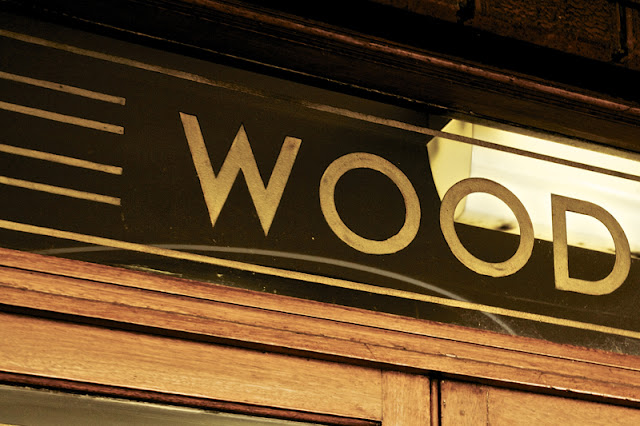
These beautiful Art Deco and Art Deco style signs are from Truffle Pig's 'Type Tour - of Potts Point', "Extensively developed from the 1920s through to World War II, the neighbourhood boasts some of Australia's best examples of Art Deco architecture and many of the gracious apartment buildings are adorned with beautiful examples of custom signage".
I'm lucky that Brighton has many wonderful examples of Art Deco architecture & signage, but when you see them so regularly it's easy to take them for granted. I often think about taking the camera out and shooting them properly, but I never seem to find the time. These pics have inspired me to finally do it though, so watch this space.
Images copyright Truffle Pig.
Via Notcot.
Invasive Species
Phone masts disguised as trees are a constant source of amusement on my travels. They can be spotted easily at a distance, as easily in fact as a regular mast, but I love the lengths someone has gone to trying to blend them into the environment.
These wonderful images are the work of South African photographer Dillon Marsh. Thanks to Vic at Sell! Sell! for sending us the link. The series, 'Invasive Species' explores, 'the relationship between the environment and the disguised towers of Cape Town and its surrounds'.
The very first one was allegedly erected in South Africa in 1996 so it seems fitting that Dillon's series is based around the country. See his full collection here and while you're there check out his images of large man-made everyday objects, 'Giants Among Men'!
Images copyright Dillon Marsh.
The Lancashire Coast
As much as I love these towns though, I never remember any of them looking as lovely as Daphne illustrates them!
Image from Quad Royal.
Auto Type XXVXII
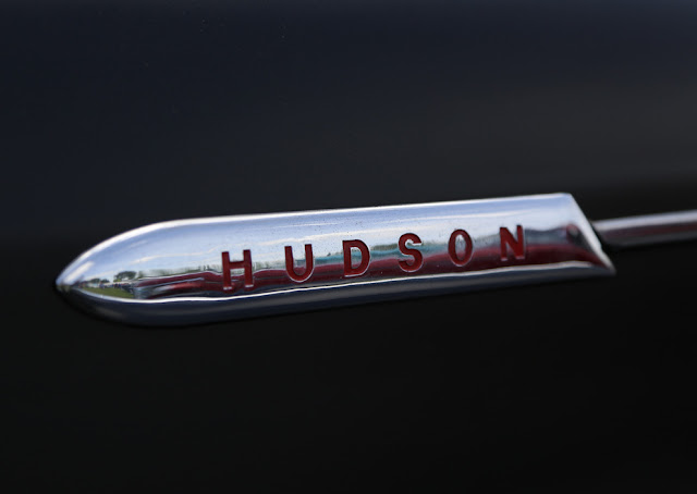
Auto Type XXVXII - from Billing Hot Rod Show a selection of mainly american automobile badges with wonderful lettering as always.
Lots of weathered emblems and patina paint in this bunch but that just adds to their beauty. I particularly like the Country Squire and the Ranch Wagon - two I haven't seen before!
Check out our other Auto Type here or go to our Flickr set.
From the reference box #137
 #137 - Matchbooks & matchbook covers. This little lot were in a collection of souvenir match books I was given recently. The majority of the covers are uninspiring design-wise, but there's something about the ones above, be it their tacky charm or giant graphics that jumped out at me - especially the flame graphic!
We have many more matchbook covers in the reference box and on our blog, take a look here.
Welcome

Welcome to the Delicious Industries blog. We're an independent design studio based in Brighton, UK and this is our scrapbook packed full of design, illustration, photography & typography inspiration. Check out our work here.
Links
DELICIOUS FRIENDS
DELICIOUS FAVOURITES
- 50 Watts
- Acejet 170
- Grain Edit
- It's Nice That
- National Geographic Found
- Notcot
- Pretty Clever
- Retronaut
- So Much Pileup
- We Love Typography
- Another Mag


