Starbucks step back in time for a rebrand
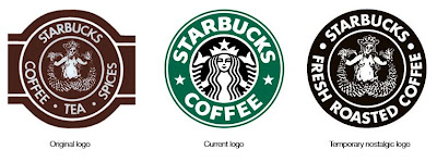
Starbucks appear to be undergoing a rebranding exercise, or at least they are in the US - there doesn't seem to be any evidence of it in the Uk. There's lots of confusion on the internet as to the extent of this nostalgic rebrand, but it seems on their cups at least, they have reverted back to the style of their very first, single colour logo with the full graphic of the original twin-tailed mermaid.
According to Business Week, "Starbucks plans to use the logo on all its cups for about eight weeks. It will remain in ads and as the logo for Pike Place bags of coffee" - their new product.
It seems like an odd thing to do, and although the new/old logo is much more appealing and less corporate looking (which seems to be the strategy) - are consumers really stupid enough to perceive Starbucks as a small boutique coffee brand, by the use of a nostalgic logo for 8 weeks? I really hope not!
https%3A%2F%2Fwww.deliciousindustries.com%2Fstarbucks-step-back-in-time-for-a-rebrand
Delicious+Industries%3A+Starbucks+step+back+in+time+for+a+rebrand
Welcome
Welcome to the Delicious Industries blog. We're an independent design studio based in Brighton, UK and this is our scrapbook packed full of design, illustration, photography & typography inspiration. Check out our work here.
Links
DELICIOUS FRIENDS
DELICIOUS FAVOURITES
- 50 Watts
- Acejet 170
- Grain Edit
- It's Nice That
- National Geographic Found
- Notcot
- Pretty Clever
- Retronaut
- So Much Pileup
- We Love Typography
- Another Mag


