art direction, design + typography
From the reference box #144
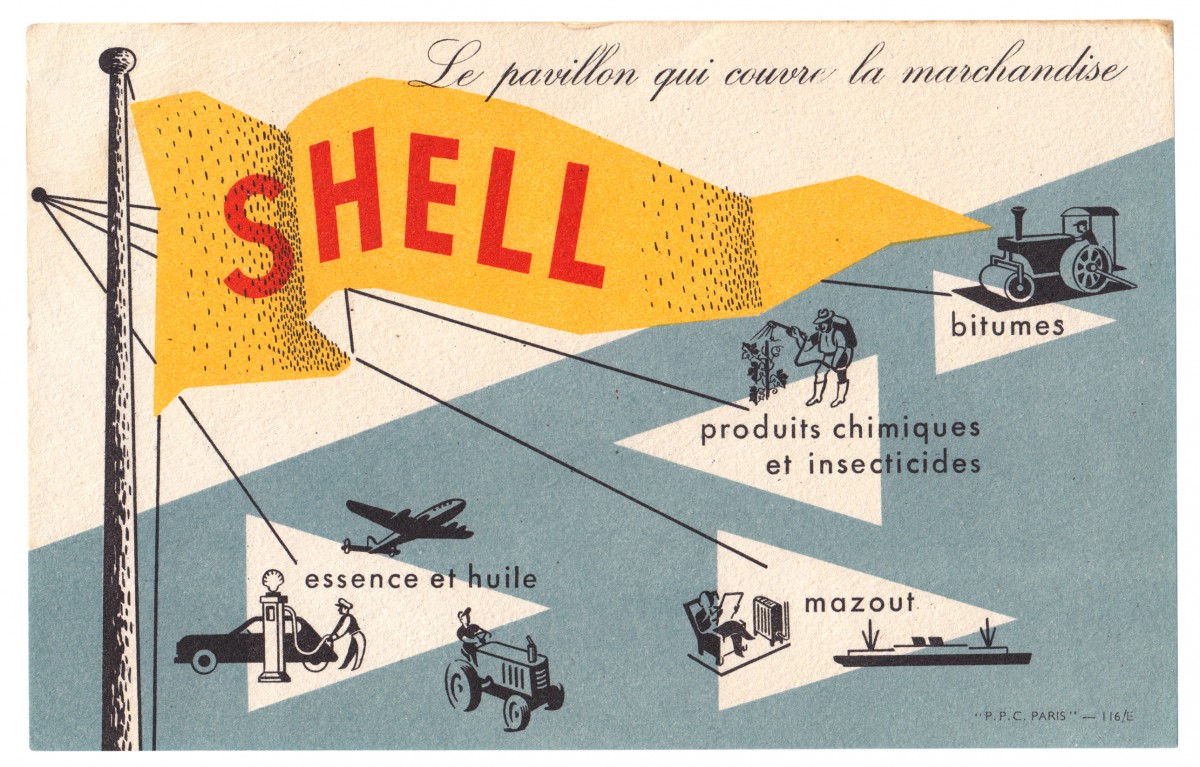
#144 - Shell promotional card, circa 1950s. Another gem from Paris.
It's advertising Shell's portfolio of products; so as well as the obvious petrol and oil, they supplied fuel oil, chemicals, insecticides and bitumen (asphalt).
I love everything about this little card; the colours, the pulpy uncoated stock that the ink has sunk into, the illustrations, the way the shading has been illustrated and the way they left the 'S' of Shell under the black layer of print to make it slightly darker too. The type and illustrations remind me of the instructional and educational charts from the same era. Shame I don't know who the illustrator/designer was.
Have a dig around in our reference box for more delicious ephemera...
https%3A%2F%2Fwww.deliciousindustries.com%2Ffrom-the-reference-box-144
Delicious+Industries%3A+From+the+reference+box+%23144


Welcome

Welcome to the Delicious Industries blog. We're an independent design studio based in Brighton, UK and this is our scrapbook packed full of design, illustration, photography & typography inspiration. Check out our work here.
Links
DELICIOUS FRIENDS
DELICIOUS FAVOURITES
- 50 Watts
- Acejet 170
- Grain Edit
- It's Nice That
- National Geographic Found
- Notcot
- Pretty Clever
- Retronaut
- So Much Pileup
- We Love Typography
- Another Mag