Blog: August 2009
Alexey Brodovitch Spreads
Anyway, I came accross these Harper's Bazaar spreads art directed by Alexey Brodovitch and was totally shocked by how dynamic and experimental they are. I'm familiar with the covers he art directed, as they're probably his most famous works, but I've never before seen his page layouts which really show the true depths of his talent.
Carmel Snow the editor-in-chief who hired Brodovitch, hoped his unique design style would refresh the magazine and set it apart from it's rivals, "I saw a fresh, new conception of layout technique that struck me like a revelation: pages that "bled" beautifully cropped photographs, typography and design that were bold and arresting". Taken from 'The world of Carmel Snow'' by Carmel Snow & Mary Louise Aswell, McGraw-Hill, 1962.
It's a shame fashion mags these days don't aspire to this level of design. They seem to achieve great heights with photography, but they leave little room for design with almost every inch of the page plastered in content. I think these spreads really show the value of white space and composition - less is more, people!
Images taken from Iconofgraphics.
https%3A%2F%2Fwww.deliciousindustries.com%2Falexey-brodovitch-spreads
Delicious+Industries%3A+Alexey+Brodovitch+Spreads
BLUE

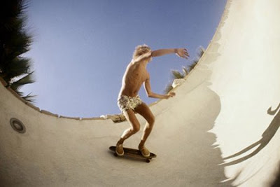
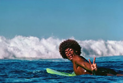
Brighton gallery, Crane Kalman has a great Summer exhibition running at the minute on the theme 'BLUE'. It incorporates work from some really great photographers; Slim Aarons, Rob Carter, Karine Laval, Christopher Morlinghaus, Wendy Pye and Morgan Silk (above), as well as a couple of our personal favourites, Hugh Holland (below top) and Jeff Divine (below bottom)...


The exhibition runs until 30 August, so if you are down at the seaside over the next few weeks take a detour and check it out!
Images copyright (top to bottom): Morgan Silk, Hugh Holland, Jeff Divine.
https%3A%2F%2Fwww.deliciousindustries.com%2Fblue
Delicious+Industries%3A+BLUE
Pigeon Pilfer by Michael Stevenson
Pigeon Pilfer from Michael Stevenson on Vimeo.
Pigeons are great, they're so funny! I love sitting at my local cafe on the seafront watching them terrorise tourists - trying to literally steal their food off their plates, it's hilarious!Michael Stevenson's stop motion film, Pigeon Pilfer captures their characteristics brilliantly. Created at San Francisco State University as part of his course, it took 4 months to make and used 60lbs of clay! It was all worthwhile though as it cam Runner up in Animation at the Sundial Film festival 2009 and was an official selection of the San Francisco United Film Festival 2009 and the Animation Block Party 2009.
Visit Pigeon Pilfer for more information about the making of the film.
Via Notcot.
https%3A%2F%2Fwww.deliciousindustries.com%2Fpigeon-pilfer-by-michael-stevenson
Delicious+Industries%3A+Pigeon+Pilfer+by+Michael+Stevenson
Auto Type III


More auto type - emblems, badges and signwriting from the 1066 Cruisers, Mid-Summer Picnic yesterday. I really like the 'Futura' badge from a 1964 Ford Falcon, especially the 'F'. I'll be uploading them to the Flickr group asap.
More auto type here and here. And some automotive industry logos from the 50's here.
https%3A%2F%2Fwww.deliciousindustries.com%2Fauto-type-iii
Delicious+Industries%3A+Auto+Type+III
From the reference box #48

#48 - Sunlight Soap Packaging. This Sunlight Soap packaging has unfortunately been opened out and the ends of the box are missing which is a shame. But the pic below shows how the complete pack should look...

When I bought it I estimated it was probably from the 50’s, however after a bit of research it seems it is much older. According to the Unilever timeline they introduced ‘Sunlight Flakes’ in 1899 and then changed their name to ‘LUX Flakes’ in 1900. This box advertises the ‘NEW Sunlight Flakes’ (in the yellow sash) and therefore must be from 1899!
Sunlight Soap was originally produced in 1884 by Lever Brothers, UK. It was designed for general household use and in particular washing clothes, making it “one of the first examples of a cleaning product being produced as a consumer commodity”, says Wikipedia. It was also one of the earliest internationally-marketed branded products!
These days Sunlight Soap has been replaced by man-made detergents in the laundry business, but it’s still available as a hand-wash soap in some European countries and is still a leading brand of dish-washing soap in Canada!
Complete package images from Advertising Antiques.
https%3A%2F%2Fwww.deliciousindustries.com%2Ffrom-the-reference-box-48
Delicious+Industries%3A+From+the+reference+box+%2348
Welcome

Welcome to the Delicious Industries blog. We're an independent design studio based in Brighton, UK and this is our scrapbook packed full of design, illustration, photography & typography inspiration. Check out our work here.
Links
DELICIOUS FRIENDS
DELICIOUS FAVOURITES
- 50 Watts
- Acejet 170
- Grain Edit
- It's Nice That
- National Geographic Found
- Notcot
- Pretty Clever
- Retronaut
- So Much Pileup
- We Love Typography
- Another Mag


