The Magnificent Chatwin Brothers

I came across these great, hand-printed wallpapers today and just want to buy rolls and rolls of them. They're based on old Navy tattoos and were created by the Magnificent Chatwin Brothers. Both designs are 3 colour prints; ‘Swallows’ (pink, petrol blue & white), ‘Skulls’ (black, white & pink) and are available from Beyond the Valley for £140 per 10 x 0.5m roll.
https%3A%2F%2Fwww.deliciousindustries.com%2Fthe-magnificent-chatwin-brothers
Delicious+Industries%3A+The+Magnificent+Chatwin+Brothers
Camera Tossing

This is fantastic, we've all moved our cameras around at night with the shutter open and got blurry trails of lights, but this takes it one step further. The phenomenon, known as 'Camera Tossing' seems to have started with a Flickr group, created by Ryan Gallagher, called Camera Toss. The group has currently has over 5000 members and over 3500 posted images.
The most common throwing techniques are apparently, "flipping end over end where the lens sweeps a full 360 degrees or more, spinning on the lens axis facing the subject, chaotic (a mixture of motion), and flat (simple up and down with as little rotation as possible)." I can see the news now, "Insurance companies across the country are baffled by a huge surge in camera related claims...".
Via Colour Lovers. Image by Clickykbd.
https%3A%2F%2Fwww.deliciousindustries.com%2Fcamera-tossing
Delicious+Industries%3A+Camera+Tossing
Animals on the Underground

Tube journeys will never be the same again, now I've seen Animals on the Underground. There are 32 to date, the first being the elephant spotted in 1988 by Paul Middlewick on his daily commute. Since then more and more animals have been spotted, and are still being spotted - they even have their own merchandise!
The site supports the work done by the International Fund for Animal Welfare (IFAW). They have teamed up to create promotional posters and campaign t-shirts to help 'Stop Whale & Seal Hunting' and to 'Ban Ivory trade' - 50% of all campaign t-shirt profits are donated to the charity.
Via It's Nice That.
https%3A%2F%2Fwww.deliciousindustries.com%2Fanimals-on-the-underground
Delicious+Industries%3A+Animals+on+the+Underground
From the reference box #9

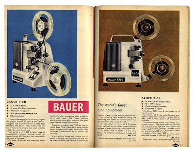
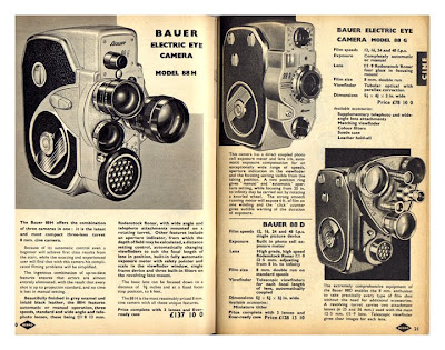

This was a carboot find a few years back and has been nestled in the reference box ever since. It's a 1961 Nebro Photographic Catalogue, mainly in black and white, but with a few colour pages. The product images and colour reproduction have a fantastic quality and there are some sweet little bits of type too.
There we have it #9 - 1961, Nebro Photographic Catalogue
https%3A%2F%2Fwww.deliciousindustries.com%2Ffrom-the-reference-box-9
Delicious+Industries%3A+From+the+reference+box+%239
Modern Toss: Museum of Urban Shit Naks

Modern Toss have created a 'Museum of Urban Shit Naks' to celebrate Brighton Fringe Festival, it includes a lifesize Alan, a selection of decorative wall-mounted ceramic Shit-Frisbees and a four hundred pound hand-knitted Book-Cosy.
You can see it in all it's glory at Ink-d, an independent Brighton gallery throughout this month.
https%3A%2F%2Fwww.deliciousindustries.com%2Fmodern-toss-museum-of-urban-shit-naks
Delicious+Industries%3A+Modern+Toss%3A+Museum+of+Urban+Shit+Naks
From the reference box #8

We have a great collection of fruit labels here at Delicious - here are some of our favourites. The detail is fantastic and the bold graphics, bright colours and simple print give them a lovable charm - who wouldn't want to collect them?
#8 - Selection of fruit labels
https%3A%2F%2Fwww.deliciousindustries.com%2Ffrom-the-reference-box-8
Delicious+Industries%3A+From+the+reference+box+%238
Visions of America at Crane Kalman
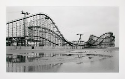
If you do pop down to the coast for the Brighton Festival make sure you visit photography gallery, Crane Kalman situated in the heart of the lanes. Throughout May until the 8 June they are running, ‘Visions of America’ an exhibition showcasing work from Jeff Liao and Christoph Morlinghaus.
I love the contrast of these two collections shown together, Liao’s images are very raw and colourful, whereas Morlinghaus captures a nostalgic faded glory in his black and white images, as shown above in ‘Great White 2, 2007’. Take a look, you won’t be disappointed.
https%3A%2F%2Fwww.deliciousindustries.com%2Fvisions-of-america-at-crane-kalman
Delicious+Industries%3A+Visions+of+America+at+Crane+Kalman
Artizan Editions at Castor + Pollux

Brighton Gallery, Castor + Pollux are hosting a great exhibition, ‘Artizan Editions: A printmaking retrospective’ as part of the Brighton Festival Fringe 3 – 26 May. The exhibition is a retrospective of the publishers and proponents of original art in print - Artizan Editions.
We were lucky enough to have a sneak preview at the weekend and it really is a great collection of work from printmaking greats like Bridget Riley and Brian Rice . Plus it’s right on the beach – what more could you want?
https%3A%2F%2Fwww.deliciousindustries.com%2Fartizan-editions-at-castor-pollux
Delicious+Industries%3A+Artizan+Editions+at+Castor+%2B+Pollux
From the reference box #7

You've got to love this - advertising in it's simplest form. Some kids in the local area started a car washing business last Summer and popped these on all the cars.
Exhibit #7 - Hand written car wash flyer
https%3A%2F%2Fwww.deliciousindustries.com%2Ffrom-the-reference-box-7
Delicious+Industries%3A+From+the+reference+box+%237
Christian Hückstädt Collages


We love the work of German, illustrator Christian Hückstädt, especially his corrugated card and vegetable collages, they're really clever and guaranteed to make you smile.
https%3A%2F%2Fwww.deliciousindustries.com%2Fchristian-hueckstaedt-collages
Delicious+Industries%3A+Christian+H%C3%BCckst%C3%A4dt+Collages
Cartoon character who's who?
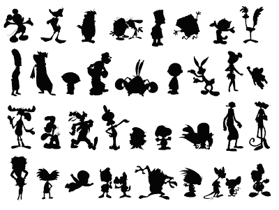
I saw this over on Jinx the Monkey earlier - it's a silhouette game created by Bob Flynn to show how recognisable cartoon characters are, even in this form, due to their strong design.
It's good fun, but it drove me crazy - I know most of them, but some, I have no idea and more irritating is that some of the ones I do recognise, I can't remember the names of!
https%3A%2F%2Fwww.deliciousindustries.com%2Fcartoon-character-whos-who
Delicious+Industries%3A+Cartoon+character+who%26%23039%3Bs+who%3F
Live Now Posters

Eric Smith has created these great posters and is selling them in aid of Live Strong, the Lance Armstrong Foundation. They are for sale on his website, I Draw All Day for only $12.95 + postage, so why not brighten up your office and help a worthy cause!
https%3A%2F%2Fwww.deliciousindustries.com%2Flive-now-posters
Delicious+Industries%3A+Live+Now+Posters
Found typography #1

I love this packaging, especially the 'Glico' type. Found on a discarded box outside an Oriental food store in Hove, East Sussex.
https%3A%2F%2Fwww.deliciousindustries.com%2Ffound-typography-1
Delicious+Industries%3A+Found+typography+%231
Typographic Welcome Mat


These typographic rugs are brilliant. They are hand-cut from felt by John Agelii and are available in a range of colours from John Pour Home.
https%3A%2F%2Fwww.deliciousindustries.com%2Ftypographic-welcome-mat
Delicious+Industries%3A+Typographic+Welcome+Mat
From the reference box #6

How great are these old Hoover Electric Washing Machine Instructions? We have a collection of vintage instruction cards and this is one of our favourites. The colour, the quality of the print and the detail of the illustrations are fantastic and for the amount of information on there, it is really well designed.
#6 then - Hoover, Electric Washing Machine Instruction Card
https%3A%2F%2Fwww.deliciousindustries.com%2Ffrom-the-reference-box-6
Delicious+Industries%3A+From+the+reference+box+%236
Welcome
Welcome to the Delicious Industries blog. We're an independent design studio based in Brighton, UK and this is our scrapbook packed full of design, illustration, photography & typography inspiration. Check out our work here.
Links
DELICIOUS FRIENDS
DELICIOUS FAVOURITES
- 50 Watts
- Acejet 170
- Grain Edit
- It's Nice That
- National Geographic Found
- Notcot
- Pretty Clever
- Retronaut
- So Much Pileup
- We Love Typography
- Another Mag

