art direction, design + typography
Lasse Skarbovik at Castor + Pollux

Hope you all had a lovely Easter Bank Holiday weekend. We kicked ours off in fine style Good Friday evening at the Castor + Pollux preview (pics below) of Norwegian graphic artist and muralist, Lasse Skarbovik's paintings and prints.
Lasse Skarbovik currently works and lives in Stockholm where he's part of the Stockholm Illustration Collective. His fun, graphic illustrations that have graced the pages of the New Yorker, TIme Magazine and The Economist will be exhibited throughout the Brighton Festival (until 30 May). But don't worry if you can't make it down to Brighton - many of the prints are available to buy in their online store.


Image copyright Lasse Skarbovik.
Gallery images copyright Castor + Pollux.
https%3A%2F%2Fwww.deliciousindustries.com%2Flasse-skarbovik-at-castor-pollux
Delicious+Industries%3A+Lasse+Skarbovik+at+Castor+%2B+Pollux
From the reference box #104


#104 - Vintage OXO tin, but no ordinary OXO tin! No, this one is a souvenir celebrating the Coronation of Her Majesty Queen Elizabeth II, 2 June 1953 - "LONG MAY SHE REIGN".
Whilst everyone seems to have Royal Wedding fever I thought it only fitting to share this fabulous little tin. It's not in the best condition, but I love it's kitschness - there's even a timeline of the Queens life on the inside of the lid (below).

If you get bored over the Bank Holiday (or any day really) make a cuppa and have a good look through our reference box.
https%3A%2F%2Fwww.deliciousindustries.com%2Ffrom-the-reference-box-104
Delicious+Industries%3A+From+the+reference+box+%23104
It Pays to Advertise - The Answers!

https%3A%2F%2Fwww.deliciousindustries.com%2Fit-pays-to-advertise-the-answers
Delicious+Industries%3A+It+Pays+to+Advertise+-+The+Answers%21
From the reference box #103

#103 - Vintage Pepys Party Game (Castell Brothers) 'It Pays to Advertise'.
This quirky game has been in the reference box for quite a while and unfortunately most of the cards are missing. As far as I can tell it's from the late 50's, players had to write down the product the characters are associated with as well as filling in the missing words in the famous slogans.
So, are you ready for a just-for-fun Friday game (answers on Monday)...


https%3A%2F%2Fwww.deliciousindustries.com%2Ffrom-the-reference-box-103
Delicious+Industries%3A+From+the+reference+box+%23103
Your Bets Mate
Our friends Sell! Sell! have just launched a great TV campaign, 'Your Bets Mate' for the new Racing Post App.
The 3 ads - 'Lederhosen', 'Snake charmer' (above) and 'cow' feature quirky clips of Getty library footage pieced together with shot scenes that match closely (but not that closely!).
They're a refreshing change, entertaining and funny - check out the full campaign here.
https%3A%2F%2Fwww.deliciousindustries.com%2Fyour-bets-mate
Delicious+Industries%3A+Your+Bets+Mate
Draplin's Show and Tell


It's reassuring to know I'm not the only person with drawers full of what most people would call 'old crap', but that I call 'design reference'.
The images above are stills from Level Mag's Show and Tell with Portland's renowned graphic designer, Aaron Draplin of Draplin Design Co.
Filmed by Jared Sourney whilst video-documenting Draplin for a snowboard website, the clip shows, "a guided peak into the big man’s drawers of dirty delights"!
Watch the full video here.
Stills/footage copyright Level Mag.
Via Notcot.
https%3A%2F%2Fwww.deliciousindustries.com%2Fdraplins-show-and-tell
Delicious+Industries%3A+Draplin%26%23039%3Bs+Show+and+Tell
Wim Crouwel: A Graphic Odyssey


The Design Museum, London are currently showing the UK's first retrospective of Dutch designer Wim Crouwel's work, Wim Crouwel: A Graphic Odyssey. An exhibition showcasing posters, print, typography and exhibition design from his 60 year of his career.
Crouwel is recognised for his love of grids and typographic systems to create dynamic, experimental work. "Regarded as one of the leading designers of the twentieth century, Crouwel embraced a new modernity to produce typographic designs that captured the essence of the emerging computer and space age of the early 1960s".
Wim Crouwel: A Graphic Odyssey runs until 3 July 2011. A set of 5 limited edition 'C' prints (above) designed exclusively for the Design Museum by Spin are available here throughout the exhibition.
Images copyright of the Design Museum.
https%3A%2F%2Fwww.deliciousindustries.com%2Fwim-crouwel-a-graphic-odyssey
Delicious+Industries%3A+Wim+Crouwel%3A+A+Graphic+Odyssey
Qantas Travel Posters


Here's some fabulous Monday inspiration in the form of 50's and 60's Qantas Travel Posters designed by William F Schey and Harry Rogers.
The full range can be seen here.
Images copyright GMJames.
Via Stickers and Stuff.
https%3A%2F%2Fwww.deliciousindustries.com%2Fqantas-travel-posters
Delicious+Industries%3A+Qantas+Travel+Posters
No time for average Joes!

Our lovely friends over at Sell! Sell! are on the look out for a new account/project manager. They're after someone with zero to two years experience, but don't have time for average Joes.
If this sounds like the job for you, read more about it here and download an application form here.
Good luck!
https%3A%2F%2Fwww.deliciousindustries.com%2Fno-time-for-average-joes
Delicious+Industries%3A+No+time+for+average+Joes%21
From the reference box #102


#102 - more vintage tins, small but perfectly formed!
The Songster Gramaphone Needles tin (top) is my favourite of this bunch. All that detailed design, illustration and typography on such a small tin - it's easy to see why they have become so desirable in recent years.
I think the Snowfire Jelly tin (middle) is from the 1940's - Snowfire Jelly was a hand cream, "for beautiful hands".
The QA Brand Tablet tin (bottom) is really, really small - only 25mm high and 12mm in diameter. QA Brand "quick acting Asprin" were produced by Thompson & Capper, a homeopathic chemist company based in Liverpool.
As always, there's lots more vintage packaging and ephemera in the reference box if you feel like a root around.
https%3A%2F%2Fwww.deliciousindustries.com%2Ffrom-the-reference-box-102
Delicious+Industries%3A+From+the+reference+box+%23102
More Vintage Packaging


There's nothing better on a Monday morning than some vintage packaging! This wonderful selection is from Neato Coolville's Vintage Packaging Flickr set.
My favourite is the little 1960's box for Rediplete Pediatric Syrup (above) made by Merck Sharp & Dohme - it's such a clever, fun design.
It's a great collection, which is definitely worth a look. Here are a few more that caught my eye...
My favourite is the little 1960's box for Rediplete Pediatric Syrup (above) made by Merck Sharp & Dohme - it's such a clever, fun design.
It's a great collection, which is definitely worth a look. Here are a few more that caught my eye...


https%3A%2F%2Fwww.deliciousindustries.com%2Fmore-vintage-packaging
Delicious+Industries%3A+More+Vintage+Packaging
The Movie Title Stills Collection


The Movie Title Stills Collection is a fantastic online resource for movie titles and end frames. Collated by designer Christian Annyas, the collection ranges from the early 1920's to the present day and can be viewed by decade or by 'Western' and 'Film Noir' genres.
There's plenty to look through - some are old classics, others are more obscure, some are bold and minimal, others are charmingly ornate, but they all have great typography. Enjoy.
Via our friends, Sell! Sell!
Images copyright The Movie Title Stills Collection.
https%3A%2F%2Fwww.deliciousindustries.com%2Fthe-movie-title-stills-collection
Delicious+Industries%3A+The+Movie+Title+Stills+Collection
From the reference box #101


#101 - Vintage tins. There can never be enough vintage tins in the reference box! My favourite of this little lot is the John Bull, Mend-a-tear one (top) with it's stripey-edged lid. You can't really tell in the pic, but it has a lovely pale grey background. I really love the Ogden's and Bondman type too.
If vintage tins and ephemera are your thing - make a cup of tea, grab a biscuit and have a root through our reference box.
https%3A%2F%2Fwww.deliciousindustries.com%2Ffrom-the-reference-box-101
Delicious+Industries%3A+From+the+reference+box+%23101
We are 3!

Today we're celebrating 3 years of our Delicious blog.
It's been a busy, fun-packed few years, we've made lots of new friends and been exposed to fantastic opportunities. So we'd just like to say a huge thanks for all your support and for continuing to stop by.
Here's to the next inspiration filled year!
https%3A%2F%2Fwww.deliciousindustries.com%2Fwe-are-3
Delicious+Industries%3A+We+are+3%21
Auto Type XI


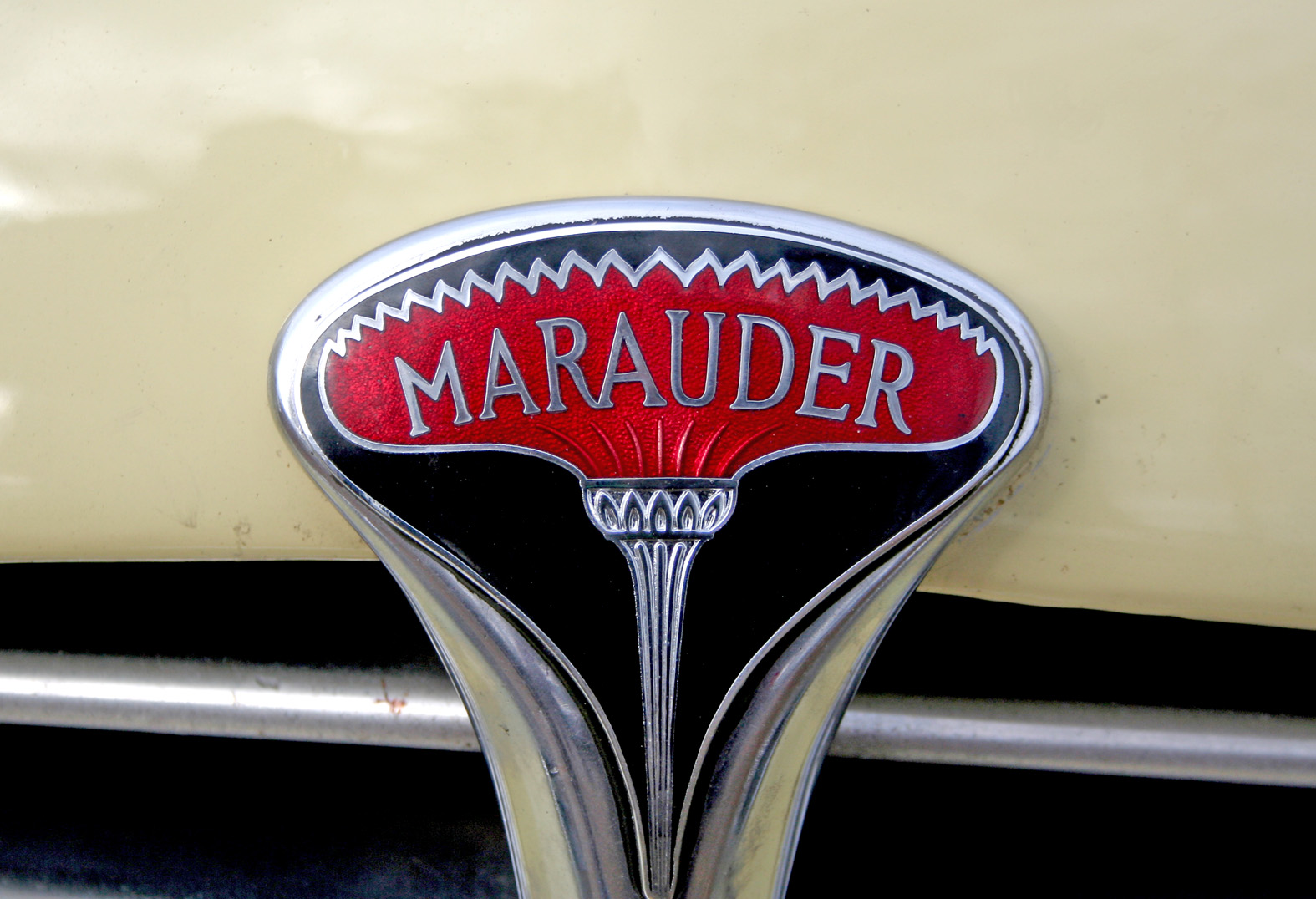


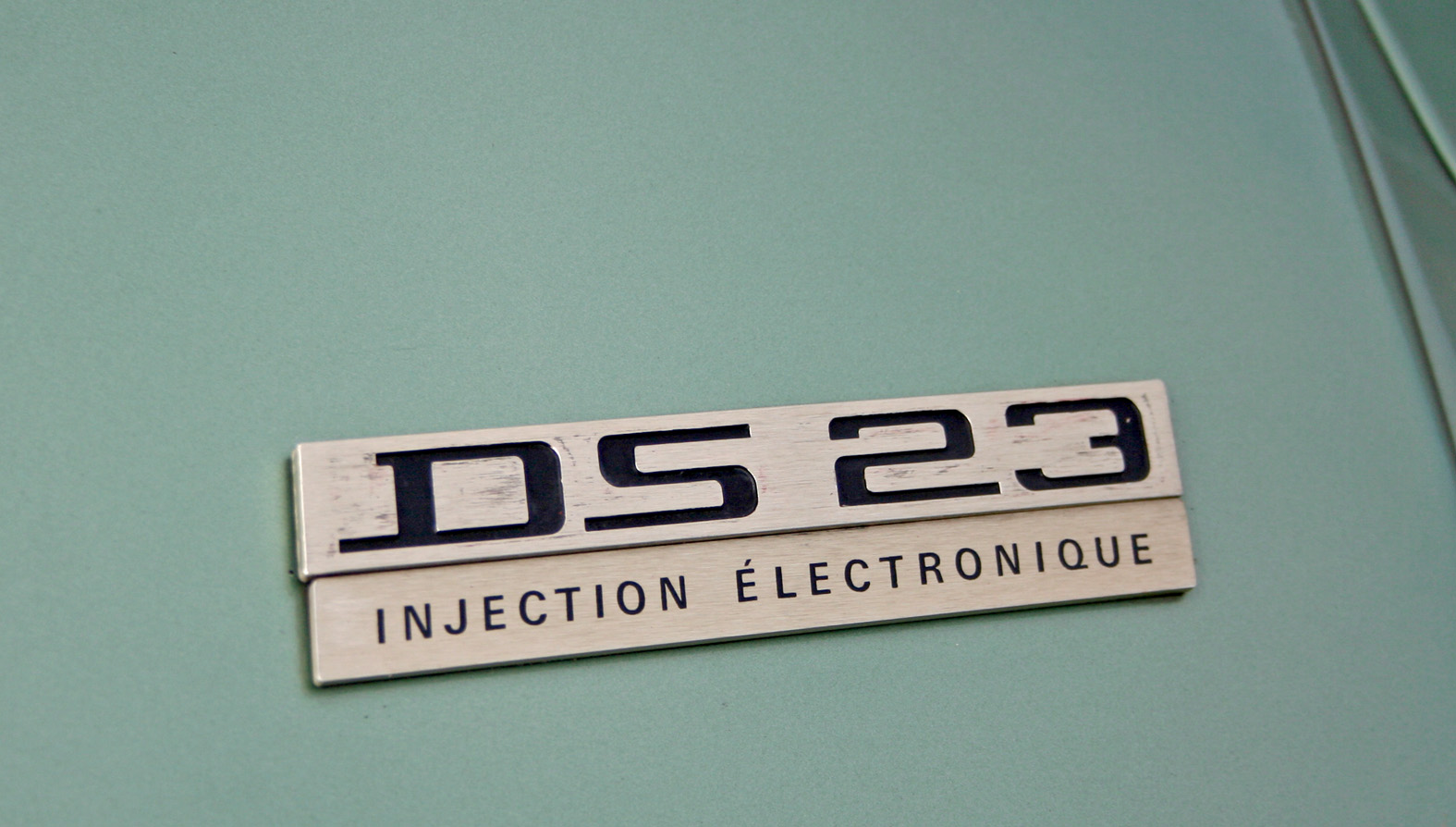


Auto Type XI - more fabulous Auto Type, taken on Sunday at the first Goodwood Breakfast Club of the year. The sun was shining and as you can see it brought out some mighty fine automobiles.
See lots more Auto Type and Automobilia here.
https%3A%2F%2Fwww.deliciousindustries.com%2Fauto-type-xi
Delicious+Industries%3A+Auto+Type+XI
Welcome

Welcome to the Delicious Industries blog. We're an independent design studio based in Brighton, UK and this is our scrapbook packed full of design, illustration, photography & typography inspiration. Check out our work here.
Links
DELICIOUS FRIENDS
DELICIOUS FAVOURITES
- 50 Watts
- Acejet 170
- Grain Edit
- It's Nice That
- National Geographic Found
- Notcot
- Pretty Clever
- Retronaut
- So Much Pileup
- We Love Typography
- Another Mag