art direction, design + typography
Blog: Ephemera
The birth of Windfall magazine
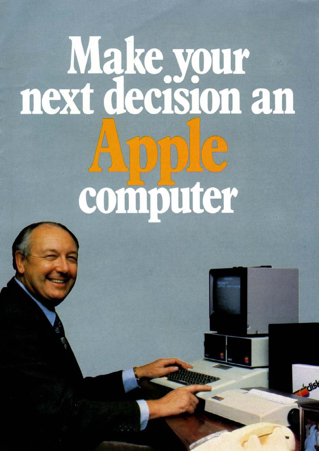
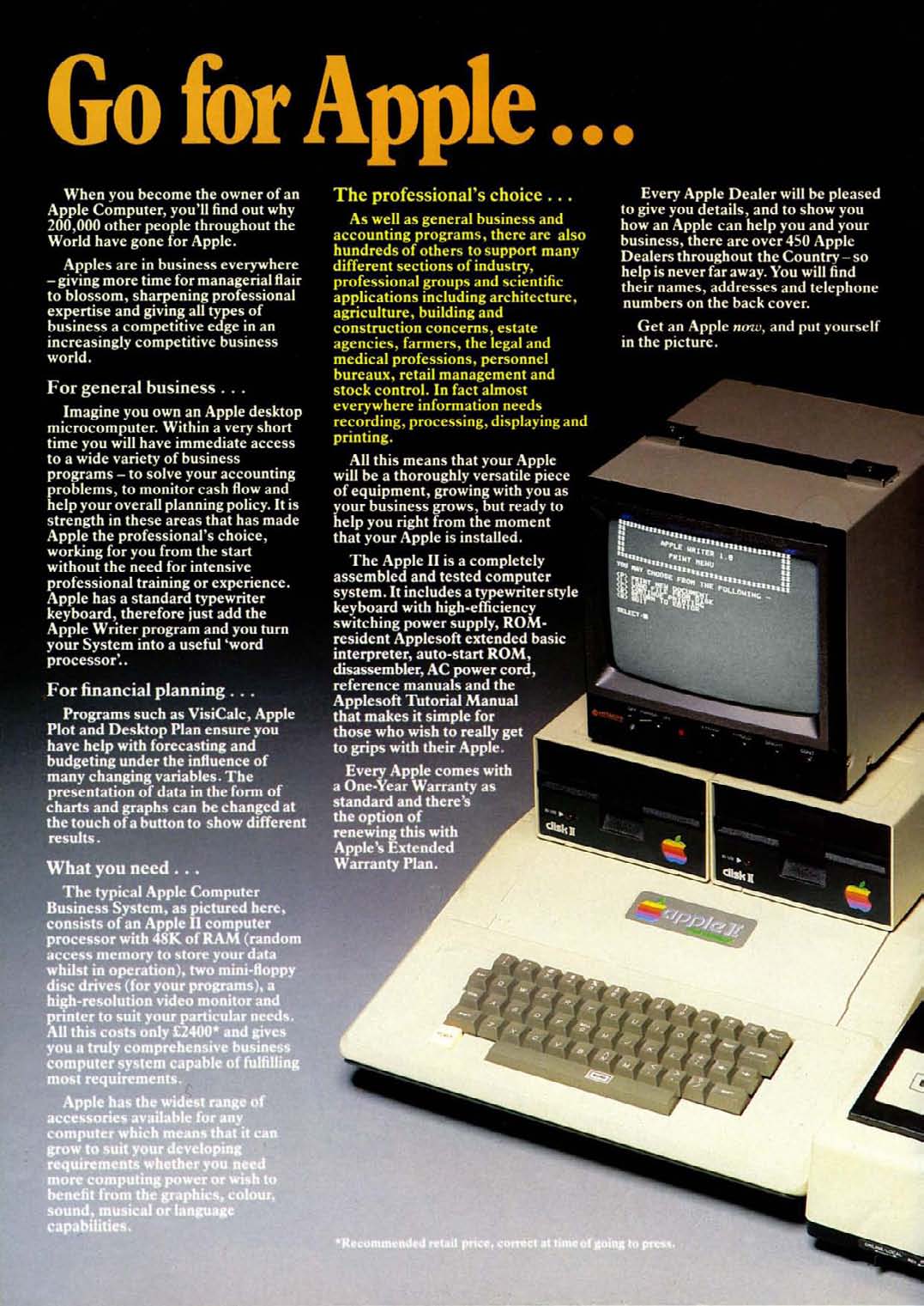
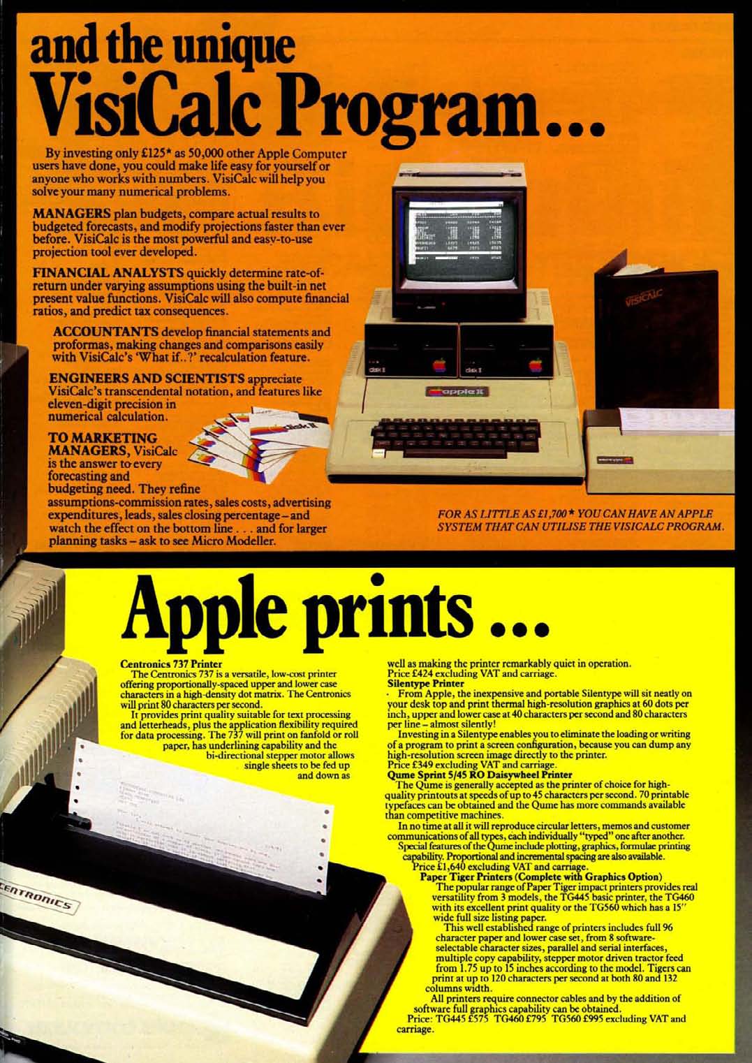
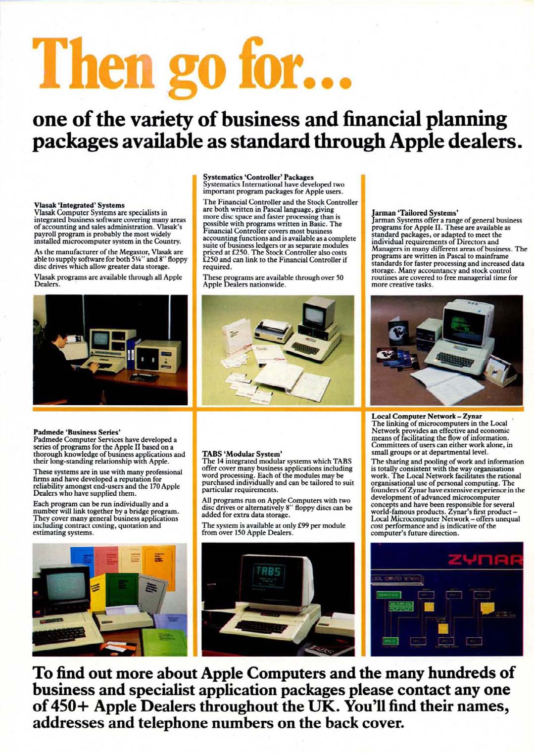
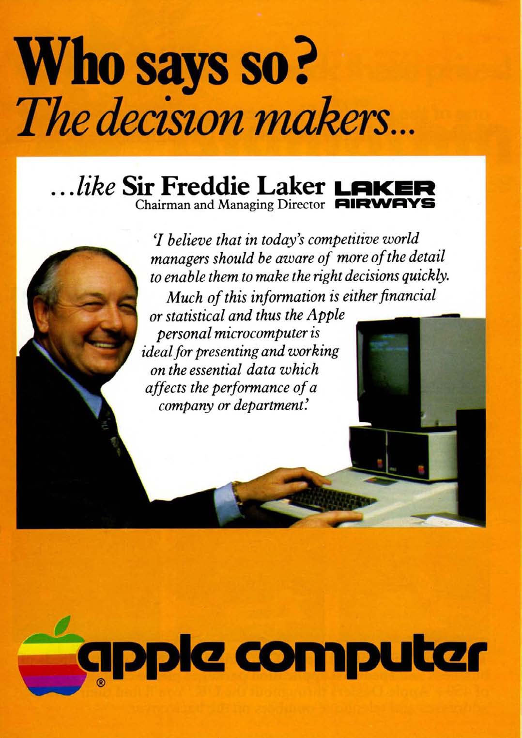
Back in 2008 I posted about Windfall magazine (the predecessor to Apple User) after finding a few copies on a boot sale. The post sparked comments from quite a few of the original Windfall editorial team adding their recollections. Fast-forward to earlier this year and I had the pleasure of receiving an email from Peter F Bramfeld, sharing with me his memories of the birth of Windfall magazine, the people involved in its early development and some of his collection of early Apple marketing.
Here's the story in Peter's own words...
Hello all,
I have just stumbled across this thread and feel that I can add some background to what has already been quoted above [comments on the original post], as I am 75 years old I thought I should attempt to make this contribution before life takes its natural course.
Early 1980 whilst I was working as an experimental officer at UMIST, I received funding to purchase a personal computer. Everyone else had gone for Commodore pets, but I was attracted by the ease of interfacing external devices to the Apple 2, so I use my funding to buy an Apple.
At that time there was a national Commodore user's club, but there was no such organisation for the users of Apple, so I decided that I would start one, the Manchester Evening News got hold of the activity, via the PR department of the University, which resulted in the rather grandiose headline in the evening news "Manchester University shows American company how to use their technology".
I decided that I would advertise for Apple users to attend an evening meeting at the University so we could have a meeting of minds, at that meeting I suggested a subscription of £10 a year to the user group, for which each member would receive a monthly magazine.
The initial meeting far exceeded our expectations, and it was attended by over 200 people, at the end of the meeting I had loads of money, but an obligation to publish a magazine.
I was supported in my endeavours by my good friend and fellow university employee, Max Parrott, Max and I struggled to write the first couple of monthly magazines. In the audience had been one Derek Meakin, he approached us and said he would produce the magazine for nothing if we would supply the editorial, well this was Manna from Heaven, in addition we were both offered a fee of £100 a month for our trouble, life is too good to be true!
In the fullness of time I left the university, and joined Derek making as editor-in-chief, and from the beginning of Windfall grew a computer specific magazine stable of I think seven titles.
As to who deserves the accolade of the person responsible for the magazine, I feel that belongs to myself, and my colleague Max Parrott. David was the first editor and indeed was responsible for setting the editorial tone which was very successful in ensuring the magazine appealed to a wide readership.
If anyone would like to contact me as a consequence of this posting I would love to hear from them.
Peter F Brameld
If any of the original team wish to contact Peter, please get in touch with me and I will pass along his details as he has requested.
https%3A%2F%2Fwww.deliciousindustries.com%2Fthe-birth-of-windfall-magazine
Delicious+Industries%3A+The+birth+of+Windfall+magazine
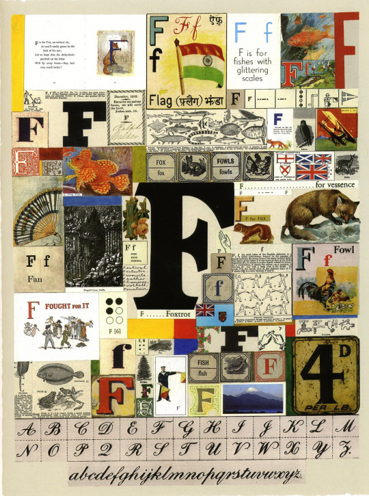
Alphabets, Letters & Numbers
Pin this on Pinterest
 View large image
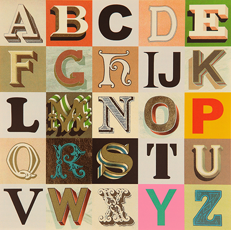
Appropriated Alphabet no.7 (2013) © Peter Blake. Courtesy CCA Gallery, London
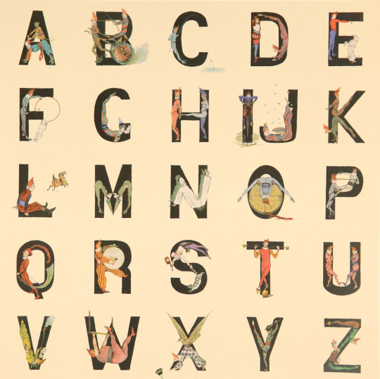
Peter Blake at the De La Warr Pavilion.
Blake has personally curated Alphabets, Letters and Numbers to showcase three series of editions: Alphabet (1991) a 26 piece series of silk screen prints with a print for each letter of the alphabet - I is for Idols ("a collage of screen legends, artists and musicians"), An Alphabet (2007) a series of found ephemera, illustration and handwritting collages - one for each letter of the alphabet. , and Appropriated Alphabets (2013) a series consisting of 12 individually collated alphabets.
"Throughout his long and prestigious career Blake has created several series of works based around the alphabet related to his enduring interest in childhood innocence and nostalgia, and Victorian and Edwardian graphic illustration. Using vintage cards, magazines, books and other found ephemera, he assembles collages that are at once whimsical, humorous and fascinating. He began using found letters and commercial lettering in the 1950s and, as a young artist, allied himself with decorators, sign painters and commercial artists."
The exhibition is free and runs until Sunday 27 November 2016. You know it's also the rule when you visit the De La Warr that you have to have a cream tea sat out on the terrace!
Mon 10 Oct 2016
Posted under: Design , Typography , Ephemera , Prints , Things to buy , Illustration , Exhibition , Found typography
https%3A%2F%2Fwww.deliciousindustries.com%2Falphabets-letters-numbers
Delicious+Industries%3A+Alphabets%2C+Letters+%26amp%3B+Numbers
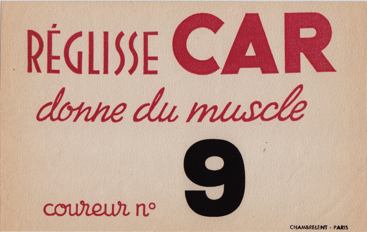
From the reference box #145
#145 - more beautiful Parisian vintage ephemera.
I love the quality of this little card. It's quite a thick, textured stock which, gives the print a lovely texture too and as you can see it is very agedaround the edges but that just adds to it's charm.
With my bad French and the help of Google translate, I think it's some sort of sponsored competitor's card which reads, 'Because liquorice gives muscles. Rider No.9. Chambrelent, Paris', but i could be very, very wrong!
Have a look at some of out other ephemera gems here.
https%3A%2F%2Fwww.deliciousindustries.com%2Ffrom-the-reference-box-145
Delicious+Industries%3A+From+the+reference+box+%23145
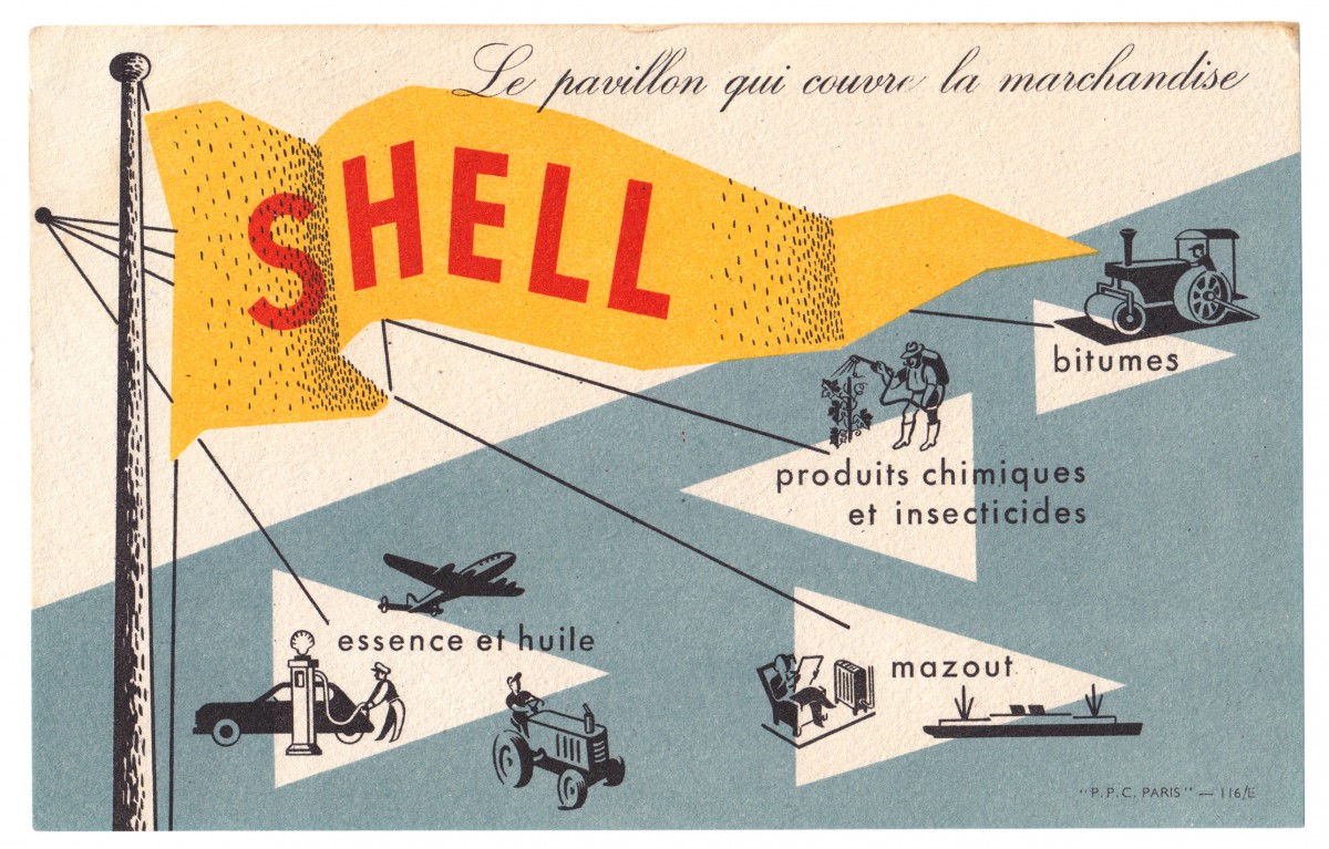
From the reference box #144
#144 - Shell promotional card, circa 1950s. Another gem from Paris.
It's advertising Shell's portfolio of products; so as well as the obvious petrol and oil, they supplied fuel oil, chemicals, insecticides and bitumen (asphalt).
I love everything about this little card; the colours, the pulpy uncoated stock that the ink has sunk into, the illustrations, the way the shading has been illustrated and the way they left the 'S' of Shell under the black layer of print to make it slightly darker too. The type and illustrations remind me of the instructional and educational charts from the same era. Shame I don't know who the illustrator/designer was.
Have a dig around in our reference box for more delicious ephemera...
https%3A%2F%2Fwww.deliciousindustries.com%2Ffrom-the-reference-box-144
Delicious+Industries%3A+From+the+reference+box+%23144
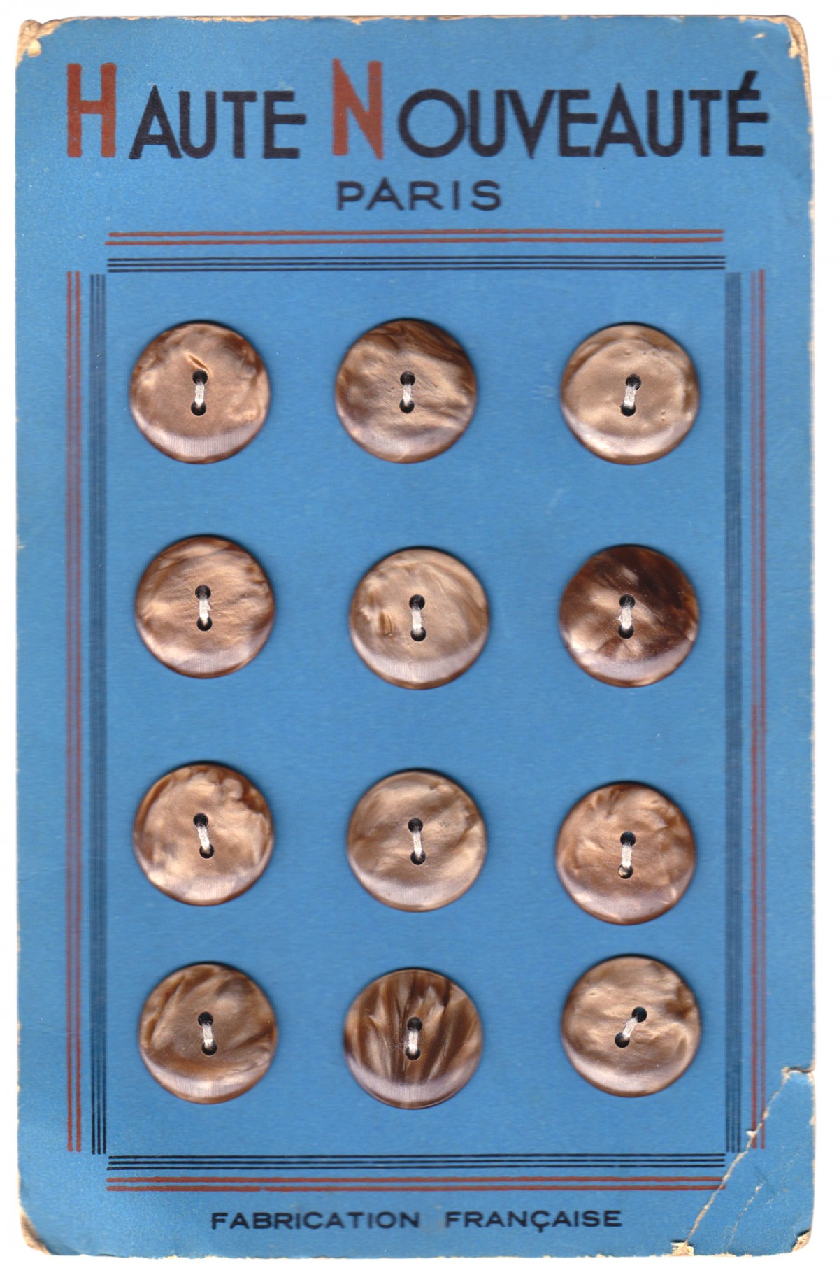
From the reference box #143
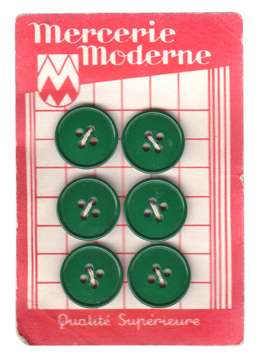
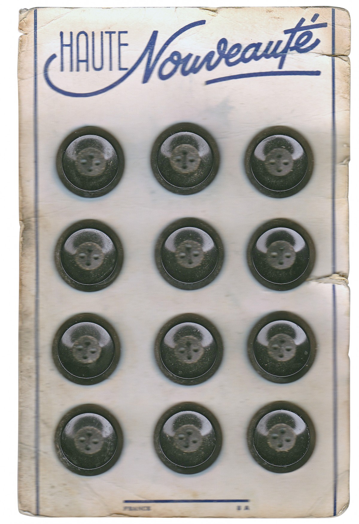
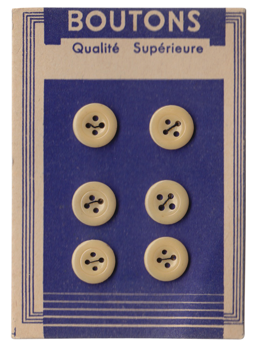
#143 - French Button display cards, circa 1940/1950. These lovely vintage button cards are from the Brighton street market and only £1 per card!
The lettering is fantastic and I bought them for that alone - I love the scripty 'Nouveauté' on the white card (third from top), it has such a Parisian feel as does the 'Haute Nouveauté' on the blue card (top) with it's ascending A's and quirky E's.
I feel another collection starting!
https%3A%2F%2Fwww.deliciousindustries.com%2Ffrom-the-reference-box-143
Delicious+Industries%3A+From+the+reference+box+%23143
From the reference box #142
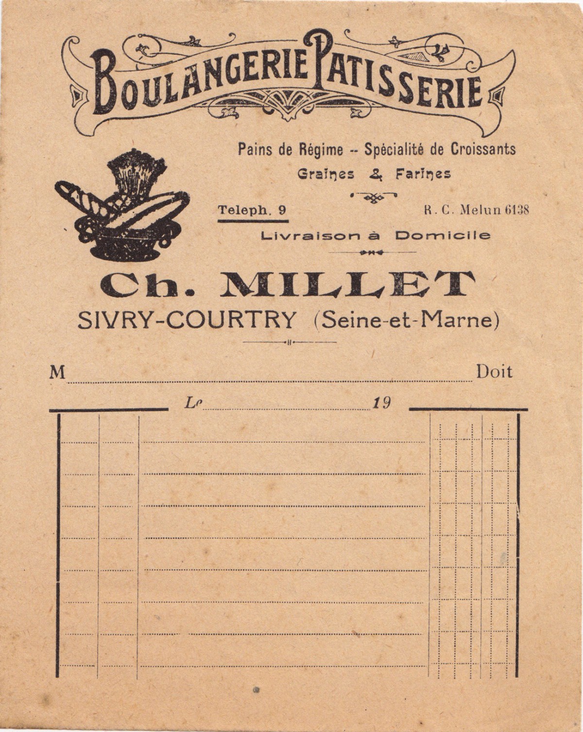
#142 - Vintage Boulangerie Patisserie receipt, "Pains de Régime - Specialité de Croissants, Graines & Farines".
A new addition to the reference box - this is the first of my Paris ephemera haul from the Marché aux Puces (flea markets).
It's a letter-pressed receipt probably from around the early 1900s. If only receipts were this elaborate today, shopping would be much more fun!
https%3A%2F%2Fwww.deliciousindustries.com%2Ffrom-the-reference-box-142
Delicious+Industries%3A+From+the+reference+box+%23142
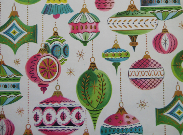
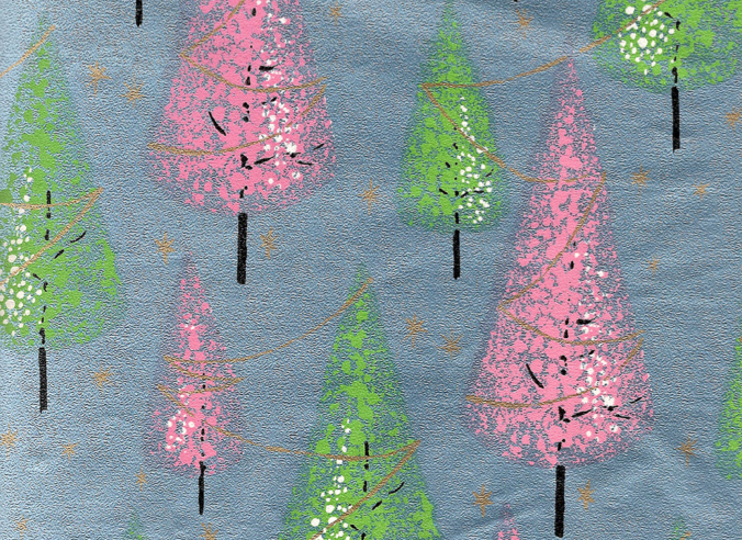
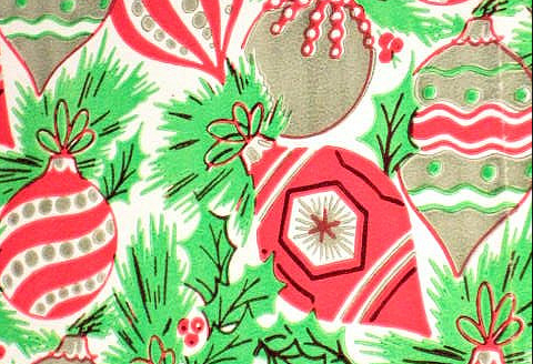
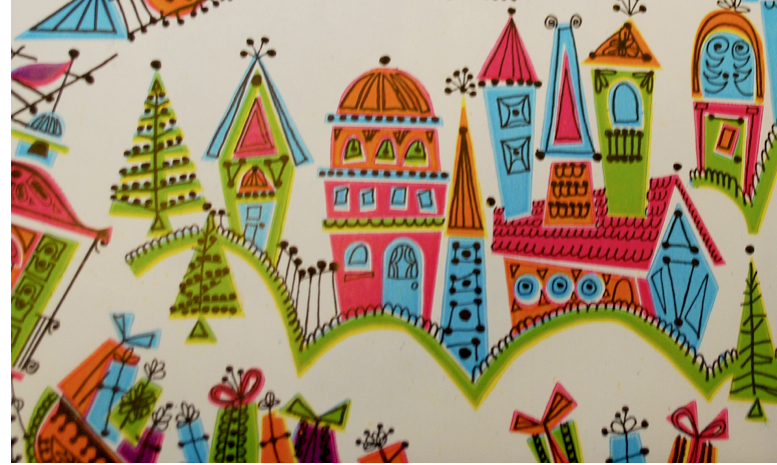
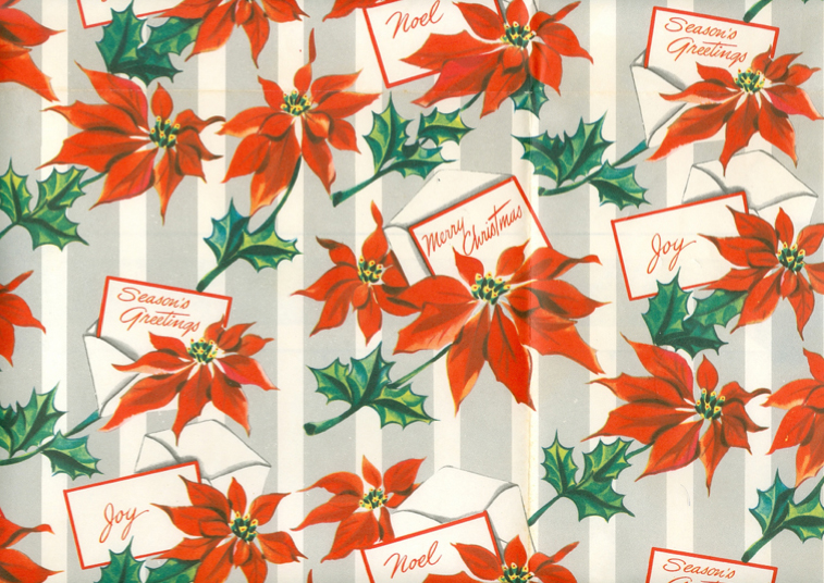
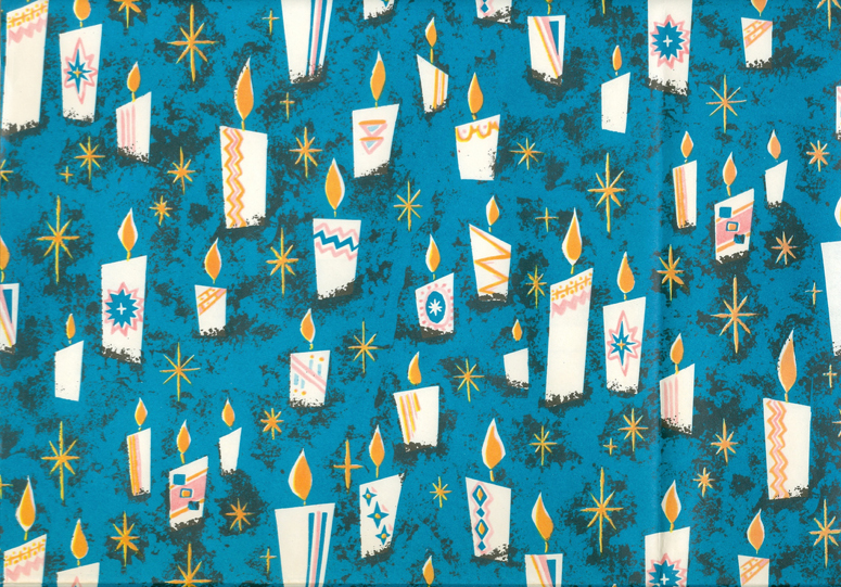
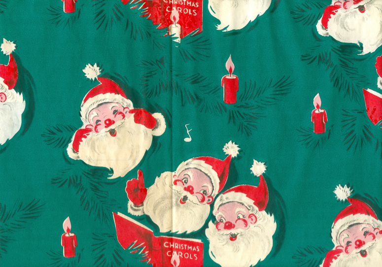
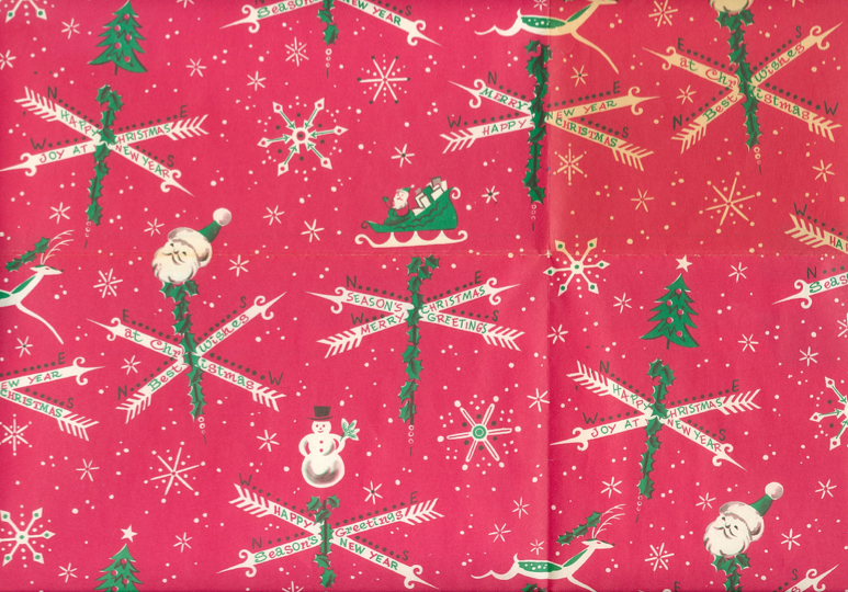
Vintage Christmas Wrap
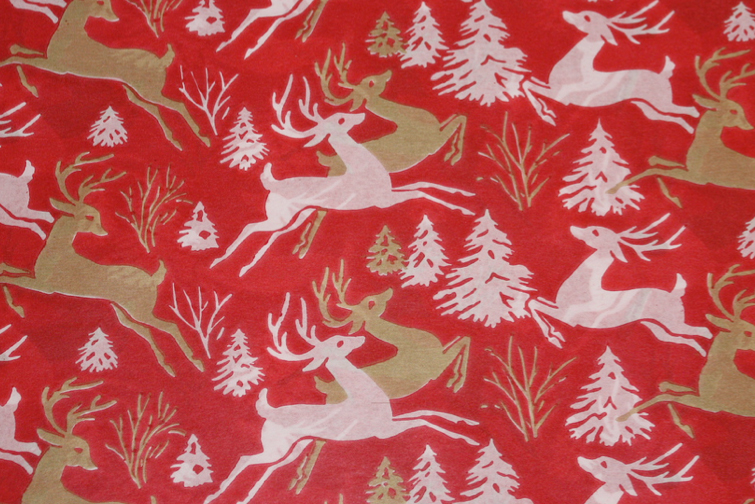
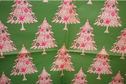
I know you're probably sick of the sight of gift wrap at the minute, but this collection of vintage Christmas wrap from the deepest depths of Flickr is so gorgeous, I'm sure it will restore your festive cheer.
https%3A%2F%2Fwww.deliciousindustries.com%2Fvintage-christmas-wrap
Delicious+Industries%3A+Vintage+Christmas+Wrap
From the reference box #141
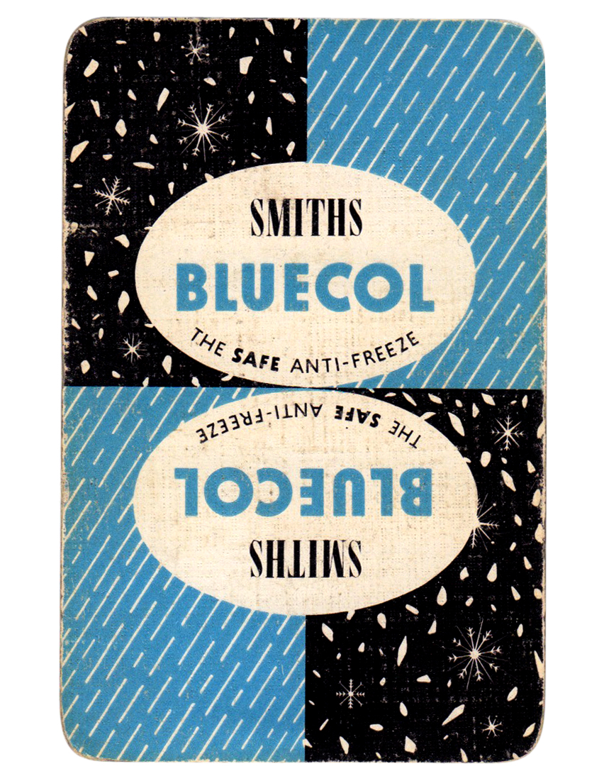
#141 - Smiths Bluecol playing card, circa 1950.
Not sure why an anti-freeze company would produce playing cards, but I'm glad they did. The sleet and snow illustrations are beautiful - the snowflakes are so fine and delicate.
Check out the other 140 pieces of ephemera stashed away in our reference box here.
https%3A%2F%2Fwww.deliciousindustries.com%2Ffrom-the-reference-box-141
Delicious+Industries%3A+From+the+reference+box+%23141
From the reference box #140
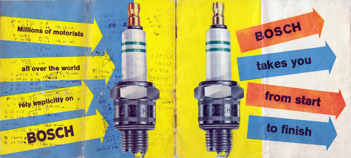
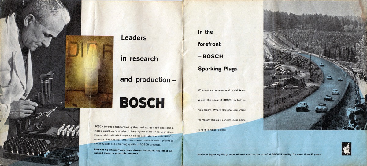
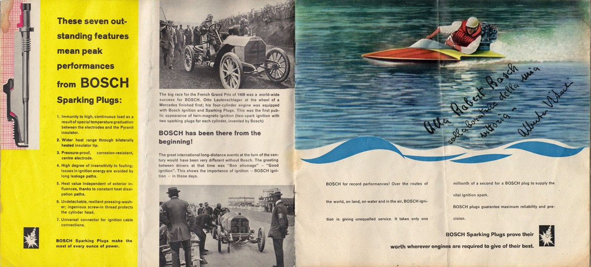
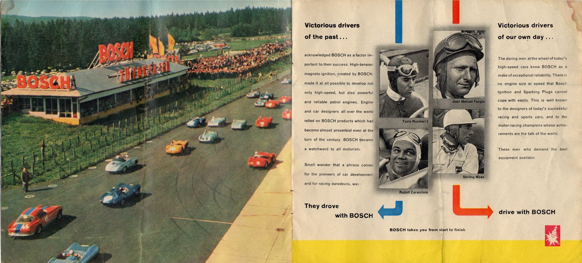
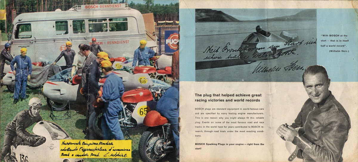
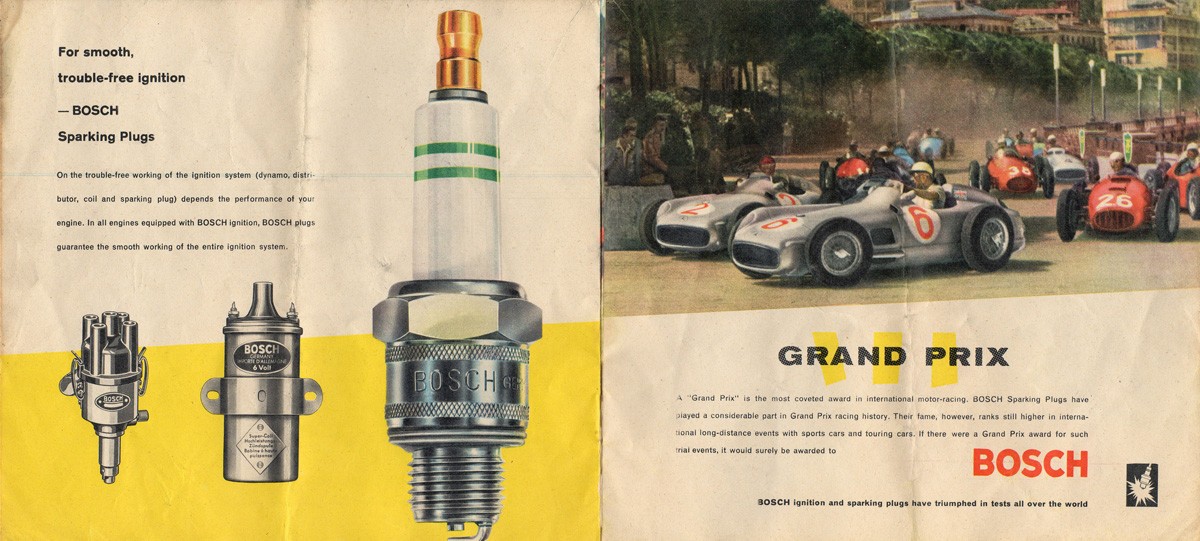
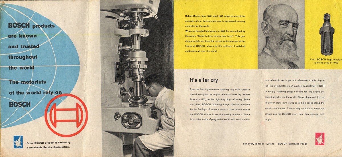
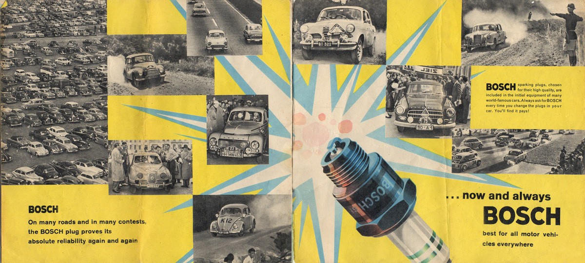
#140 - A rather gorgeous 1960s Bosch spark plug brochure - 'Bosch takes you from start to finish'.
This 16pp brochure highlights the advantages of Bosch spark plugs and backs it up with examples of motorsport success from Grand Prix winning vehicles to land speed records.
There are some amazing illustrations throughout, but some very questionable typesetting with an abundance of hyphens.
I love finding little notes on ephemera that tell you something extra about the item and this brochure has a whole host of figures and calculations on the back cover which seem to refer to a vehicles mileage & maintenance - length (in time) of journeys taken, mileage covered, dates and quantities of oil added and mileage at service points. It was clearly kept either in the car or close by used as a constant reference. Wish I knew what car it related to.
There's loads more ephemera and vintage packaging tucked away in our reference box, have a look and see what you can find.
https%3A%2F%2Fwww.deliciousindustries.com%2Ffrom-the-reference-box-140
Delicious+Industries%3A+From+the+reference+box+%23140
From the reference box #139
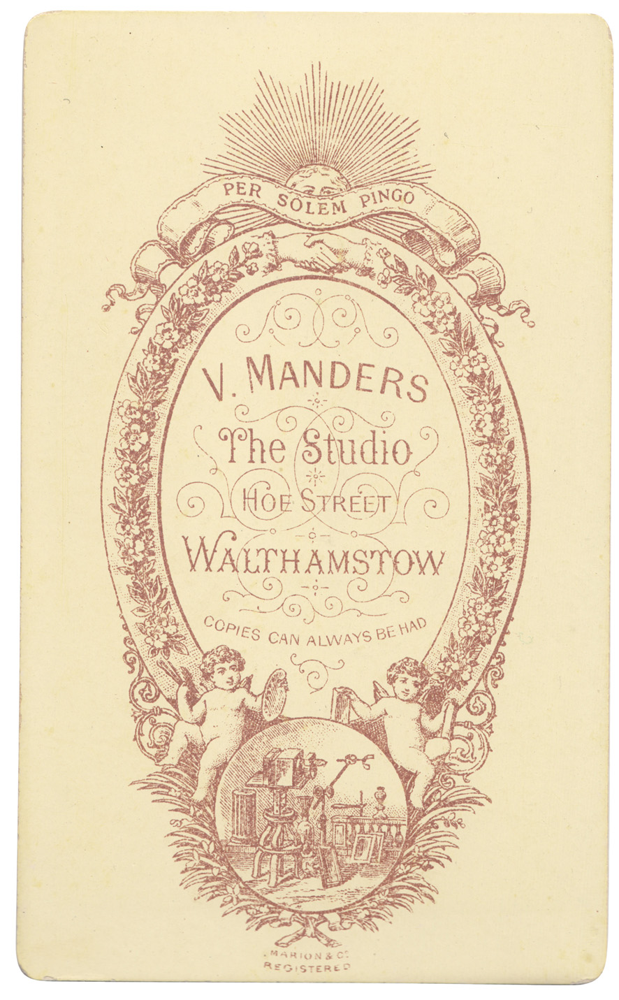
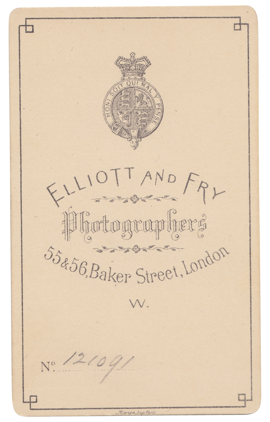
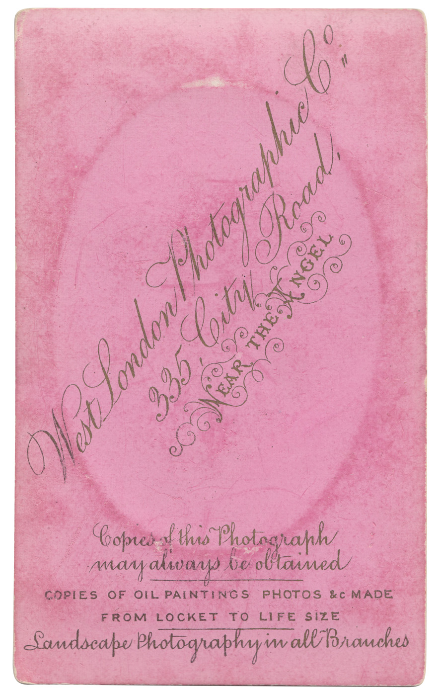
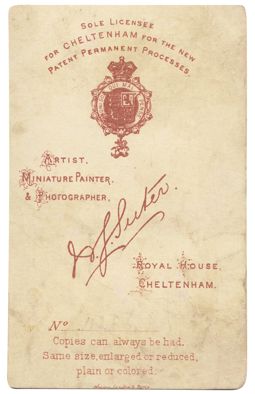
# 139 - Some new additions to the reference box, and to my Carte-de-Visite collection. Cards from four different photographic studios / photographers in the South of England, all beautifully lettered and detailed.
Quite a few of the cards in my collection have 'Marion Imp Paris' or 'Marion & Co Registered' which I assumed to be the printer of the cards, and I was correct. I found this great website all about Carte-de- Visite with a whole section about Marion & Co and how to use their marks to date the cards (and photographs). Check it out here.
See our whole collection here and previous posts about Carte-de-Visite here, here and here. You can find out more about Carte-de-Visite here, an article written by Graham Hudson from the Ephemera Society.
https%3A%2F%2Fwww.deliciousindustries.com%2Ffrom-the-reference-box-139
Delicious+Industries%3A+From+the+reference+box+%23139
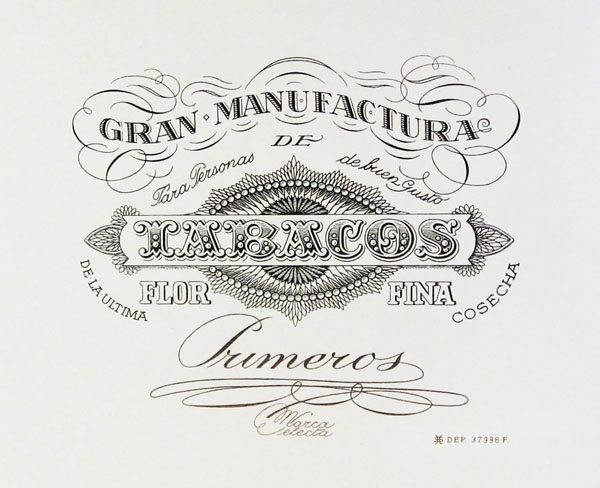
Vintage Cigar Labels
EE9s2ufFjpBR5sVoJ_Tw~~60_57.jpg)
f!~~60_57.jpg)
cE9s4PsNKSBR5sT)tCcQ~~60_57.jpg)
These beautifully detailed and lettered cigar labels are from a collection over on Letterology. It's an interesting post showing the elaborate designs introduced to establish more sophisticated looking brand styles and prevent counterfeits being easily produced. Check out the full post here.
Images copyright Letterology.
https%3A%2F%2Fwww.deliciousindustries.com%2Fvintage-cigar-labels
Delicious+Industries%3A+Vintage+Cigar+Labels
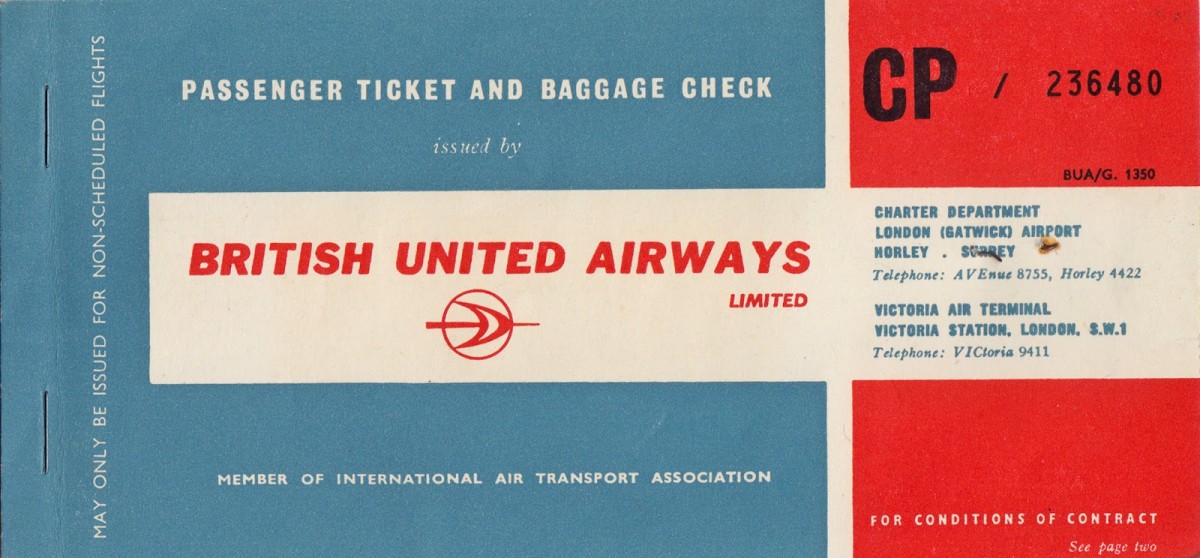
From the Reference Box #138
#138 - British United Airways passenger ticket and baggage check, 1963. I love to see a classic logo on an original bit of print so I couldn't leave this behind at the boot sale.
This lucky person, a Miss MV Dickinson travelled from London Gatwick to Venice on what was then the UK's largest independent airline, largely owned by British & Commonwealth Shipping (B&C) and the largest unsubsidised airline outside the US.
Have a delve into the rest of our reference box for more ephemera and vintage design goodies.
https%3A%2F%2Fwww.deliciousindustries.com%2Ffrom-the-reference-box-138
Delicious+Industries%3A+From+the+Reference+Box+%23138
The Lancashire Coast

As much as I love these towns though, I never remember any of them looking as lovely as Daphne illustrates them!
Image from Quad Royal.
https%3A%2F%2Fwww.deliciousindustries.com%2Fthe-lancashire-coast
Delicious+Industries%3A+The+Lancashire+Coast
From the reference box #137


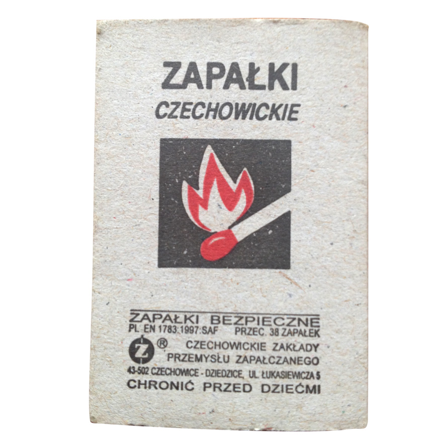
 #137 - Matchbooks & matchbook covers. This little lot were in a collection of souvenir match books I was given recently. The majority of the covers are uninspiring design-wise, but there's something about the ones above, be it their tacky charm or giant graphics that jumped out at me - especially the flame graphic!
We have many more matchbook covers in the reference box and on our blog, take a look here.
https%3A%2F%2Fwww.deliciousindustries.com%2Ffrom-the-reference-box-137
Delicious+Industries%3A+From+the+reference+box+%23137
From the reference box #135


It covers current and proposed land use residential and commercial (this was immediately after the war and much of the city needed re-development), looks at traffic & public transport solutions, population density problems and shows plans for the Thames riverside re-development. All of which are illustrated with these wonderful infographics...


For more delightful ephemera have a dig around the rest of our reference box here.
https%3A%2F%2Fwww.deliciousindustries.com%2Ffrom-the-reference-box-135
Delicious+Industries%3A+From+the+reference+box+%23135
Welcome

Welcome to the Delicious Industries blog. We're an independent design studio based in Brighton, UK and this is our scrapbook packed full of design, illustration, photography & typography inspiration. Check out our work here.
Links
DELICIOUS FRIENDS
DELICIOUS FAVOURITES
- 50 Watts
- Acejet 170
- Grain Edit
- It's Nice That
- National Geographic Found
- Notcot
- Pretty Clever
- Retronaut
- So Much Pileup
- We Love Typography
- Another Mag