art direction, design + typography
Blog: Advertising
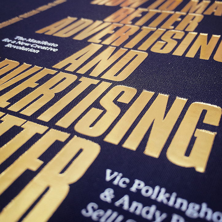
How to Make Better Advertising and Advertising Better
How To Make Better Advertising and Advertising Better – is the new book from our friends, creative agency Sell! Sell!.
Written by Vic Polkinghorne and Andy Palmer after two decades in the business and ten years running their agency 'The Manifesto for a New Creative Revolution’ outlines their no-nonsense approach to the industry:
Bullshit-free
Advertising and marketing people need to lose the jargon. A culture of business bullshit has slowly polluted the commercial world. Engagement, low-hanging fruit, synergy, media-neutral, content-led, always-on, ideation, adcepts, holistic approach, storytelling, user-generated content, leverage, realtime 24/7, cultural currency, the list goes on (and on). This language is symptomatic of a move towards the unnecessary complication of the world of advertising and marketing.
These terms allow people to hide behind them, and mask flimsy thinking. They confuse and conceal, where the aim of the advertising process should always be to simplify and clarify. And they make the rest of the business world even more sceptical about advertising and marketing. Let’s drive the bullshit and the bullshitters out of the process, use plain speaking, and always simplify.
Their beautifully produced book is available exclusively at the Design Museum, get your copy here.
Wed 13 Apr 2016
Posted under: Advertising , Delicious things , Things to buy , Books , Marketing , Writing
https%3A%2F%2Fwww.deliciousindustries.com%2Fhow-to-make-better-advertising-and-advertising-better
Delicious+Industries%3A+How+to+Make+Better+Advertising+and+Advertising+Better
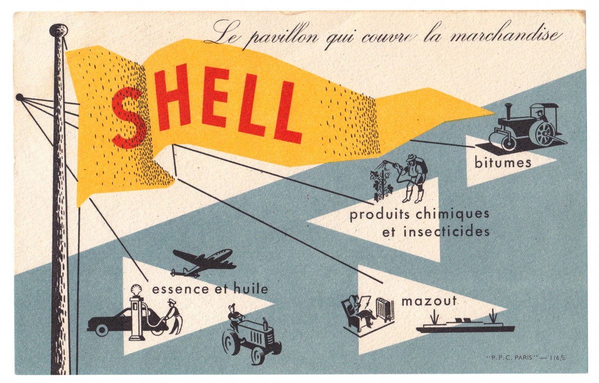
From the reference box #144
#144 - Shell promotional card, circa 1950s. Another gem from Paris.
It's advertising Shell's portfolio of products; so as well as the obvious petrol and oil, they supplied fuel oil, chemicals, insecticides and bitumen (asphalt).
I love everything about this little card; the colours, the pulpy uncoated stock that the ink has sunk into, the illustrations, the way the shading has been illustrated and the way they left the 'S' of Shell under the black layer of print to make it slightly darker too. The type and illustrations remind me of the instructional and educational charts from the same era. Shame I don't know who the illustrator/designer was.
Have a dig around in our reference box for more delicious ephemera...
https%3A%2F%2Fwww.deliciousindustries.com%2Ffrom-the-reference-box-144
Delicious+Industries%3A+From+the+reference+box+%23144
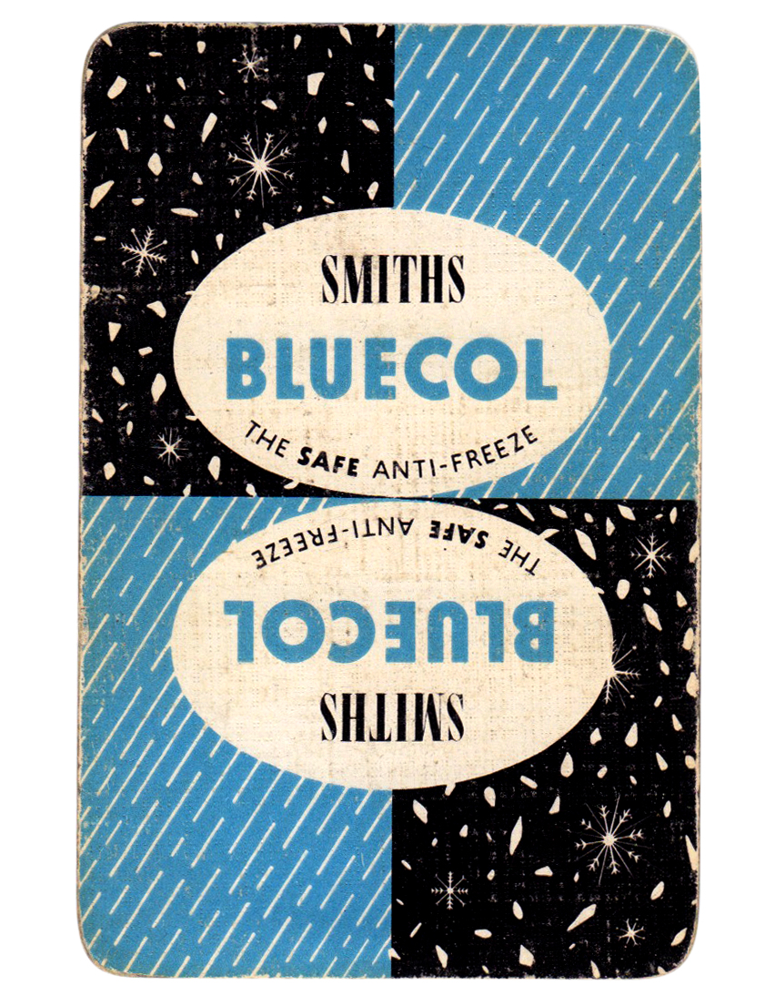
From the reference box #141
#141 - Smiths Bluecol playing card, circa 1950.
Not sure why an anti-freeze company would produce playing cards, but I'm glad they did. The sleet and snow illustrations are beautiful - the snowflakes are so fine and delicate.
Check out the other 140 pieces of ephemera stashed away in our reference box here.
https%3A%2F%2Fwww.deliciousindustries.com%2Ffrom-the-reference-box-141
Delicious+Industries%3A+From+the+reference+box+%23141
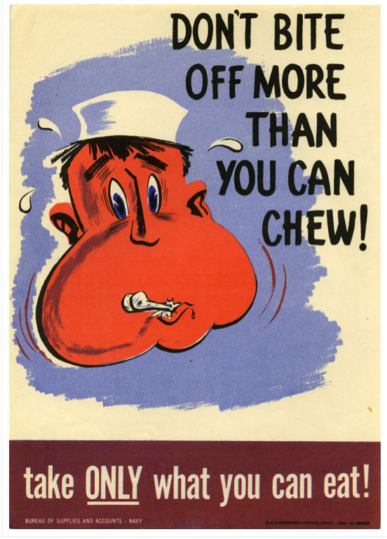
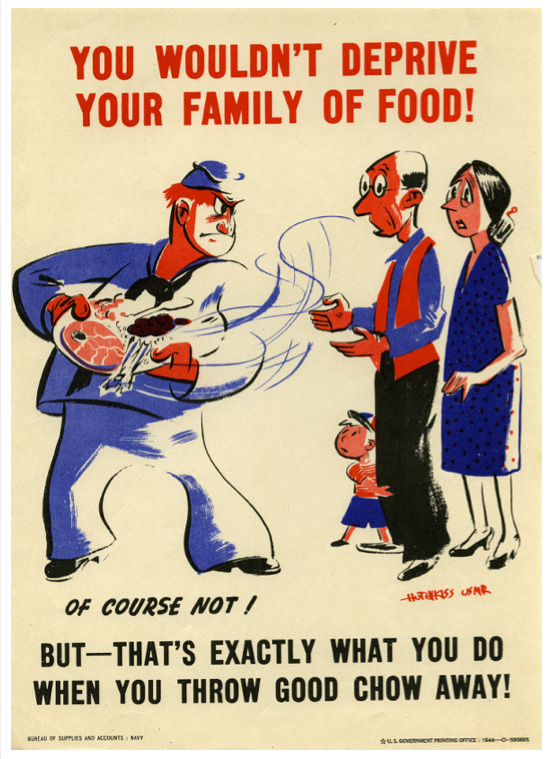
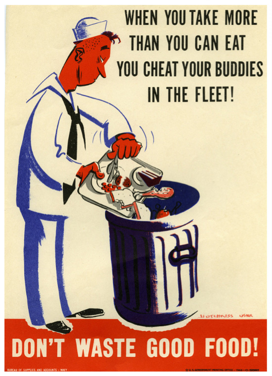
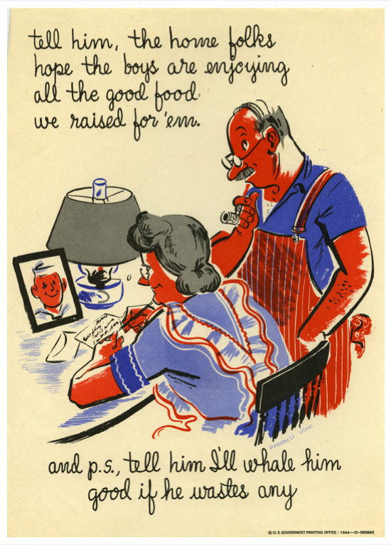
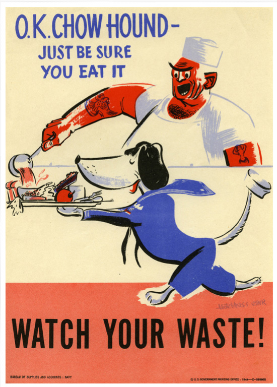
WW2 US Navy Posters
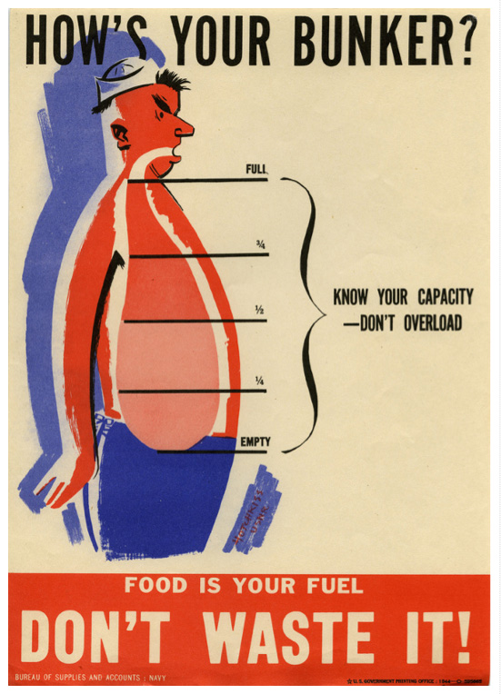
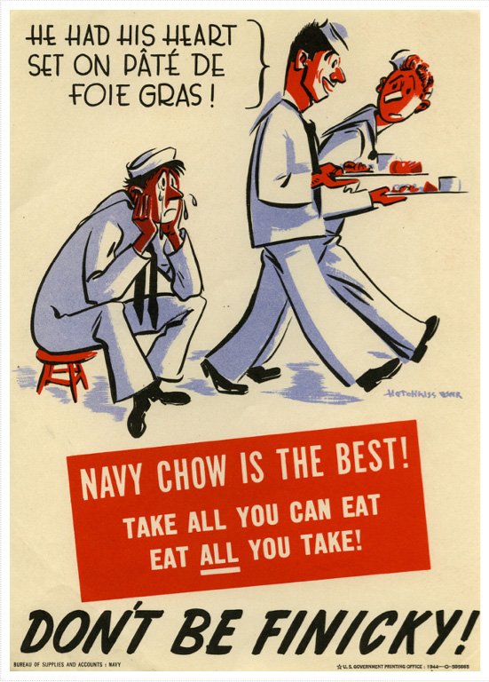
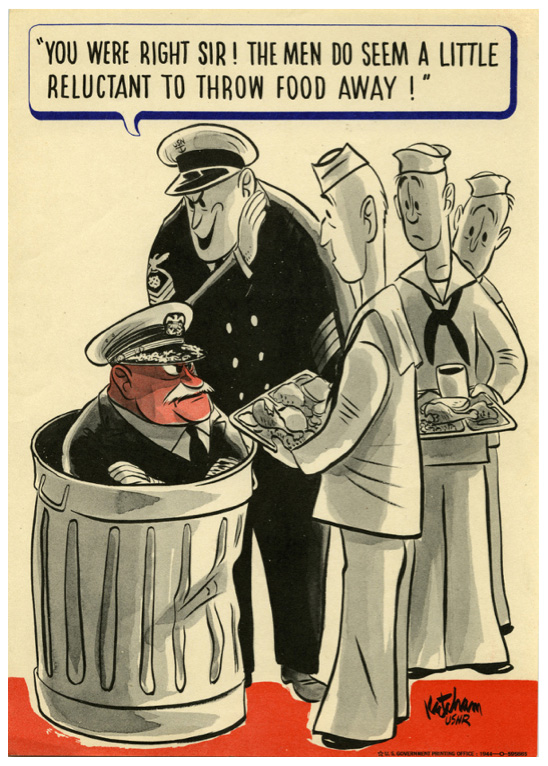
From the US Bureau of Supplies and Accounts: Navy, I love these WW2 anti greed and food waste posters illustrated by Hotchkiss with the exception of the last one which was illustrated by Dennis the Menace creator Hank Ketcham.
Funny that these messages are still valid today, 70 years on.
Via Retronaut.
https%3A%2F%2Fwww.deliciousindustries.com%2Fww2-us-navy-posters
Delicious+Industries%3A+WW2+US+Navy+Posters
Why Agencies Are Responsible For ‘Unreasonable’ Client Expectations
An oh-so-true post by London creative agency, Sell! Sell! as to why 'unreasonable' client expectations are the fault of the agencies. The points they make are equally relevant to the design industry (or in fact any creative industry) so here it is, the most words I've ever posted:
....................................................
Why Agencies Are Responsible For 'Unreasonable' Client Expectations
A smart salesman that I know once blew my mind with this simple statement:
We train clients to expect what they expect.
It's a simple truth.
Clients can ask for a campaign to be turned around in a day
or five different 'routes'
or a TV commercial to be made for way less than it should really take
or a photo shoot on a pittance
or for changes that make the work worse
or for excruciatingly small fees from the agency.
They can ask for what they want. It is a free world.
But it is only when agencies say yes to these things, only when agencies and agency staff are complicit, that these requests, and this behaviour, is given credibility.
Agreeing to do it endorses the request.
That is how clients have been trained to expect all of the unreasonable and harmful things that have become part and parcel of advertising for most people at most agencies.
It is because there are always enough agencies and people out there willing to say yes to the next unreasonable demand.
I'll be honest here - we spend an unbelievable amount of energy here at Sell! Towers managing the process of not agreeing to the kinds of things listed above. It's the harder road. It's much easier in the short term to say yes.
And we know that many agencies out there are saying yes.
But, we are honest with out clients about our high fees up front - and we know that some clients who wanted to work with us have walked away because of that - we can live with that.
It means the ones who work with us, value us.
We resist changes and amendments to work that we believe will make it less good, that takes a lot of managing and takes time, energy and skill to build relationships with clients strong and respectful enough for that to be possible, but we think it's worth it.
We don't work to piss-take schedules, we don't make people work weekends and through the night to meet them.
We don't take the piss out of suppliers by passing on unreasonable cost requests, or by hammering them unreasonably just because a job is a 'creative opportunity'.
We don't churn out work to meet a set number of routes, or as cannon fodder. We only work on things that we think will be the solution.
In short, we do all of the things that we think it takes to be a creative agency of integrity, with standards and professionalism, and with respect for those we work with.
But it's becoming increasingly obvious that there are tons of agencies out there who will literally do whatever they're asked to gain or keep a piece of business.
On a level, it's understandable. The advertising market is massively over-supplied. This means that some people become increasingly desperate to win business.
Small agencies trying anything to compete.
Other kinds of businesses - like digital specialists, pr firms, and production companies - trying to get in on the advertising budgets.
And network agencies, pushed by pressure from afar to gain and retain clients at all costs.
They all have their reasons.
It's understandable, but it's not excusable.
And yes, we are lucky, because we are masters of our own destiny, so to speak. We can make these choices.
But we have made the choices not to become a lowest common denominator agency, not to compete on price, speed and how often we can say yes.
And the result is, we work with the kind of clients who value that. We have a great group of clients, but it takes a lot of work, and effort and time to build those relationships of trust and respect.
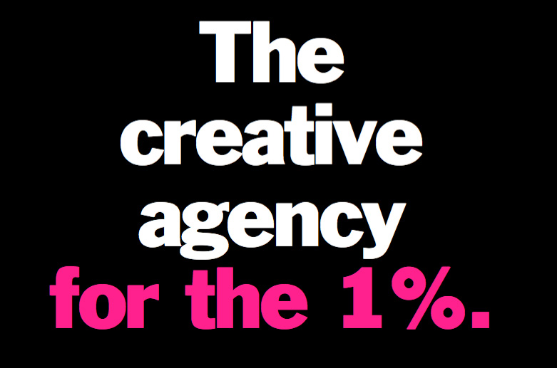
And it often seems like the number of clients who want an agency like that is reducing - so much so that these days we openly say that we're the "Creative agency for the 1%" of clients.
And we're okay with that.
It works for us.
But it's funny when you hear agency people complaining about clients' behaviour and expectations.
They blame it all on the client. Yet their own agency endorses those requests by agreeing to them.
The simple fact is, while there are enough agencies out there that will agree to the unreasonable, the unreasonable will always be expected.
If clients aren't made to realise the something is unreasonable, how are they expected to know that it's unreasonable?
No one made out it was unreasonable. They asked, and someone said yes.
Or in other words, as my friend rightly said: We train clients to expect what they expect.
....................................................
For more wonderful insights into the ad industry, visit Sell! Sell! or check out their work here.
https%3A%2F%2Fwww.deliciousindustries.com%2Fwhy-agencies-are-responsible-for-unreasonable-client-expectations
Delicious+Industries%3A+Why+Agencies+Are+Responsible+For+%26%238216%3BUnreasonable%26%238217%3B+Client+Expectations
Rare & Important Travel Poster Auction
Pin this on Pinterest
 View large image
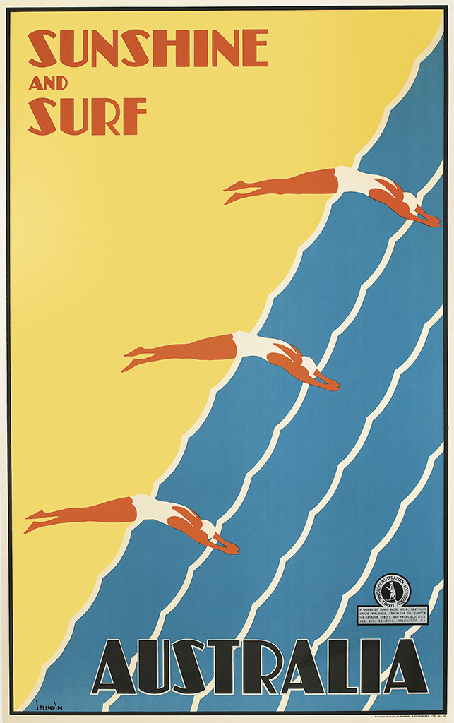
Sunshine and Surf / Australia. Circa 1936. Designed by Gert Sellheim.
Pin this on Pinterest
View large image
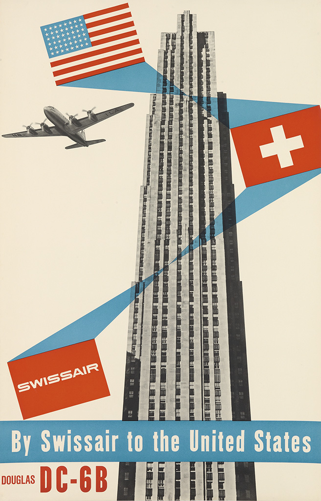
Swissair / By Swissair To The United States / Douglas DC - 6B. Circa 1952. Designed by Henri Ott.
Pin this on Pinterest
View large image
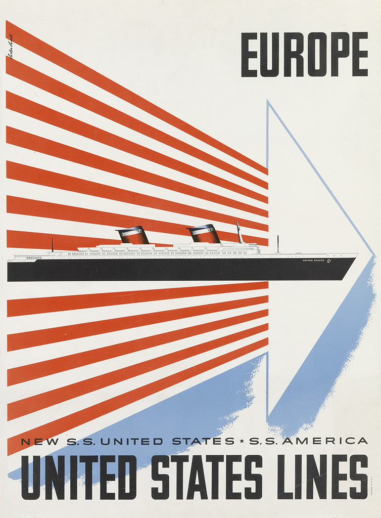
Europe / United States Lines. Circa 1952. Designed by Lester Beall.
Pin this on Pinterest
View large image
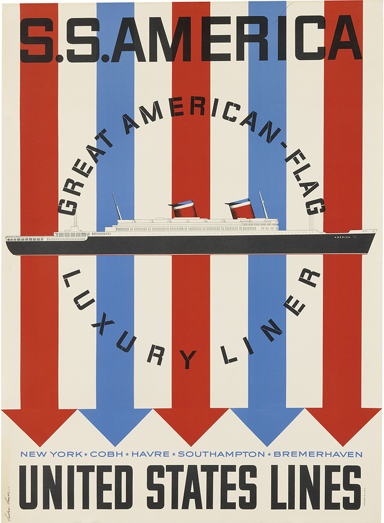
S.S. America / United States Lines. Circa 1952. Designed by Lester Beall.
Pin this on Pinterest
View large image
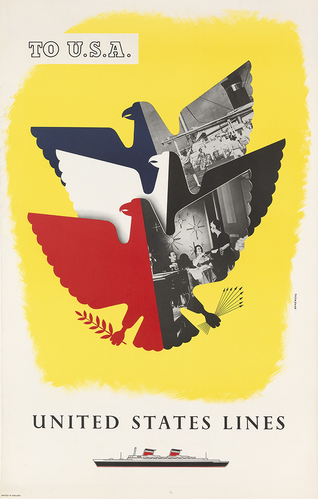
To U.S.A. / United States Lines. Circa 1952. Designed by Armengol.
Pin this on Pinterest
View large image
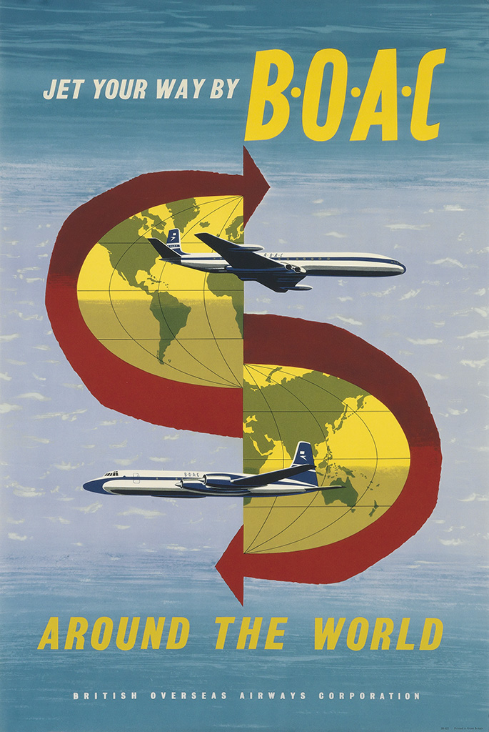
Jet Your Way By B • O • A • C / Around The World. Circa 1960. Designer Uunknown.
Swann Galleries, New York are holding a 'Rare & Important Travel Poster' auction on October 18th. They always have an impressive selection of posters in their auctions and this one is no exception.
"From the deserts of the Mideast to the alpine resorts of Europe, this auction offers images of diverse geographical locations, in addition to bold depictions of trains, ocean liners and airplanes."
For me it doesn't matter about rarety, importance or designer. It's the bold, bright, graphic ones I like, however I will need significantly deeper pockets to be bidding on any of these.
See the full catalogue here.
https%3A%2F%2Fwww.deliciousindustries.com%2Frare-important-travel-poster-auction
Delicious+Industries%3A+Rare+%26amp%3B+Important+Travel+Poster+Auction
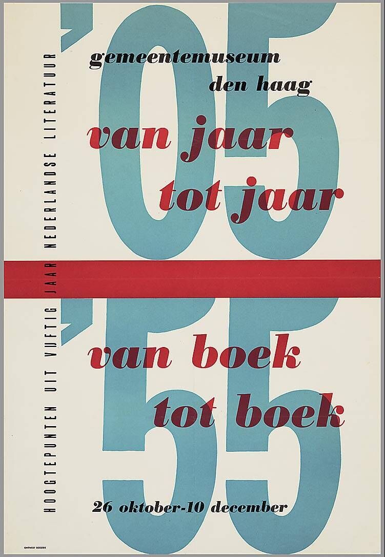
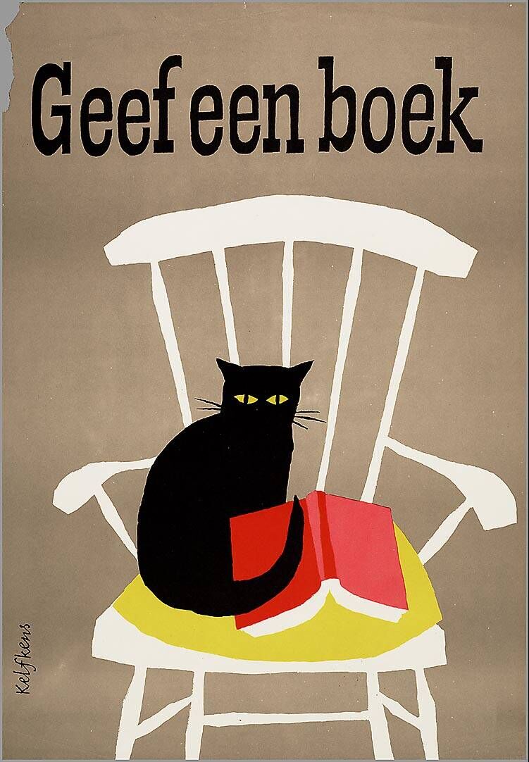
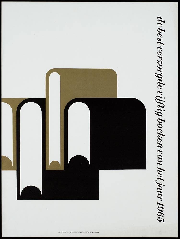
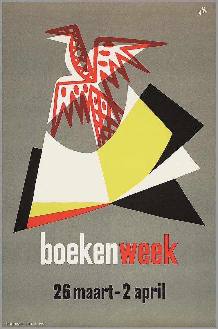
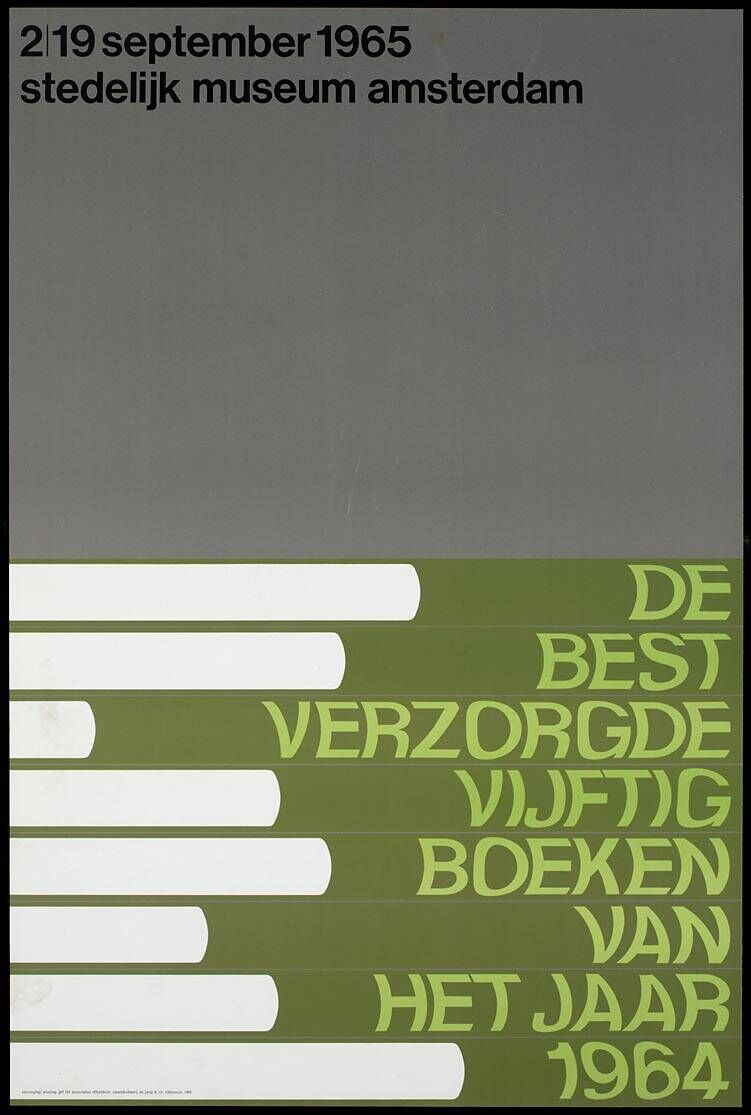
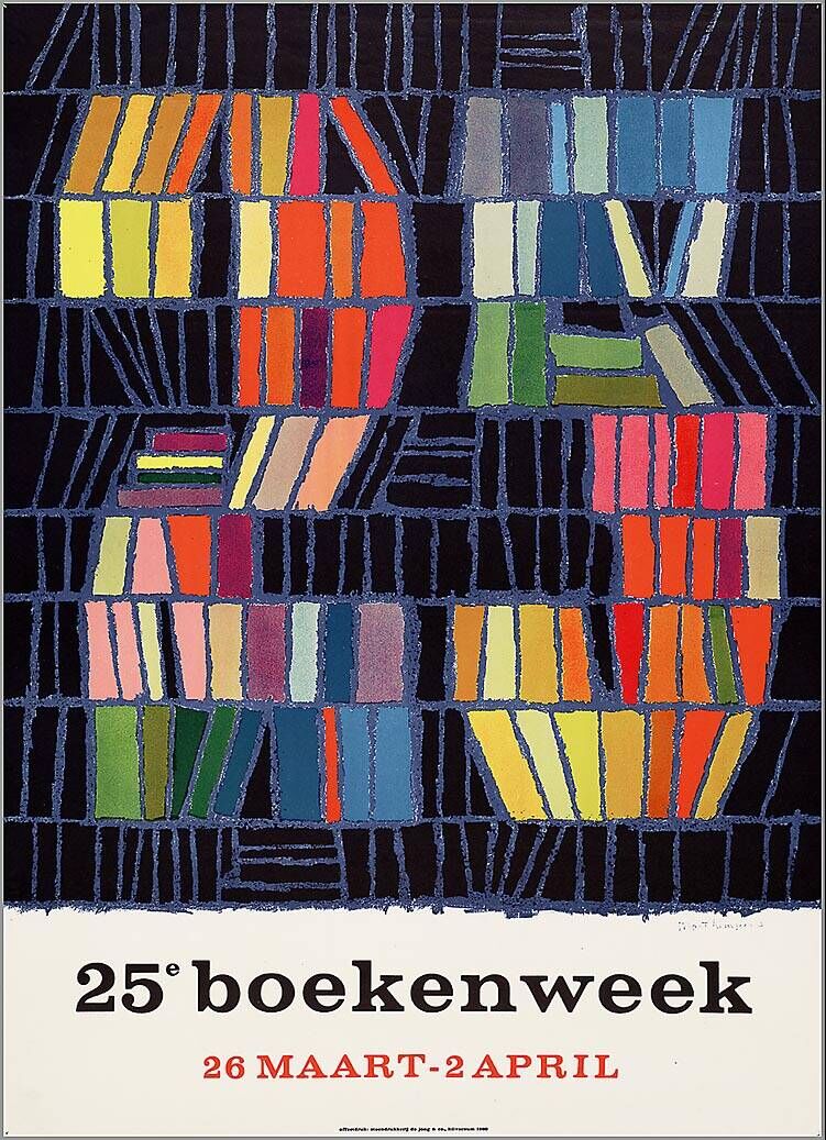
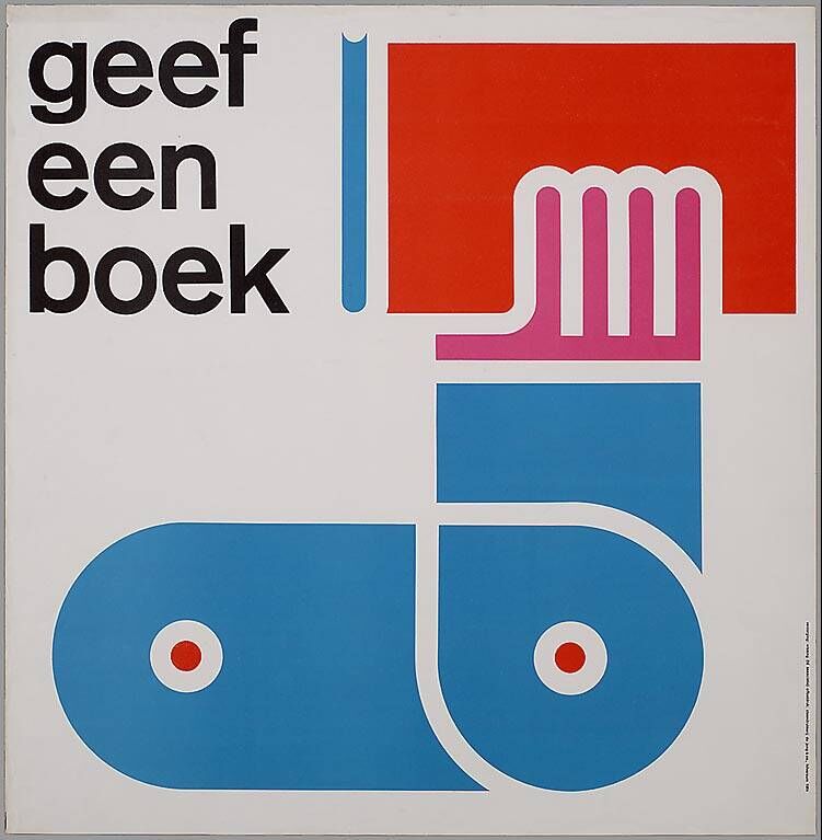
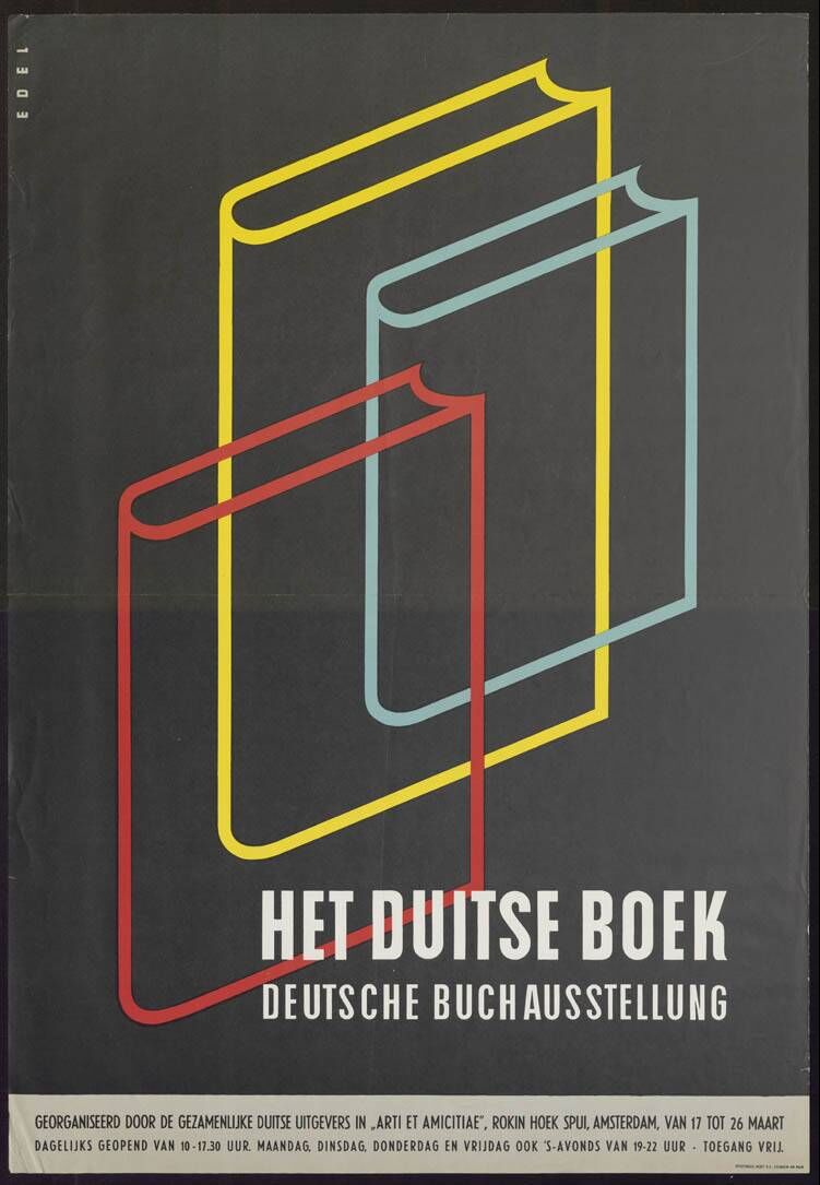
Dutch Book Week Posters
These beautiful vintage posters advertising Book Week (1955 - 1971) and lots, lots more form the Dutch design resource ADVIZ, "a new bilingual (NED / EN) interactive platform for the graphic design industry, the advertising industry and for anyone interested in visual communication".
The two-part website was launched in 2011 to; A. bring together design reference from the collections of the Dutch Archive Graphic Designers (Nederlands Archief Grafisch Ontwerpers - NAGO), the Advertising Arsenal (ReclameArsenaal - RA) and the Poster Museum (Affichemuseum) in Hoorn, and B. to offer a platform for the public to upload their own design collections or portfolios, share design related links and interact with other users.
It's definitely worth a look around, there are some really great vintage posters on there.
Via @presentcorrect
https%3A%2F%2Fwww.deliciousindustries.com%2Fdutch-book-week-posters
Delicious+Industries%3A+Dutch+Book+Week+Posters
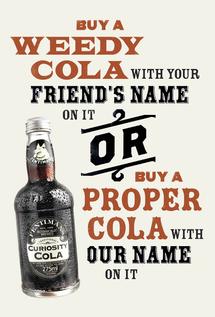
Buy a proper cola…
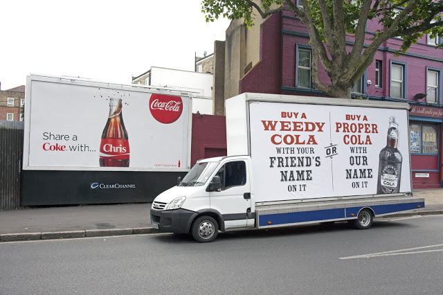
Those clever boys at Sell! Sell! are helping Fentimans take on the might of the big boys with a cheeky new advertising campaign for Curiosity Cola. Genius, we love it...
https%3A%2F%2Fwww.deliciousindustries.com%2Fbuy-a-proper-cola
Delicious+Industries%3A+Buy+a+proper+cola%26%238230%3B
Sell! Sell!'s Efficacious Fentimans Ad


I think you'll agree it was well worth the effort, you can really tell the difference between this and previous ads which have been created purely digitally - this one has so much more charm and depth.

Images copyright Sell! Sell!
https%3A%2F%2Fwww.deliciousindustries.com%2Fsell-sells-efficacious-fentimans-ad
Delicious+Industries%3A+Sell%21+Sell%21%26%23039%3Bs+Efficacious+Fentimans+Ad
London Underground 150 year anniversary stamps

To celebrate this 150 year milestone Royal Mail have released a set of 6 commemorative stamps (above) that illustrate the tube's timeline with lithographs, illustrations and photographs. They also give a nod to the design of the iconic tube map.
However, it's these miniature stamps each showing 3 classic London Underground advertising posters that I found the most interesting/inspiring...


Images copyright Royal Mail.
Stamps designed by Hat-Trick.
Miniature stamp sheets designed by NB Studio.
https%3A%2F%2Fwww.deliciousindustries.com%2Flondon-underground-150-year-anniversary-stamps
Delicious+Industries%3A+London+Underground+150+year+anniversary+stamps
Sell! Sell!'s Extraordinary Bar Ad for Drambuie
The new Drambuie TV and cinema ad from our friends at Sell! Sell! builds on the 'A Taste of the Extraordinary' campaign launched last year and is so weirdly wonderful we just can't stop watching it.
We are a little concerned what goes on in their heads though to create such a surreal landscape of colourful characters!
https%3A%2F%2Fwww.deliciousindustries.com%2Fsell-sells-extraordinary-bar-ad-for-drambuie
Delicious+Industries%3A+Sell%21+Sell%21%26%23039%3Bs+Extraordinary+Bar+Ad+for+Drambuie
A Taste Of The Extraordinary


We are loving the ads (above), they have such a timeless look that oozes sophistication. Simple yet beautifully weird. Sell! Sell! set out to create imagery that reflected the uniqueness of the drink - a whisky liqueur made from a blend of aged Speyside malt whiskies, spices, heather honey and herbs. Imagery that created intrigue and curiosity.
To create that classic feel, photographer John Ross shot the ads on large format film (yes, that does still exist - just!) and it really makes a difference.
There's so much attention to detail in these ads, that it's the behind the scenes pics that really had me intrigued - seeing how all the elements were shot to create the right shadows and perspective, how the floor was made and how the drip was added. Just see for yourselves...


Images copyright Sell! Sell!
https%3A%2F%2Fwww.deliciousindustries.com%2Fa-taste-of-the-extraordinary
Delicious+Industries%3A+A+Taste+Of+The+Extraordinary
Fifty years of progress in advertising…

There's only been two so far, but we're hoping they'll keep doing more. Here's the first one if you missed it.
Thanks Sell! Sell! for making us chuckle.
https%3A%2F%2Fwww.deliciousindustries.com%2Ffifty-years-of-progress-in-advertising
Delicious+Industries%3A+Fifty+years+of+progress+in+advertising%26%238230%3B
Soviet anti-alcohol posters


Their post “In eternal memory” outlines the background to these posters - Russia's social history, their struggle with alcoholism and drunkeness, cheap alcohol readily available and a drop in the average male life expectancy to 47!
Above are some of the more graphic ones that really caught my attention.
See the full post and collection of posters here.
All images from Rio Wang.
Via Notcot.
https%3A%2F%2Fwww.deliciousindustries.com%2Fsoviet-anti-alcohol-posters
Delicious+Industries%3A+Soviet+anti-alcohol+posters
Erik Nitsche for General Dynamics


I saw a great collection of General Dynamics posters over on Words & Eggs created by late Erik Nitsche - graphic designer/art director for the General Dynamics in the late 50's.
Nitsche was responsible for all General Dynamics brand communication from 1953 - 1960. He brought an optimistic, modern dynamic to the brand and produced bold, graphic designs which can be seen in the selection of posters (above), in these adverts...


Copyright held by image owners.
https%3A%2F%2Fwww.deliciousindustries.com%2Ferik-nitsche-for-general-dynamics
Delicious+Industries%3A+Erik+Nitsche+for+General+Dynamics
Welcome

Welcome to the Delicious Industries blog. We're an independent design studio based in Brighton, UK and this is our scrapbook packed full of design, illustration, photography & typography inspiration. Check out our work here.
Links
DELICIOUS FRIENDS
DELICIOUS FAVOURITES
- 50 Watts
- Acejet 170
- Grain Edit
- It's Nice That
- National Geographic Found
- Notcot
- Pretty Clever
- Retronaut
- So Much Pileup
- We Love Typography
- Another Mag