Blog: September 2008
From the reference box #24
How gorgeous are these ice cream containers? I'm guessing they're from the 50's, but have never been used, so apart from a little discolouring they're in tip top condition!
For more fab packaging have a look here and here.
#24 a new addition - 1950's ice cream containers
https%3A%2F%2Fwww.deliciousindustries.com%2Ffrom-the-reference-box-24
Delicious+Industries%3A+From+the+reference+box+%2324
From the reference box #23


More wonderful matchbook covers! To see more of my collection click here.
#23 - More matchbook covers
https%3A%2F%2Fwww.deliciousindustries.com%2Ffrom-the-reference-box-23
Delicious+Industries%3A+From+the+reference+box+%2323
Logo development

I stumbled upon a collection of classic logos and their development today, some of which I haven't seen before and others I recognise from Neatorama's collection that I posted about a few months ago. It's always interesting to see how a logo has changed over time and to see just how long some of these companies have been around!
I'm pleased to see they included Fiat, who I applaud for returning to their old 'Fiat' typeface and the simplistic bonnet badge of the 1920's - it just looks so classic.
Via Inspire Me Now.
https%3A%2F%2Fwww.deliciousindustries.com%2Flogo-development
Delicious+Industries%3A+Logo+development
Free Ephemera!


I like to visit a carboot sale at the weekend, but on Saturday I overslept and arrived quite late. It turns out though, that some of the stall holders, don't like to take anything away with them and towards the end of the sale they give everything away! Imagine my delight when one of those stalls had loads of ephemera tucked away in the bottom of the boxes - good job I had a spare bag to hand!
Above is a selection of the travel related items, I think from the mid 70's judging by some of the other paperwork. There was also quite a few old photos, photo wallets, the odd flight ticket, maps, a fuel ration book and various tickets for events throughout the 50's and 60's. I'm sure you will see it all soon enough.
https%3A%2F%2Fwww.deliciousindustries.com%2Ffree-ephemera
Delicious+Industries%3A+Free+Ephemera%21
Metallica re-branded

Turner Duckworth have redesigned the Metallica logo for their new album. Above top, is the original logo and underneath is the reincarnation, "based on the bands original version from 1981" - if you hadn't guessed!
Apparently the original logo had been re-drawn so many times over the years that it was beyond recognition, so the brief to Turner Duckworth was to try and capture the authenticity of the original logo in the new version.
Now they haven't done a bad job in my opinion, it was a tough brief and an even tougher audience to please, especially for a company more at home creating identities for companies like Waitrose and Amazon. When I first saw the new logo I didn't even realise it was a new version, and I guess that was their intention. Standing alone only true fans would know it's changed, yet next to the old one it looks well designed, more balanced and definitely has more attention to detail.
My only gripe would be that the protruding angles of the 'M' and 'A' have been changed, making the word 'Metallica' smaller than the original when the overall logo is the same size (as you can see above) and for a graphic predominantly used on merchandise I think that should have been a consideration. Although saying that, I doubt anyone these days even reads the Metallica logo, it could say anything between the 'M' and 'A', it's such an iconic design that the shape alone is instantly recognisable worldwide. Now love it or hate it, in my book that's the sign of a successful brand, be it for a product, service or rock band!
Via the Creative Review Blog.
https%3A%2F%2Fwww.deliciousindustries.com%2Fmetallica-re-branded
Delicious+Industries%3A+Metallica+re-branded
Ed Lives Here

Thanks to Lizy Gershenzon at Froeter Design for sending me the link to Ed Lives Here, “Ed’s your friendly educator for all things paper, printing and design. He's here to help you communicate your ideas, on-press and on paper. He's your source for information - and inspiration”.
Basically, this is a great resource for anyone wanting to familiarise themselves with the print process. Experienced designers will probably know most of what’s here, but it’s good to have a reference to hand just in case. I think graduates will find it a really useful guide as the production side of being a designer is rarely covered in detail when studying and is a bit of a blackhole for many fledgling designers in their first job.

The diagrams and charts are really well designed and simplifying the information, making it easier to understand. On many occasions during the past few months this website would have helped me explain a process or print technique easily, to a client. For example trying to explain the differences between printing presses, what spot and process colours are and why they are not always identical, what a foil block or an emboss is and the old favourite – why monitor and printed colours are different.
Here are some other examples from the site:
Retouching

Printing presses

It's a really interesting site, with loads of information and if you don’t believe me, take a look for yourselves here.
Images taken from Ed Lives Here. Sponsored by NewPage.
https%3A%2F%2Fwww.deliciousindustries.com%2Fed-lives-here
Delicious+Industries%3A+Ed+Lives+Here
From the reference box #22


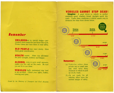
This is a new addition to the reference box, but a very worthy one. A 1954 copy of The Highway Code. The diagrams are great - I like the cross shading and the stopping distance graphic. It's so much nicer than the modern booklets.
#22 - The Highway Code, 1954
https%3A%2F%2Fwww.deliciousindustries.com%2Ffrom-the-reference-box-22
Delicious+Industries%3A+From+the+reference+box+%2322
The Nauga

How gorgeous is this Nauga? An advertising mascot created to advertise Uniroyals' synthetic fabric, 'Naugahyde' in the 60's and make it stand out from the competition.
You can read the full story here - any of you US peeps got one? Apparently they can still be found.
Via Sell! Sell!
https%3A%2F%2Fwww.deliciousindustries.com%2Fthe-nauga
Delicious+Industries%3A+The+Nauga
Logos, graphics and trademarks


These fabulous graphics are taken from 3 scrapbooks of labels, logos and trademarks, photocopied many years ago by my good friend Mike, who in turn allowed me to get a copy. I treasure them, they are such a vast and varied collection they make fantastic reference material and each time I look through them I still see something new.
So, thank you Mike, they are invaluable!
https%3A%2F%2Fwww.deliciousindustries.com%2Flogos-graphics-and-trademarks
Delicious+Industries%3A+Logos%2C+graphics+and+trademarks
Rob Ryan at Castor & Pollux

“Swirling, intricate bells, birds, trees and stars fill the prints and paper cuts of silhouetted lovers surrounded by floating poetry”
The Rob Ryan exhibition of screen prints, printed tiles and paper cuts started yesterday at Castor & Pollux and runs until 20 October.
Rob’s work is beautiful, intricate and sentimental. He’s created illustrations for Paul Smith, designed Christmas windows for Liberty’s of London and made paper-cut fashions for Vogue.
His work will be available to buy throughout the exhibition, but if you’re stuck in London at the weekends you can check out Rob’s work at Ryantown, his new shop in Columbia Road and for those of you not in the UK he also has an Etsy shop!
Image copyright Rob Ryan.
https%3A%2F%2Fwww.deliciousindustries.com%2Frob-ryan-at-castor-pollux
Delicious+Industries%3A+Rob+Ryan+at+Castor+%26amp%3B+Pollux
The Great Lance Wyman


I read a comment about Lance Wyman’s zoo graphics yesterday, and realised it’s been ages since I’ve seen them. His Mexico Olympic ’68 and his zoo graphics where the first pieces of design that I fell in love with. Their simplicity and impact are just fantastic.
Wyman specialises in directional, signage systems and branding. Early on in his career he created the identity, signage systems & symbols, for the Mexico ’68 Olympics and the Mexico ’70 World Cup, as well as developing a system for the Mexico City Metro.
In 1971 Wyman teamed up with Bill Cannan to form, Wyman & Cannan. A New York studio where they worked successfully creating iconic signage systems, including the above one for the Minnesota Zoo (one of my personal favourites), until 1979 when Wyman started his own studio, Lance Wyman Ltd.
There is a great interview with Wyman on Web Esteem where he discusses his design process and thoughts on his work.Also, if you want to see more of his graphics check out his website which true to form, is simple and informative. His graphics look even better small and in black and white – the ultimate test of a good logo.
PS. Lance, if you are reading this - we need a retrospective exhibition in the UK - please!
All images and graphics copyright Lance Wyman Ltd.
https%3A%2F%2Fwww.deliciousindustries.com%2Fthe-great-lance-wyman
Delicious+Industries%3A+The+Great+Lance+Wyman
Rabbit Garbage Bags


How fab are these garbage (or rubbish) bags?? created to help prevent littering and encourage people to take their rubbish away with them. I love them - they're genius!
They are designed by Japanese company, MAQ Inc. and can be bought from Mottainai along with loads of other really cool bags for your rubbish. This rabbit one is by far the best though.
Via Trend Hunter.
https%3A%2F%2Fwww.deliciousindustries.com%2Frabbit-garbage-bags
Delicious+Industries%3A+Rabbit+Garbage+Bags
From the reference #21

One of 'The Practical Motorist, Care & Safety Check Charts', my favourite movable chart. It was presumably a free gift with The Practical Motorist, I'm guessing in the late 50's or early 60's.
It's double sided and gives helpful 'remedies' for minor car 'symptoms'; lining up the arrow on the symptom, gives you the suggested 'remedy' for steering, light or braking issues. For example, the front (above left) shows 'wheel Tramp' as the symptom and 'Balance wheels; renew faulty hydraulic dampers; equalise tyre pressures' as the remedy. There is also a cool stopping distance chart/graphic on the reverse.
#21 - The Practical Motorist, Care & Safety Charts
https%3A%2F%2Fwww.deliciousindustries.com%2Ffrom-the-reference-21
Delicious+Industries%3A+From+the+reference+%2321
We heart infographics


I picked up a copy of the International Designers Network (Vol.15 No.4) at the weekend and it's a great issue with a really good article on infographics (Signs of the Times) featuring 10 designers who specialise in this area, enjoying the challenge, and ultimately, the satisfaction in this type of design; Catalogtree, Dave Bowker, Nicholas Felton, Lamosca, Number27, Plusminus, Polar, SPVZ, Timm Kekeritz and Troikart.
It's not a publication I normally buy, but I will definitely be seeking it out again. The print quality is really good - this issue has a matt laminate, spot varnish and a foil on the cover which is extravagant, but looks good. Inside it uses a few different kinds of paper which gives it a really nice feel, has fold out pages to accomodate some of the larger infographics and is packed with interesting and up-to-date content. To top it all, the design throughout is great, not all to my taste, but interesting, experimental and relevant to the content. Oh, and this issue came with a free DVD of goodies including, the Diesel 'Liquid' Fashion Show and some behind the scenes footage of Bjork's Wonderlust video.
https%3A%2F%2Fwww.deliciousindustries.com%2Fwe-heart-infographics
Delicious+Industries%3A+We+heart+infographics
Public Lettering in Central London


Public Lettering: A walk in Central London is a website outlining a walk around Central London taking in large examples of public lettering as prepared by Phil Baines for the ATypI Conference in 1997.
The site pinpoints key buildings (ie. ones containing lettering of note) like the British Library, The Coliseum and Parsons' Library, gives a brief history and shows detailed pics (as shown above). It does not mention, what it calls. 'incidentals' en route, such as stop-cocks, manhole covers, building dates or builders marks, nor does it mention corporate signage or advertising hoarding, as, "the pleasure of this kind of walk, is finding things yourself".
What a brilliant reference for public signage and lettering - I love the idea of taking in a walk with such rich typographic interest. It's a great idea and something I would like to do in other cities too.
Images copyright Phil Baines, 1997, 2002.
https%3A%2F%2Fwww.deliciousindustries.com%2Fpublic-lettering-in-central-london
Delicious+Industries%3A+Public+Lettering+in+Central+London
Welcome

Welcome to the Delicious Industries blog. We're an independent design studio based in Brighton, UK and this is our scrapbook packed full of design, illustration, photography & typography inspiration. Check out our work here.
Links
DELICIOUS FRIENDS
DELICIOUS FAVOURITES
- 50 Watts
- Acejet 170
- Grain Edit
- It's Nice That
- National Geographic Found
- Notcot
- Pretty Clever
- Retronaut
- So Much Pileup
- We Love Typography
- Another Mag

