Blog: April 2009
Type Nesting

I love Type Nesting - two of my favourite things, birds and type!
Dubi Kaufmann trawls the internet looking for photos of birds nesting in signs and posts them on Type Nesting in the hope of seeing a pattern and determining which letter they prefer.
To date it's the counters in capital A's and R's that seem more popular, but the cap B's aren't far behind.
Images fromType Nesting.
Via Swissmiss.
https%3A%2F%2Fwww.deliciousindustries.com%2Ftype-nesting
Delicious+Industries%3A+Type+Nesting
Happy Easter!



Here's a selection of our favourite 60s/70s chick and bunny graphics to get you in the Easter mood. Hope you all enjoy the long weekend - see you back here Tuesday!
Graphics from Trademarks & Symbols, Yasaburo Kuwayama and Trademarks of the 60s & 70s, Tyler Blik.
https%3A%2F%2Fwww.deliciousindustries.com%2Fhappy-easter1
Delicious+Industries%3A+Happy+Easter%21
The Art of Necessity

There's an interesting article on the CR Blog about 'The Art of Necessity' - the ingenuity of Spanish printers in the early 1930's when avant-garde had spread through Europe into Spain.
The small print shops had to find ways of creating this new look with no new resources, so they imitated the style using the bullets, dingbats, rules and ornaments from their existing type trays and transformed them into new typefaces and illustrations creating the modern look of the avant-garde.
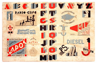
Read the full article here.
Images copyright CR Blog.
https%3A%2F%2Fwww.deliciousindustries.com%2Fthe-art-of-necessity
Delicious+Industries%3A+The+Art+of+Necessity
Vintage Ephemera on Flickr

These cool bits of ephemera are from HA! Designs Flickr group - Vintage Ephemera. A collection of items discovered whilst clearing out their Grandpa's house.
There are loads of random items; tins, adverts, playing cards, packaging, coupons, instruction booklets and greetings cards. It's interesting to see what their Grandpa thought was worth keeping for all these years.


Images copyright HA! Designs.
https%3A%2F%2Fwww.deliciousindustries.com%2Fvintage-ephemera-on-flickr
Delicious+Industries%3A+Vintage+Ephemera+on+Flickr
Golden Gems
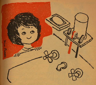
I discovered Golden Gems quite recently and I love it! It's an inspirational blog packed full of modern & vintage illustration along with a selection of Little Golden Books.
All the books have been lovingly scanned for our pleasure. I really love the illustrations from the 1961 'Humpty Dumpty's Magazine' (above and below), especially the animals with their speech bubbles.
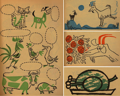
Check out the rest of this book and many, many more here.
Images copyright Golden Gems.
https%3A%2F%2Fwww.deliciousindustries.com%2Fgolden-gems
Delicious+Industries%3A+Golden+Gems
Mystery parcel

It's always nice to get an unexpected parcel in the post, but even more exciting when it's full of vintage ephemera - especially matchbooks! So a very big thank you to Jack Hooker for sending us a great selection.
Here are a few of my favourites. I especially like the Air India one and it's actually made of wood, the P&O one has different destinations stamped into the bottom of each match (which can just be made out in the pic) and I love the VIA one with 'Bon Voyage!' printed on the inside.


They will all be added to my Flickr group asap.
https%3A%2F%2Fwww.deliciousindustries.com%2Fmystery-parcel
Delicious+Industries%3A+Mystery+parcel
The Wonderful Work of Tad Carpenter

Big thanks to Tad Carpenter for his email and kind words about our blog.
You might remember some of Tad's work from the Grain Edit Giveaway - his illustrations are bold and bright with a good sprinkling of quirky, fun typography.
'HI' (above) is acrylic on wood, but much of his work is silk screened at Vahalla Studios - a business he shares with Dan Padavic producing gig posters and "other awesome silkscreen goodies".

Have a look at Tad's portfolio here, check out his blog, or stop by his online store which is packed full of his lovely prints.
Images copyright Tad Carpenter.
https%3A%2F%2Fwww.deliciousindustries.com%2Fthe-wonderful-work-of-tad-carpenter
Delicious+Industries%3A+The+Wonderful+Work+of+Tad+Carpenter
Welcome
Welcome to the Delicious Industries blog. We're an independent design studio based in Brighton, UK and this is our scrapbook packed full of design, illustration, photography & typography inspiration. Check out our work here.
Links
DELICIOUS FRIENDS
DELICIOUS FAVOURITES
- 50 Watts
- Acejet 170
- Grain Edit
- It's Nice That
- National Geographic Found
- Notcot
- Pretty Clever
- Retronaut
- So Much Pileup
- We Love Typography
- Another Mag

