art direction, design + typography
Blog: Inspiration
Preston Bus Station by Jonathan Kenyon


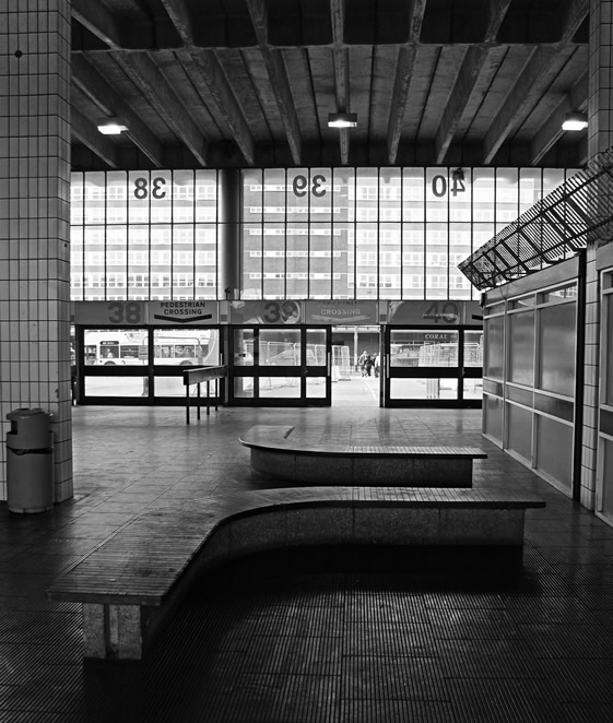
I was saddened earlier in the year to hear it's going to be knocked down as part of Preston's Tithebarn scheme (yet another urban regeneration programme) after it's application to become a listed building failed. It was designed in the late 60's by a Preston-based architect, Keith Ingham who worked at a local company, BDP (ironically the company now running the regeneration programme!) and when it first opened in 1969 it was hailed as the largest in the world.
There's no denying that the building could do with a bit of tlc, but Jonathan's images really capture the beauty of the building even in it's current state. Long live Preston Bus Station!
Images copyright Jonathan Kenyon.
Via Notcot.
https%3A%2F%2Fwww.deliciousindustries.com%2Fpreston-bus-station-by-jonathan-kenyon
Delicious+Industries%3A+Preston+Bus+Station+by+Jonathan+Kenyon
SR692: Swissair - The Ultimate Fansite


I can't get enough of all the wonderful Swissair design and print on SR692: Swissair - The Ultimate Fansite. They have a massive collection of Swissair printed ephemera including posters, tickets, calenders, publications, postcards, annual reports, time tables and route maps, as well as a very informative history of the brand and logo.
Above are a selection of the more graphic route map and time table covers. They're all really fantastic, but my favourites are the ones using the Reudi Bircher designed plane graphic logo of the 50's and 60's.
Huge thanks to Darren for sending me a link to Wanken, which led me to this great site.
Images copyright SR692.
https%3A%2F%2Fwww.deliciousindustries.com%2Fsr692-swissair-the-ultimate-fansite
Delicious+Industries%3A+SR692%3A+Swissair+-+The+Ultimate+Fansite
Warning - Sensory overload!


These matchbook labels from Kindra Murphy's (kindra is here) wonderful collection of uncut Czechoslovakian matchbox labels have just been uploaded to Flickr.
It's so great to see full sets totally unmolested and as new - the graphics are absolutely fantastic. I love the little vegetable characters. Thanks for sharing these Kindra, we can't wait to see more!
Images copyright Kindra Murphy.
Via the always inspiring World Famous Design Junkies.
https%3A%2F%2Fwww.deliciousindustries.com%2Fwarning-sensory-overload
Delicious+Industries%3A+Warning+-+Sensory+overload%21
When Beans were Bullets


"Combining the eye of a graphic designer with the research skills of a historian, curator Cory Bernat highlights the dramatic differences in style and content that emerged between the two wars. She displays copies of over seventy posters on fence panels instead of in frames to highlight their mass-produced quality. She uncovered the posters over the last two years among unprocessed holdings within NAL’s Special Collections, where the originals are still held."
There's something charming and homely about wartime posters and it's funny how the same slogans to reduce wastage and grow our own food are still topical today.
View whole exhibition online here or if you're lucky enough to live close by, you can see it in person at the National Agricultural Library until 10 September and then at the USDA South Building in Washington, D.C. from 6 October until 10 November 10, 2010.
Images copyright Cory Bernat.
Via Sell! Sell!
https%3A%2F%2Fwww.deliciousindustries.com%2Fwhen-beans-were-bullets
Delicious+Industries%3A+When+Beans+were+Bullets
Muhammad Ali: The Champ


Muhammad Ali: The Champ is a fantastic exhibition currently running at Proud Chelsea gallery until 3 October 2010. Taken by award-winning photographer, Michael Gaffney, the collection documents the public and private life of Muhammad Ali from 1977 to 1978 when he worked as Ali's personal photographer.
"the result of this phenomenal year will reveal Ali the fighter, the friend, the father and the inspiration through the eyes of a true confidant".
It's a rare opportunity to see natural images of such an iconic figure, but if you can't make it down there to see them in person don't despair, you can view the full exhibition online here.
Images copyright Michael Gaffney, taken from Proud Gallery website.
https%3A%2F%2Fwww.deliciousindustries.com%2Fmuhammad-ali-the-champ
Delicious+Industries%3A+Muhammad+Ali%3A+The+Champ
Flickr updates


We've finally got organised and updated our Flickr sets with more Auto Type, Matchbook labels and Racing numbers as well as adding a Vintage stamp set. Check them all out here.
https%3A%2F%2Fwww.deliciousindustries.com%2Fflickr-updates
Delicious+Industries%3A+Flickr+updates
Vintage Milk Bottles
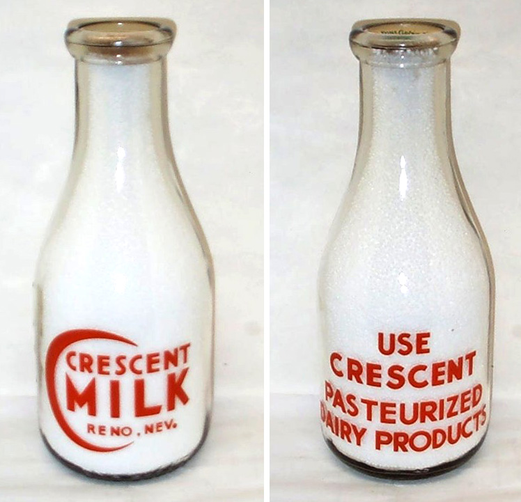


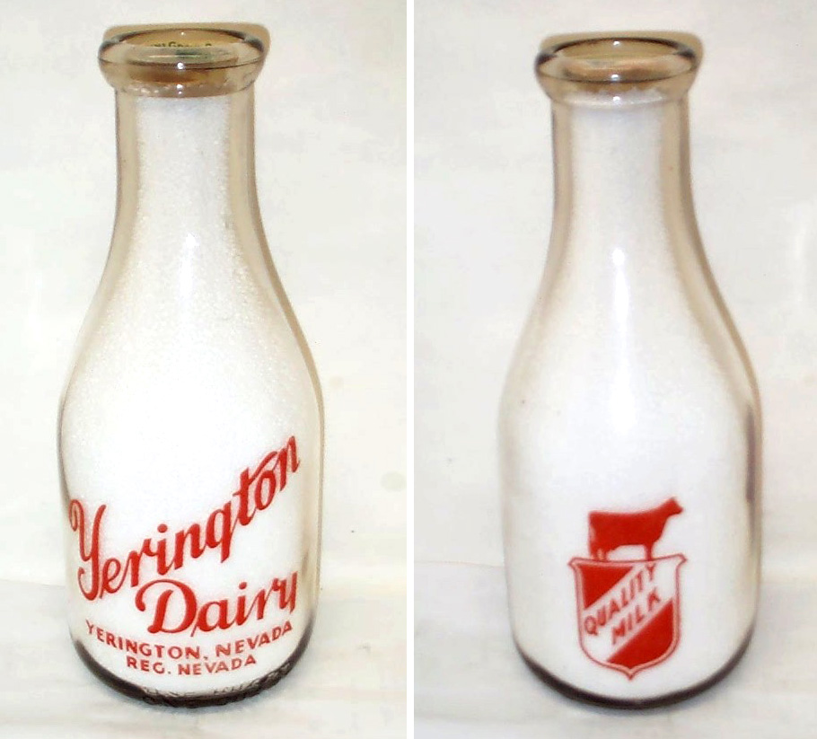


Who knew milk bottles could be so gorgeous, this lovely collection belongs to milk bottle collector and member of The National Association of Milk Bottle Collectors, Bill Kaiser. He has pages of bottles, the ones above are just a selection.
All the bottles have great graphics and decorative type, my personal favourites are the Crescent Milk graphic and the United Dairy type. It must have been lovely to start the day with one of these fine bottles on the table and don't forget how fabulous the bottle tops also used to be.
All the bottles above are available for sale on Got Milk Bottles. There is no mention of date, but my guess would be that they're from the 40's and 50's (I could however be very wrong!).
All images copyright Bill Kaiser.
https%3A%2F%2Fwww.deliciousindustries.com%2Fvintage-milk-bottles
Delicious+Industries%3A+Vintage+Milk+Bottles
Holiday Magazine Covers


The fabulous Gono have all the covers from 1946 - 1968, many are photographic, but there are quite a few graphic ones as above - check them out here.
Holiday was a US travel magazine from 1928 - 1977, first published by the AAA (American Automobile Association) until the mid 40's when it was sold to Curtis Publishing Company who ran the magazine until 1977 when it was sold to Travel magazine who merged it with their publication to form Travel Holiday.
Via Covenger + Kester.
https%3A%2F%2Fwww.deliciousindustries.com%2Fholiday-magazine-covers
Delicious+Industries%3A+Holiday+Magazine+Covers
PROSIGN - traditional signwriters


I've known of Prosign (Neil and Mandy Melliard) for a few years now and even been lucky enough to have my car signwritten by Neil! They're renowned in car and racing circles for their amazing work hand painting and pinstriping hot rods, race cars and promotional vehicles (above).
But I wasn't aware until today when I checked out their blog that they also do shop facias and window signage. In fact Neil has been working on window signage for Adidas in their Carnaby Street store earlier this month.
There's something lovely about a real hand-painted sign that other more modern techniques can never replicate. Here are some of the fabulous shops he's painted recently...


All images copyright Prosign.
https%3A%2F%2Fwww.deliciousindustries.com%2Fprosign-traditional-signwriters
Delicious+Industries%3A+PROSIGN+-+traditional+signwriters
From the reference box # 85

These gorgeous diagrams (below) are very detailed and printed on a fold out flap that can be veiwed at the same time as the written instructions.


https%3A%2F%2Fwww.deliciousindustries.com%2Ffrom-the-reference-box-85
Delicious+Industries%3A+From+the+reference+box+%23+85
LA TImes 50: Cigar Bands


From the LA TImes 50, these Cigar Bands "Gilded momentos of pre-revolutionary Cuba" are fantastic. I love the bright colours and detailed designs, it's great to see all the specialist print on such small labels. There's some really nice type on some of them too.
Other LA TImes 50 collections worth a look at are Matchbooks, Soda Pops, Crime Rags and LAPD Badges.
Images copyright LA TImes.
Via The Silver Lining Blog.
https%3A%2F%2Fwww.deliciousindustries.com%2Fla-times-50-cigar-bands
Delicious+Industries%3A+LA+TImes+50%3A+Cigar+Bands
Modern British Posters offer!

The very kind people at Black Dog Publishing have been in touch to offer our lovely readers 40% discount on their new publication, Modern British Posters by Paul Rennie.
"The book is drawn entirely from the prestigious graphic collection of Paul and Karen Rennie, with posters from artists including Paul Nash, Edward Bawden, Edward McKnight Kauffer, Abram Games, Peter Max and Tom Eckersley amongst others."
It's a great source of design reference filled with vintage posters from the likes of London Underground, BOAC and Shell (all below) as well as badges, books and items of ephemera from the same era. I really love this BOAC poster with the overlayed arrows making up the BOAC logo.


Here are some spreads to whet your appetite...


https%3A%2F%2Fwww.deliciousindustries.com%2Fmodern-british-posters-offer
Delicious+Industries%3A+Modern+British+Posters+offer%21
Huge news for UK Charley Harper fans…

Our friends at Castor + Pollux, Brighton have just announced the first UK exhibition of American illustrator Charley Harper's outstanding work. To say we're excited is an understatement!
Fans of Harper will be familiar with his work for Ford Times and know that many of his illustrations were also offered to readers as screen prints.
Well, this exhibition has 22 of the original Ford Times screen prints from the 50's and 60's hand-printed by the Harpers in their basement, along with some later prints from the 70's and 80's printed by the studio.
Last week I was fortunate enough to have a sneaky peak at the work and I can report it's even more amazing in the flesh than it is in any book.
The private view is on Friday 2 July and the exhibition runs from 3 July to 5 September 2010, so there is plenty of time to plan a trip to the seaside (Castor + Pollux is right on the seafront).
Read more about Charley Harper here and here.
https%3A%2F%2Fwww.deliciousindustries.com%2Fhuge-news-for-uk-charley-harper-fans
Delicious+Industries%3A+Huge+news+for+UK+Charley+Harper+fans%26%238230%3B
Mullard Valves Tested

This wonderful 50's sign makes me smile every morning, so I thought I'd share it with you guys for some Monday inspiration.
It's the printed glass from the front of an illuminated, Mullard's advertising sign given to me by my uncle when he closed his old electrical shop. I just love everything about it - especially the 'Valves Tested' type and the little man's quiff!
https%3A%2F%2Fwww.deliciousindustries.com%2Fmullard-valves-tested
Delicious+Industries%3A+Mullard+Valves+Tested
From the reference box # 74

Above is a pic of the whole collection and below are some pics of my favourites covers (please excuse the crappy iPhone pics, I'll scan them all in asap and add them to my Flickr set).


https%3A%2F%2Fwww.deliciousindustries.com%2Ffrom-the-reference-box-74
Delicious+Industries%3A+From+the+reference+box+%23+74
Welcome

Welcome to the Delicious Industries blog. We're an independent design studio based in Brighton, UK and this is our scrapbook packed full of design, illustration, photography & typography inspiration. Check out our work here.
Links
DELICIOUS FRIENDS
DELICIOUS FAVOURITES
- 50 Watts
- Acejet 170
- Grain Edit
- It's Nice That
- National Geographic Found
- Notcot
- Pretty Clever
- Retronaut
- So Much Pileup
- We Love Typography
- Another Mag