art direction, design + typography
Pop Art Design
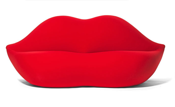
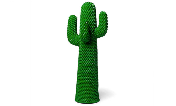
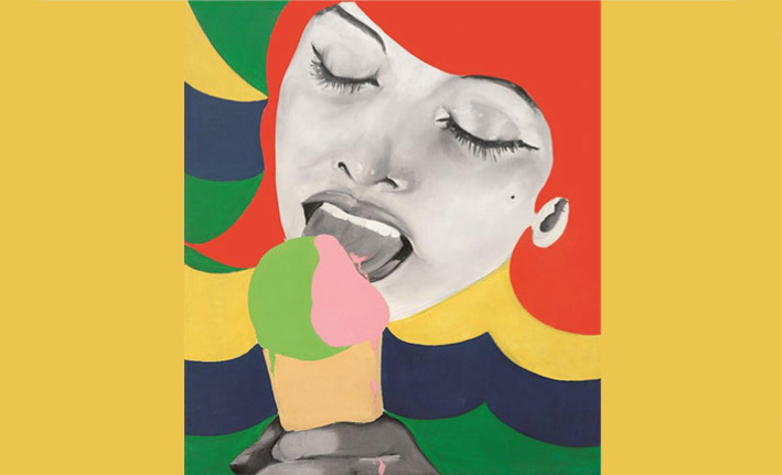
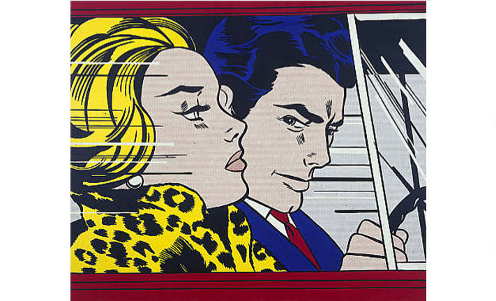
Pop Art Design starts tomorrow at the Barbican! With over 200 works from over 70 artists and designers including Peter Blake, Roy Lichtenstein, Andy Warhol, Charles and Ray Eames, it's going to be a great exhibition.
"Pop artists commented on the cult of celebrity, commodity fetishism and the proliferation of media that permeated everyday life in America and the United Kingdom after the Second World War. Radically departing from all that had gone before, artists delighted in adopting the design language of advertising, television and commerce to create work that was playful but often also intentionally irreverent and provocative. In turn, designers routinely looked to Pop Art as a constant source of inspiration. Pop Art Design paints a new picture of Pop – one that recognises the central role played by design."
The exhibition runs until February 2014 so there's plenty of time to get down there and I have it on very good authority that the gallery shop is packed full with fabulous pop art style goodies.
https%3A%2F%2Fwww.deliciousindustries.com%2Fpop-art-design
Delicious+Industries%3A+Pop+Art+Design
Why Agencies Are Responsible For ‘Unreasonable’ Client Expectations
An oh-so-true post by London creative agency, Sell! Sell! as to why 'unreasonable' client expectations are the fault of the agencies. The points they make are equally relevant to the design industry (or in fact any creative industry) so here it is, the most words I've ever posted:
....................................................
Why Agencies Are Responsible For 'Unreasonable' Client Expectations
A smart salesman that I know once blew my mind with this simple statement:
We train clients to expect what they expect.
It's a simple truth.
Clients can ask for a campaign to be turned around in a day
or five different 'routes'
or a TV commercial to be made for way less than it should really take
or a photo shoot on a pittance
or for changes that make the work worse
or for excruciatingly small fees from the agency.
They can ask for what they want. It is a free world.
But it is only when agencies say yes to these things, only when agencies and agency staff are complicit, that these requests, and this behaviour, is given credibility.
Agreeing to do it endorses the request.
That is how clients have been trained to expect all of the unreasonable and harmful things that have become part and parcel of advertising for most people at most agencies.
It is because there are always enough agencies and people out there willing to say yes to the next unreasonable demand.
I'll be honest here - we spend an unbelievable amount of energy here at Sell! Towers managing the process of not agreeing to the kinds of things listed above. It's the harder road. It's much easier in the short term to say yes.
And we know that many agencies out there are saying yes.
But, we are honest with out clients about our high fees up front - and we know that some clients who wanted to work with us have walked away because of that - we can live with that.
It means the ones who work with us, value us.
We resist changes and amendments to work that we believe will make it less good, that takes a lot of managing and takes time, energy and skill to build relationships with clients strong and respectful enough for that to be possible, but we think it's worth it.
We don't work to piss-take schedules, we don't make people work weekends and through the night to meet them.
We don't take the piss out of suppliers by passing on unreasonable cost requests, or by hammering them unreasonably just because a job is a 'creative opportunity'.
We don't churn out work to meet a set number of routes, or as cannon fodder. We only work on things that we think will be the solution.
In short, we do all of the things that we think it takes to be a creative agency of integrity, with standards and professionalism, and with respect for those we work with.
But it's becoming increasingly obvious that there are tons of agencies out there who will literally do whatever they're asked to gain or keep a piece of business.
On a level, it's understandable. The advertising market is massively over-supplied. This means that some people become increasingly desperate to win business.
Small agencies trying anything to compete.
Other kinds of businesses - like digital specialists, pr firms, and production companies - trying to get in on the advertising budgets.
And network agencies, pushed by pressure from afar to gain and retain clients at all costs.
They all have their reasons.
It's understandable, but it's not excusable.
And yes, we are lucky, because we are masters of our own destiny, so to speak. We can make these choices.
But we have made the choices not to become a lowest common denominator agency, not to compete on price, speed and how often we can say yes.
And the result is, we work with the kind of clients who value that. We have a great group of clients, but it takes a lot of work, and effort and time to build those relationships of trust and respect.
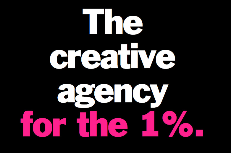
And it often seems like the number of clients who want an agency like that is reducing - so much so that these days we openly say that we're the "Creative agency for the 1%" of clients.
And we're okay with that.
It works for us.
But it's funny when you hear agency people complaining about clients' behaviour and expectations.
They blame it all on the client. Yet their own agency endorses those requests by agreeing to them.
The simple fact is, while there are enough agencies out there that will agree to the unreasonable, the unreasonable will always be expected.
If clients aren't made to realise the something is unreasonable, how are they expected to know that it's unreasonable?
No one made out it was unreasonable. They asked, and someone said yes.
Or in other words, as my friend rightly said: We train clients to expect what they expect.
....................................................
For more wonderful insights into the ad industry, visit Sell! Sell! or check out their work here.
https%3A%2F%2Fwww.deliciousindustries.com%2Fwhy-agencies-are-responsible-for-unreasonable-client-expectations
Delicious+Industries%3A+Why+Agencies+Are+Responsible+For+%26%238216%3BUnreasonable%26%238217%3B+Client+Expectations
Rare & Important Travel Poster Auction
Pin this on Pinterest
 View large image
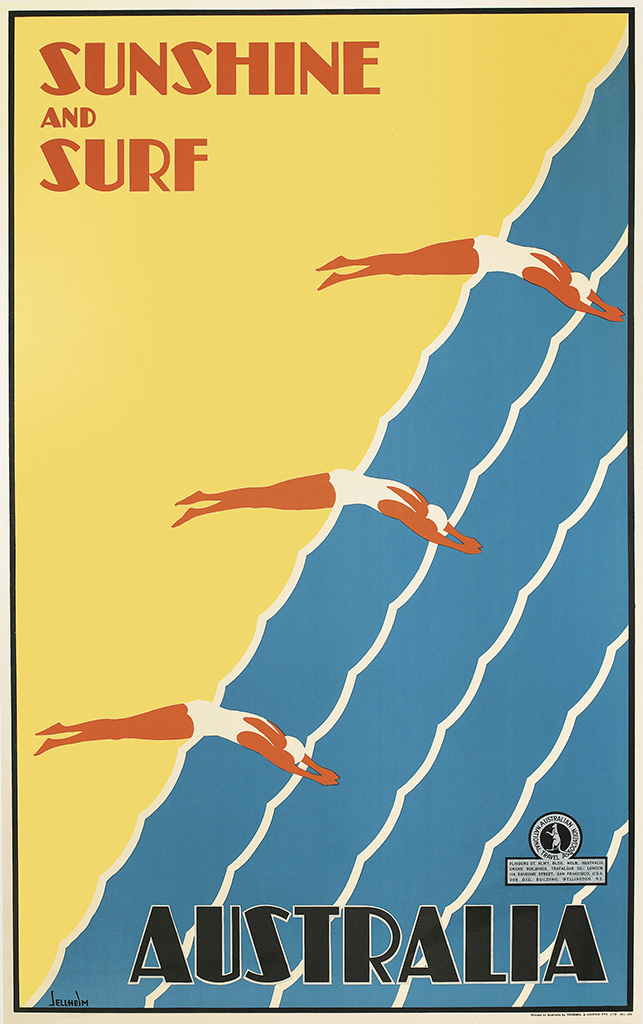
Sunshine and Surf / Australia. Circa 1936. Designed by Gert Sellheim.
Pin this on Pinterest
View large image
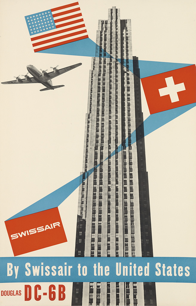
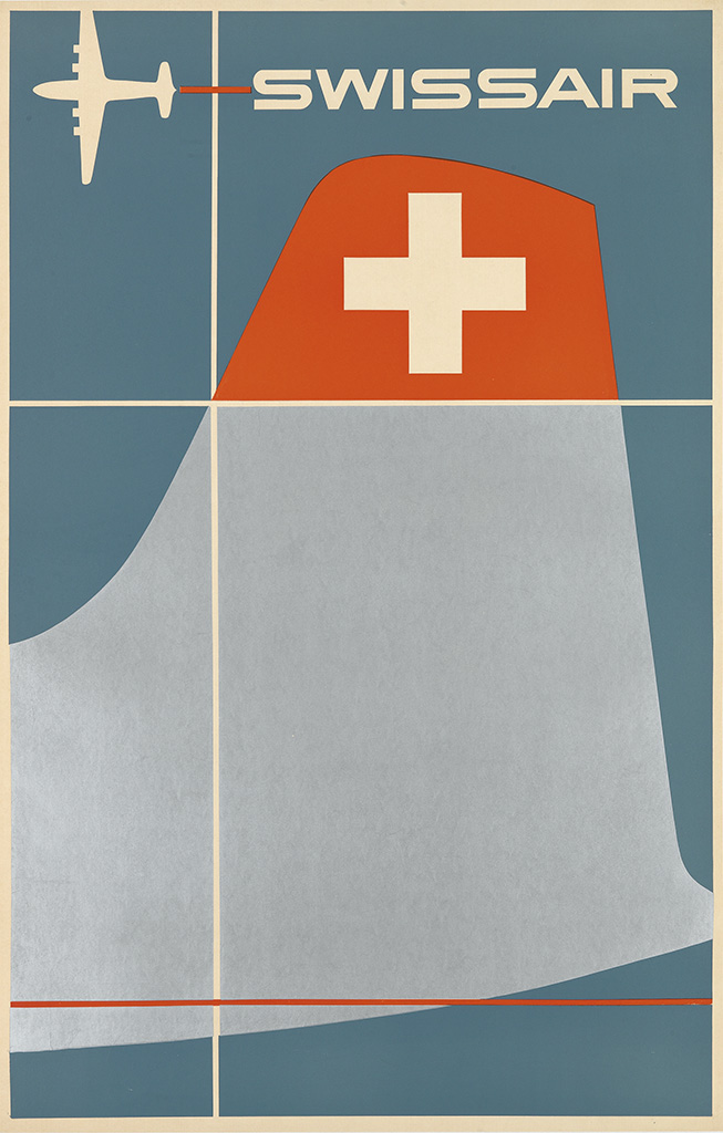
Swissair / By Swissair To The United States / Douglas DC - 6B. Circa 1952. Designed by Henri Ott.
Pin this on Pinterest
View large image
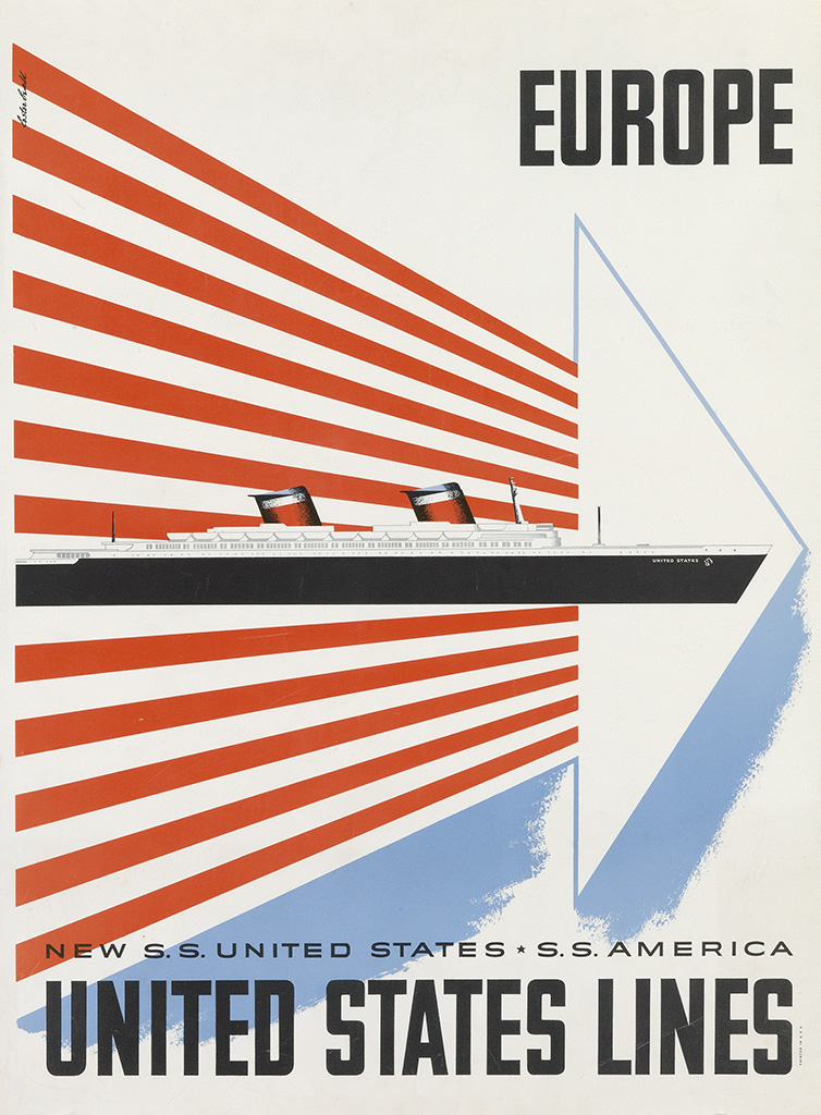
Europe / United States Lines. Circa 1952. Designed by Lester Beall.
Pin this on Pinterest
View large image
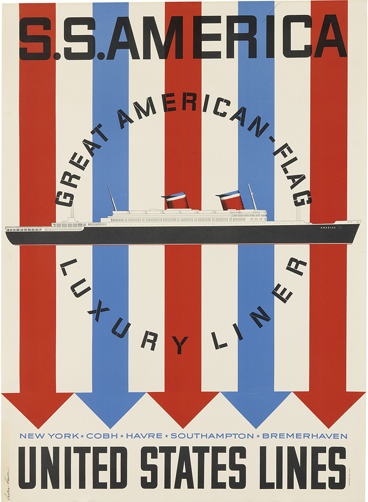
S.S. America / United States Lines. Circa 1952. Designed by Lester Beall.
Pin this on Pinterest
View large image
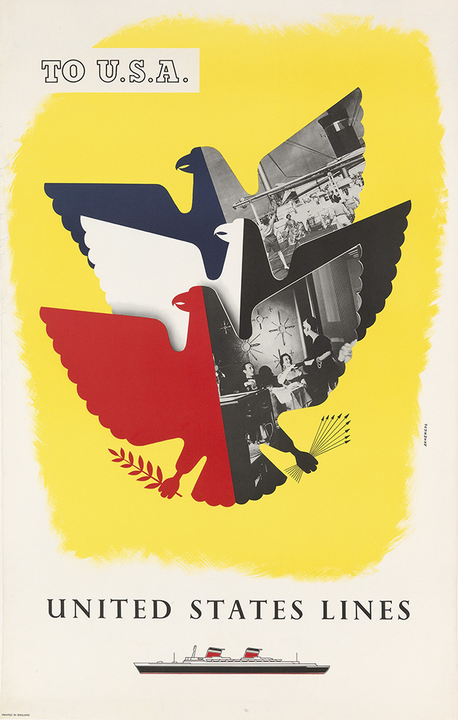
To U.S.A. / United States Lines. Circa 1952. Designed by Armengol.
Pin this on Pinterest
View large image
Jet Your Way By B • O • A • C / Around The World. Circa 1960. Designer Uunknown.
Swann Galleries, New York are holding a 'Rare & Important Travel Poster' auction on October 18th. They always have an impressive selection of posters in their auctions and this one is no exception.
"From the deserts of the Mideast to the alpine resorts of Europe, this auction offers images of diverse geographical locations, in addition to bold depictions of trains, ocean liners and airplanes."
For me it doesn't matter about rarety, importance or designer. It's the bold, bright, graphic ones I like, however I will need significantly deeper pockets to be bidding on any of these.
See the full catalogue here.
https%3A%2F%2Fwww.deliciousindustries.com%2Frare-important-travel-poster-auction
Delicious+Industries%3A+Rare+%26amp%3B+Important+Travel+Poster+Auction
Jacques Lowe: My Kennedy Years
Pin this on Pinterest
View large image
Jackie and John F Kennedy in a diner in Oregon in the autumn of 1959 (© Estate of Jacques Lowe)
Pin this on Pinterest
View large image
Jackie relaxes on the beach in Hyannis Port in the summer of 1960 (© Estate of Jacques Lowe)
Pin this on Pinterest
View large image
John F and Jackie Kennedy working together in autumn, 1958 (© Estate of Jacques Lowe)
Pin this on Pinterest
View large image
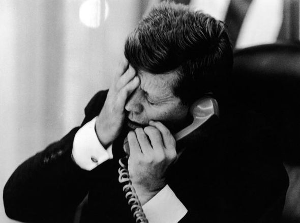
John F Kennedy is devastated by Patrice Lumumba's assassination, 1961 (© Estate of Jacques Lowe)
Pin this on Pinterest
View large image
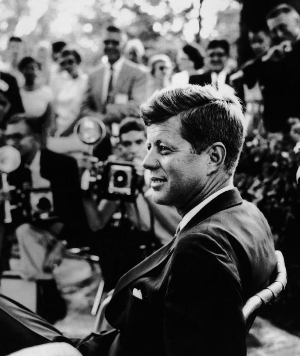
The presidential candidate appears in Omaha, Nebraska, 1959 (© Estate of Jacques Lowe)
Pin this on Pinterest
View large image
Jackie, John F Kennedy and daughter Caroline in Hyannis Port, August 1960 (© Estate of Jacques Lowe)
Jacques Lowe: My Kennedy Years - an intimate archive of a political rock star.
To mark the 50th anniversary of John F Kennedy's death Proud Gallery, Chelsea are showing a wonderful exhibition of intimate, beind-the-scene images of JFK and his family.
Jacques Lowe became the Kennedy's personal photographer in the mid 50s after turning down an official post as White House photographer. The 28 year old was given full access to the day-to-day life of the president, at work, at home and at play. He took over 40,000 images during this time but unfortunately all the negatives were destroyed in the 9/11 attacks leaving only these images printed by Lowe before his death in 2001.
The exhibition runs until November 25th and there's an accompanying book, 'My Kennedy Years: A Memoir by Jacques Lowe' published by Thames & Hudson for those who can't make it in person.
Images copyright: Estate of Jacques Lowe
Via Chapeau!
https%3A%2F%2Fwww.deliciousindustries.com%2Fjacques-lowe-my-kennedy-years
Delicious+Industries%3A+Jacques+Lowe%3A+My+Kennedy+Years
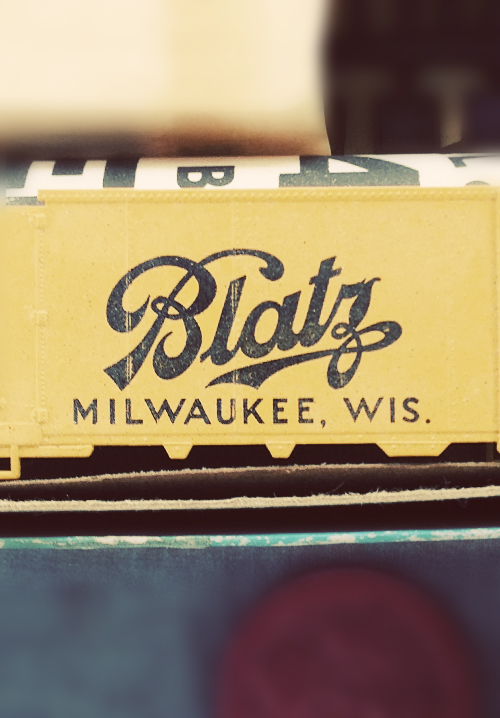
Auto Type XXVXIV
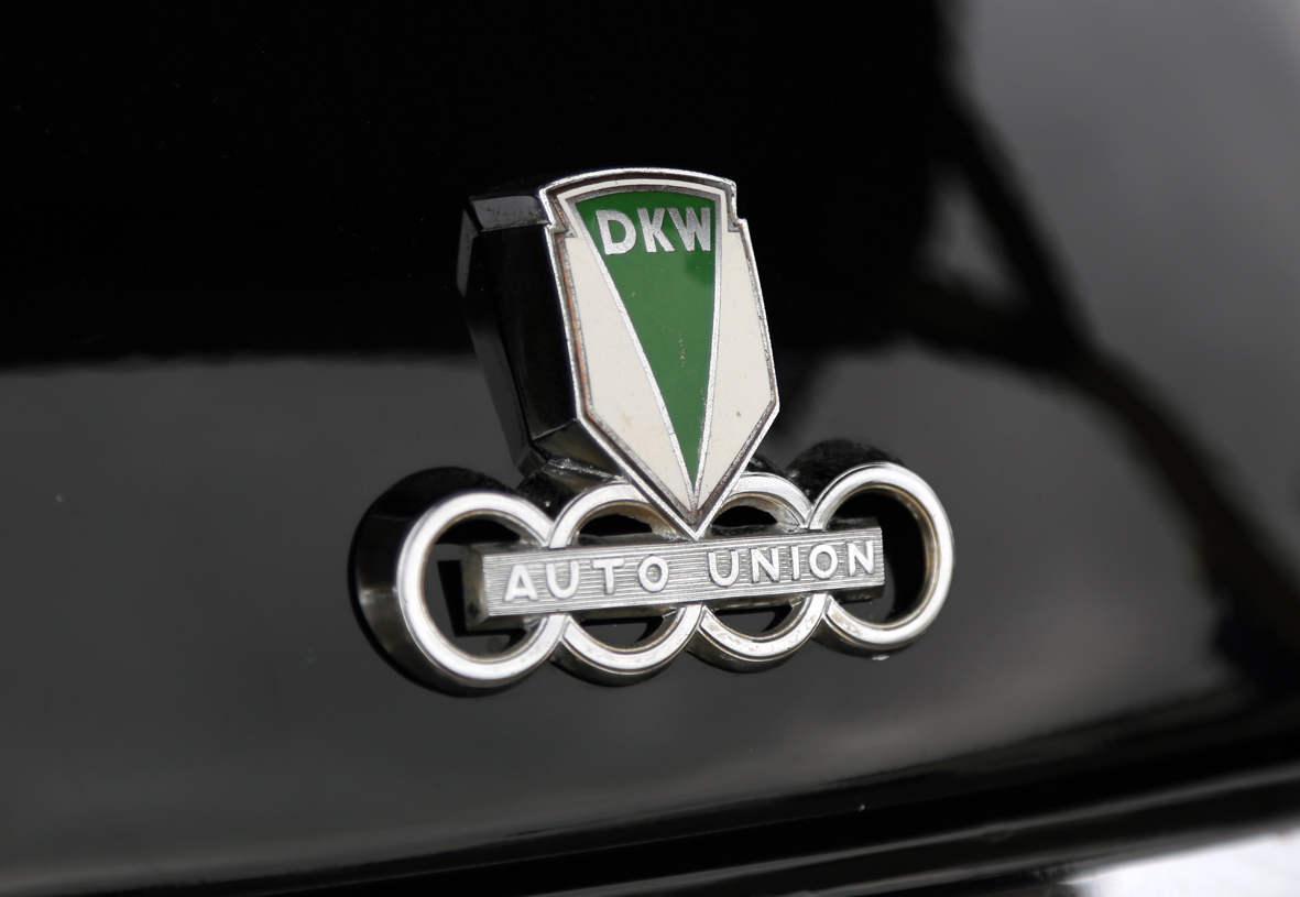
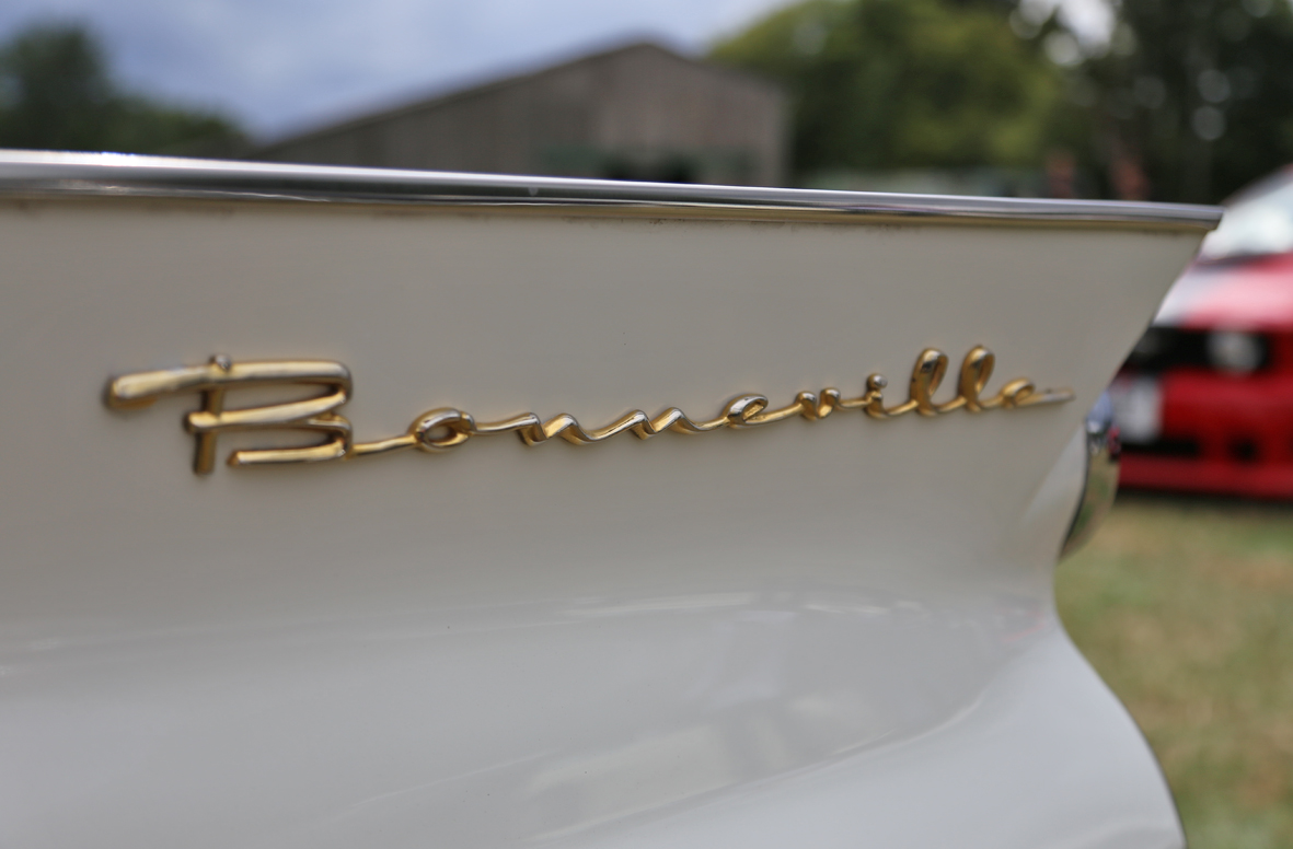
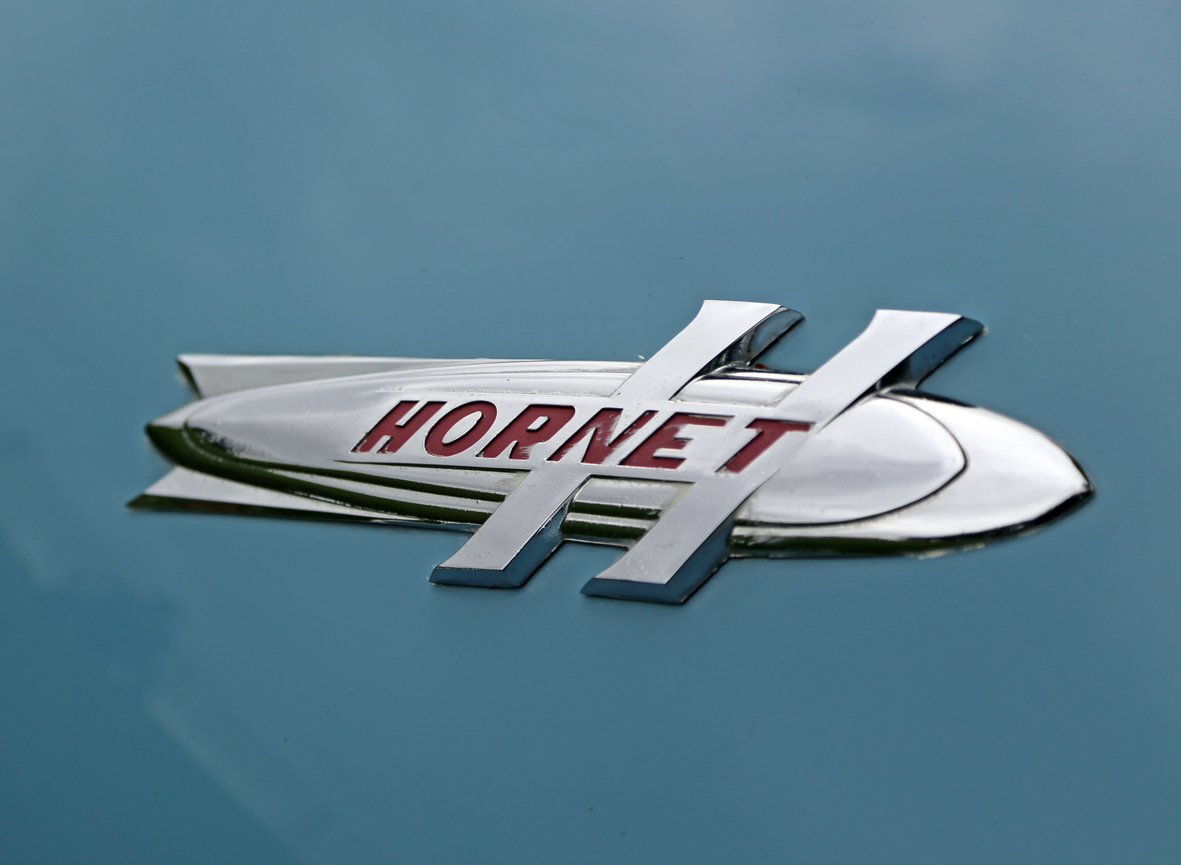
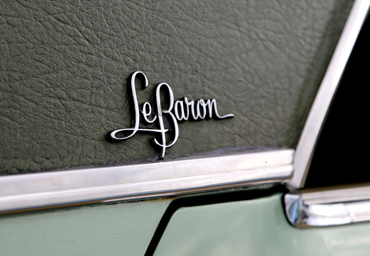
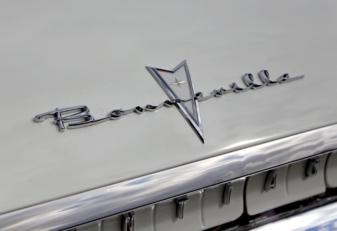
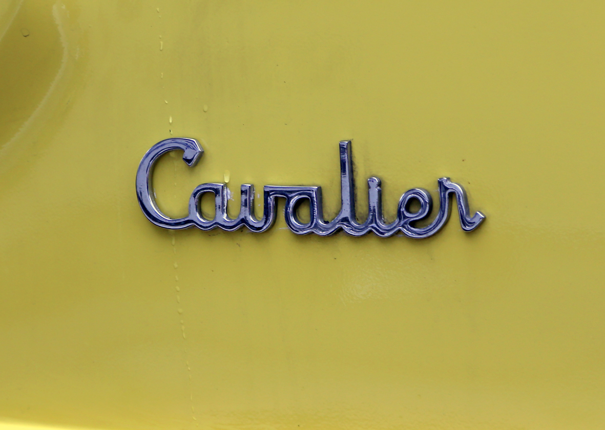
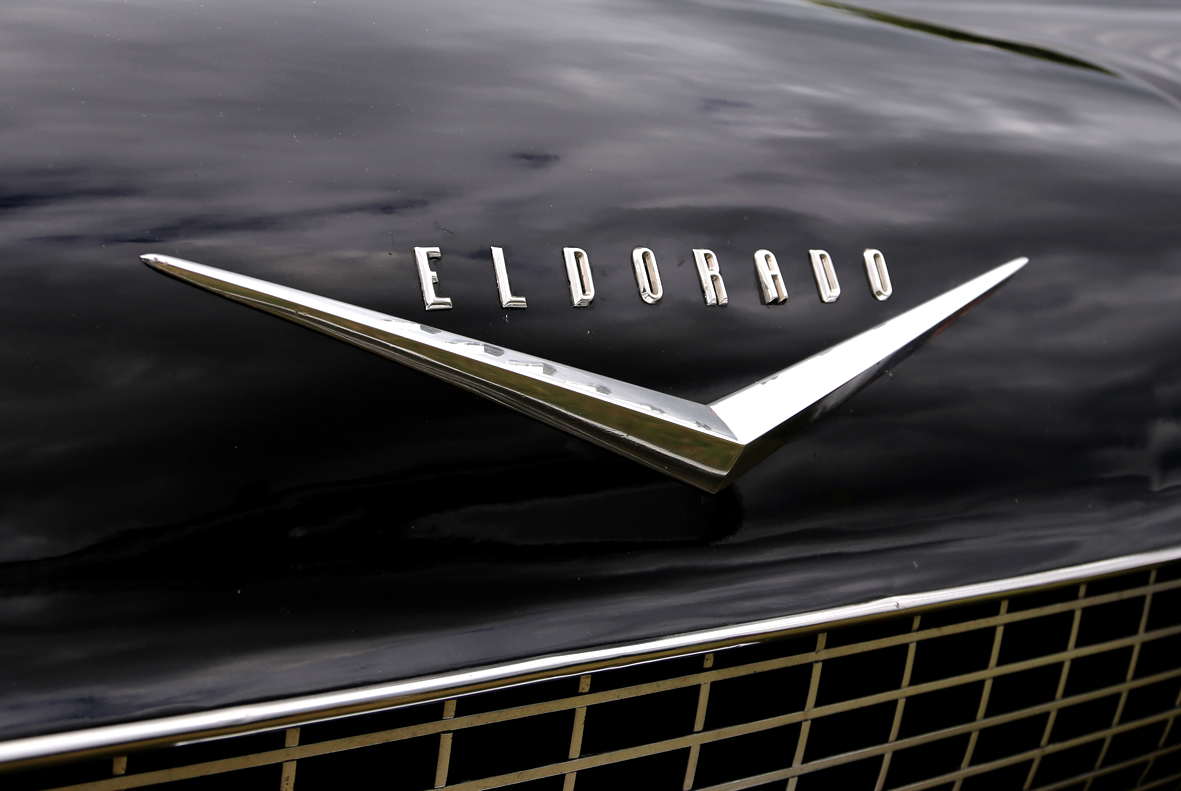
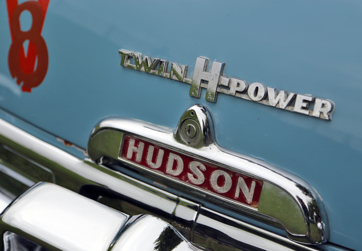
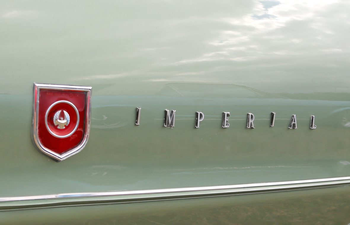
An eclectic selection of lettering from mainly American cars, with the exceptions of the DKW Auto Union and the Harrington Cavalier.
The DKW 3-6 Sonderklasse is a rare German beast and from the actual car that racing legend Jim Clark drove in his first race at Crimond June 1956. The 'Cavalier' is from an English Harrington Cavalier Coach.
Rarety aside though, the Hornet lettering has to be my favourite on that lovely 50s rocket-shaped chrome - beautiful!
See our full Auto Type collection here and here.
https%3A%2F%2Fwww.deliciousindustries.com%2Fauto-type-xxvxiv
Delicious+Industries%3A+Auto+Type+XXVXIV
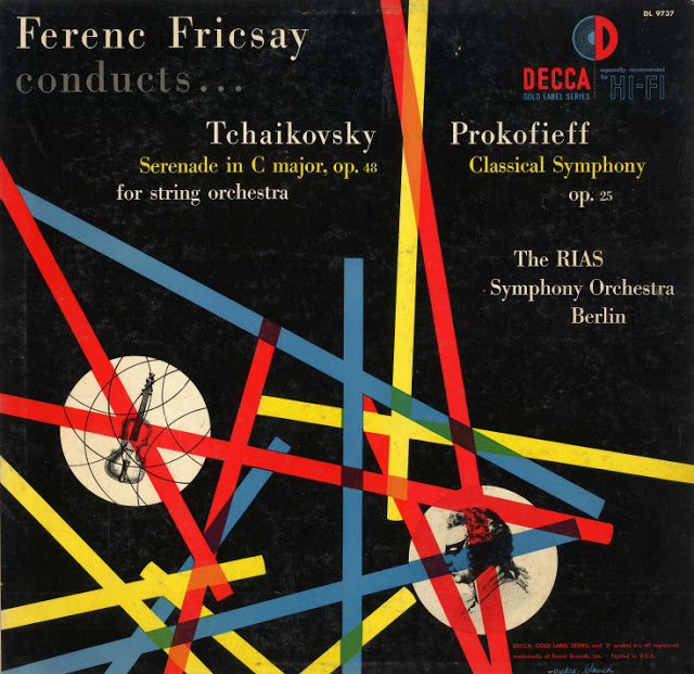
Alex Steinweiss
_Decca_Gold_Label_Series_catalogue_no._DL_8400.jpg)
Throughout his career, Alex Steinweiss (1917 - 2011) was art director at Columbia Records, London, Decca and A & R records. He was the man behind the record cover's very existence - before him records were sold in plain wrappers, no branding, no design, no marketing.
“I got this idea that the way they were selling these albums was ridiculous. The covers were just big brown, tan or green paper. I said: “Who the hell’s going to buy this stuff? There’s no push to it. There’s no attractiveness. There’s no sales appeal.” So I told them I’d like to start designing covers.”
Art & Artists have written a really interesting 6-part biography illustrated with a massive collection of cover designs spanning his extensive career. Check it out here.
Via Pretty Clever. Images from Art & Artists.
https%3A%2F%2Fwww.deliciousindustries.com%2Falex-steinweiss
Delicious+Industries%3A+Alex+Steinweiss
From the reference box #140
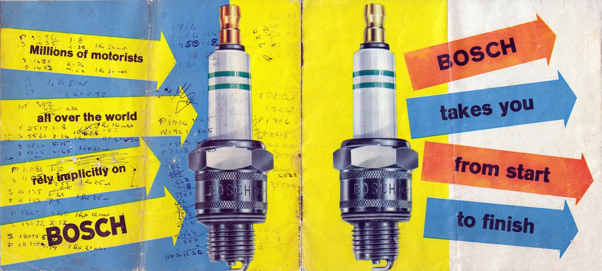
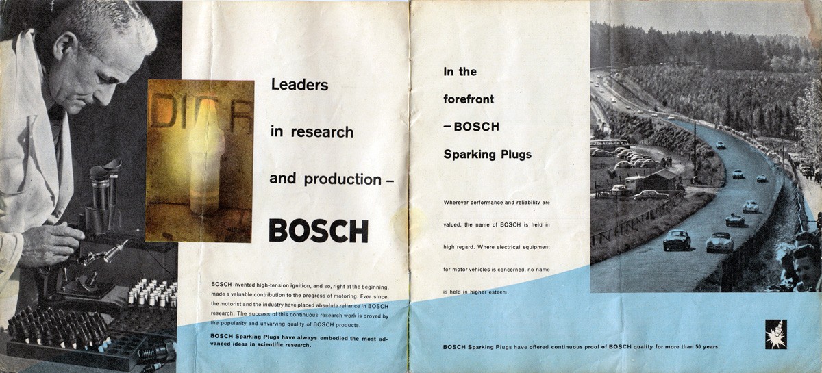
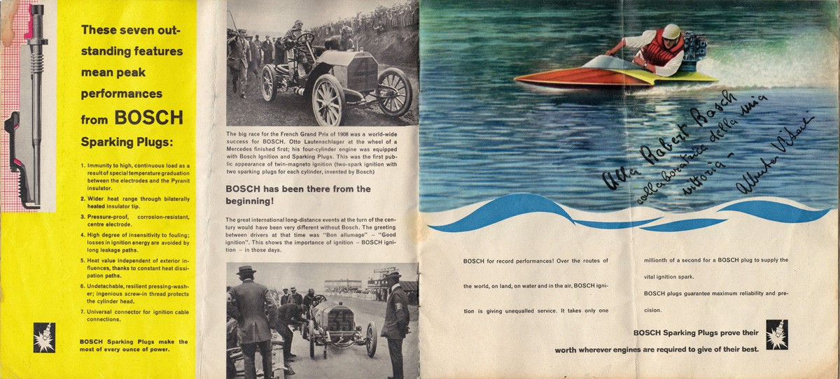
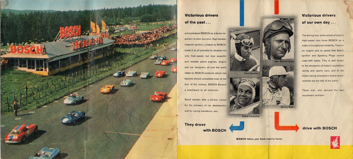
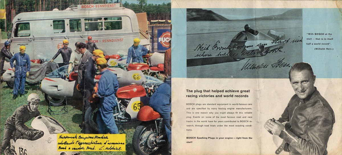
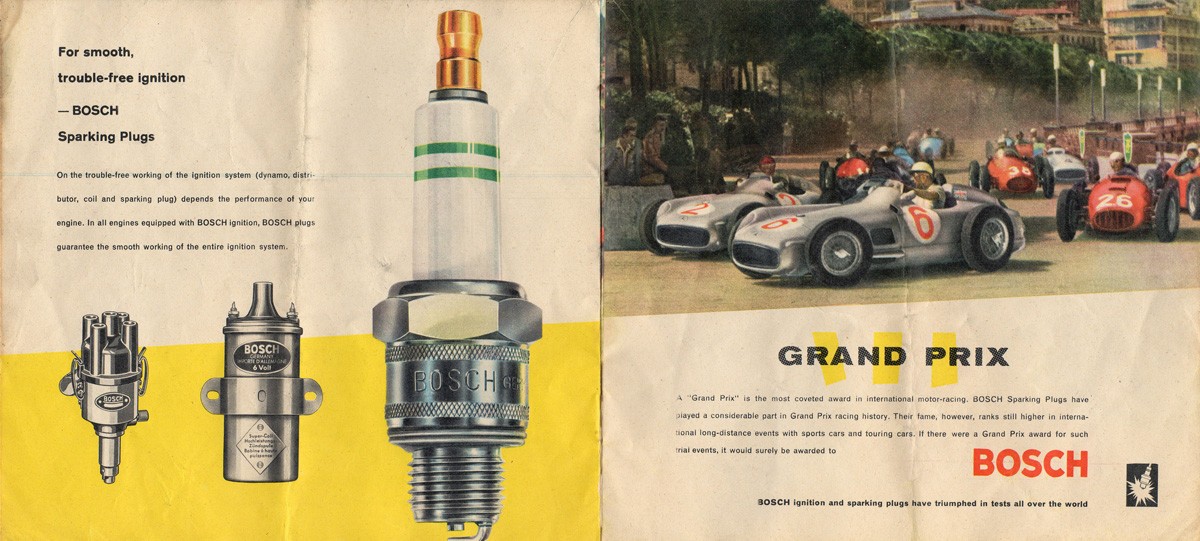
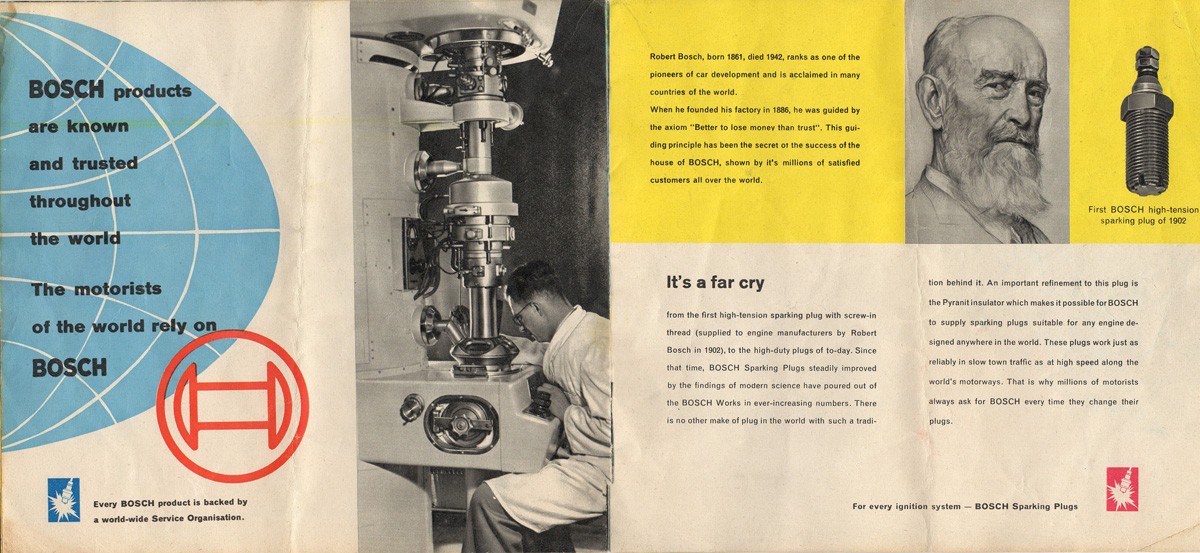
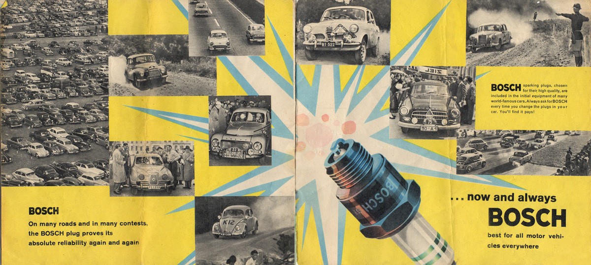
#140 - A rather gorgeous 1960s Bosch spark plug brochure - 'Bosch takes you from start to finish'.
This 16pp brochure highlights the advantages of Bosch spark plugs and backs it up with examples of motorsport success from Grand Prix winning vehicles to land speed records.
There are some amazing illustrations throughout, but some very questionable typesetting with an abundance of hyphens.
I love finding little notes on ephemera that tell you something extra about the item and this brochure has a whole host of figures and calculations on the back cover which seem to refer to a vehicles mileage & maintenance - length (in time) of journeys taken, mileage covered, dates and quantities of oil added and mileage at service points. It was clearly kept either in the car or close by used as a constant reference. Wish I knew what car it related to.
There's loads more ephemera and vintage packaging tucked away in our reference box, have a look and see what you can find.
https%3A%2F%2Fwww.deliciousindustries.com%2Ffrom-the-reference-box-140
Delicious+Industries%3A+From+the+reference+box+%23140
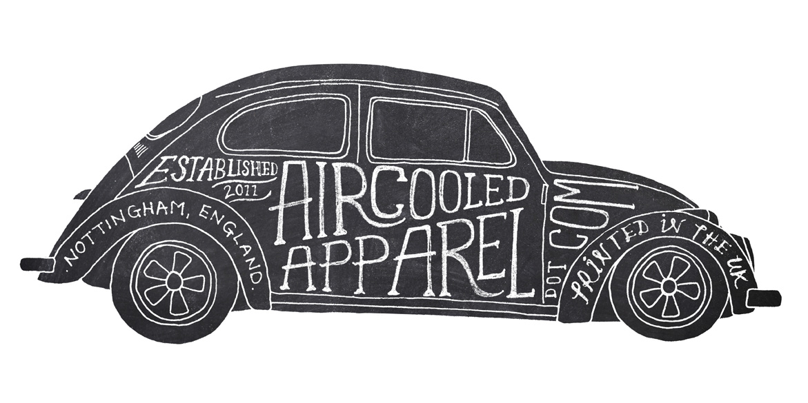
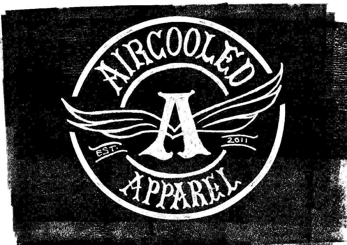
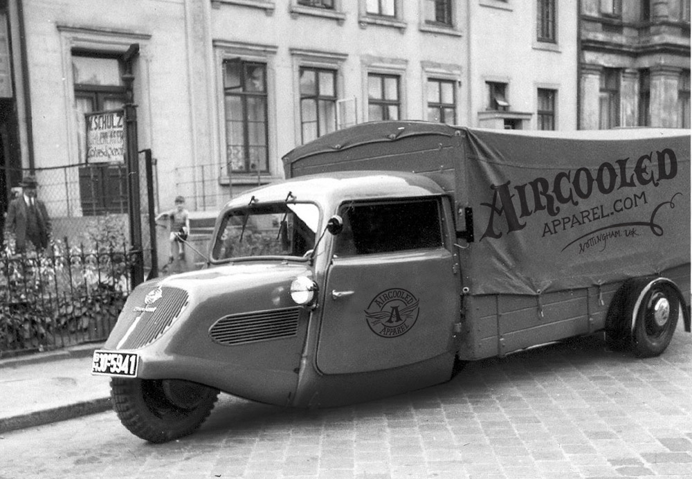
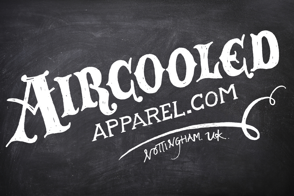
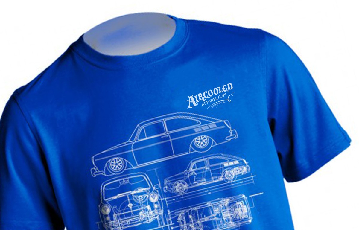
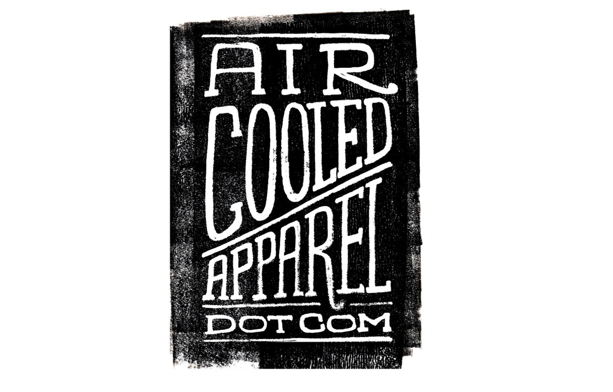
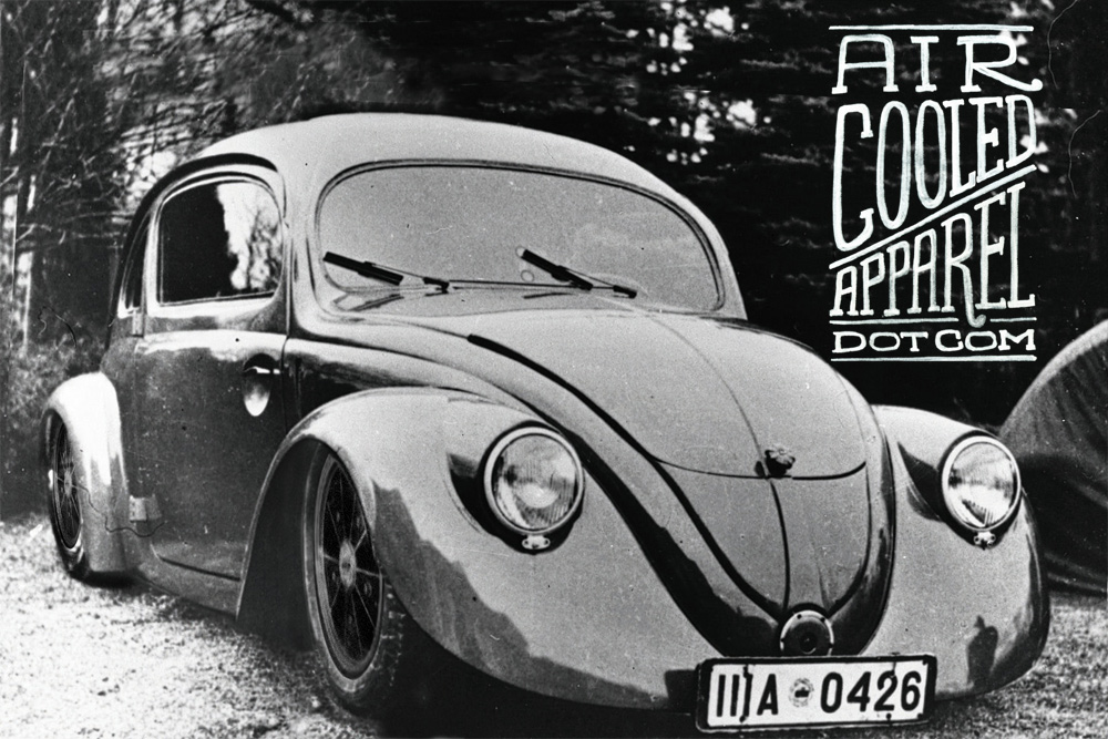
Aircooled Apparel
Thought we'd share a fun project we've been working on recently for the guys at Aircooled Apparel - a selection of versatile, hand-lettered graphics that can be used in their marketing and across their clothing & stickers range.
See more of our work here and here.
https%3A%2F%2Fwww.deliciousindustries.com%2Faircooled-apparel
Delicious+Industries%3A+Aircooled+Apparel
Type Hunting
Type Hunting have a great selection of type and lettering images on their Tumblr. Some very good mid-week inspiration.
Makes me think I should pull all my found type images together and create a Found Type Tumblr. Watch this space!
Via Sell! Sell! Blog.
https%3A%2F%2Fwww.deliciousindustries.com%2Ftype-hunting
Delicious+Industries%3A+Type+Hunting
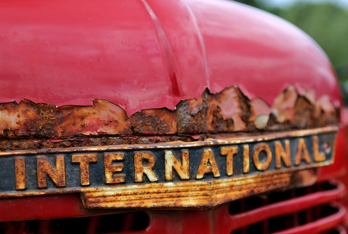
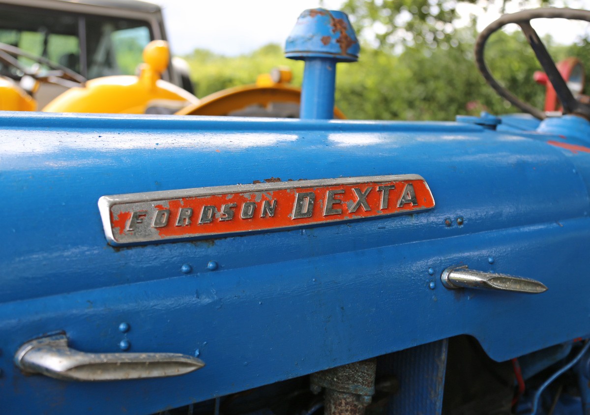
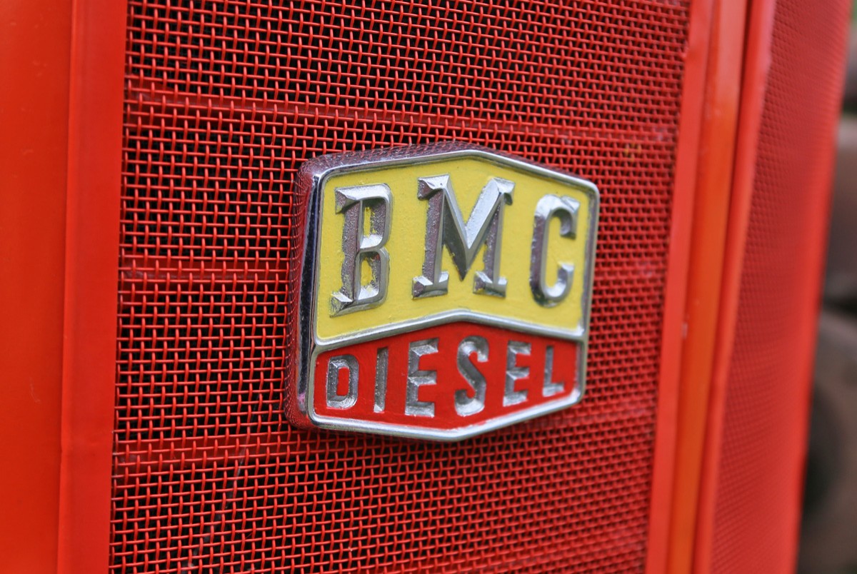
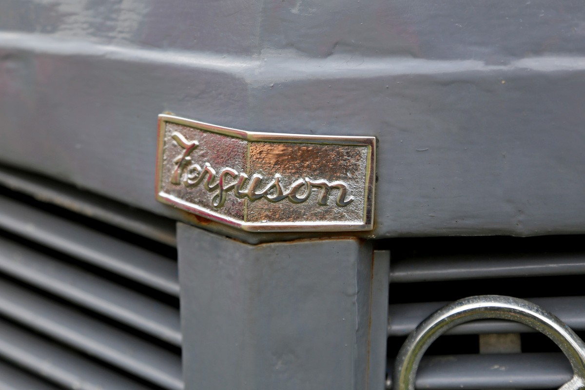
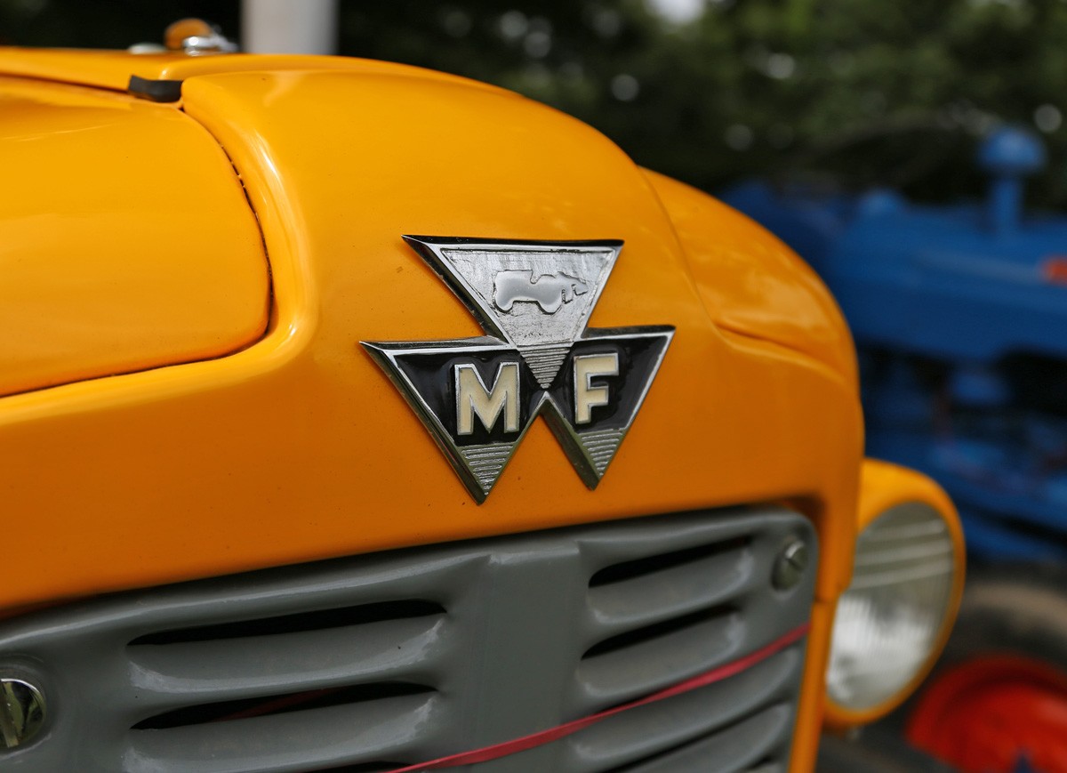
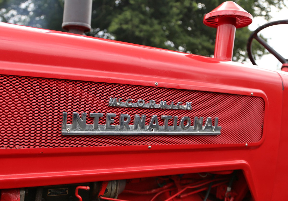
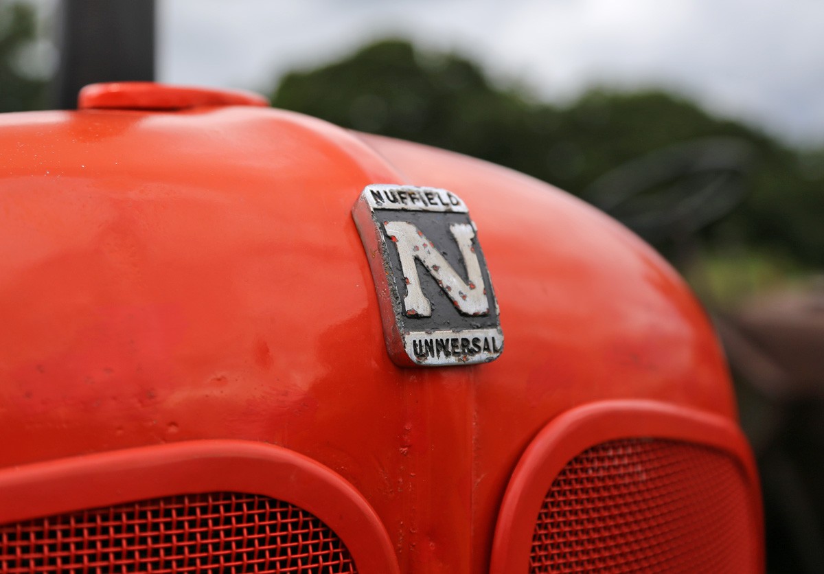
Auto Type Special: Vintage Tractors
Just look at the fabulous lettering that can be found lurking in barns & farm yards.
There's something about the simplicity and functionality of vintage tractors that I've always found charming, but their appeal doesn't end there. As you can see these work horses also have beautiful hand-lettered emblems.
If Auto Type is your thing or if you need a bit of inspiration, have a look at our complete collection here and here.
https%3A%2F%2Fwww.deliciousindustries.com%2Fauto-type-special-vintage-tractors
Delicious+Industries%3A+Auto+Type+Special%3A+Vintage+Tractors
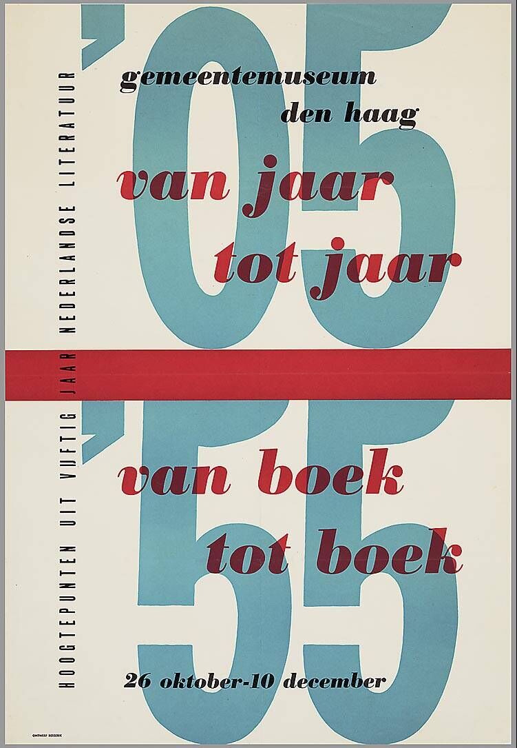
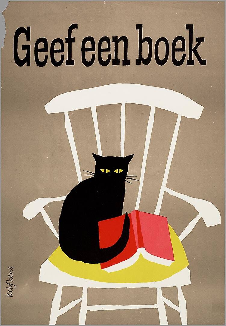
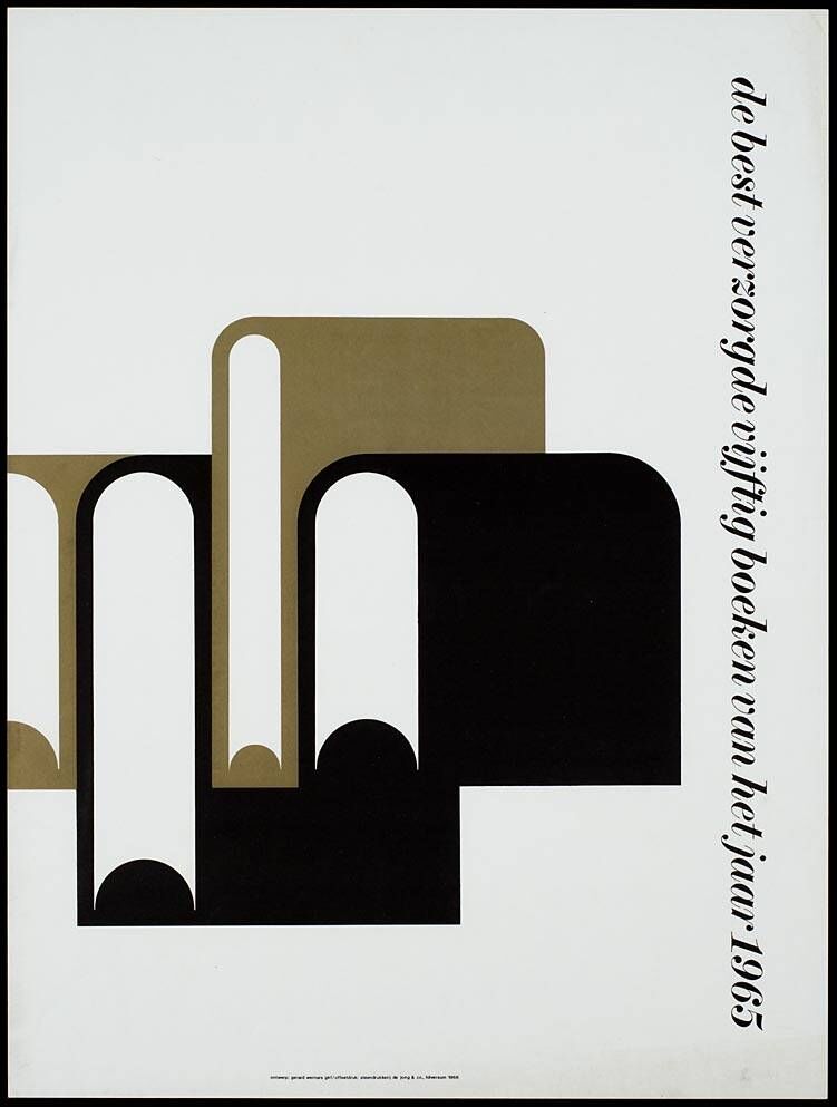
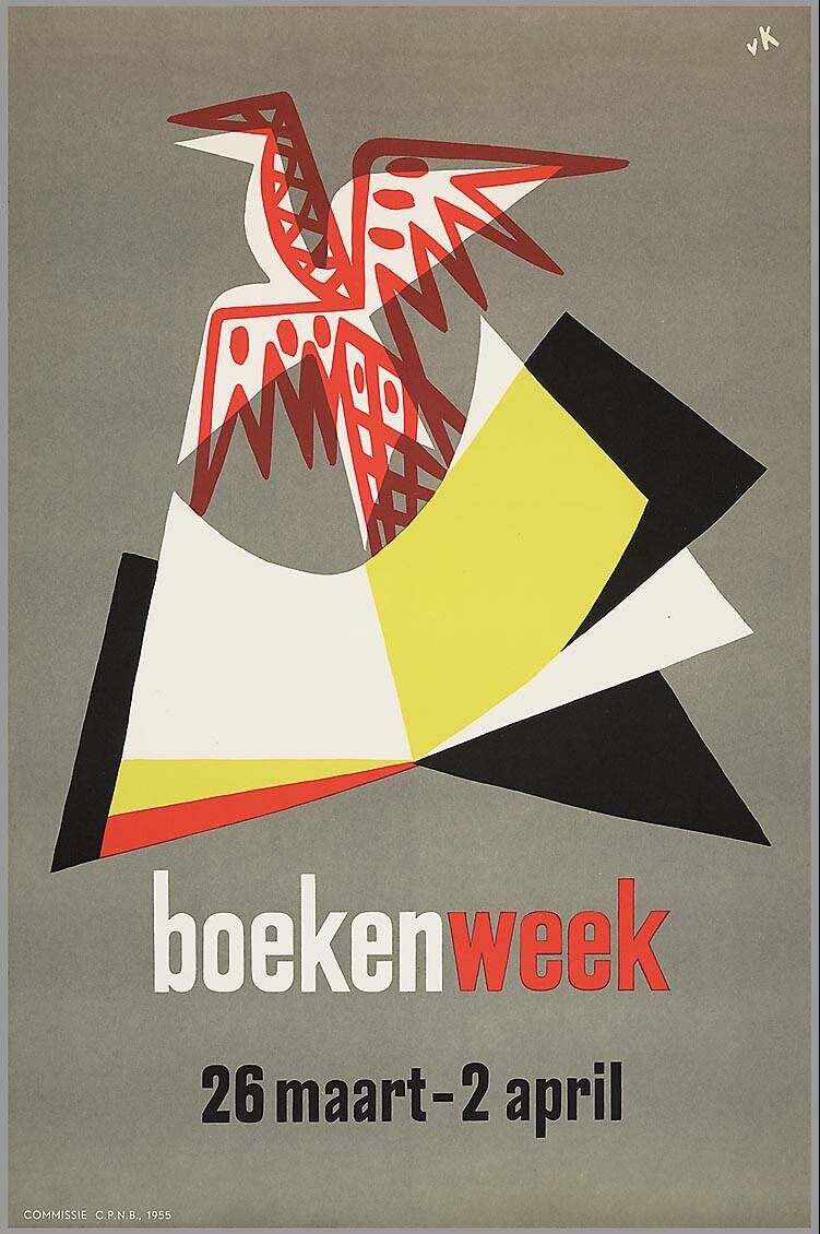
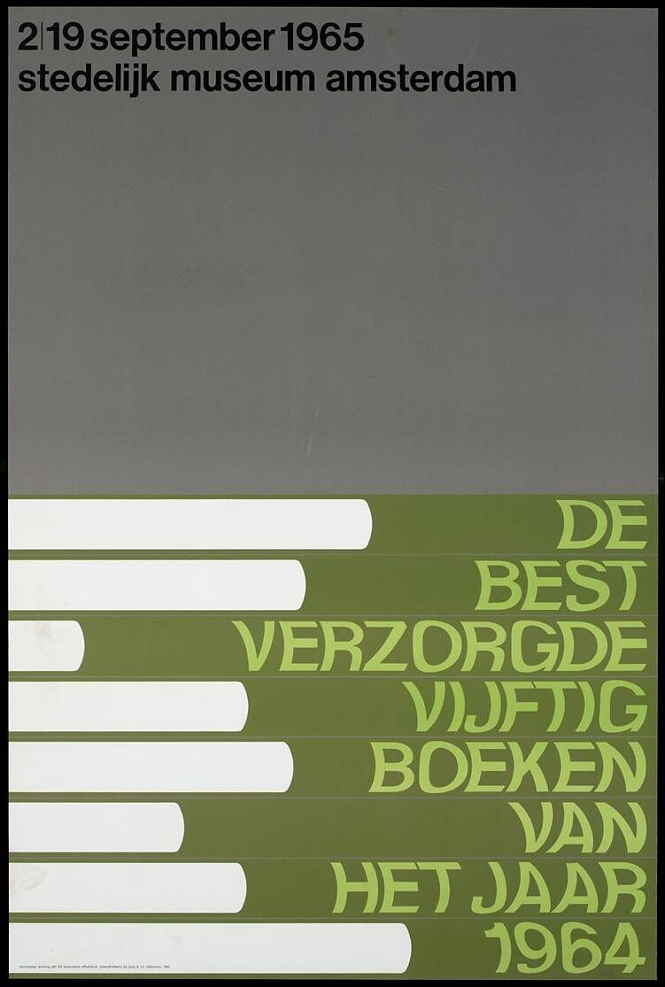
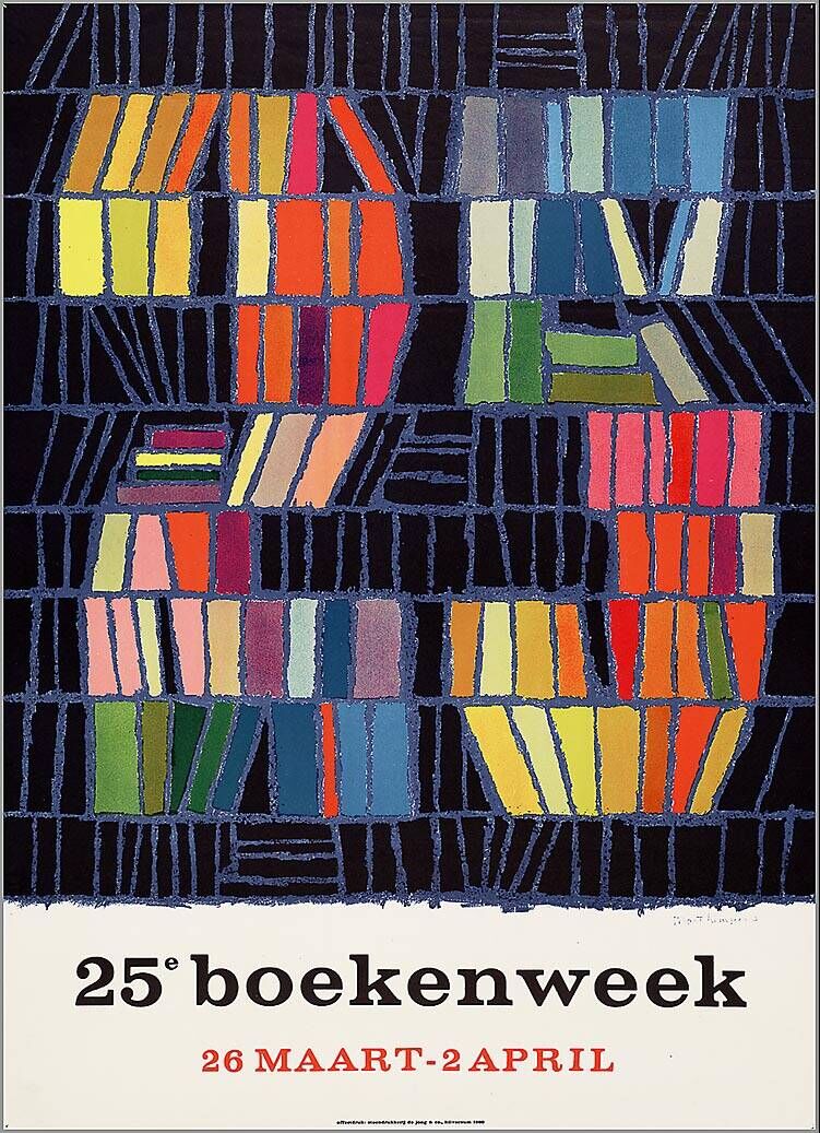
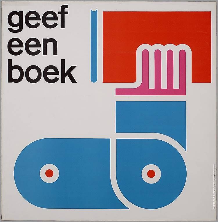
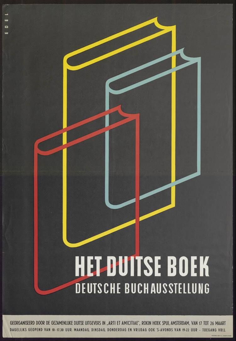
Dutch Book Week Posters
These beautiful vintage posters advertising Book Week (1955 - 1971) and lots, lots more form the Dutch design resource ADVIZ, "a new bilingual (NED / EN) interactive platform for the graphic design industry, the advertising industry and for anyone interested in visual communication".
The two-part website was launched in 2011 to; A. bring together design reference from the collections of the Dutch Archive Graphic Designers (Nederlands Archief Grafisch Ontwerpers - NAGO), the Advertising Arsenal (ReclameArsenaal - RA) and the Poster Museum (Affichemuseum) in Hoorn, and B. to offer a platform for the public to upload their own design collections or portfolios, share design related links and interact with other users.
It's definitely worth a look around, there are some really great vintage posters on there.
Via @presentcorrect
https%3A%2F%2Fwww.deliciousindustries.com%2Fdutch-book-week-posters
Delicious+Industries%3A+Dutch+Book+Week+Posters
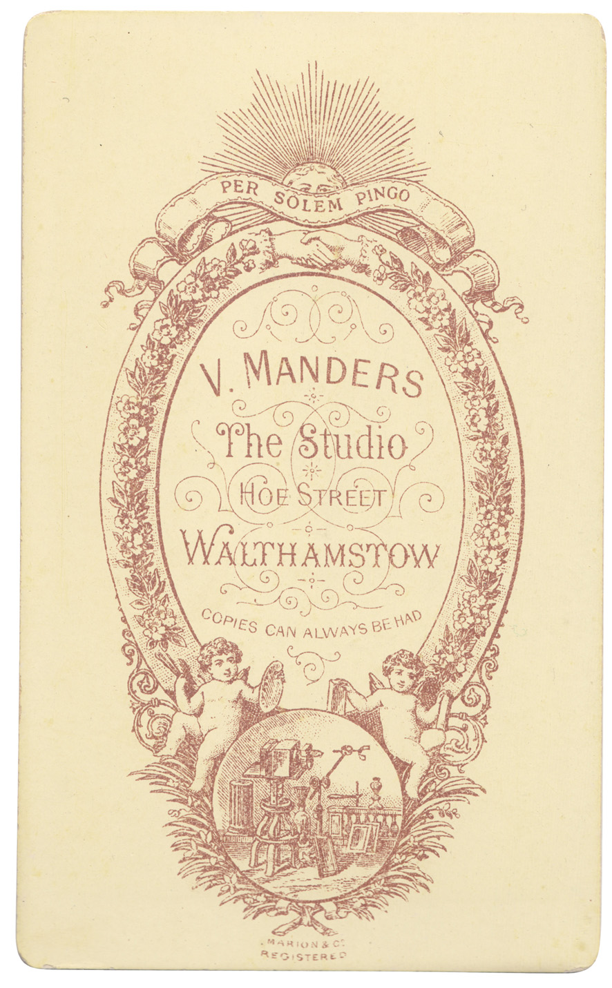
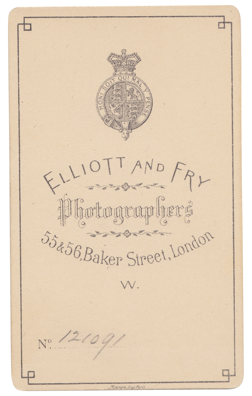
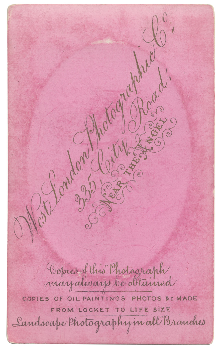
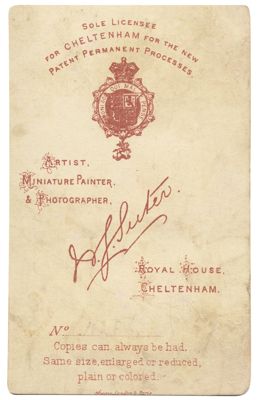
From the reference box #139
# 139 - Some new additions to the reference box, and to my Carte-de-Visite collection. Cards from four different photographic studios / photographers in the South of England, all beautifully lettered and detailed.
Quite a few of the cards in my collection have 'Marion Imp Paris' or 'Marion & Co Registered' which I assumed to be the printer of the cards, and I was correct. I found this great website all about Carte-de- Visite with a whole section about Marion & Co and how to use their marks to date the cards (and photographs). Check it out here.
See our whole collection here and previous posts about Carte-de-Visite here, here and here. You can find out more about Carte-de-Visite here, an article written by Graham Hudson from the Ephemera Society.
https%3A%2F%2Fwww.deliciousindustries.com%2Ffrom-the-reference-box-139
Delicious+Industries%3A+From+the+reference+box+%23139
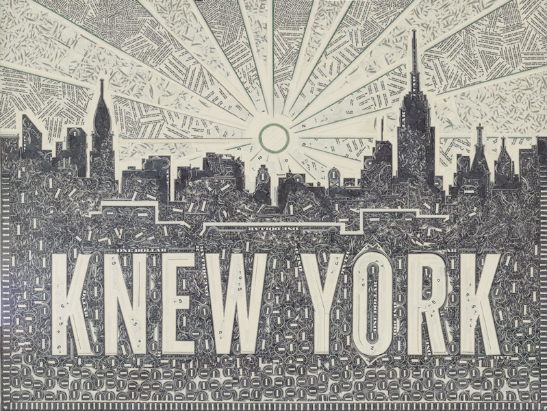
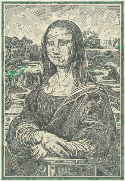
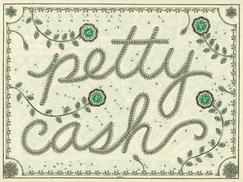
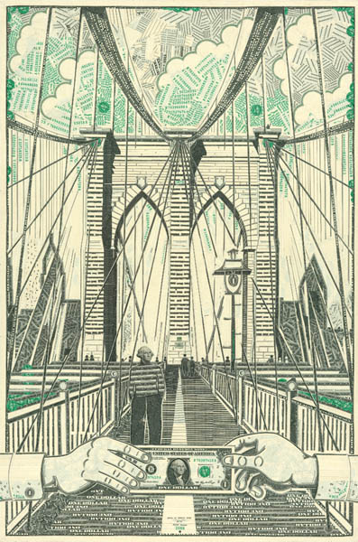
Money, Power, Sex & Mark Wagner
These amazingly intricate currency collages are the work of brooklyn-based artist, writer and book-maker Mark Wagner.
He strives to create, "something bizarre, beautiful, or unbelievable... the foreign in the familiar" and uses only one dollar bills in his masterpieces, what he describes as, "the most ubiquitous piece of paper in America" and "a ripe material: intaglio printed on sturdy linen stock, covered in decorative filigree, and steeped in symbolism and concept".
Watch him at work in this great little stop motion...
If you're lucky enough to be in New York next month you can check out his work in person at the Pavel Noubok Gallery. His next exhibition, 'Money, Power, Sex & Mark Wagner' starts on the 6th September and runs until 5th October 2013.
Images and video copyright Mark Wagner.
Via Colossal.
https%3A%2F%2Fwww.deliciousindustries.com%2Fmoney-power-sex-mark-wagner
Delicious+Industries%3A+Money%2C+Power%2C+Sex+%26amp%3B+Mark+Wagner
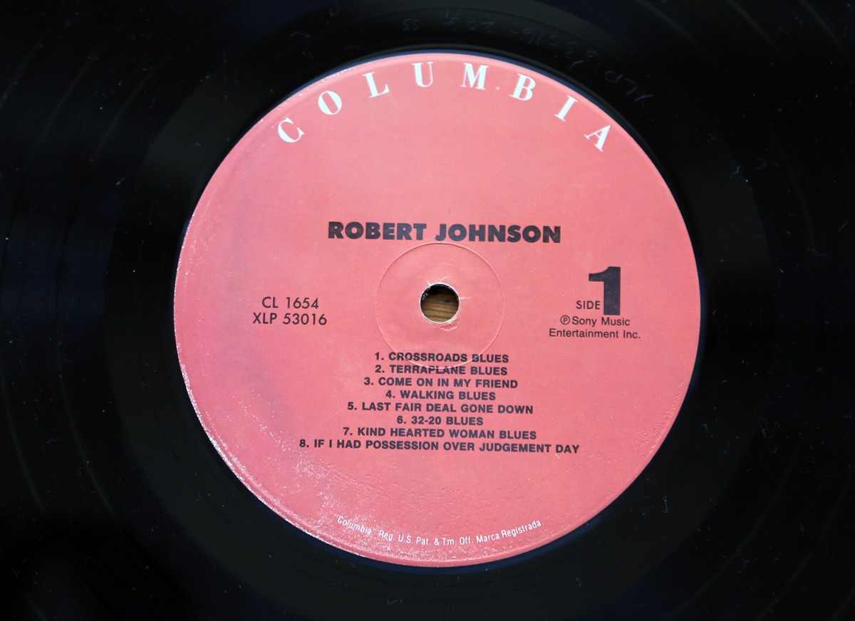
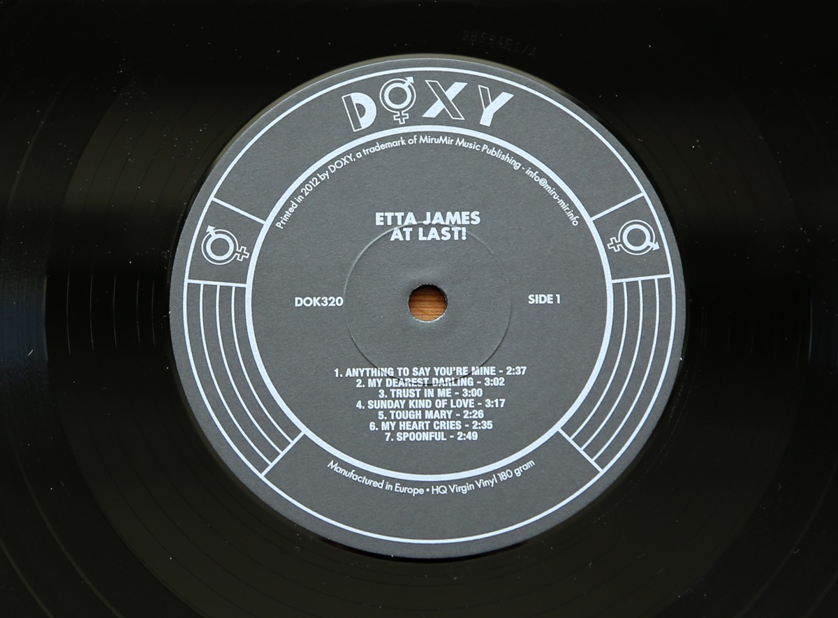
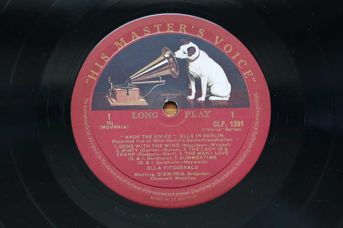
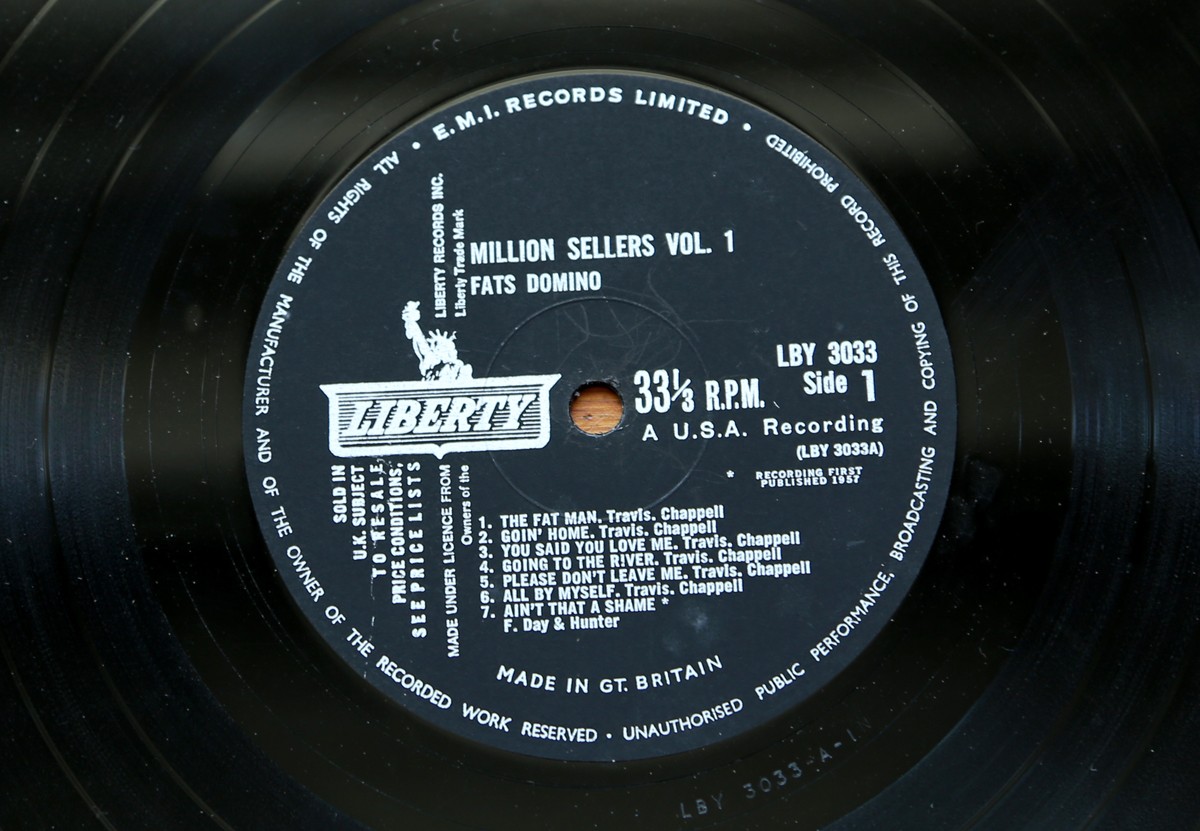
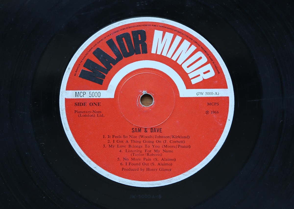
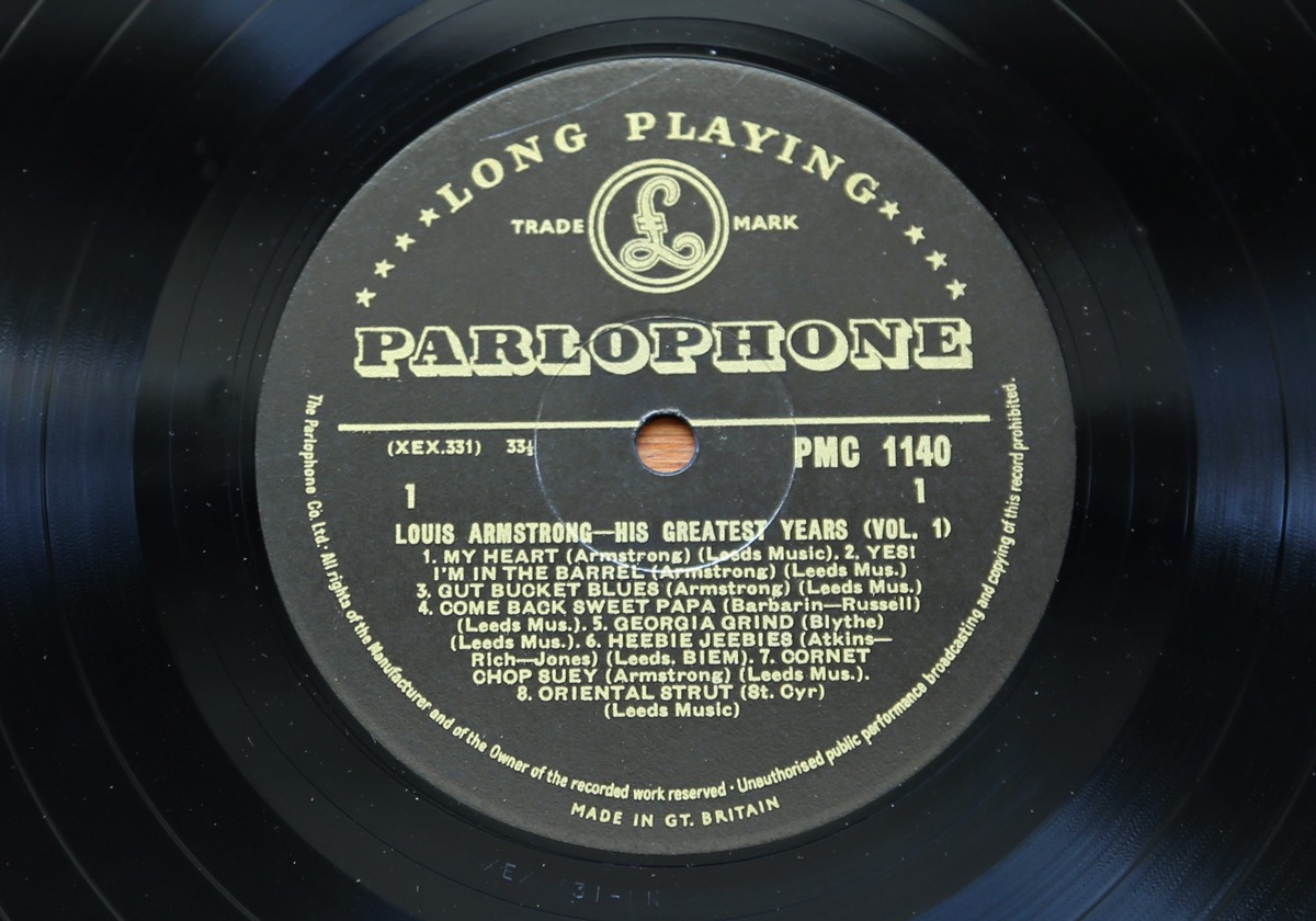
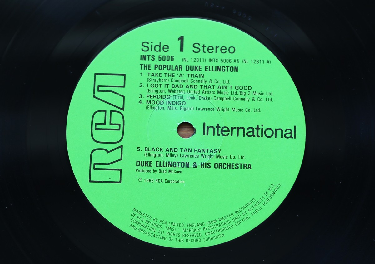
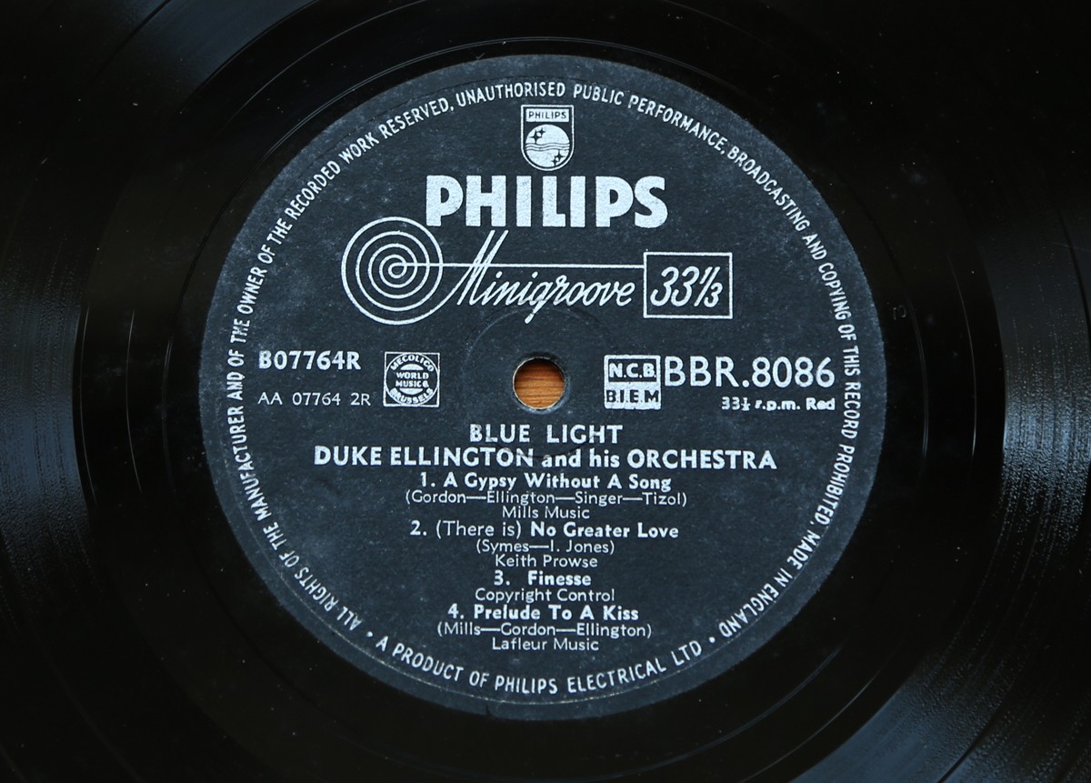
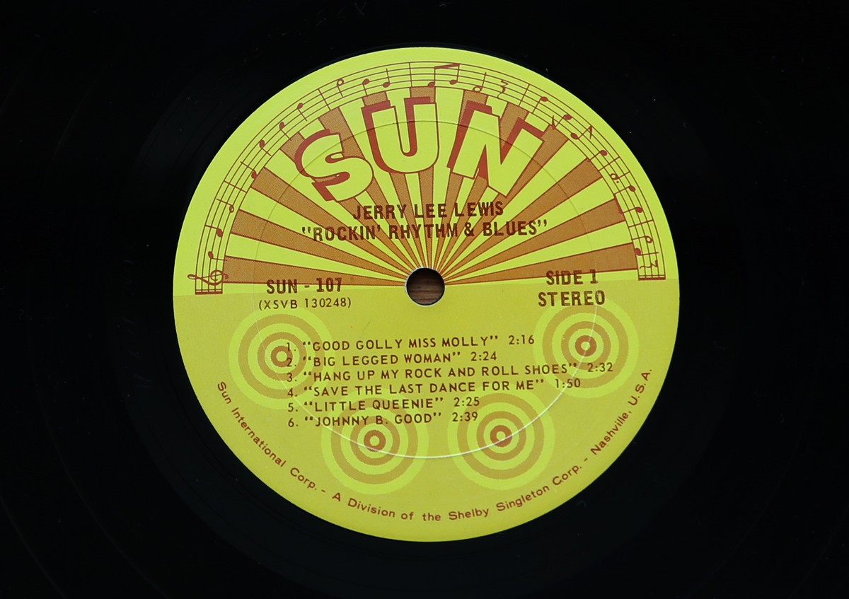
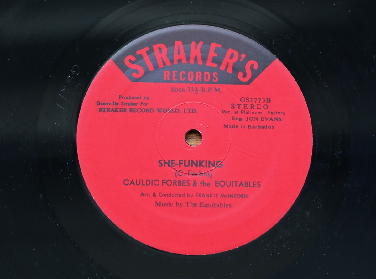
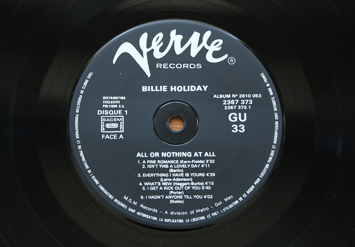
Record Centre Labels - part 2
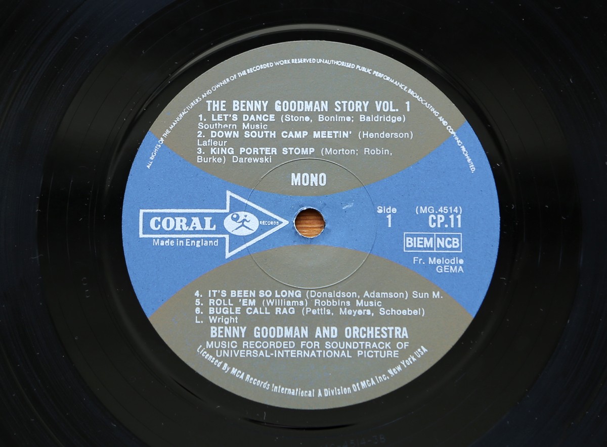
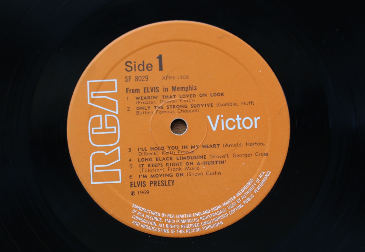
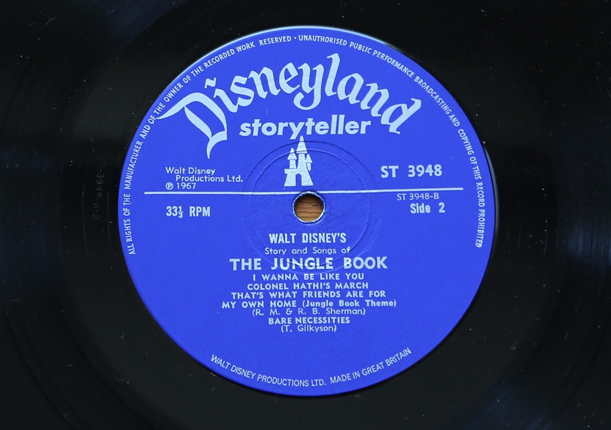
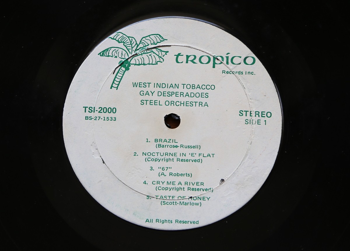
So here it is, part two of my record centre label collection...
They're all great, but I love the simplicity of the Columbia label and the lettering on the Verve label the most.
https%3A%2F%2Fwww.deliciousindustries.com%2Frecord-centre-labels-part-2
Delicious+Industries%3A+Record+Centre+Labels+-+part+2
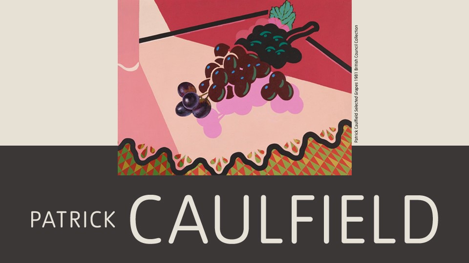
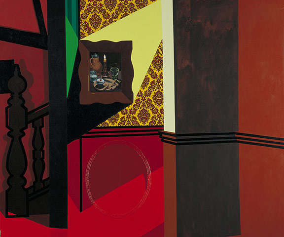
Patrick Caulfield at Tate Britain
Pin this on Pinterest
View large image
After Lunch, 1975 © The Estate of Patrick Caulfield. All rights reserved, DACS 2013
Pin this on Pinterest
View large image
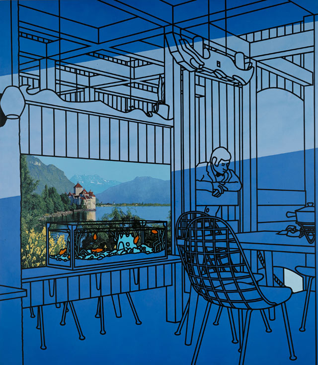
Café Interior, 1973 © The Estate of Patrick Caulfield. All rights reserved, DACS 2013
Pin this on Pinterest
View large image
Bishops, 2004 © The estate of Patrick Caulfield. All Rights Reserved, DACS 2013
Pin this on Pinterest
View large image
Pottery, 1969 © The estate of Patrick Caulfield. All Rights Reserved, DACS 2013
Last week I took a trip over to Tate Britain to see the Patrick Caulfield exhibition and wow, was it worth it. Such amazing work; graphic, colourful, witty and enormous!
The exhibition follows his artistic career chronologically from the early 60s when he left the Royal College of Art through many iconic pieces to some of his last paintings in 2005.
Caulfield's work was influenced by cubism and rather than use traditional painting techniques, he developed a unique graphic style with simplistic shapes, flat colours and black outlines - a style more associated with commercial signwriters. It was great to see this style develop and become perfected as I moved through the exhibition/ years.
Anyone in any doubt over whether he could paint in a more traditional style will be blown away by the realism in some sections of his paintings. For example, take a close look at the landscape picture in After Lunch (above) - you would be forgiven for thinking it was a picture postcard, but it is in fact an extremely detailed landscape painting. The brass door handles in Bishops (above) are another fine example of his traditional painting pedigree.
These areas of detail surrounded by over-simplified objects and flat coloured backgrounds are typical of Caulfields work. They created what he thought was a reflection of how our memories record information, "I find that in treating things in different ways, they become a point of focus. It's the idea that one doesn't encompass everything, and that your eye can look around and see things. I'm not so sure whether it's your eye or whether it's that your memory remembers things in different ways. There seems no reason to treat everything evenly. It's more like a collaged memory of things. Some of the things are in sharp focus, and others, if you like, symbolise the object".
The exhibition runs until 1st September 2013 at Tate Britain.
https%3A%2F%2Fwww.deliciousindustries.com%2Fpatrick-caulfield-at-tate-britain
Delicious+Industries%3A+Patrick+Caulfield+at+Tate+Britain
Welcome

Welcome to the Delicious Industries blog. We're an independent design studio based in Brighton, UK and this is our scrapbook packed full of design, illustration, photography & typography inspiration. Check out our work here.
Links
DELICIOUS FRIENDS
DELICIOUS FAVOURITES
- 50 Watts
- Acejet 170
- Grain Edit
- It's Nice That
- National Geographic Found
- Notcot
- Pretty Clever
- Retronaut
- So Much Pileup
- We Love Typography
- Another Mag