Blog: stamps
From the reference box #55


#55 - Set of 4 UK postage stamps commemorating the ‘Centenary of the first Telephone call by Alexander Graham Bell’, issued 10 March 1976 and designed by Philip Sharland.
Each stamp depicts a different kind of person in society using the telephone - a Housewife (8 1/2p), Policeman (10p), District Nurse (11p) and an industrialist (13p).
The bright, blocks of colour and simplified graphic illustrations make these stamps really pop. I love the fact that they’ve put a mini in the background of the nurse one – such a stereotype!
My set, particularly the policeman, are covered in postmarks, the set below doesn't have any so you can really see how great the designs are.
To see what other wonders the reference box holds look here.
https%3A%2F%2Fwww.deliciousindustries.com%2Ffrom-the-reference-box-55
Delicious+Industries%3A+From+the+reference+box+%2355
From the reference box #54


#54 - Centenary of the Universal Postal Union (1874 - 1974) commemorative stamps issued on the 12th June 1974.
They set was designed by illustrator Rosalind Dease. Each stamp celebrates a different service; 3 1/2p - P&O packet steamer Peninsular 1888, 5 1/2p - First official airmail Coronation 1911 (Farman H.F III biplane), 8p - Airmail blue van and postbox 1930, 10p - Imperial Airways flyingboat (Short S.21 Flying Boat Maia) 1937.
The simplicity of the silhouette style illustrations on the white backgrounds is refreshing and creates a fresh, clean look. I also like how the miniature postmarks add a flash of contrasting colour to brighten up the designs.
For more great stamp designs and other gorgeous items of ephemera take time to sift through the rest of our reference box.
https%3A%2F%2Fwww.deliciousindustries.com%2Ffrom-the-reference-box-54
Delicious+Industries%3A+From+the+reference+box+%2354
From the reference box # 53


#53 - British Post Office Technology Stamps, 1969. I love this set of stamps designed by legendary stamp designer, David Gentleman. They were issued in October 1969 to celebrate Post Office Technologies; the National Grid, Telecommunications - International Subscriber Dialing, Telecommunications - Pulse Code Modulation and Postal Mechanisation - Automatic Sorting.
David Gentleman has created over 100 British stamp designs over the last 40 years. This bold and bright set demonstrates a classic 'Gentleman' technique - when designing individual stamps he considers the effect of the overall sheet of stamps. If you look at the designs above, each has an element that bleeds off so when multiples of the same stamp are placed together (ie. on a sheet) the pattern is continuous. Simple, but effective!
If you like these I'm pretty sure you'll like these Jerzy Karo and Peter Murdoch designed stamps too.
https%3A%2F%2Fwww.deliciousindustries.com%2Ffrom-the-reference-box-53
Delicious+Industries%3A+From+the+reference+box+%23+53
From the reference box # 52


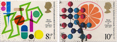
#52 - Centenary of Royal Institute of Chemistry stamps, 1977 celebrating British Achievement in Chemistry.
Designed by Jerzy Karo, each stamp commemorates a different Nobel prize winning achievement from the last 100 years; Steroids - Conformational Analysis (8 1/2p), Vitamin C - synthesis (10p), Starch - Chromatography (11p) and Salt - Crystallography (13p).
I love the Steroids one with the overprinting and really bright colours - it's a great stamp.
https%3A%2F%2Fwww.deliciousindustries.com%2Ffrom-the-reference-box-52
Delicious+Industries%3A+From+the+reference+box+%23+52
From the reference box #50

#50 - British Technology Stamps, September 1966 depicting the Jodrell Bank Radio Telescope, British Motor Cars, the SR N6 Hovercraft and Nuclear power (Windscale reactor).
When I first saw this set of stamps I really loved the top two because of how graphic and simple they are, but was confused why the bottom two seemed to be in a totally different style. These days a set of stamps is normally designed by the same people or company, but it seems in the 60's at least, it was common practice for two designers/illustrators to work on two stamps each. In this case, D Gillepie created the 4d and 6d (top two) and J Andrew Restall designed the 1/3 and 1/6 (bottom two).
I find it funny that no attempt was made to keep consistency through the set - the Gillespie ones have no description and have quite large Queen's heads in white compared to Restall's ones, which do have a description and have smaller Queen's heads in black. Even the typefaces they've used are different.
For more stamps, ephemera and random bits of inspiration, take a delve into our reference box.
https%3A%2F%2Fwww.deliciousindustries.com%2Ffrom-the-reference-box-50
Delicious+Industries%3A+From+the+reference+box+%2350
From the reference box #49

#49 - Energy stamps, 1978. These stamps were issued on 25 January 1978 to highlight the importance of Energy in modern life, "our industrial strength and high standard of living depend on it's certain supply", to encourage, "greater efforts in the efficient use of energy and the elimination of wasteful practices" to preserve the resources we have and give, "scientists and technologists time to develop alternative and acceptable energy supplies".

The set of stamps and the First Day Cover (above) were designed by the great British designer, Peter Murdoch FSIAD - known Internationally for his wonderful cardboard furniture designs, his role as Special Projects Director for the 1968 Mexico Olympics (which included designing the collapsible, cardboard display systems, souvenirs and the newspaper kiosks) and for his many collaborations with fellow designer, Lance Wyman (Camino Real Hotel logo /signage and The Red Lion Disco logo in Mexico, Creative Parks Playground in Boston).
Our full collection of reference box items can be rummaged through here.
https%3A%2F%2Fwww.deliciousindustries.com%2Ffrom-the-reference-box-49
Delicious+Industries%3A+From+the+reference+box+%2349
From the reference box #46

#46 - Commemorative 'British Textiles' stamps celebrating great British textile designers, designed by Peter Hatch and released in July 1982.
The set of four stamps showcase prints from (left to right); William Morris - 'Strawberry Thief', Steiner & Co. - 'Untitled', Paul Nash - 'Cherry Orchard' and Andrew Foster - 'Chevron'.
Check out more reference box goodies here.
https%3A%2F%2Fwww.deliciousindustries.com%2Ffrom-the-reference-box-46
Delicious+Industries%3A+From+the+reference+box+%2346
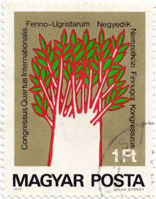
70's Hungarian Stamp

How cool is the tree illustration on this Hungarian stamp from 1975. The red and green print works really well against the neutral background and I love it when the overprint is visible.
I think the illustrator is Olah Gyorgy (bottom right on the stamp), although all I can find out about him was that he was a Hungarian, Nobel-prize winning Chemist - so maybe he isn't the illustrator??
See more of my favourite stamps here, here and here.
https%3A%2F%2Fwww.deliciousindustries.com%2F70s-hungarian-stamp
Delicious+Industries%3A+70%26%23039%3Bs+Hungarian+Stamp
More stamps

Loving stamps at the minute, especially the Czech ones. These little beauties are from 1974 - you just can't beat big numbers and simple graphics!
https%3A%2F%2Fwww.deliciousindustries.com%2Fmore-stamps
Delicious+Industries%3A+More+stamps
Welcome

Welcome to the Delicious Industries blog. We're an independent design studio based in Brighton, UK and this is our scrapbook packed full of design, illustration, photography & typography inspiration. Check out our work here.
Links
DELICIOUS FRIENDS
DELICIOUS FAVOURITES
- 50 Watts
- Acejet 170
- Grain Edit
- It's Nice That
- National Geographic Found
- Notcot
- Pretty Clever
- Retronaut
- So Much Pileup
- We Love Typography
- Another Mag


