art direction, design + typography
From the reference box # 82


#82 - Temporary Individual Liquor Permit. Issued on 13 December, 1943 by the Nova Scotia Liquor Commission in accordance with the provisions of The Nova Scotia Liquor Control Act, it's a temporary permit valid for only one month.
I love the red overprinted date in the top left corner and the little leather wallet it came in -it's a great bit of ephemera and one I was given!
There are lots more gorgeous items of ephemera in the reference box - take a look here.
https%3A%2F%2Fwww.deliciousindustries.com%2Ffrom-the-reference-box-82
Delicious+Industries%3A+From+the+reference+box+%23+82
New Sell! Sell! Website
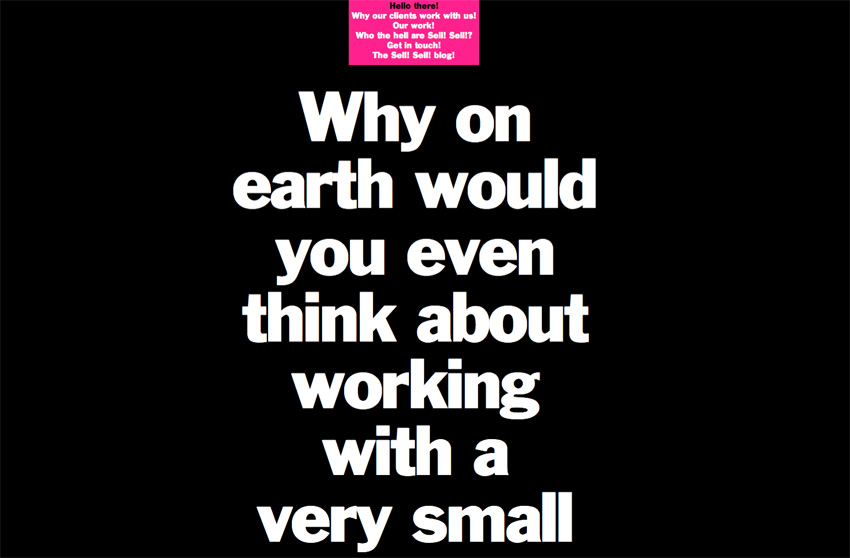


Our friends over at Sell! Sell! have just finished their new website and it’s definitely worth a look. As you can see it’s not what you will have come to expect from a creative agency, but since they write as much as they design & create I think it’s a refreshing idea and one that pushes the value of copy to the fore.
The copy is written in a way that keeps you reading without realising it - there’s also a more immediate navigation for the more traditionalists, but I quite enjoyed the journey through the site via the copy. It’s a very bold approach, but I think it really works and obviously I can’t help but love the big bold type!
Take a look here.
https%3A%2F%2Fwww.deliciousindustries.com%2Fnew-sell-sell-website
Delicious+Industries%3A+New+Sell%21+Sell%21+Website
From the reference box # 81


#81 - Small, round vintage tins; Ucal Brand's Zinc Ointment and Chesebrough-Pond's Vaseline. I love these little tins, especially the type on the Zinc Ointment one, it's very ornate in total contrast to the Vaseline one with it's functional, simplicity. Each tin is only 65mm (approx. 2.5") in diameter, but they look great on the book shelf.
As ever I've done a bit of research into the companies and found out that Chesebrough (originally an oil business, whose founder chemist Robert Augustus Chesebrough produced the first petroleum jelly in 1859) merged with Pond's Creams in 1955 to form Chesebrough-Pond's before being bought by Unilever in 1987. I've seen other Vaseline tins from the Chesebrough-Pond's era that definitely look older than this one, soa I'm guessing mine is from the late 60's or early 70's.
Unfortunately I can't find out anything about Ucal brand who manufactured the Zinc Ointment, other than they seemed to have produce a variety of Throat Lozenges, Pastilles and Health Salts in the late 50's.
For more reference box loveliness, have a root around here.
https%3A%2F%2Fwww.deliciousindustries.com%2Ffrom-the-reference-box-81
Delicious+Industries%3A+From+the+reference+box+%23+81
Blisters Blackout Submission Call

Print Club are now accepting submissions for their December show, Blisters Blackout - "40 Illustrators. 40 Edition and hand signed prints. 40 Pounds each".
All entries must be new work, and for the 'blackout' must have an element of glow-in-the-dark. Throughout opening night the exhibition space will be blacked-out revealing the glowing bits of the designs.
So get your skates on, the closing date for submissions is 30 September 2010 after which time 50 posters will be selected for the show.
For more information and to see work from previous Blisters shows visit Print Club London.
https%3A%2F%2Fwww.deliciousindustries.com%2Fblisters-blackout-submission-call
Delicious+Industries%3A+Blisters+Blackout+Submission+Call
Auto Type VI


I warned you the Auto Type posts would be more frequent now the show season has started! So here is #VI, a selection taken at the fabulous Goodwood Festival of Speed.
See Auto Type posts I-V and more Automobilia here.
https%3A%2F%2Fwww.deliciousindustries.com%2Fauto-type-vi
Delicious+Industries%3A+Auto+Type+VI
Roman Cieślewicz Retrospective


"Cieślewicz was - alongside Fernando Arrabal and Alejandro Jodorowsky - a member of Panique, the 'last' surrealist group in France. At the same time he was a brilliant art director at Elle, and a contributor to Vogue. Remarkably prolific, he also worked closely with figures from the worlds of advertising and fashion including Guy Bourdin and Helmut Newton.
Extraordinarily talented as an image-maker, Cieślewicz’s tools were not the pen or the brush but the scalpel and scissors. Working with collage, he produced compelling and original images by reworking familiar icons such Che Guevara or Mona Lisa. “I always go for the maximum picture and the maximum information. You need to stimulate imagination to the maximum” - he once said in an interview."
The exhibition will include 150 pieces of Cieślewicz's diverse work including the iconic magazine covers created for Opus (above top & middle) and the poster he designed for Hitchcock's Vertigo (above bottom). The collections on display are from the National Museum in Poznan, the Museum Art in Łódź and the private collection of Cezary Pieczyński.
See other posts about Roman Cieślewicz here and here.
Images copyright Roman Cieślewicz from 'Roman Cieślewicz: Master of Graphic Design' by Margo Rouard-Snowman. Published by Thames & Hudson Ltd. London, 1993.
Quotation from the Polish Cultural Institute.
https%3A%2F%2Fwww.deliciousindustries.com%2Froman-cielewicz-retrospective
Delicious+Industries%3A+Roman+Cie%C5%9Blewicz+Retrospective
Carte-de-Visite

Whilst browsing the Ephemera Society website yesterday I discovered a great article about 'carte-de-visite' written by their secretary, Graham Hudson. I've collected carte-de-visite (example shown above) for years and always referred to them as photographer's cards - I had no idea they had an official name!
Graham has very kindly given his permission for me to post his article, so here it is. Make a cup of tea and get the biscuits, because it's much longer than my usual posts, but it's well worth a read...
Among collectors the term passes without comment - carte-de-visite. At antiques fairs and collectors’ markets they are ubiquitous, these little photographs, on the one side perhaps a fashionable young man in elegant topper or young woman in voluminous crinoline, or (less commonly) a small family group: on the other the elaborately presented studio address of the photographer. As records of costume they are invaluable, but as more personal records they are not without poignancy. In old shoe boxes amid the pots and pans of the boot fair, divested now of the family context that once brought them into being, we buy them at 50p a card. Who are these people whose eyes now touch ours across the years? We cannot know.
But why carte-de-visite, literally ‘visiting card’? In an article in Antiques Journal Lou McCulloch noted ‘The mounted card was approximately 2½ by 4 inches, slightly larger than a calling card, and, correspondingly received the French equivalent for a visiting card as its 'nom de plume’, McCulloch thus assuming the term adopted through simple association of scale. Yet if one puts a carte-de-visite photograph actually side by side with a range of nineteenth-century calling cards, then the difference in the simple look of them makes such a transference of nomenclature unlikely.
The great populariser of the carte-de-visite was André Disdéri, who in 1854 was granted patent for a means whereby several smaller images could be exposed on to a single 10 x 8in plate, thus reducing overall processing costs. It is not clear however on what Disdéri’s patent was based, for central to the process must have been the camera, and the camera Disdéri first used was one invented by Antoine Claudet, and shown by him at the Great Exhibition in 1851. Claudet’s instrument, the ‘multiplying camera-obscura’, had a plate holder "Which could be mechanically moved both across and down to allow different areas of the emulsion to be covered by successive exposures through the same lens, to represent on the same surface a number of different pictures, or the same in various aspects, the portraits of several persons, & c".
Later cameras adopted by carte-de-visite photographers included those with four independent lenses which, working with a simple shift mechanism, could double up to take the usual set of eight images on the one plate, and those of the London manufacturer Routledge, which worked on the Claudet principle but with which no fewer than twelve cartes could be taken.
The great period for the carte-de-visite was from 1859 to the later 1860s. It was in May 1859 that Napoleon III riding at the head of his troops, actually halted the French army en route to the war in Austria whilst he called at Disdéri’s Paris studio. The Emperor had shrewdly realised how effective as personal publicity such cheap portraits would be among the populace; and what the Emperor did the whole of fashionable Paris was quick to emulate. Disdéri made a fortune, opening studios in Toulon, Madrid and London. At the height of the craze, in 1866, it was estimated that between three and four hundred million of the small-scale photographs were sold in England alone. But after that year the fashion went into quick decline, though the carte-de-visite as the accepted format for run-of-the-mill family record was to last well into the century. Ergo those countless little sepias we find today in every fleamarket.
They are worth collecting, and not least for the sake of their often richly decorated backs, photographers in effect turning their very products into tradesman’s cards for the businesses that produced them. Most frequently the backs were printed by lithography, exploiting the freedom and intricacy in design afforded by the process, and rich in invention though they were it is not uncommon for the collector to come across the same basic imagery employed on the photo backs of quite different establishments. The designs were created of course not by the photographers but by commercial printers, who had access to ready-drawn imagery in the form of stock litho transfers in the same way that letterpress printers had the facility of stock blocks, and it is these stock motifs that one finds recurring.
Though photography was in very essence part and parcel of the science and technology of the period - collodion, silver nitrate, anastigmatic lenses et al - the theme of photo-back imagery is essentially that of ‘Art’. There is scarce a chemical in sight. The underlying art theme of A & G Taylor’s photo-back illustrated here, with its flowers, birds, abstract patterning and one little putto actually creating a picture by drawing is not untypical, and that the imagery in this case does include an incidental camera is sufficiently uncommon to put this example into a distinct sub-category known to collectors as a ‘camera-back’. Rare indeed is a design such as that of Lambert Partington of Southport showing the whole paraphernalia - camera, dark slide, developing dish, retouching brushes and even painted studio backcloth-virtually the complete kit.
But still, ‘visiting card’? Could these little photographs ever actually have been so used? I had this question in mind for a long time. Helmut and Alison Gernsheim in their History of Photography quote Ernest Lacan, editor of La Lumiére writing in the issue of 28 October 1854 regarding two Parisian amateurs E Delessert and Count Aguado who, it appears had at least the idea of photographic calling cards: "For formal calls, the visitor should be represented wearing gloves, the head bowed in greeting, as social etiquette requires; in bad weather he should be shown with an umbrella under his arm; for farewell visits, a portrait should be furnished in travelling costume." The Gernsheims take this at face value, without further comment, but there is a hint of tongue-in-cheek they overlook. Shown with an umbrella in bad weather indeed!

However, in 1857, photographer T. Bullock of Macclesfield was actually advertising address cards ‘with a splendid photograph on the reverse side’ (have any surviving examples been located, one wonders?) and a chance find at an Ephemera Society bazaar was the carte of Charles Tomlinson, of New Britain, Connecticut (above), where, with its combination of tasteful engraver’s black-letter and discreet script, the back has all the appearance of a gentleman’s calling card rather than the up-front display of the photographer.

The clincher though must be the Punch cartoon of 1862 (above), only recently noticed. There is your young man about town, young Tomkins, card case in hand, attempting to leave his undoubted carte-de-visite. The joke is that the little photograph, scarce glanced at by the flunkey, is taken for a mere tradesman’s card and Tomkins peremptorily dismissed. Evidently the fashion of the carte as card was uncommon even then.
Thus a little light is thrown on a forgotten and ephemeral fashion. How briefly must those cartes have manifested on the card trays of those who made and received calls, to have left so little impression on the historic record and in the collections of the ephemerist.
As for Disdéri, reputed in 1861 to have been the richest photographer in the world, money ran through his fingers. With the decline in the carte-de-visite craze his fortunes too went into decline and he ended his career as a beach photographer in Nice, dying in the poor house there in 1890.
© Graham Hudson 2003. All Rights reserved.
https%3A%2F%2Fwww.deliciousindustries.com%2Fcarte-de-visite
Delicious+Industries%3A+Carte-de-Visite
TypArchive


I came across a great site, TypArchive totally by accident yesterday and what a joy! It's a collection of found type and signage, focusing mainly on hand-painted signage from around the world but also includes quite a lot of auto type and neon.
The idea, "is to amass a comprehensive global collection of a high-quality images and produce hard-copy volumes". I hope it works out - that would be one cool reference book!
If signage is your thing, chances are you'll find this, this and this rather interesting too.
Images copyright the individual photographers. All from TypArchive.
https%3A%2F%2Fwww.deliciousindustries.com%2Ftyparchive
Delicious+Industries%3A+TypArchive
Charley Harper at Castor + Pollux

The Charley Harper private view at Castor + Pollux on Friday night was great, the vintage prints looked fantastic framed and mounted up together and I noticed lots of red dots, so if you want one I would get down there sharpish. We are now the proud owners of the Trumpeter Swan (above) which I absolutely love and can't wait for the exhibition to end so we can bring it home (huge thanks Mike)! From memory the following were still available:


As well as the vintage prints on display they also have a selection of limited edition giclee prints and few of the posters Harper designed towards the end of his career (below) which are huge and great value for money at £35-45 unframed or mounted on board for an additional £30.


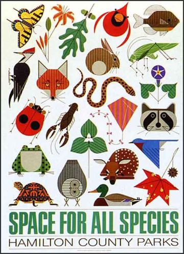


Congrats to everyone at Castor + Pollux for putting on such a great show!
Images copyright the Estate of Charley Harper.
https%3A%2F%2Fwww.deliciousindustries.com%2Fcharley-harper-at-castor-pollux
Delicious+Industries%3A+Charley+Harper+at+Castor+%2B+Pollux
Modern British Posters offer!

The very kind people at Black Dog Publishing have been in touch to offer our lovely readers 40% discount on their new publication, Modern British Posters by Paul Rennie.
"The book is drawn entirely from the prestigious graphic collection of Paul and Karen Rennie, with posters from artists including Paul Nash, Edward Bawden, Edward McKnight Kauffer, Abram Games, Peter Max and Tom Eckersley amongst others."
It's a great source of design reference filled with vintage posters from the likes of London Underground, BOAC and Shell (all below) as well as badges, books and items of ephemera from the same era. I really love this BOAC poster with the overlayed arrows making up the BOAC logo.


Here are some spreads to whet your appetite...


https%3A%2F%2Fwww.deliciousindustries.com%2Fmodern-british-posters-offer
Delicious+Industries%3A+Modern+British+Posters+offer%21
Make Your Own Brand Advertisement
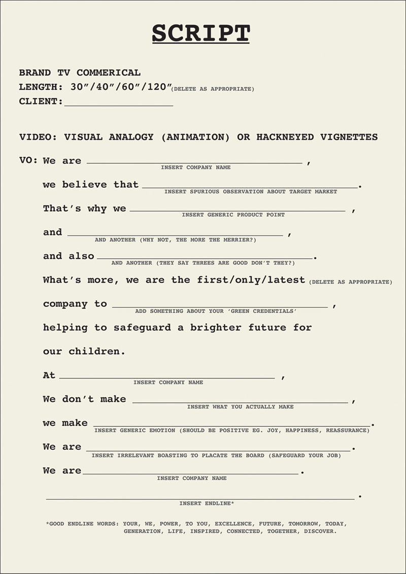
I love this generic advertising script on the Sell! Sell! Blog.
"Make Your Own Brand Advertisement script. Simply fill in the gaps, and hey presto! Big brand ad a-gogo!"
It's funny and cringe worthy at the same time - way too many TV and Radio scripts following this kind of formula and not in a tongue-in-cheek way. I can't believe they're giving away work that some agencies charge thousands for!
https%3A%2F%2Fwww.deliciousindustries.com%2Fmake-your-own-brand-advertisement
Delicious+Industries%3A+Make+Your+Own+Brand+Advertisement
Auto Type V


I thought it was about time we saw some more fabulous Auto type, so here we have Auto Type V. These are the most recent additions to my collection, but as the show season really starts to kick in I'm sure I'll have more to share very soon!
If you missed our previous Auto Type posts you can see them here, here, here and here or check out our Flickr set. If race numbers are more your thing you'll definitely like these too.
https%3A%2F%2Fwww.deliciousindustries.com%2Fauto-type-v
Delicious+Industries%3A+Auto+Type+V
From the reference box # 80

#80 - BOAC First Day Cover, celebrating the their first flights between London and Mexico back in April 1966.
The stamps are not that spectacular, but the graphic on the envelope is great and caught my eye. The orange and blue are really strong and I love the BOAC logo.
I didn't realise when I bought it, but inside there's a card with information about the first flight and cover. Apparently all the First Day Covers travelled 6246 miles on a Boeing 707 for 14 hours 55 mins during the inaugural flights. What a well travelled First Day Cover!

See more items from our wonderful reference box here.
https%3A%2F%2Fwww.deliciousindustries.com%2Ffrom-the-reference-box-80
Delicious+Industries%3A+From+the+reference+box+%23+80
Happy Birthday Tigger!

Remember Tigger, our gorgeous cat? Well today is his 15th birthday!
He's spending it mainly eating his red salmon and sleeping in the sunshine, but took a break for a quick portrait.
Happy Birthday Tigs. x
https%3A%2F%2Fwww.deliciousindustries.com%2Fhappy-birthday-tigger
Delicious+Industries%3A+Happy+Birthday+Tigger%21
Huge news for UK Charley Harper fans…

Our friends at Castor + Pollux, Brighton have just announced the first UK exhibition of American illustrator Charley Harper's outstanding work. To say we're excited is an understatement!
Fans of Harper will be familiar with his work for Ford Times and know that many of his illustrations were also offered to readers as screen prints.
Well, this exhibition has 22 of the original Ford Times screen prints from the 50's and 60's hand-printed by the Harpers in their basement, along with some later prints from the 70's and 80's printed by the studio.
Last week I was fortunate enough to have a sneaky peak at the work and I can report it's even more amazing in the flesh than it is in any book.
The private view is on Friday 2 July and the exhibition runs from 3 July to 5 September 2010, so there is plenty of time to plan a trip to the seaside (Castor + Pollux is right on the seafront).
Read more about Charley Harper here and here.
https%3A%2F%2Fwww.deliciousindustries.com%2Fhuge-news-for-uk-charley-harper-fans
Delicious+Industries%3A+Huge+news+for+UK+Charley+Harper+fans%26%238230%3B
Welcome

Welcome to the Delicious Industries blog. We're an independent design studio based in Brighton, UK and this is our scrapbook packed full of design, illustration, photography & typography inspiration. Check out our work here.
Links
DELICIOUS FRIENDS
DELICIOUS FAVOURITES
- 50 Watts
- Acejet 170
- Grain Edit
- It's Nice That
- National Geographic Found
- Notcot
- Pretty Clever
- Retronaut
- So Much Pileup
- We Love Typography
- Another Mag