art direction, design + typography
Blog: signage
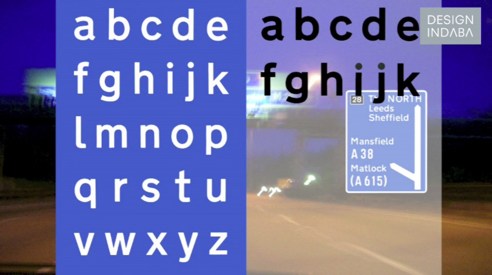
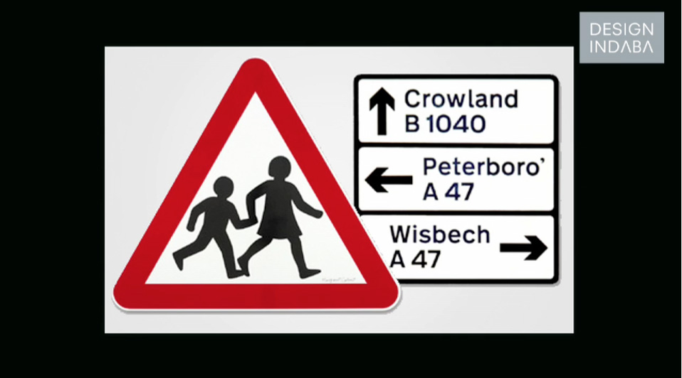
Margaret Calvert Interview
Here's a great little interview with designer Magaret Calvert at the AGI Open London 2013 by Design Indaba. I'm sure you all know, but Magaret along with her former tutor Jack Kinnear created and developed the British road signs we see everyday.
“When you design road signs you have to start from scratch,” she says. “We looked at what they already had and then started drawing letterforms in terms of making it readable for the driver.”
https%3A%2F%2Fwww.deliciousindustries.com%2Fmargaret-calvert-interview
Delicious+Industries%3A+Margaret+Calvert+Interview
Australian Art Deco & Art Deco Style Signage


I'm lucky that Brighton has many wonderful examples of Art Deco architecture & signage, but when you see them so regularly it's easy to take them for granted. I often think about taking the camera out and shooting them properly, but I never seem to find the time. These pics have inspired me to finally do it though, so watch this space.
Images copyright Truffle Pig.
Via Notcot.
https%3A%2F%2Fwww.deliciousindustries.com%2Faustralian-art-deco-art-deco-style-signage
Delicious+Industries%3A+Australian+Art+Deco+%26amp%3B+Art+Deco+Style+Signage
Sign Language. Photographs by Marc Shur


"I strive for a sense of hyperrealism and a graphic feel in my photographs, wanting the signs to be larger than life, appearing much bigger and important than they do in real life. I want people to see the colors and details as if they were standing just a few feet away".
Marc's website and Flickr are an absolute feast of distressed and ageing signage all beautifully photographed - be sure to take a look, but only when you have plenty of time to spare!
All images copyright Marc Shur
Via Type for Now
https%3A%2F%2Fwww.deliciousindustries.com%2Fsign-language.-photographs-by-marc-shur
Delicious+Industries%3A+Sign+Language.+Photographs+by+Marc+Shur
Horse Meat Not Rationed!

Image via Retronaut.
https%3A%2F%2Fwww.deliciousindustries.com%2Fhorse-meat-not-rationed
Delicious+Industries%3A+Horse+Meat+Not+Rationed%21
A Word is Worth a Thousand Pictures
.jpg)
Adore (3 deep), 2012
Phily born Powers (aka ESPO) is renowned in NY for his large scale sign painting/ graffiti often seen around the City. This exhibition showcases various scaled enamel on aluminium paintings - from his daily 'Metaltations' (small 10 x 8" pieces) to some 8 x 16ft giants, all in his recognisable style.

Daily Mataltation - 6.26.12

Everything is shit except you love, 2012

Holler back, 2012
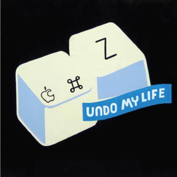
Undo my life, 2012
If like me, you can't make the exhibition you can see loads of his gorgeous painted signs and other work here and follow his day to day adventures here.
Images copyright Stephen Powers.
Via World Famous Design Junkies.
https%3A%2F%2Fwww.deliciousindustries.com%2Fa-word-is-worth-a-thousand-pictures
Delicious+Industries%3A+A+Word+is+Worth+a+Thousand+Pictures
Retro Tesco at Goodwood Revival 2011


The shelves were stacked with a mix of vintage products and packages for display purposes only that sat alongside modern products with classic packaging (like Lyon's Golden Syrup and Wrigley's Chewing Gum) and modern products re-packaged in a vintage style that could all be purchased.
I loved the single product displays like Double Diamond and Fairy with loads of the products stacked high. It's great to see all the old packages on the shelves together and really good fun buying them at the 60's style check-out. I hope it's there again next year!
If you want to have a virtual tour of the Retro Tesco there's a short video here.
https%3A%2F%2Fwww.deliciousindustries.com%2Fretro-tesco-at-goodwood-revival-2011
Delicious+Industries%3A+Retro+Tesco+at+Goodwood+Revival+2011
Boston Sign Project


The Boston Sign Project is a growing collection of Instagram photos by pantone356 (aka Keith Sliney, Creative Director for the Boston Celtics) celebrating the signage in and around Boston. From bright neon, to faded 'ghost' signs they're all gorgeous and I love reading the descriptions and history of each one. Luckily he's only up to #59 of his 100 target, so there's still lots to look forward to.
Follow pantone356 on Instagram to see the rest of the project (while you're at it, check deliciousind out too!) or view the full collection and lots more lovely signage here.
All images copyright pantone 356/ Keith Sliney.
https%3A%2F%2Fwww.deliciousindustries.com%2Fboston-sign-project
Delicious+Industries%3A+Boston+Sign+Project
A room full of letters


I need this much old signage in my life - where do they get it all from?
Actually it's best for my home and my bank balance that I don't know!
Actually it's best for my home and my bank balance that I don't know!
Via ffffound.
Originally from Graphic-Exchange.
https%3A%2F%2Fwww.deliciousindustries.com%2Fa-room-full-of-letters
Delicious+Industries%3A+A+room+full+of+letters
Store Front: The Disappearing Face of Old New York


I love these pics over on How to be a Retronaut. They're taken from Store Front: The Disappearing Face of Old New York by James and Karla Murray, the result of years of photographing and "faithfully documenting the generations-old stores and shop windows of New York's neighbourhoods".
When it was published in 2009 the Murray's estimated that a third of the stores photographed had already closed, so I wonder how many are still open now, or even still standing? It's sad to think of those beautiful old signs being torn down as they add such character to a street, so much nicer than the bland plastic signage we see so much of today.
It's not just in New York either, it's the same story in every city - regeneration, redevelopment it's a never-ending cycle and I know it boosts the local economies, creates jobs and is good for the community, but I like the faded glory.
Two of my favourite places are Manchester and Blackpool, UK - purely for the charm and character of the old buildings and abandoned signage hidden in the back streets.
All images taken from Store Front:The Disappearing Face of Old New York. Copyright James & Karla Murray.
Published by Gingko Press.
https%3A%2F%2Fwww.deliciousindustries.com%2Fstore-front-the-disappearing-face-of-old-new-york
Delicious+Industries%3A+Store+Front%3A+The+Disappearing+Face+of+Old+New+York
MOMA's Department of Advertising & Graphic Design

MOMA's Department of Advertising and Graphic Design (their in-house design team) have launched a portfolio site showcasing a selection of their recent exhibition design, advertising and print.
It's really interesting to see how they use the gallery space for each exhibition and how well they design the info graphics/signage to enhance the visitor experience and compliment each artists work. I also love that they've commissioned traditional billboard artists too!


I've always wanted to visit MOMA, but after seeing these pics I want to go even more.
Images copyright Museum of Modern Art.
Via Swissmiss.
https%3A%2F%2Fwww.deliciousindustries.com%2Fmomas-department-of-advertising-graphic-design
Delicious+Industries%3A+MOMA%26%23039%3Bs+Department+of+Advertising+%26amp%3B+Graphic+Design
Dana Tanamachi's Chalk Lettering


This fantastic chalk lettering is the handy work of Brooklyn based graphic designer, Dana Tanamachi. Her chalky masterpieces have adorned the walls of The Ace Hotel, NY, The Wes Anderson, Brooklyn and Google's NYC offices among many more.
I love her type choices and I'm amazed at the amount of detail and definition she can get from a piece of chalk! As you can see in these time-lapse films she works completely freehand, sketching and re-sketching to get the desired design (see below).
I would be terrified of smudging it right at the end, or of someone else smudging it! Although that vulnerability does add to their charm.


https%3A%2F%2Fwww.deliciousindustries.com%2Fdana-tanamachis-chalk-lettering
Delicious+Industries%3A+Dana+Tanamachi%26%23039%3Bs+Chalk+Lettering
Up There
I love this little video, 'Up There' directed by Malcolm Murray. It's a blatant Stella advertisement, but good on them for supporting traditional artisans.
The painting of large scale advertising is more of a dying art than hand-painting signage. I found it really interesting to see how it's done and to hear about the artists keeping it well and truly alive. You would definitely have to love your job to work in those conditions and train as an apprentice for that length of time though.
It's such a shame we don't have it here in the UK, I would pay much more attention to adverts if they'd been hand-painted on location.
Produced by Mekanism. Music by The Album Leaf.
Based on an original concept by Mother.
Via O+G Blog
https%3A%2F%2Fwww.deliciousindustries.com%2Fup-there
Delicious+Industries%3A+Up+There
Jay B Sauceda Photography


Great photos of traditional sign writing by Texan photographer, Jay B Sauceda - I love that feeling of faded glory they portray.
"Before there was vinyl printing there were big brick walls and craftsmen who covered said walls with their commercial artwork. This is my ever growing collection of those that I find while on the road."
Check out more of Jay's images here.
Via Oh Joy.
Images copyright Jay B Sauceda.
https%3A%2F%2Fwww.deliciousindustries.com%2Fjay-b-sauceda-photography
Delicious+Industries%3A+Jay+B+Sauceda+Photography
PROSIGN - traditional signwriters


I've known of Prosign (Neil and Mandy Melliard) for a few years now and even been lucky enough to have my car signwritten by Neil! They're renowned in car and racing circles for their amazing work hand painting and pinstriping hot rods, race cars and promotional vehicles (above).
But I wasn't aware until today when I checked out their blog that they also do shop facias and window signage. In fact Neil has been working on window signage for Adidas in their Carnaby Street store earlier this month.
There's something lovely about a real hand-painted sign that other more modern techniques can never replicate. Here are some of the fabulous shops he's painted recently...


All images copyright Prosign.
https%3A%2F%2Fwww.deliciousindustries.com%2Fprosign-traditional-signwriters
Delicious+Industries%3A+PROSIGN+-+traditional+signwriters
TypArchive


I came across a great site, TypArchive totally by accident yesterday and what a joy! It's a collection of found type and signage, focusing mainly on hand-painted signage from around the world but also includes quite a lot of auto type and neon.
The idea, "is to amass a comprehensive global collection of a high-quality images and produce hard-copy volumes". I hope it works out - that would be one cool reference book!
If signage is your thing, chances are you'll find this, this and this rather interesting too.
Images copyright the individual photographers. All from TypArchive.
https%3A%2F%2Fwww.deliciousindustries.com%2Ftyparchive
Delicious+Industries%3A+TypArchive
Welcome

Welcome to the Delicious Industries blog. We're an independent design studio based in Brighton, UK and this is our scrapbook packed full of design, illustration, photography & typography inspiration. Check out our work here.
Links
DELICIOUS FRIENDS
DELICIOUS FAVOURITES
- 50 Watts
- Acejet 170
- Grain Edit
- It's Nice That
- National Geographic Found
- Notcot
- Pretty Clever
- Retronaut
- So Much Pileup
- We Love Typography
- Another Mag