art direction, design + typography
Blog: Illustration
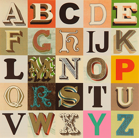
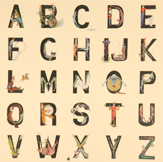
Alphabets, Letters & Numbers
Pin this on Pinterest
 View large image
Appropriated Alphabet no.7 (2013) © Peter Blake. Courtesy CCA Gallery, London
Peter Blake at the De La Warr Pavilion.
Blake has personally curated Alphabets, Letters and Numbers to showcase three series of editions: Alphabet (1991) a 26 piece series of silk screen prints with a print for each letter of the alphabet - I is for Idols ("a collage of screen legends, artists and musicians"), An Alphabet (2007) a series of found ephemera, illustration and handwritting collages - one for each letter of the alphabet. , and Appropriated Alphabets (2013) a series consisting of 12 individually collated alphabets.
"Throughout his long and prestigious career Blake has created several series of works based around the alphabet related to his enduring interest in childhood innocence and nostalgia, and Victorian and Edwardian graphic illustration. Using vintage cards, magazines, books and other found ephemera, he assembles collages that are at once whimsical, humorous and fascinating. He began using found letters and commercial lettering in the 1950s and, as a young artist, allied himself with decorators, sign painters and commercial artists."
The exhibition is free and runs until Sunday 27 November 2016. You know it's also the rule when you visit the De La Warr that you have to have a cream tea sat out on the terrace!
Mon 10 Oct 2016
Posted under: Design , Typography , Ephemera , Prints , Things to buy , Illustration , Exhibition , Found typography
https%3A%2F%2Fwww.deliciousindustries.com%2Falphabets-letters-numbers
Delicious+Industries%3A+Alphabets%2C+Letters+%26amp%3B+Numbers
Three reasons to visit the De La Warr Pavillion this weekend
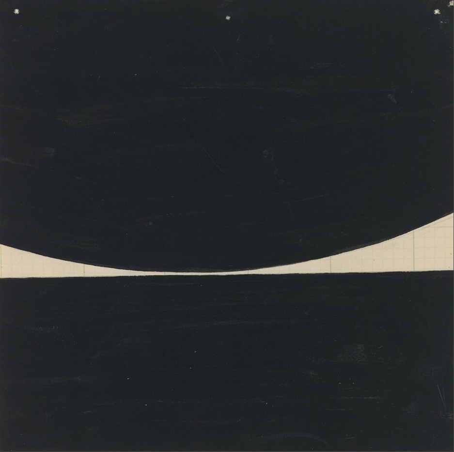
1. Bridget Riley - The Curve Paintings 1961 - 2014
Not long left now to see this wonderful exhibition of paintings and studies spanning Bridget Riley’s 50 year career all, “illustrating the artist’s close dedication to the interaction of form and colour by looking at a single motif” - the curve.
The exhibition coincides with the start of celebrations marking 80 years of the Pavillion becoming the first public modernist building in the UK and has been curated to “directly connect with the building’s elegant architecture, opening out the interior space towards the sea”.
The exhibition runs until 6 September 2015 (free entry).
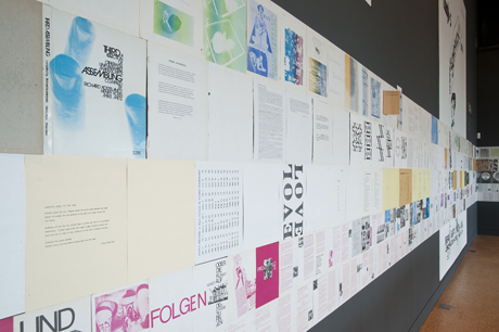
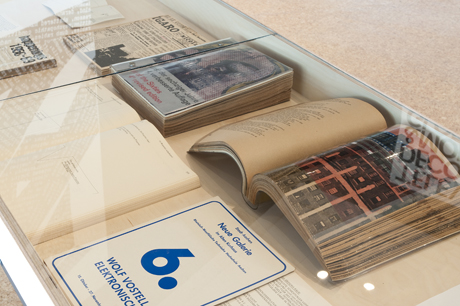
2. Towards an alternative history of graphic design: Schmuck, POP, bRian, Assembling
A slice of graphic design history from the late 60s to the mid 70s, shown through the development of four innovative publications; Schmuck, POP, bRian and Assembling - all created by artists with no design or typographic training, who embraced technological developments and exploited them to publish their own content.
“Artists were now in control of content and the form of a publication could be explored, creating a new energy and enthusiasm for print.”
The exhibition runs until the 4 October 2015 (free entry).
3. The Cream Teas
As gallery cafes go, this one is pretty special. There’s nothing better than one of their homemade scones, a bit of clotted cream, a dollop of jam and a lovely pot of tea sat out on their first floor terrace overlooking the sea.
https%3A%2F%2Fwww.deliciousindustries.com%2Fthree-reasons-to-visit-the-de-la-warr-pavillion-this-weekend
Delicious+Industries%3A+Three+reasons+to+visit+the+De+La+Warr+Pavillion+this+weekend
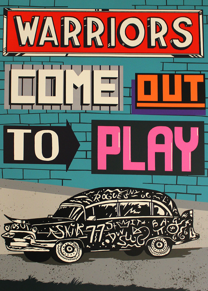
Summer Screen Prints
Print Club London's Summers Screen Prints opens at Somerset House today. We were lucky enough to grab tickets for the preview last night and can definitely recommend it.
This years show consists of fifteen film-themed screen prints by selected Print Club artists, including two of our personal favourites Cassandra Yap and Steve Wilson. Each print is an edition of 200, signed and numbered by the artist and available exclusively through Print Club London.
The show runs until 23 August in the West Wing Galleries, so there's plenty of time to pop in and see it.
https%3A%2F%2Fwww.deliciousindustries.com%2Fsummer-screen-prints
Delicious+Industries%3A+Summer+Screen+Prints
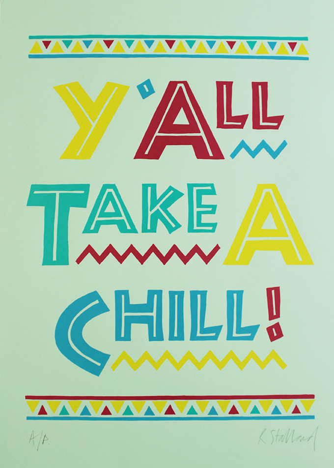
Quentin Blake Rareties at Castor + Pollux
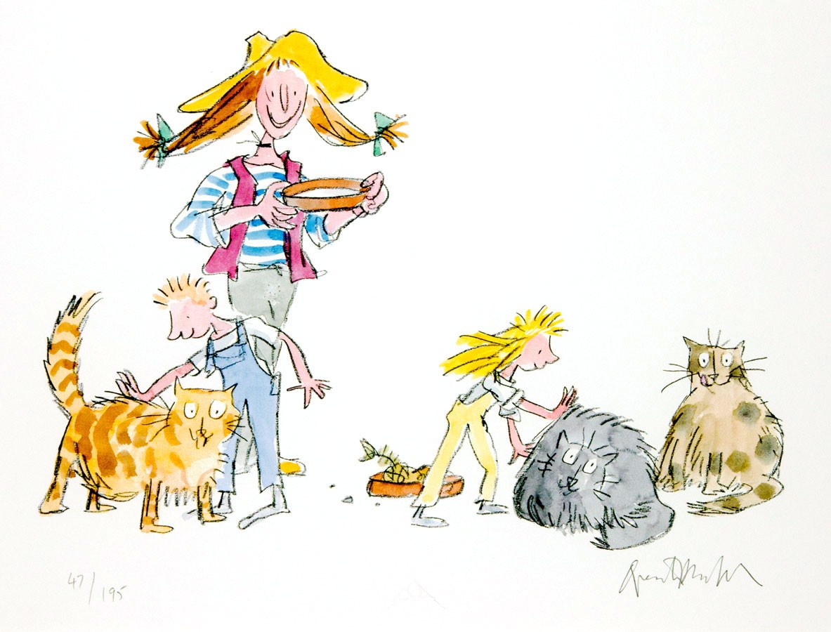
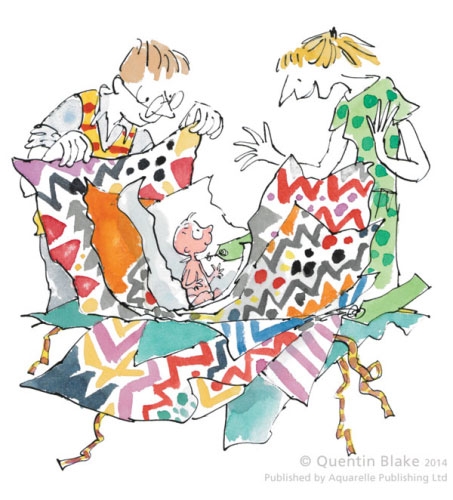
Signed, limited edition Quentin Blake prints and sold-out rareties at Castor + Pollux, Brighton.
Our favourite seafront gallery is showing a wonderful selection of Quentin Blake limited edtion and previously sold-out rarely available prints all signed by the man himself. Recognised and loved by all ages from the pages of Roald Dahl' s equally wonderful books, these illustrations bring back happy childhood memories and I can't wait to see them.
The exhibiton runs until 4 January 2015 at Castor + Pollux, seafront gallery and bookstore, 165 King's Road Arches, Lower Promenade, Brighton BN1 1NB
All images copyright Quentin Blake.
Fri 21 Nov 2014
Posted under: Design , Art , Delicious things , Prints , Things to buy , Illustration , Exhibition
https%3A%2F%2Fwww.deliciousindustries.com%2Fquentin-blake-rareties-at-castor-pollux
Delicious+Industries%3A+Quentin+Blake+Rareties+at+Castor+%2B+Pollux
Instagram Experiments by Javier Perez
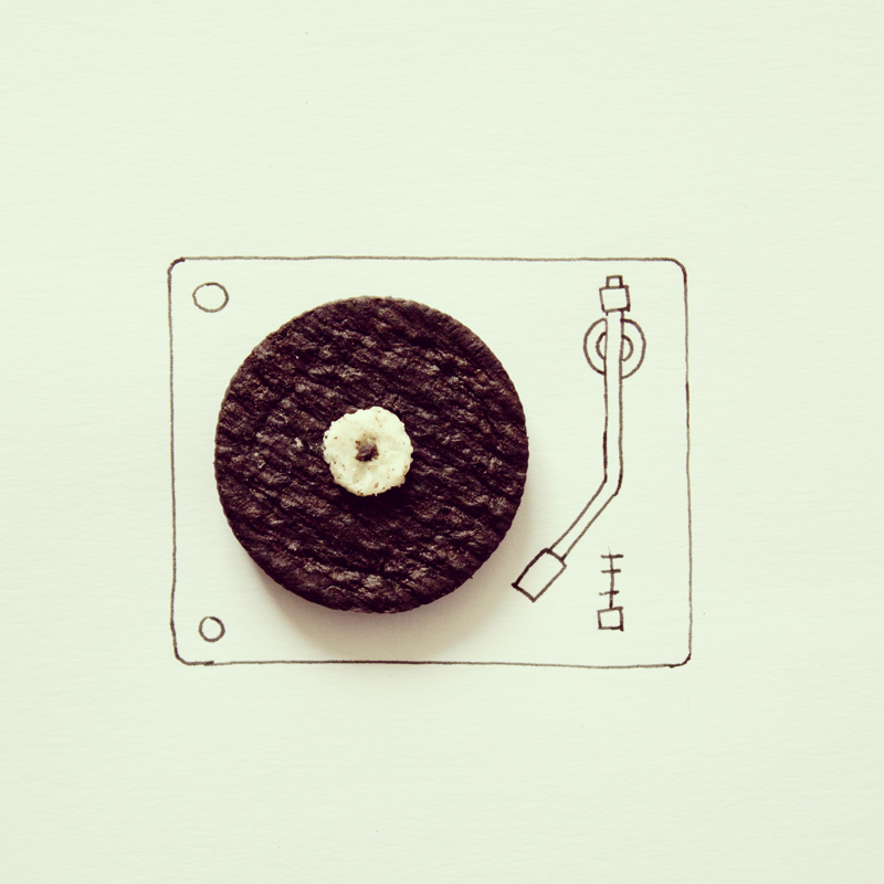
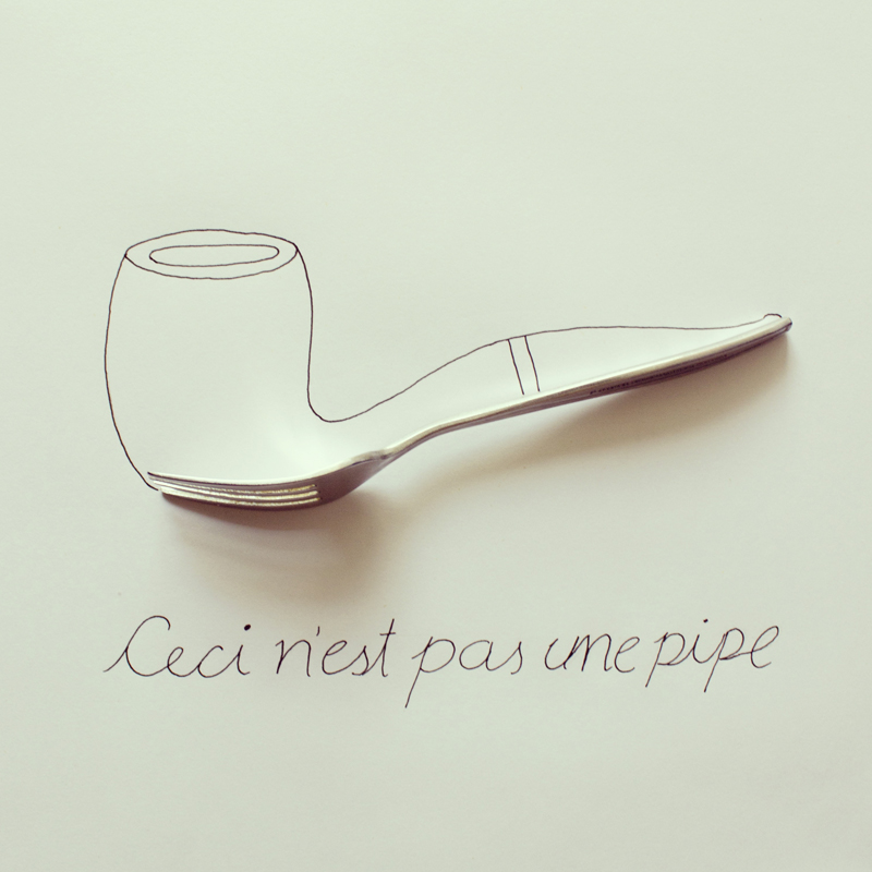
Fun Instagram images for a Friday afternoon.
These little minimalist collages using everyday objects are photographed and posted regularly to instagram by illustrator Javier Parez.
You can see more of them here or follow him on Instagram to see his new pieces as he posts them.
Via Colossal.
https%3A%2F%2Fwww.deliciousindustries.com%2Finstagram-experiments-by-javier-perez
Delicious+Industries%3A+Instagram+Experiments+by+Javier+Perez
Rare & Important Travel Poster Auction
Pin this on Pinterest
View large image
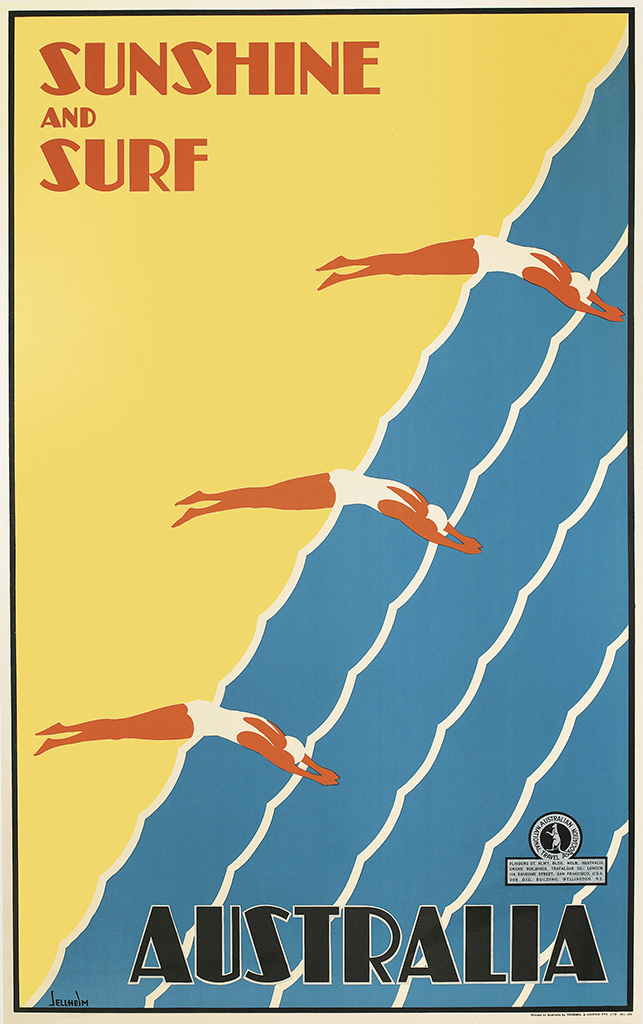
Sunshine and Surf / Australia. Circa 1936. Designed by Gert Sellheim.
Pin this on Pinterest
View large image
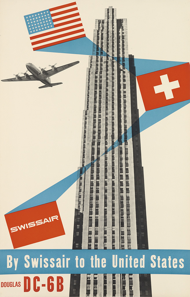
Swissair / By Swissair To The United States / Douglas DC - 6B. Circa 1952. Designed by Henri Ott.
Pin this on Pinterest
View large image
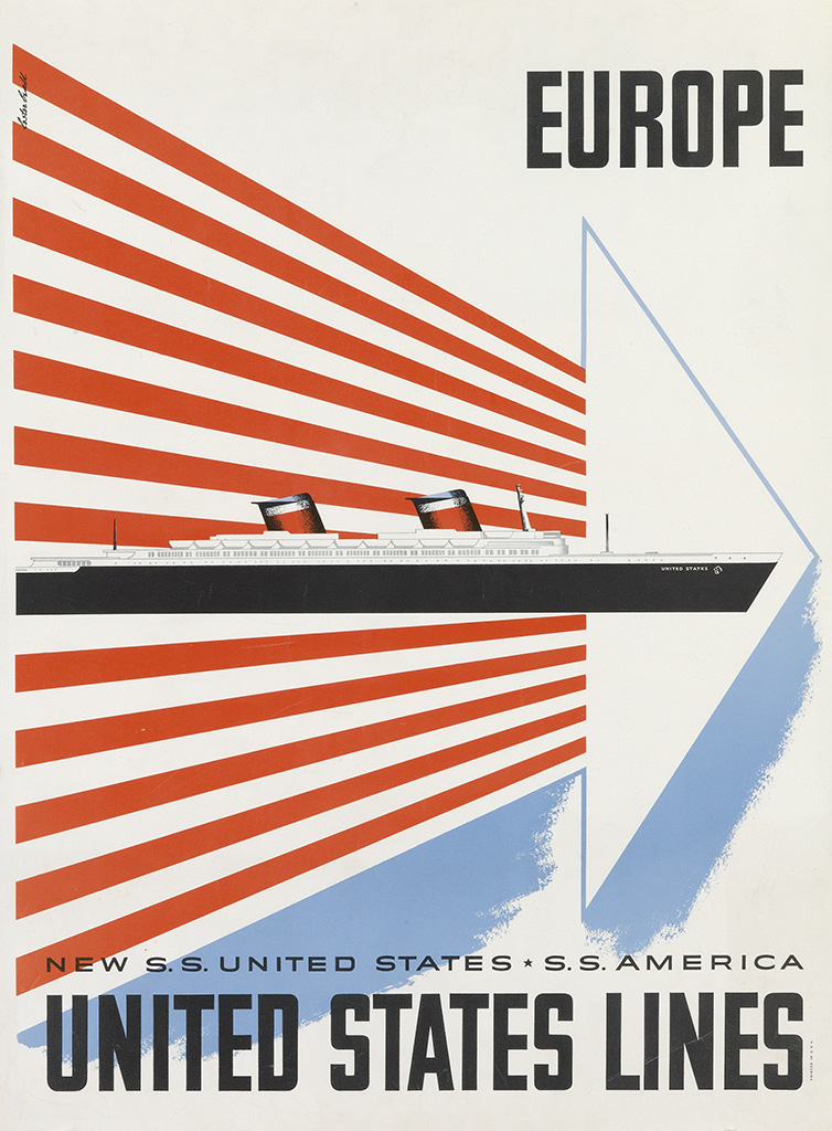
Europe / United States Lines. Circa 1952. Designed by Lester Beall.
Pin this on Pinterest
View large image
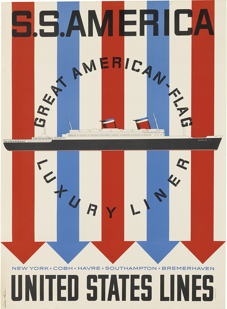
S.S. America / United States Lines. Circa 1952. Designed by Lester Beall.
Pin this on Pinterest
View large image
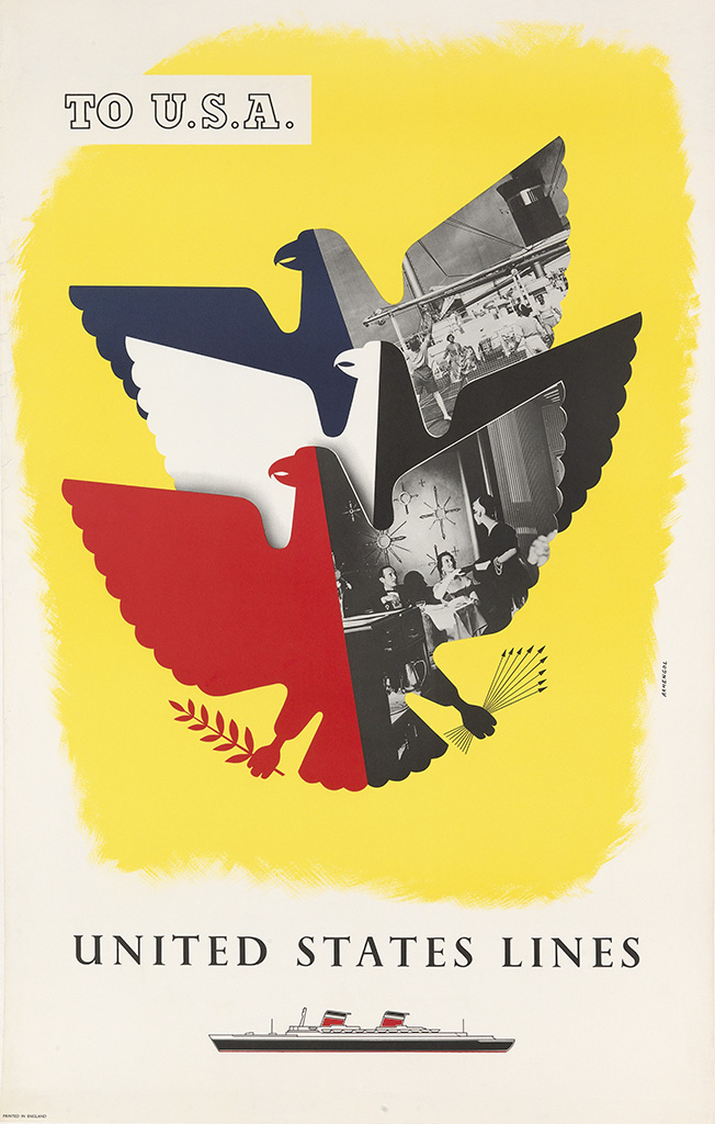
To U.S.A. / United States Lines. Circa 1952. Designed by Armengol.
Pin this on Pinterest
View large image
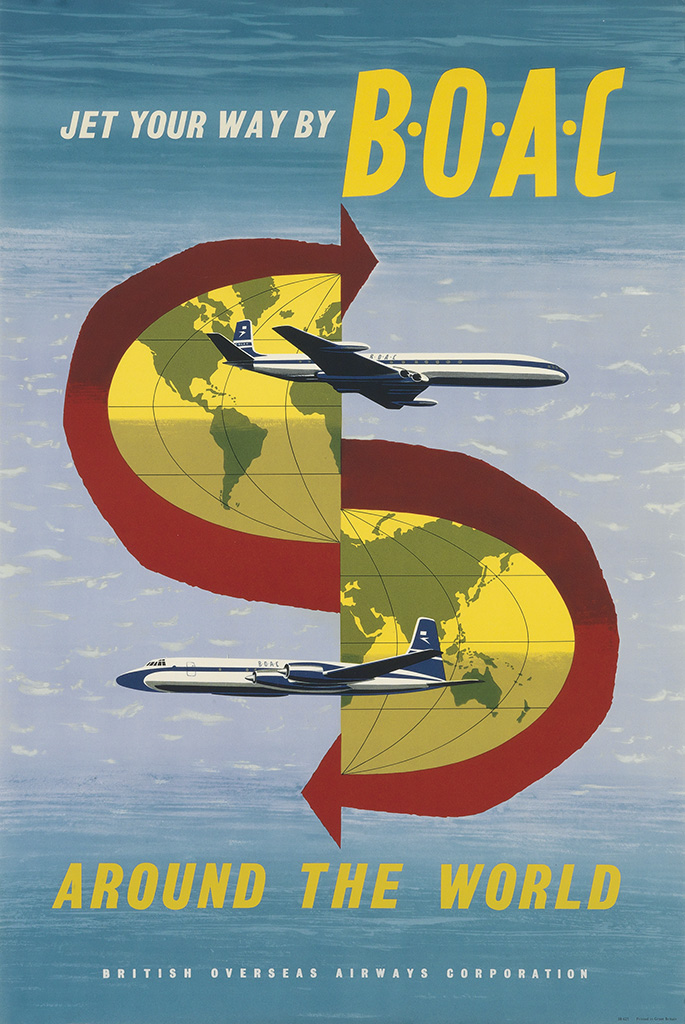
Jet Your Way By B • O • A • C / Around The World. Circa 1960. Designer Uunknown.
Swann Galleries, New York are holding a 'Rare & Important Travel Poster' auction on October 18th. They always have an impressive selection of posters in their auctions and this one is no exception.
"From the deserts of the Mideast to the alpine resorts of Europe, this auction offers images of diverse geographical locations, in addition to bold depictions of trains, ocean liners and airplanes."
For me it doesn't matter about rarety, importance or designer. It's the bold, bright, graphic ones I like, however I will need significantly deeper pockets to be bidding on any of these.
See the full catalogue here.
https%3A%2F%2Fwww.deliciousindustries.com%2Frare-important-travel-poster-auction
Delicious+Industries%3A+Rare+%26amp%3B+Important+Travel+Poster+Auction
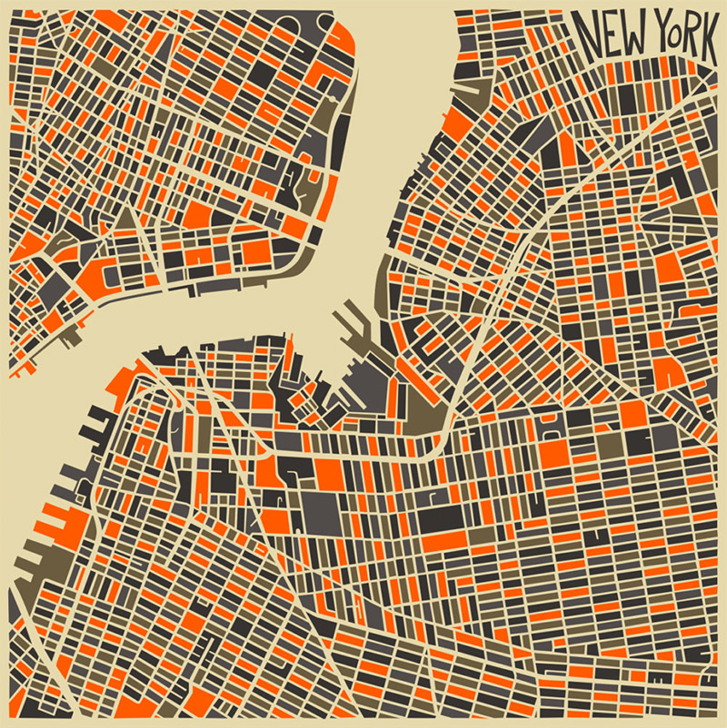
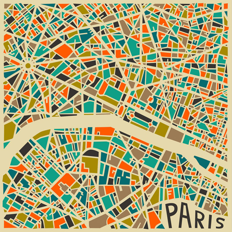
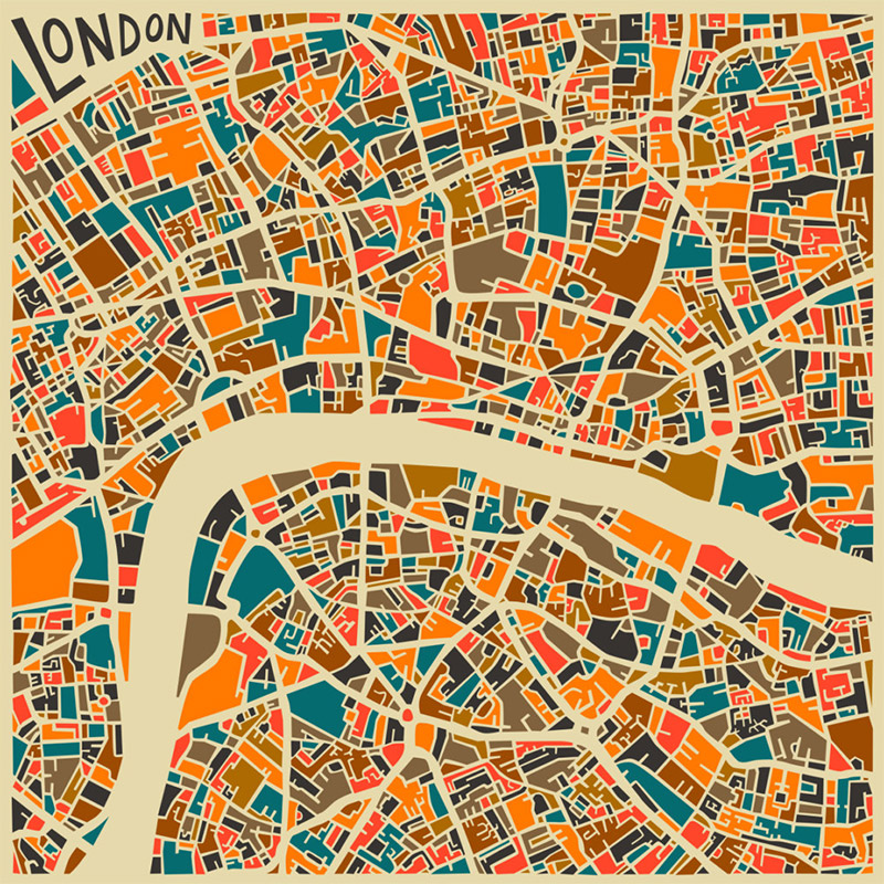
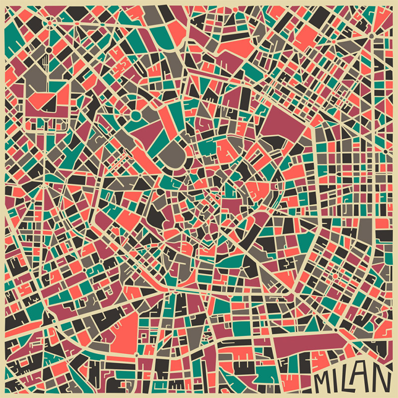
Abstract City Maps
I do like a map and these abstract city maps by Jazzberry Blue are no exception with their blocks of colour and graphic shapes they're definitely ticking all the right boxes.
It's really interesting to see the street plans in such a simple form. I love how crazy and random the London streets are compared to the others and the New York one is grid heaven.
Jazzberry Blue have a great body of illustration work, including more maps for New Delhi, LA and Jerusalem all available as Giclee art prints here.
Images copyright Jazzberry Blue.
Via Colossal.
https%3A%2F%2Fwww.deliciousindustries.com%2Fabstract-city-maps
Delicious+Industries%3A+Abstract+City+Maps
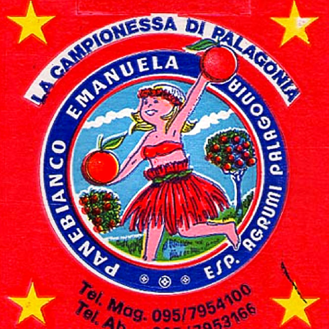
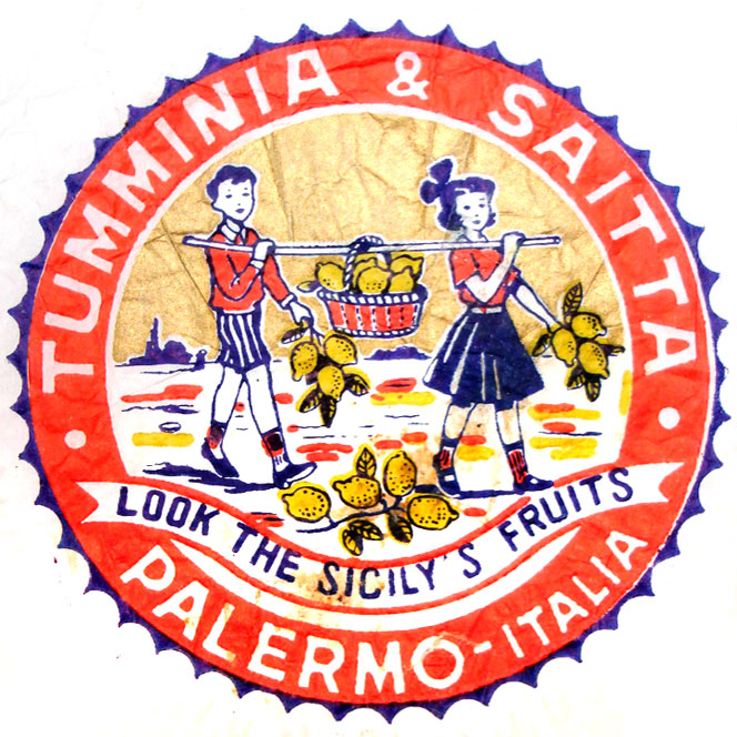
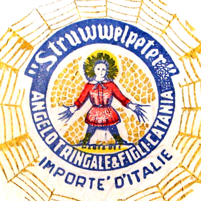
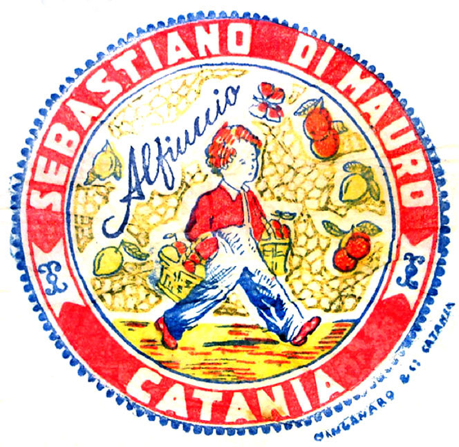
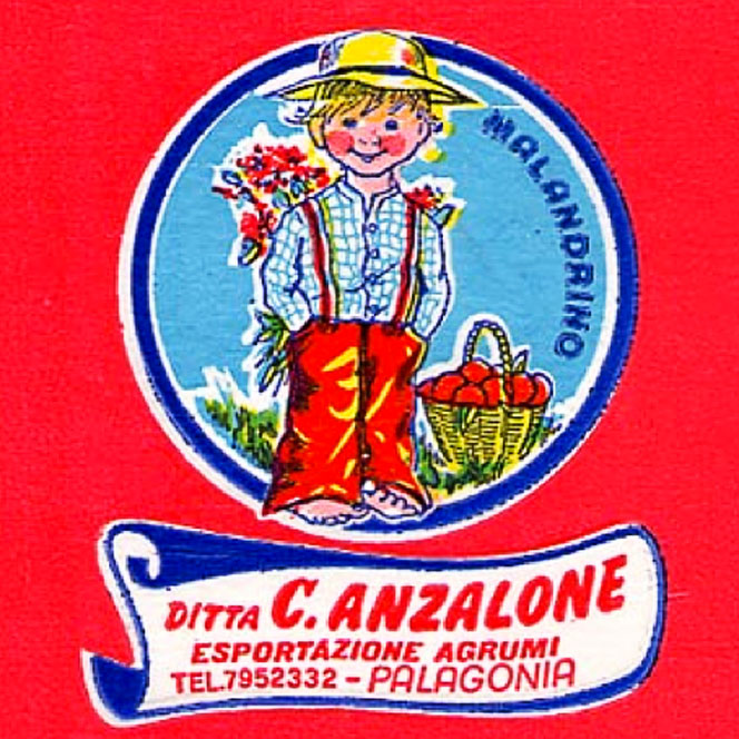
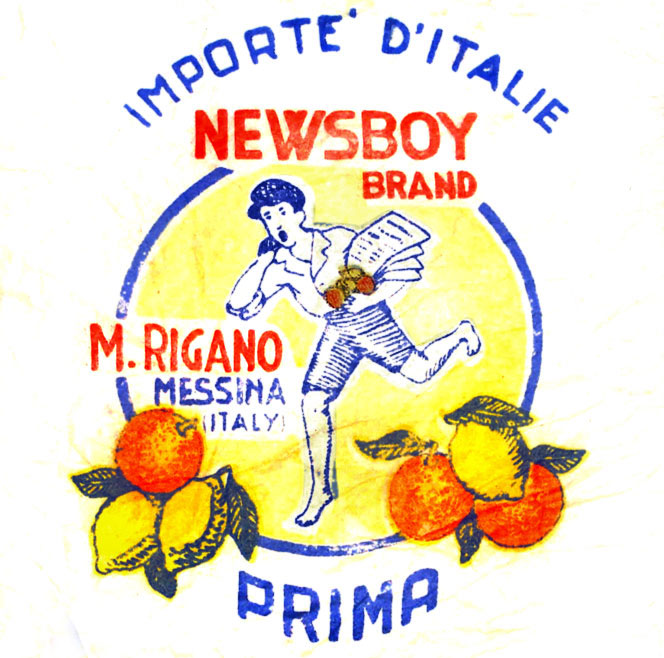
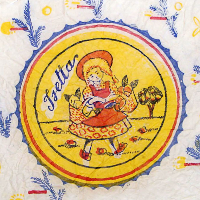
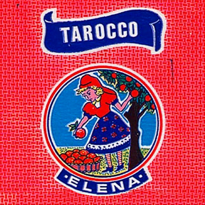
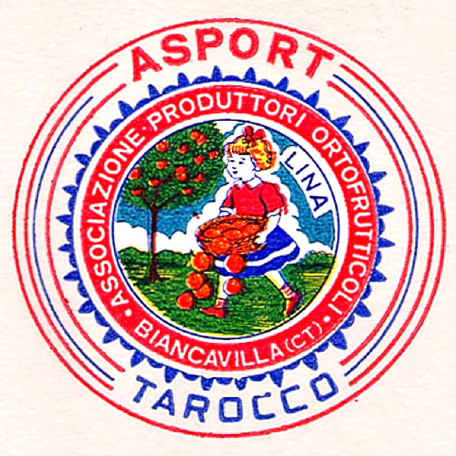
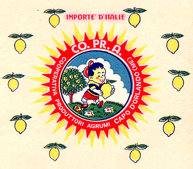
Sicilian Fruit Tissue Wrap
Colourful illustrations, charming but lo-fi print and wonderful lettering all come together on these Sicilian fruit wrappers to turn an unremarkable, everday item into something beautiful.
I'm always amazed at the level of detail on packaging like this, that for the most part goes totally unnoticed.
Images copyright Italian Ways
Via FFFFound!
https%3A%2F%2Fwww.deliciousindustries.com%2Fsicilian-fruit-tissue-wrap
Delicious+Industries%3A+Sicilian+Fruit+Tissue+Wrap
The Lancashire Coast

As much as I love these towns though, I never remember any of them looking as lovely as Daphne illustrates them!
Image from Quad Royal.
https%3A%2F%2Fwww.deliciousindustries.com%2Fthe-lancashire-coast
Delicious+Industries%3A+The+Lancashire+Coast
Final weekend of AT Open House


To whet your appetite a little more, here are my favourite Petting Zoo & Collectables screen prints available at the house and also in the web shop.
https%3A%2F%2Fwww.deliciousindustries.com%2Ffinal-weekend-of-at-open-house
Delicious+Industries%3A+Final+weekend+of+AT+Open+House
Dave Thompson Sussex Prints

Our friends at Castor & Pollux have a great selection of Dave Thompson's Sussex giclee prints in stock at the moment. Based on mid-century travel posters, this nostalgic range highlights iconic buildings and landmarks in and around Sussex. These are my favourites, but check out the full range here.


All images copyright Dave Thompson.
https%3A%2F%2Fwww.deliciousindustries.com%2Fdave-thompson-sussex-prints
Delicious+Industries%3A+Dave+Thompson+Sussex+Prints
AT Open House 2013 Line-up

It's almost that time again, in less than a week AT Open house will fling open it's doors for the first Artists Open house weekend.
We'll be there with a selection of letterpress prints, cards, notebooks, totes, vintage circus prints and some new linocuts, as will AT regulars Dead Methods, Snorkus, Alice Pattullo, Petting Zoo, Mr Wingate, Hello Dodo, James Sawyer, Nathan James, Natalie Martin and Winsome & Saucy.
In addition this year, we have a new artist joining the AT gang - fabulous illustrator Claire Scully aka. The Quiet Revolution.
Claire describes her work as, "a mix of strange utopian worlds and parallel universes with juxtapositions of the unexpected, playing with scale and narrative".
I had a sneaky peek at the Giclee prints she's selling at AT open house and believe me, they look good on screen but when you see them up close and full scale, the detail in astounding.


Fret not, if you can't make it over, you can keep up-to-date on the AT blog and once the show starts all the work will be available in their online shop.
Images copyright Claire Scully.
https%3A%2F%2Fwww.deliciousindustries.com%2Fat-open-house-2013-line-up
Delicious+Industries%3A+AT+Open+House+2013+Line-up
Peskimo


We've been checking out The Mighty Pencil's new site and are loving the work of Bristol based illustration duo Peskimo. So many fun characters, lashings of retro styling and lots of bold, bright colours what's not to like - a perfect bit of Thursday afternoon inspiration.
All illustrations copyright Peskimo.
https%3A%2F%2Fwww.deliciousindustries.com%2Fpeskimo
Delicious+Industries%3A+Peskimo
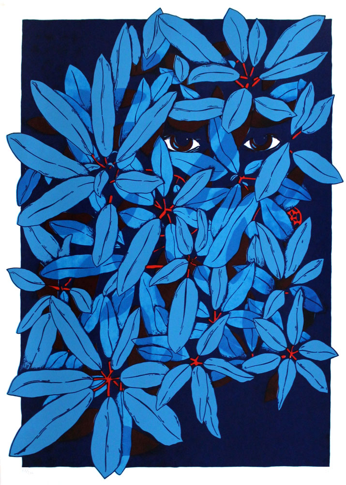
The love of imperfection


https%3A%2F%2Fwww.deliciousindustries.com%2Fthe-love-of-imperfection
Delicious+Industries%3A+The+love+of+imperfection
From the reference box #136


https%3A%2F%2Fwww.deliciousindustries.com%2Ffrom-the-reference-box-136
Delicious+Industries%3A+From+the+reference+box+%23136
Welcome

Welcome to the Delicious Industries blog. We're an independent design studio based in Brighton, UK and this is our scrapbook packed full of design, illustration, photography & typography inspiration. Check out our work here.
Links
DELICIOUS FRIENDS
DELICIOUS FAVOURITES
- 50 Watts
- Acejet 170
- Grain Edit
- It's Nice That
- National Geographic Found
- Notcot
- Pretty Clever
- Retronaut
- So Much Pileup
- We Love Typography
- Another Mag