art direction, design + typography
Blog: February 2011
John Hollows Superior Alcoholic Ginger Beer

Congrats to our friends over at Sell! Sell! for creating the fabulous branding and advertising for Fentiman's new Alcoholic Ginger Beer - John Hollows.
Research is my favourite part of a project, so I loved reading about the branding and how it developed through their research into Fentiman's and Hollow's brewing history.
The advertising is bold and fun, challenging the 'fake' ginger wine-based or flavoured lager ginger beers of the competition and warning customers, 'Beware of imitations'...

And to promote the new drink in pubs and bars, they've created the 'not a genuine ginger?' beermat - perfectly designed to disguise yourself as a true ginger...

Read more about the project here.
Images copyright Sell!Sell!
https%3A%2F%2Fwww.deliciousindustries.com%2Fjohn-hollows-superior-alcoholic-ginger-beer
Delicious+Industries%3A+John+Hollows+Superior+Alcoholic+Ginger+Beer
P&O Menus & Entertainment Programmes

P&O Entertainment Programme, Dorrit Dekk.

P&O Entertainment Programme, Dorrit Dekk. 1962.

P&O Entertainment Programme, Dorrit Dekk. 1962.

P&O Gala Menu, Daphne Padden. 1962.

P&O Entertainment Programme, Daphne Padden. Circa 1950's.

P&O Gala Menu, Daphne Padden. 1958.

P&O Entertainment Programme, Daphne Padden. 1959.

P&O Menu/Entertainment Programme cover, Daphne Padden.

P&O Gala Menu, Daphne Padden. 1956.
Here's a bit of inspiration for a dreary, wet Wednesday morning.
I first saw a P&O Entertainment Programme designed by Dorrit Dekk over on Quad Royal and was instantly drawn to the bright, graphic illustrations/collages.
On further investigation I found Bonito Club's Flickr and yet more fabulous P&O covers (Menus and Entertainment Programmes) from the late 50's and early 60's. All the ones I've seen were designed by either Daphne Padden or Dorrit Dekk, but I'm not sure if they created all the covers during this period.
There must be hundreds more in existence, as it seems the designs changed every year and each P&O liner had different designs. I'll have to keep my eye out for some of these on Ebay!
If you like this post, chances are you'll also like these:
Gebrauchsgraphik Magazine
Modern Packaging
Holiday Magazine
Country Fair Magazine
Which? Magazine
Mac Fisheries
Images copyright Quad Royal and Bonito Club.
https%3A%2F%2Fwww.deliciousindustries.com%2Fpo-menus-entertainment-programmes
Delicious+Industries%3A+P%26amp%3BO+Menus+%26amp%3B+Entertainment+Programmes
Don't drain my anti-freeze!

"Don't drain my anti-freeze it protects my engine, winter and summer"
I snapped this Shell sticker last Summer - the cute little chappie was on the front screen of a very old car and by the looks of it, he'd been there for quite some time.
If found type/old signage is your thing, check out previous posts here.
https%3A%2F%2Fwww.deliciousindustries.com%2Fdont-drain-my-anti-freeze
Delicious+Industries%3A+Don%26%23039%3Bt+drain+my+anti-freeze%21
Burning Love - Jonny Hannah at Castor + Pollux

Burning Love is illustrator, Jonny Hannah's Valentine's exhibition currently showing at the fabulous Castor + Pollux until the 13 March.
Mr Hannah himself curated the exhibition and hung the work which includes lots of lovely screen prints, lino prints, hand drawn type and cut out letters (see pics below). I couldn't make it to the private view, but I'm really looking forward to seeing it this weekend.
Mr Hannah himself curated the exhibition and hung the work which includes lots of lovely screen prints, lino prints, hand drawn type and cut out letters (see pics below). I couldn't make it to the private view, but I'm really looking forward to seeing it this weekend.


I love Jonny Hannah's prints and already have a few myself. They always make me smile with their quirky typography and funny illustrations.


Images copyright Jonny Hannah, taken from Castor + Pollux.
https%3A%2F%2Fwww.deliciousindustries.com%2Fburning-love-jonny-hannah-at-castor-pollux
Delicious+Industries%3A+Burning+Love+-+Jonny+Hannah+at+Castor+%2B+Pollux
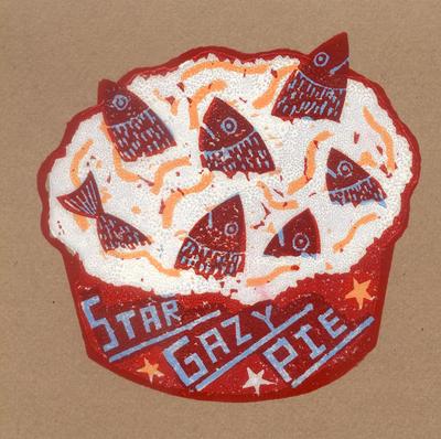
From the reference box # 99
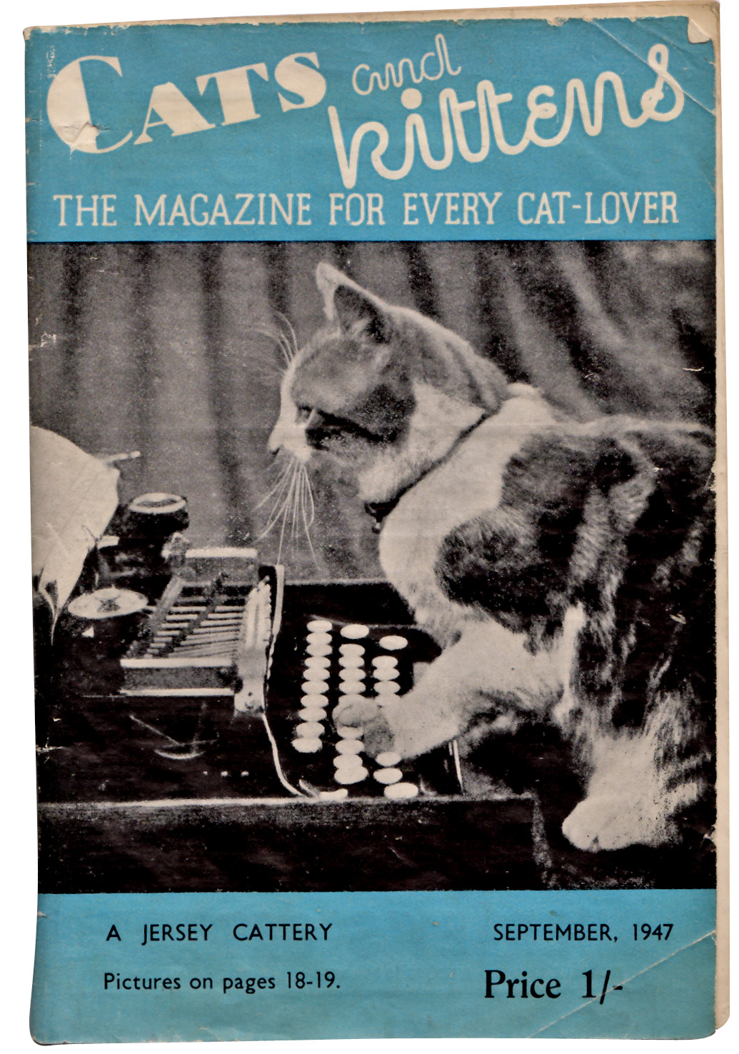
#99 - Cats and kittens: The magazine for every cat-lover, September 1947. Who can resist cats and kittens? Not me that's for sure, so imagine my delight finding cat related ephemera!
I've been unable to find out much about this monthly publication (other than there is a publication by the same name still going strong today, but in the US). I've found references to this Rolls House Published version dating back to the early 30's, but unfortunately I can't find an exact launch date.
Anyway, even without all the history, it's great that back in the 30's and 40's people loved their cats so much there was a need for a monthly publication and how great is that 'kitten' type?
Check out some of the wonderful cat related ads below...


There are lots more items in our reference box, have a root here.
And watch out for #100, it's going to be a special one!
https%3A%2F%2Fwww.deliciousindustries.com%2Ffrom-the-reference-box-99
Delicious+Industries%3A+From+the+reference+box+%23+99
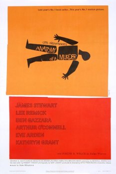
Bass Notes: The film posters of Saul Bass

Much of his work was for the film industry and throughout the 60's Bass famously worked with film directors Martin Scorsese, Alfred Hitchcock and Otto Preminger producing iconic film posters. Posters we are now going to get the chance to see again thanks to Kemistry Gallery, London.
Bass Notes: The film posters of Saul Bass is a collection of film posters, title credits and film festival posters from the Lloyd Northover donation to the British Film Institute. I'm not sure which posters will be in the exhibition and I can't wait to find out, but to get you in the mood here's a selection of the classics...


https%3A%2F%2Fwww.deliciousindustries.com%2Fbass-notes-the-film-posters-of-saul-bass
Delicious+Industries%3A+Bass+Notes%3A+The+film+posters+of+Saul+Bass
Giant Sellotape Tin


The vintage Sellotape tins have become a bit of an obsession and I now have quite a collection including this fabulous example. It's a large (165mm [6.5"] high & 120mm [4 5/8"] diameter) tubular tin designed to hold a stack of 12 individual tins.
I think this is how they were sold to retailers/trade, so I don't think they were ever available to the general public unless they were buying 12 rolls!
I love this tape on the side with the contents information on...

This was the only large Sellotape tin I had ever seen on Ebay but this current listing has 8 tins in total, 2 of which are like this. I desperately want the two with the black stripes on, but I'm holding back. I think there's a limit to the number of Sellotape tins any one person should own and I've definitely already passed it, especially as I bought an older version of this one last night! (below).

https%3A%2F%2Fwww.deliciousindustries.com%2Fgiant-sellotape-tin
Delicious+Industries%3A+Giant+Sellotape+Tin
Gebrauchsgraphik Magazine


Some lovely Tuesday inspiration in the form of Gebrauchsgraphik: International Advertising Art covers. Gebrauchsgraphik or 'Commercial Arts' magazine was a German design and graphics publication founded in 1923 by Professor H. K. Frensel.
There are lots of examples of Gebrauchsgraphik covers on line, the ones above are from; A Journey Around My Skull, Webdesigner Depot, Bust Bright's Flickr, Aqua Velvet and Designers Books.
If Vintage magazine covers are your thing, you light like the following posts:
Which?
Modern Packaging
Country Fair and more Country Fair
Holiday
Opus International
Fortune
Juana Gaita
Gentry
Scienza e Vita
https%3A%2F%2Fwww.deliciousindustries.com%2Fgebrauchsgraphik-magazine
Delicious+Industries%3A+Gebrauchsgraphik+Magazine
Welcome

Welcome to the Delicious Industries blog. We're an independent design studio based in Brighton, UK and this is our scrapbook packed full of design, illustration, photography & typography inspiration. Check out our work here.
Links
DELICIOUS FRIENDS
DELICIOUS FAVOURITES
- 50 Watts
- Acejet 170
- Grain Edit
- It's Nice That
- National Geographic Found
- Notcot
- Pretty Clever
- Retronaut
- So Much Pileup
- We Love Typography
- Another Mag