Blog: November 2008
British Design Classics


On the 13 January 2009 the Royal Mail are issuing a new set of stamps to commemorate 10 British Design Classics.
This great series includes the Mini (Sir Alec Issigonis, 1959), Harry Beck’s design of the London Underground Map from the 1930’s, the classic Red Telephone boxes (Sir Gilbert Scott, K2 Design, 1926), RJ Mitchell’s Spitfire and Concorde (Aérospatiale-BAC).
The stamps will be launched alongside a prestige stamp book which will provide more information about the celebrated design icons and their history.
2009 also marks Mini’s 50th birthday and Concorde’s 40th birthday and to celebrate the Royal Mail are issuing a generic sheet of 20 stamps for each also available in the New Year.
Via CR Blog.
Images copyright Royal Mail, from the CR Blog.
https%3A%2F%2Fwww.deliciousindustries.com%2Fbritish-design-classics
Delicious+Industries%3A+British+Design+Classics
The Pink & Blue Project

I love this photography project by JeongMee Yoon. The Pink & Blue Project shows small children surrounded by their pink or blue belongings. It was instigated by her daughter who loved the colour pink so much that, "she wanted to wear only pink clothes and play with only pink toys and objects".
JeongMee discovered that this was not unusual and in fact a worldwide phenomenon, regardless of cultural background, ethinic group or nationality, so she set about exploring the, "trends in cultural preferences and the differences in the tastes of children (and their parents) from diverse cultures, ethnic groups as well as gender socialization and identity".
It's amazing when you look through the images just how many toys and clothes they have and interestingly the girls all seem to have far more than the boys!
Images copyright of JeongMee Yoon.
https%3A%2F%2Fwww.deliciousindustries.com%2Fthe-pink-blue-project
Delicious+Industries%3A+The+Pink+%26amp%3B+Blue+Project
Beetle Drive
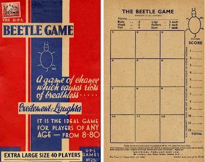
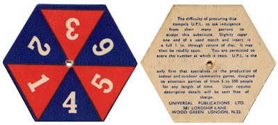
On the theme of old games, this is a late 50's (?) version of the great British game - Beetle. The Beetle game was massive in the 60's with 'Beetle Drives', an evening of playing Beetle with food and drink, often done as a fundraiser. The game can be played individually or in teams by all ages.
The aim is the first person to draw a full beetle on their card. A throw of the dice dictates which part you can draw. In this version a roll of 6 lets you draw the body, 5 - the head (which you must have before being allowed to draw the eyes or feelers), 4 - the tail, 3 - one leg, 2 - one feeler and finally 1 - an eye. The first person to complete their beetle is the winner of that game. At a Beetle Drive the winner is the person who wins the most games out of 12 and often the players switch tables for each game to make more of a social evening.
I'm not sure it sounds like, "riots of breathless excitement & laughter", but maybe after a good few drinks!
The best thing about this version is the card 'dice'. You put a matchstick through the middle and spin it, apparently due to the, "difficulty in procuring dice" at that time - or is it really because a dice wouldn't fit in the box??
https%3A%2F%2Fwww.deliciousindustries.com%2Fbeetle-drive
Delicious+Industries%3A+Beetle+Drive
From the reference box #28
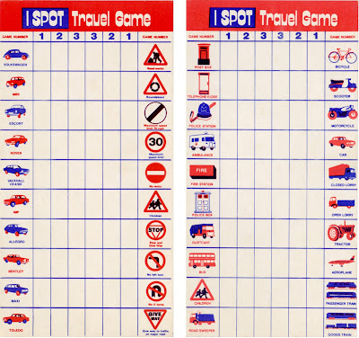
Long before portable DVD Players and Nintendo DS, the I-SPOT Travel Game was at the forefront of in-car entertainment.
From the typography and the models of cars, I'm guessing these examples are from the 70's. The simple, 2 colour illustrations are great, especially the cars and I particularly like the Dr Who style police box - I don't think I've ever seen one of those!
So #28 - a fabulous pair of I-Spot Travel Game cards.
Take a look through our reference box here.
https%3A%2F%2Fwww.deliciousindustries.com%2Ffrom-the-reference-box-28
Delicious+Industries%3A+From+the+reference+box+%2328
Type Tea Towels

I love these Tea Towels, they're so nice I want to frame the big 't' and put it on the wall!
Via SwissMiss.
https%3A%2F%2Fwww.deliciousindustries.com%2Ftype-tea-towels
Delicious+Industries%3A+Type+Tea+Towels
Cube stamps
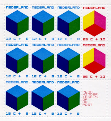
I bought these a couple of weeks ago. I love the pink, red and yellow one - it could be a club poster or album cover, with those colours and the square type.
https%3A%2F%2Fwww.deliciousindustries.com%2Fcube-stamps
Delicious+Industries%3A+Cube+stamps
Vintage Packaging
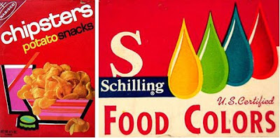

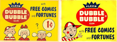
Today I found a fantastic website jam packed with vintage packaging, advertising and store displays, mainly for food and drink products. It's a brilliant resource and must have taken years to compile.
I love the product ranges that have characters - which seem to be mainly drink sachets...

There's a whole section on Funny Face Drink Mix packages showing the development of the characters and design from the early 60's through to the late 70's...

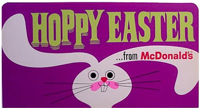
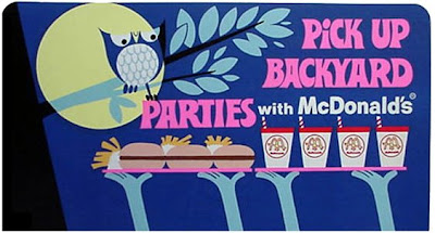
These McDonalds signs from the 60's, were my favourite find, they're really well designed with fun typography and great illustrations - not at all what I imagined!

All images copyright The Imaginary World and Tick Tock Toys.
Via the wonderful Found in Mom's Basement.
https%3A%2F%2Fwww.deliciousindustries.com%2Fvintage-packaging
Delicious+Industries%3A+Vintage+Packaging
Dick Bruna Memory Game

Forget Nintendo DS this is all you need to give your memory a workout - the Dick Bruna edition of the Ravensburger Memory game.
There are 36 pairs of cards, each with a gorgeous illustration in the wonderful Bruna style. The game is copyright 1981, but the illustrations used range from 1959 - 1980 and yes, there are a few Miffy cards!


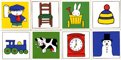
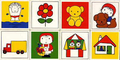

Even the instruction booklet has a lovely illustration:

All illustrations copyright Dick Bruna.
https%3A%2F%2Fwww.deliciousindustries.com%2Fdick-bruna-memory-game
Delicious+Industries%3A+Dick+Bruna+Memory+Game
Jon Burgerman Wallpaper


How great is this colour-in wallpaper by Jon Burgerman? I think it's a fantastic idea and actually looks great even before it's been coloured-in. It's available in 1000 x 52cm rolls from Nineteenseventythree along with is colour-in greetings cards!
Via Notcot.
https%3A%2F%2Fwww.deliciousindustries.com%2Fjon-burgerman-wallpaper
Delicious+Industries%3A+Jon+Burgerman+Wallpaper
From the reference box #27
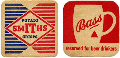
Two great beermats for two great British products; Bass Brewery and Smiths Potato Crisps.
Smiths Potato Crisps Company Ltd was a family business, formed in 1920 to bring crisps to the British masses. Mrs Smith washed, cut and fried the potatoes in the couple's North London garage. Frank Smith packaged them in greaseproof paper bags, added a twist of salt to flavour and then sold them from his pony and trap around London.
It's rumoured that during World War II, the women packing the blue sachets of salt in the crisps would sometimes pack little pieces of paper with their names and addresses on to draw the attention of any lonely soldiers!
Bass Brewery
The Bass & Co Brewery was established by William Bass in 1777 and was one of the first breweries in Burton upon Trent, UK - a town that became so popular with breweries over the years, that it is now known as a 'brewing town'. Bass was also one of the original FT 30 companies on the London Stock Exchange when the listing was established in 1935!
Not many people know that the Bass Red Triangle is one of the world's oldest logos and was the first trademark to be registered in Britain. The 1875 Trademarks Registration Act came into effect on 1 January 1876 and that New Year's Eve, a Bass employee waited overnight outside the registrar's office, in order to be the first to register a trademark the next morning. Bass actually got the first two registrations; the first was for the Bass Red Triangle (for their pale ale) and the second for the Bass Red Diamond (for their strong ale).
#27 - Bass and Smiths Potato Crisp beermats
https%3A%2F%2Fwww.deliciousindustries.com%2Ffrom-the-reference-box-27
Delicious+Industries%3A+From+the+reference+box+%2327
Nesbitt's Poster

How great is this Nesbitt's poster. I had forgotten all about it until So Much Pileup posted some 70's Nesbitt's packaging. I think it's from the late 50's / early 60's judging by the print quality and design. I love the Nesbitt's logotype and just how graphic the whole thing is.
While I was trying to find out more about Nesbitt's I came across this site which has masses of memorabillia, posters and information about the company and there products:
The Nesbitt Fruit Products Company was founded in 1924 by Hugh S. Nesbitt and produced syrups to be used in soda fountains.
Nesbitt's Orange was first bottled for distribution in 1938-39, distinguished from it's competition by the fact it was made from 10% California orange juice.
Marilyn Monroe was a model for Nesbitt's Orange in 1946.
Nesbitt's Orange was the "Official Orange Drink" for Disneyland from the time it opened in 1955 into the 1960's. It was the only orange drink sold in the Park.
In 1957, the "Nesbitt's Orange Special" dragster set 1/4 Mile speed Record of 9.445 seconds (159.02 mph). It is believed that this was the first "commercially sponsored" dragster.
How cool is that?!
https%3A%2F%2Fwww.deliciousindustries.com%2Fnesbitts-poster
Delicious+Industries%3A+Nesbitt%26%23039%3Bs+Poster
The missing letters!


So (drumroll) here's the full set...

Big thanks to Ryan at Sell! Sell! for pointing us in their direction.
https%3A%2F%2Fwww.deliciousindustries.com%2Fthe-missing-letters
Delicious+Industries%3A+The+missing+letters%21
Cuban stamps


Some Cuban Stamps celebrating the Munich 1972 Olympics. I love the pictograms against the bright colours and the Mexico68-esque type. I'm thinking there was probably a stamp for each letter in Munich, being as though we have here an 'I', 'M' and an 'N' - anyone have any of the others?
If you want to see more stamps check out these posts:
Stamp Inspiration
Stamps at Present & Correct
More Stamps
https%3A%2F%2Fwww.deliciousindustries.com%2Fcuban-stamps
Delicious+Industries%3A+Cuban+stamps
Hope & Glory

Congratulations to Barack Obama on his amazing victory - this historic day affects all of us, so Thank You America!
https%3A%2F%2Fwww.deliciousindustries.com%2Fhope-glory
Delicious+Industries%3A+Hope+%26amp%3B+Glory
SIGNS by Mark Pawson

An Exhibition of 12 New Limited Edition Ready To Hang Signs and some Jewellery is Mark Pawson's latest exhibition that runs from 7 November - 23 December at Tatty Devine's Brick Lane store.
The signs are perspex, laser-cut and etched at Tatty Devine then glued together by Pawson. They have a great nostalgic feel that Pawson attributes to the, "curious, limited sort of retro colour palette" that the perspex/acrylic is available in.
He has also been bust making 12 invitational 'ready-to-hang' signs which have been sent out to press and magazines promoting the exhibition:

Via and images from Creative Review.
https%3A%2F%2Fwww.deliciousindustries.com%2Fsigns-by-mark-pawson
Delicious+Industries%3A+SIGNS+by+Mark+Pawson
Welcome
Welcome to the Delicious Industries blog. We're an independent design studio based in Brighton, UK and this is our scrapbook packed full of design, illustration, photography & typography inspiration. Check out our work here.
Links
DELICIOUS FRIENDS
DELICIOUS FAVOURITES
- 50 Watts
- Acejet 170
- Grain Edit
- It's Nice That
- National Geographic Found
- Notcot
- Pretty Clever
- Retronaut
- So Much Pileup
- We Love Typography
- Another Mag

