art direction, design + typography
Blog: Packaging
Alex Steinweiss
_Decca_Gold_Label_Series_catalogue_no._DL_8400.jpg)
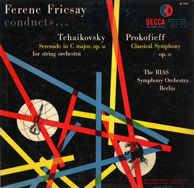
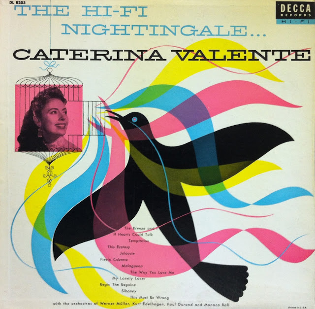
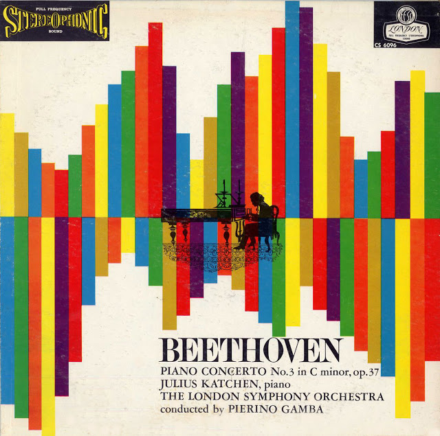
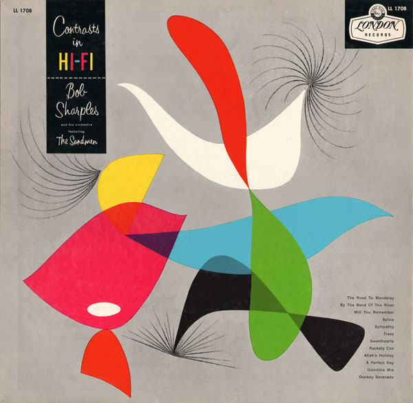
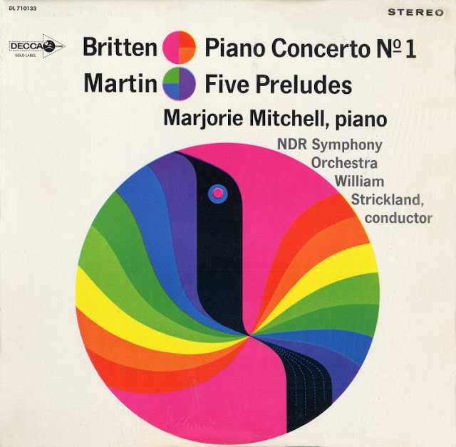
Throughout his career, Alex Steinweiss (1917 - 2011) was art director at Columbia Records, London, Decca and A & R records. He was the man behind the record cover's very existence - before him records were sold in plain wrappers, no branding, no design, no marketing.
“I got this idea that the way they were selling these albums was ridiculous. The covers were just big brown, tan or green paper. I said: “Who the hell’s going to buy this stuff? There’s no push to it. There’s no attractiveness. There’s no sales appeal.” So I told them I’d like to start designing covers.”
Art & Artists have written a really interesting 6-part biography illustrated with a massive collection of cover designs spanning his extensive career. Check it out here.
Via Pretty Clever. Images from Art & Artists.
https%3A%2F%2Fwww.deliciousindustries.com%2Falex-steinweiss
Delicious+Industries%3A+Alex+Steinweiss
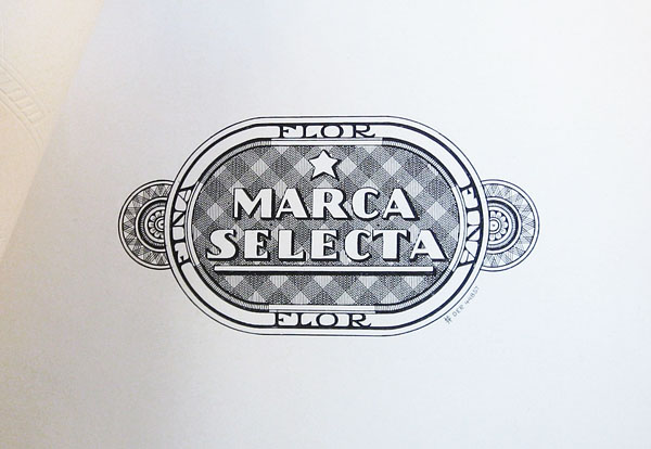
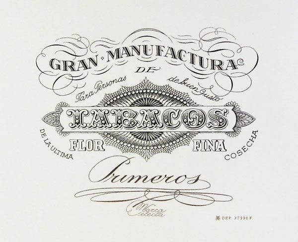
Vintage Cigar Labels
EE9s2ufFjpBR5sVoJ_Tw~~60_57.jpg)
f!~~60_57.jpg)
cE9s4PsNKSBR5sT)tCcQ~~60_57.jpg)
These beautifully detailed and lettered cigar labels are from a collection over on Letterology. It's an interesting post showing the elaborate designs introduced to establish more sophisticated looking brand styles and prevent counterfeits being easily produced. Check out the full post here.
Images copyright Letterology.
https%3A%2F%2Fwww.deliciousindustries.com%2Fvintage-cigar-labels
Delicious+Industries%3A+Vintage+Cigar+Labels
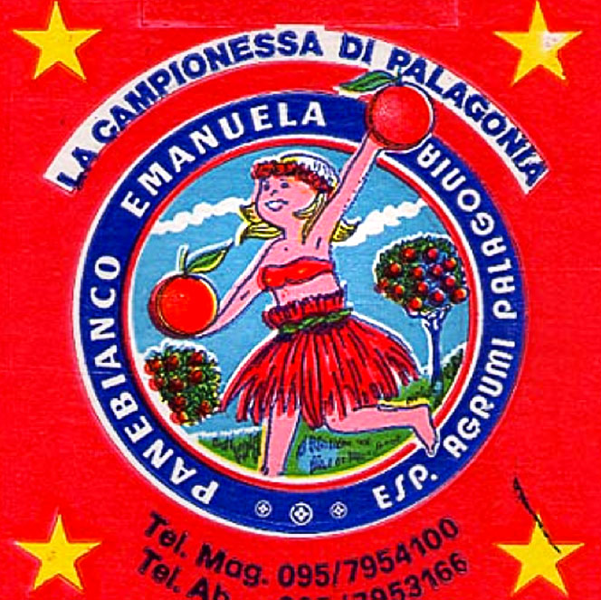
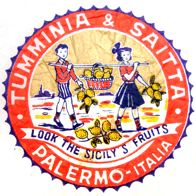
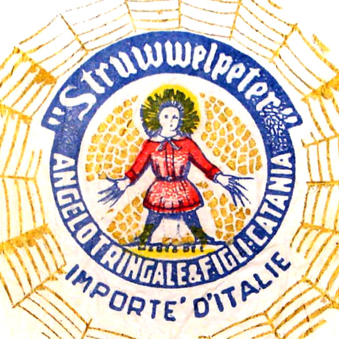
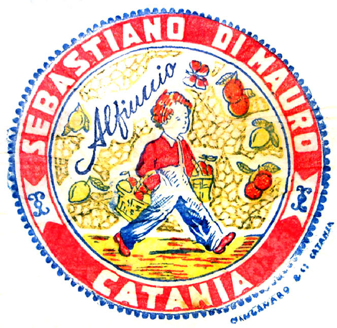
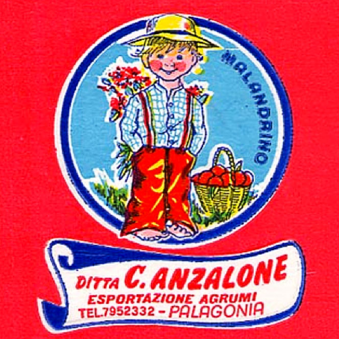
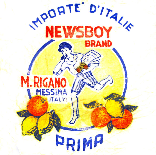
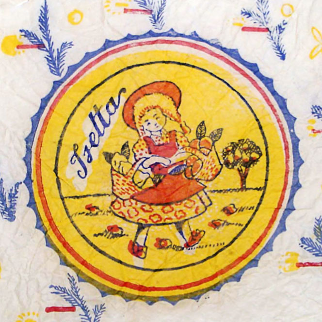
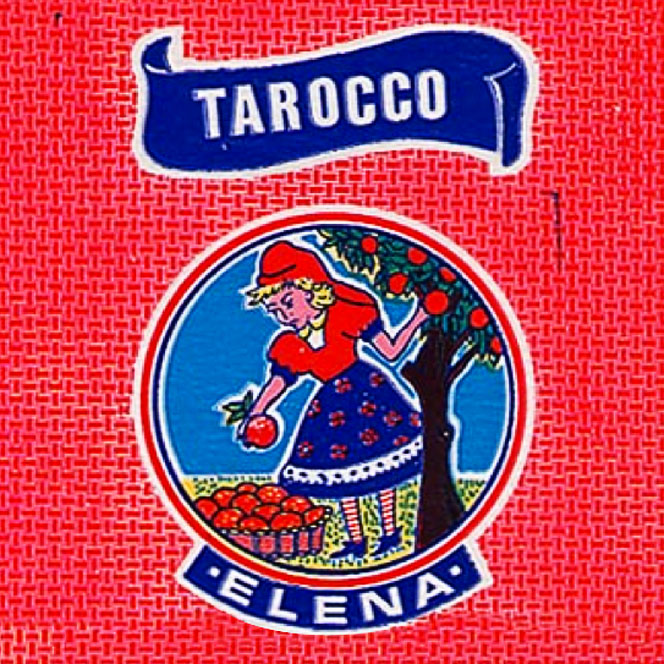
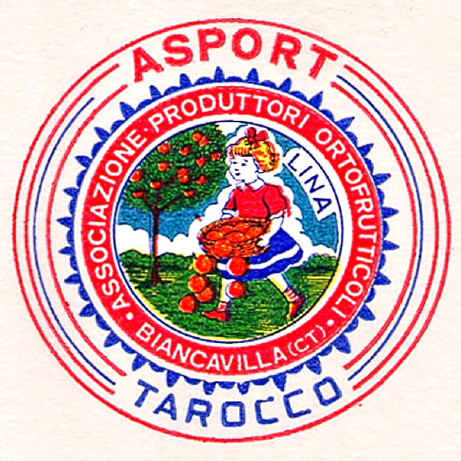
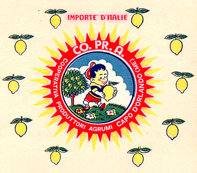
Sicilian Fruit Tissue Wrap
Colourful illustrations, charming but lo-fi print and wonderful lettering all come together on these Sicilian fruit wrappers to turn an unremarkable, everday item into something beautiful.
I'm always amazed at the level of detail on packaging like this, that for the most part goes totally unnoticed.
Images copyright Italian Ways
Via FFFFound!
https%3A%2F%2Fwww.deliciousindustries.com%2Fsicilian-fruit-tissue-wrap
Delicious+Industries%3A+Sicilian+Fruit+Tissue+Wrap
From the reference box #128


#128 - Vintage bulb packaging. I just saw that the lovely Maraid was selling some vintage bulb packaging on Ebay (can't believe I missed them!), anyway it reminded me that I had a few somewhere and here they are.
A DR. G. Fischer Autolicht car bulb for a Helphos spotlight (left), a British Electric Lamps Ltd. decorative bulb and a neon crucifix light bulb. Maybe I'll start collecting these too!
https%3A%2F%2Fwww.deliciousindustries.com%2Ffrom-the-reference-box-128
Delicious+Industries%3A+From+the+reference+box+%23128
80's Firework Packaging


With Guy Fawkes tomorrow I thought it was a good excuse to post up some of Jason Liebig's fabulous collection of 1980's fireworks packaging.
This huge collection is pasted into a scrapbook, above are a few of my favourites, but there are pages and pages in his Flickr set, with 3 or 4 packages on each - I'm guessing Jason enjoyed the 5th November growing up!
Another great collection of vintage fireworks packaging can be seen at the Firework Heritage Museum or read my previous post here.
All images copyright Jason Liebig.
https%3A%2F%2Fwww.deliciousindustries.com%2F80s-firework-packaging
Delicious+Industries%3A+80%26%23039%3Bs+Firework+Packaging
Retro Tesco at Goodwood Revival 2011


The shelves were stacked with a mix of vintage products and packages for display purposes only that sat alongside modern products with classic packaging (like Lyon's Golden Syrup and Wrigley's Chewing Gum) and modern products re-packaged in a vintage style that could all be purchased.
I loved the single product displays like Double Diamond and Fairy with loads of the products stacked high. It's great to see all the old packages on the shelves together and really good fun buying them at the 60's style check-out. I hope it's there again next year!
If you want to have a virtual tour of the Retro Tesco there's a short video here.
https%3A%2F%2Fwww.deliciousindustries.com%2Fretro-tesco-at-goodwood-revival-2011
Delicious+Industries%3A+Retro+Tesco+at+Goodwood+Revival+2011
Own Label: Sainsbury's Design Studio


This era of Sainsbury's packaging has always been a good source of inspiration for designers - it's modernist style, simple graphics and bright colours are a winning combination. "Their striking modernity pushed the boundaries, reflecting a period full of optimism. They also helped build Sainsbury’s into a brand giant, the first real ‘super’ market of the time. This book examines and celebrates this paradigm shift that redefined packaging design, and led to the creation of some of the most original packaging ever seen."
Images copyright Fuel Design & Publishing.
Via CR Blog.
https%3A%2F%2Fwww.deliciousindustries.com%2Fown-label-sainsburys-design-studio
Delicious+Industries%3A+Own+Label%3A+Sainsbury%26%23039%3Bs+Design+Studio
From the reference box # 112


#112 - Vintage 'The Young Artist' Watercolours. I picked this little beauty up on a boot sale for a bargain 20p and even though I only bought if for the lovely box, it has a full set of watercolours still inside - shame I can't paint!
The packaging and colour palate screams 1950's (1957 it seems) and I love the paintbrush graphic. All-in-all a very well spent 20p.
See more fabulous vintage packaging and ephemera in our reference box.
https%3A%2F%2Fwww.deliciousindustries.com%2Ffrom-the-reference-box-112
Delicious+Industries%3A+From+the+reference+box+%23+112
Vintage bread wrappers


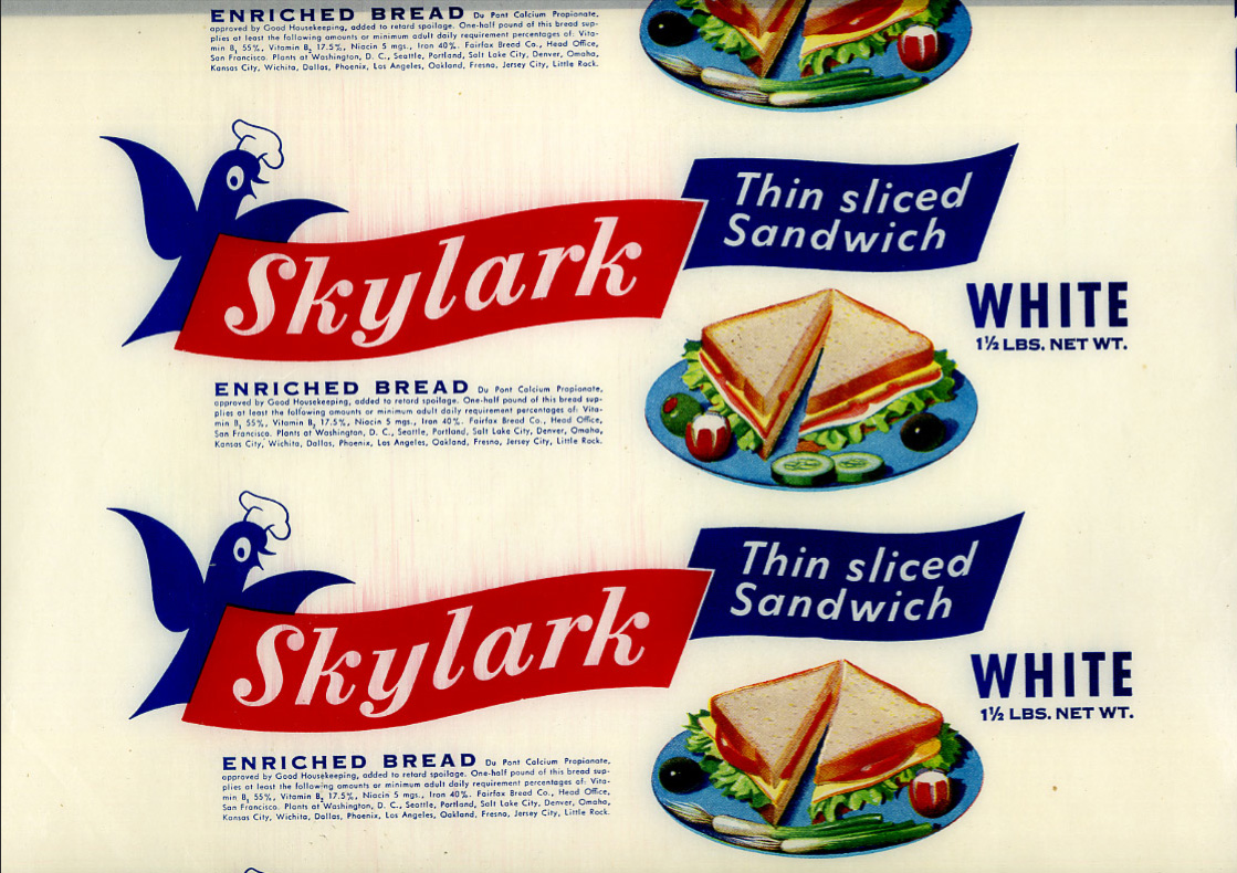


Bread used to be packaged in a waxed paper and sealed at either end with a sticker (in fact in the UK some brands still use the waxed paper, but heat sealed with a glue at the ends instead of with stickers).
These fine examples are waxed, bread wrappers from the 40's & 50's. I think the Victory Vitality Bread is my favourite because if it's simplicity, although the Skylark is giving it a run for it's money (it's that little chef hat on the skylark graphic!).
Se more of the collection here.
Via the How to be a Retronaut.
https%3A%2F%2Fwww.deliciousindustries.com%2Fvintage-bread-wrappers
Delicious+Industries%3A+Vintage+bread+wrappers
From the reference box # 111


I've already posted about the lime drink and orange drink labels I bought as part of a collection, so here are the lemon ones; C&C (Cantrell & Cochrane) Lemonade, 'new' Kia-Ora Low calorie Lemon Drink and Sunparlor Lemonade with 'New turn off cap!'.
There's something about the print quality and design on these labels that really appeals to me. Sunparlor is my favourite of this bunch - I Just love the slightly off set startburst and the weird centred, but to the right contents info.
https%3A%2F%2Fwww.deliciousindustries.com%2Ffrom-the-reference-box-111
Delicious+Industries%3A+From+the+reference+box+%23+111
Daphne Padden Original Sketches


They discovered she did quite a lot of packaging design in the 70's, mainly for M&S (or St Michael as it was back then) and kept the original design sketches as well as the finished packaging which is really great to see.
I love seeing the original sketches more than the finished design - they have so much more character. So thanks Quad Royal for sharing your bounty!
Quad Royal have been researching and championing Daphne Padden's design work for some time, so there's lots more to read see here and here.
Images copyright Quad Royal.
https%3A%2F%2Fwww.deliciousindustries.com%2Fdaphne-padden-original-sketches
Delicious+Industries%3A+Daphne+Padden+Original+Sketches
From the reference box # 108


#108 - Vintage French, Lait En Poudre (powdered milk) tin. This delightful 300g tin of powdered milk was produced by the Société France-Lait in St Martin Belle-Roche.
I love it's 2 colour print and the overprint created by the dark green on the excess pale green around the pale green type and graphics. I also like the little factory graphic on the France graphic.
Too pretty (and big) for the reference box, this one lives happily on the plan chest in the window enjoying admiring glances from passers-by.
See more vintage packaging and ephemera here.
https%3A%2F%2Fwww.deliciousindustries.com%2Ffrom-the-reference-box-108
Delicious+Industries%3A+From+the+reference+box+%23+108
From the reference box # 106


#106 - Vintage Orange Drink labels. Here are the orange drink labels that came in the collection along with the Lime Cordial ones I bought a couple of weeks ago.
They've all got something interesting to me; the Safeway one (top) is actually gold and has great 'orangeade' type - random, but fun. It's the NAAFI logo I like on the middle label and on the Batemans (bottom) it's the little orange graphics.
There are still the Lemonade and Ginger Beer ones to come!
https%3A%2F%2Fwww.deliciousindustries.com%2Ffrom-the-reference-box-106
Delicious+Industries%3A+From+the+reference+box+%23+106
From the reference box # 105


I love the simplicity of the Sainsbury's one (top) and the overlays on the Hooper Struve graphics (bottom), but those limes on the C&C label (middle) look like they've seen better days!
The collection also includes Orange cordial, ginger beer and lemonade labels from a similar era - watch this space!
https%3A%2F%2Fwww.deliciousindustries.com%2Ffrom-the-reference-box-105
Delicious+Industries%3A+From+the+reference+box+%23+105
From the reference box #104


#104 - Vintage OXO tin, but no ordinary OXO tin! No, this one is a souvenir celebrating the Coronation of Her Majesty Queen Elizabeth II, 2 June 1953 - "LONG MAY SHE REIGN".
Whilst everyone seems to have Royal Wedding fever I thought it only fitting to share this fabulous little tin. It's not in the best condition, but I love it's kitschness - there's even a timeline of the Queens life on the inside of the lid (below).

If you get bored over the Bank Holiday (or any day really) make a cuppa and have a good look through our reference box.
https%3A%2F%2Fwww.deliciousindustries.com%2Ffrom-the-reference-box-104
Delicious+Industries%3A+From+the+reference+box+%23104
Welcome

Welcome to the Delicious Industries blog. We're an independent design studio based in Brighton, UK and this is our scrapbook packed full of design, illustration, photography & typography inspiration. Check out our work here.
Links
DELICIOUS FRIENDS
DELICIOUS FAVOURITES
- 50 Watts
- Acejet 170
- Grain Edit
- It's Nice That
- National Geographic Found
- Notcot
- Pretty Clever
- Retronaut
- So Much Pileup
- We Love Typography
- Another Mag