art direction, design + typography
Blog: January 2014
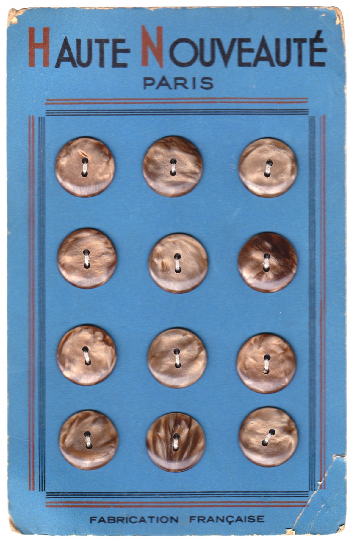
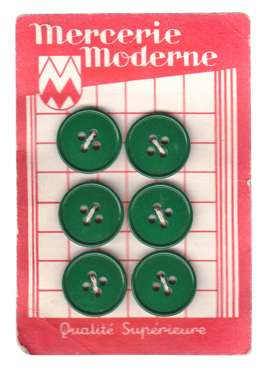
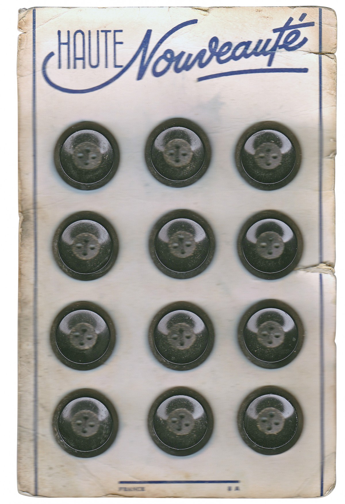
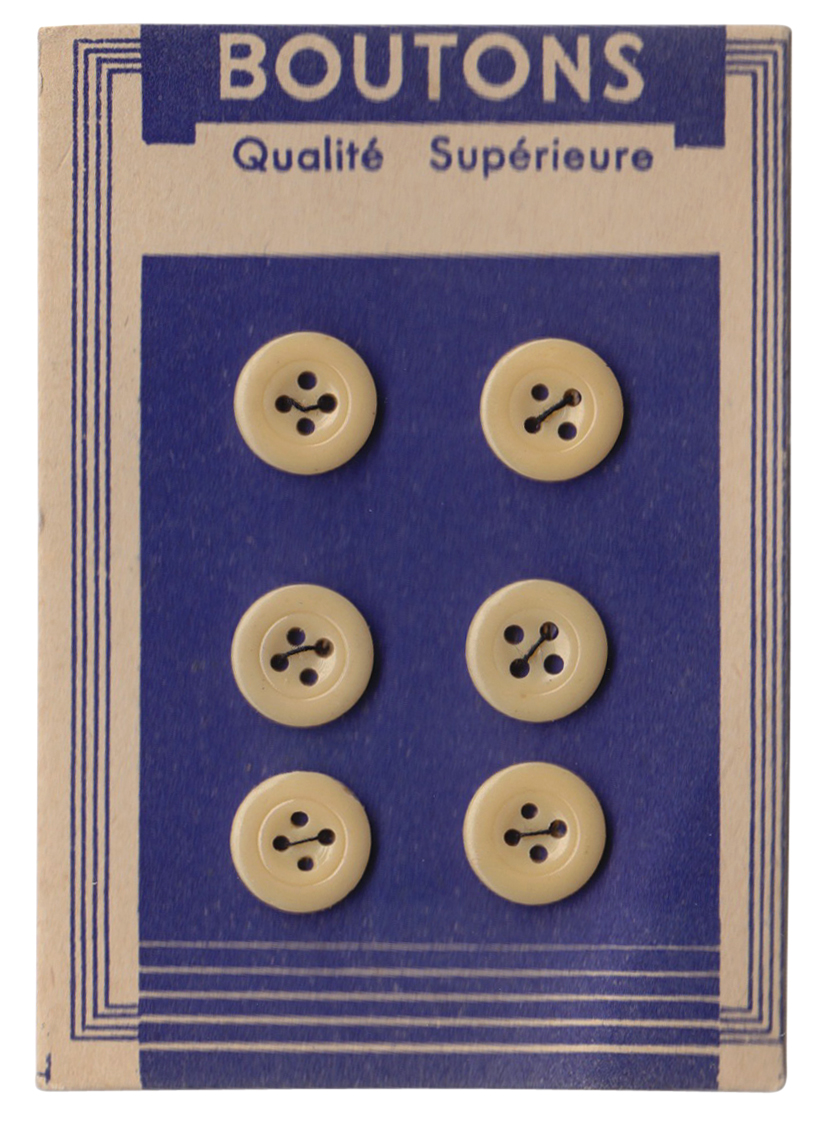
From the reference box #143
#143 - French Button display cards, circa 1940/1950. These lovely vintage button cards are from the Brighton street market and only £1 per card!
The lettering is fantastic and I bought them for that alone - I love the scripty 'Nouveauté' on the white card (third from top), it has such a Parisian feel as does the 'Haute Nouveauté' on the blue card (top) with it's ascending A's and quirky E's.
I feel another collection starting!
https%3A%2F%2Fwww.deliciousindustries.com%2Ffrom-the-reference-box-143
Delicious+Industries%3A+From+the+reference+box+%23143
Only 2 days left…
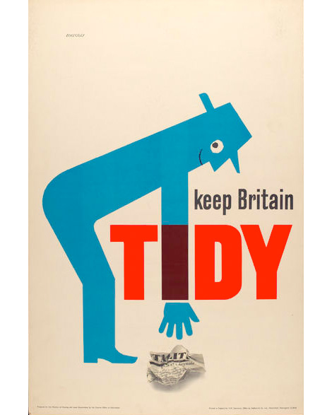
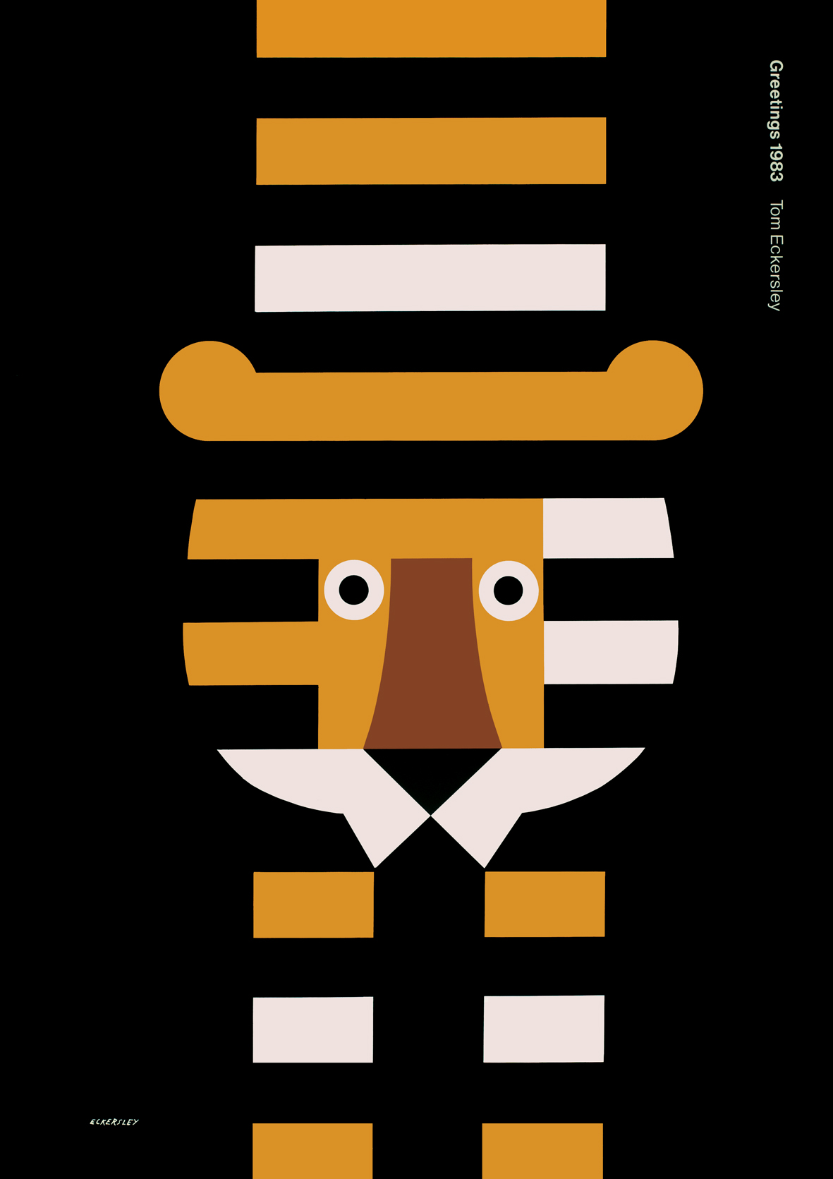
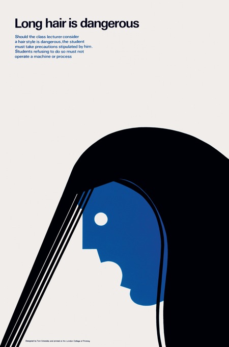
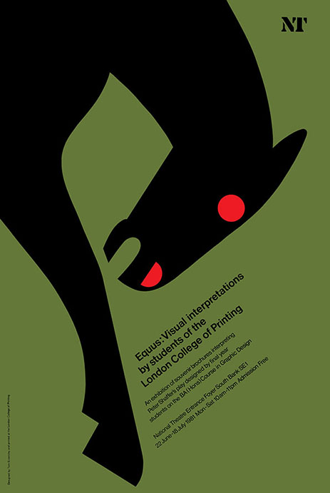
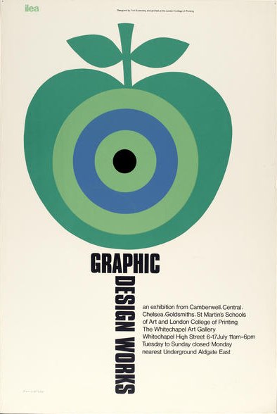
... to catch Tom Eckersley: Master of the Poster at University of the Arts London (UAL / London College of Communication).
"To mark the centenary of legendary graphic designer Tom Eckersley’s birth, London College of Communication presents an exhibition of iconic Eckersley poster designs which celebrate his enormous contribution to graphic communication and design education in Britain."
Tom Eckersley's career as a graphic desgner spanned six decades. The 'undoubted master of the poster', designed iconic posters for Royal Society for the Prevention of Accidents (RoSPA) encouraging safety in the workplace, for the Air Ministry during WWII, the General Post Office, London Transport and the BBC all in his distinctive bold, bright style. In the mid 50s Eckersley joined the London College of Printing (UAl: London College of Communication) establishing the first under-graduate graphic design course in Britain. During his 20 years as Head of Graphic Design he taught many well-known creatives of our time including; Ralph Steadman, Charles Saatchi and John Hegarty.
This exhibition is showing a selection of posters from the UAL's Eckersley archive along with reflections from those he influenced during his long career, but it ends on Wednesday (!) so hurry on over there. It's open 10am - 5pm tomorrow and Wednesday.
Images copyright of the Estate of Tom Eckersley / University of the Arts London / Archives & Special Collections Centre.
https%3A%2F%2Fwww.deliciousindustries.com%2Fonly-2-days-left
Delicious+Industries%3A+Only+2+days+left%26%238230%3B
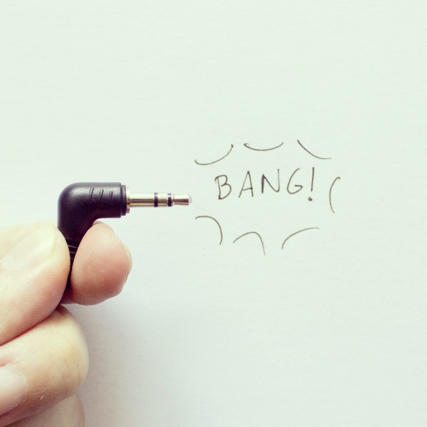
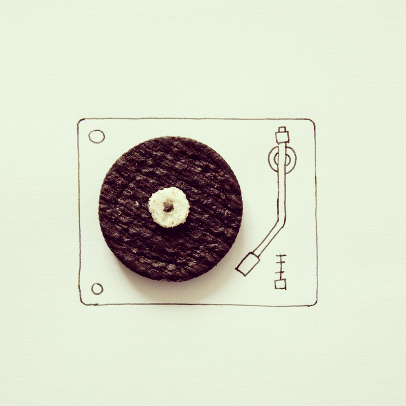
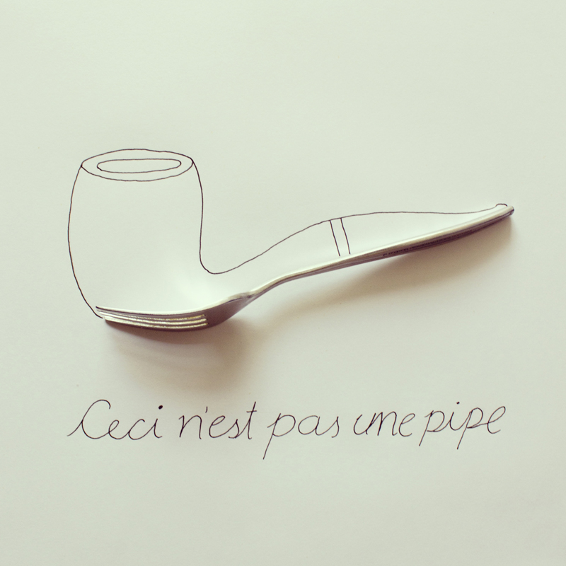
Instagram Experiments by Javier Perez
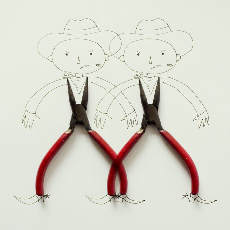
Fun Instagram images for a Friday afternoon.
These little minimalist collages using everyday objects are photographed and posted regularly to instagram by illustrator Javier Parez.
You can see more of them here or follow him on Instagram to see his new pieces as he posts them.
Via Colossal.
https%3A%2F%2Fwww.deliciousindustries.com%2Finstagram-experiments-by-javier-perez
Delicious+Industries%3A+Instagram+Experiments+by+Javier+Perez
Only in England
Pin this on Pinterest
 View large image
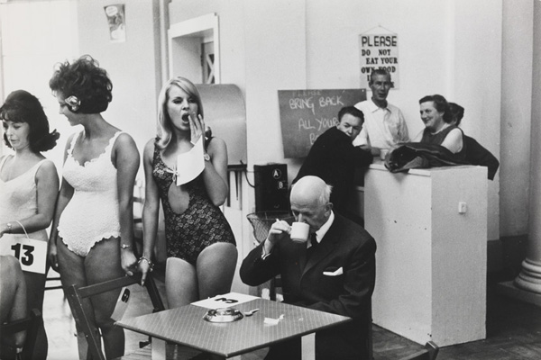
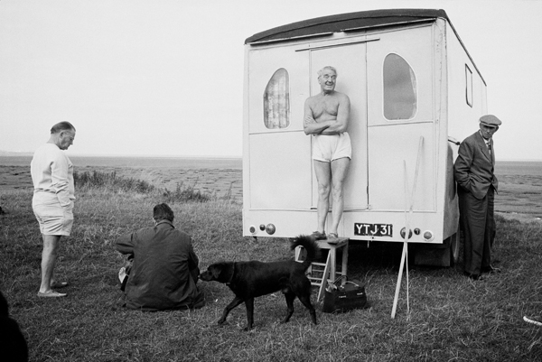
© National Media Museum Beauty contestants, Southport, Merseyside, 1967 by Tony Ray-Jones
Pin this on Pinterest
View large image
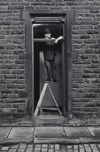
© Martin Parr/ Magnum Tom Greenwood cleaning 1976 by Martin Parr
Pin this on Pinterest
View large image
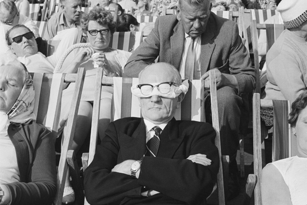
© National Media Museum Location unknown, possible Morcambe, 1967 – 68 by Tony Ray-Jones
Only in England: Photographs by Tony Ray-Jones and Martin Parr demonstrates, "the close relationships between the work of these two important photographers" by showcasing over 50 unseen images from the National Media Museum's Ray-Jones archive chosen by Martin Parr alongside The Non-Conformists, a selection of rarely seen Parr images from the 70s.
English born photographer, Tony Ray-Jones graduated from Yale University School of Art in 1964 and on returning to England travelled across the country capturing, "what he saw as a disappearing way of life" - English eccentricities and social customs. Images which struck a chord with Martin Parr and became a great influence on his work.
This exhibition runs until the 16 March 2014 at the Science Museum, London.
https%3A%2F%2Fwww.deliciousindustries.com%2Fonly-in-england
Delicious+Industries%3A+Only+in+England
From the reference box #142
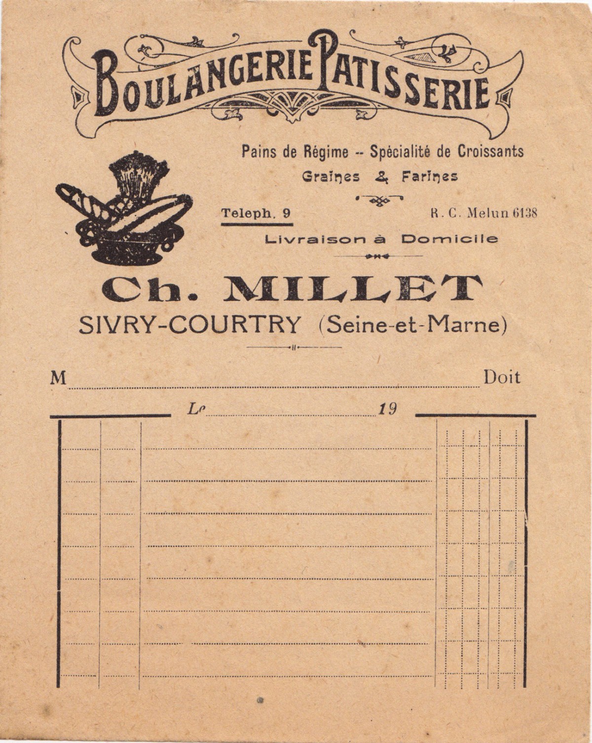
#142 - Vintage Boulangerie Patisserie receipt, "Pains de Régime - Specialité de Croissants, Graines & Farines".
A new addition to the reference box - this is the first of my Paris ephemera haul from the Marché aux Puces (flea markets).
It's a letter-pressed receipt probably from around the early 1900s. If only receipts were this elaborate today, shopping would be much more fun!
https%3A%2F%2Fwww.deliciousindustries.com%2Ffrom-the-reference-box-142
Delicious+Industries%3A+From+the+reference+box+%23142
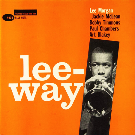
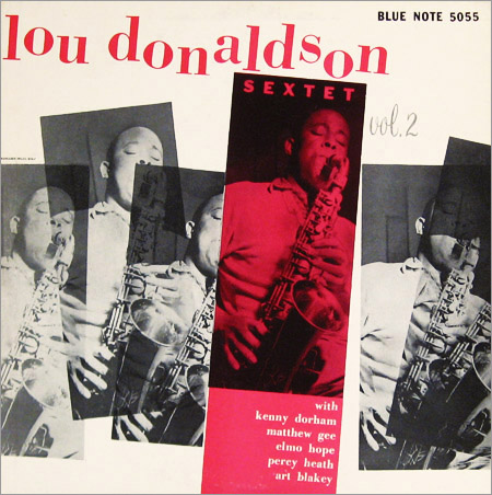
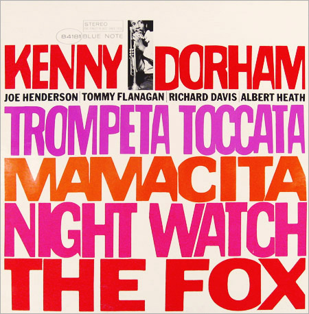
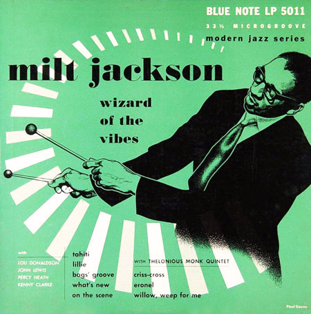
75 years of Blue Note Records
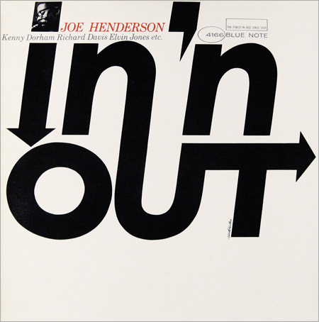
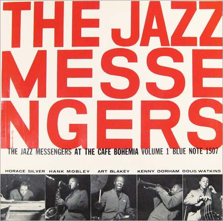
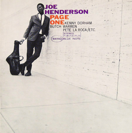
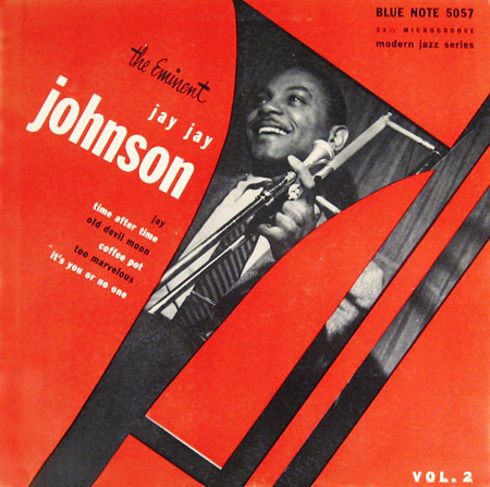
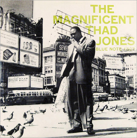
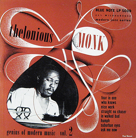
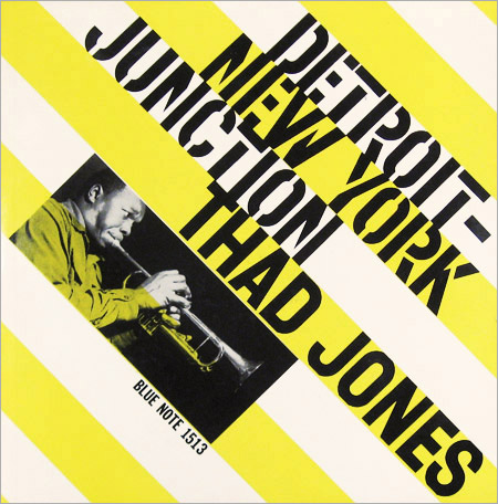
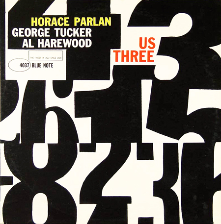
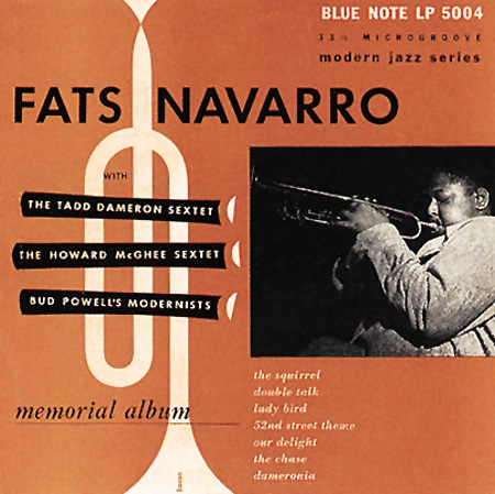
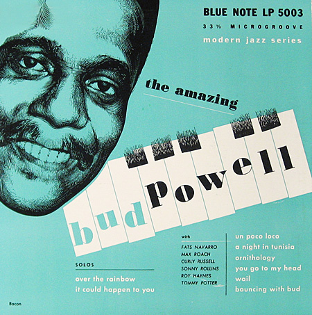
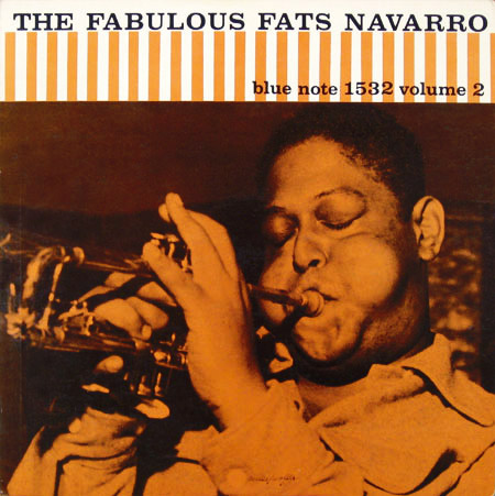
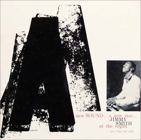
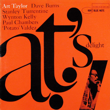
Today marks 75 years of Blue Note Records, surely that's a good enough excuse to look through some of their wonderful LP covers.
Blue Note was founded "when a German immigrant and passionate Jazz fan named Alfred Lion produced his first recording session on January 6, 1939 in New York City. Blue Note has gone on to represent The Finest In Jazz, tracing the entire history of the music from Hot Jazz, Boogie Woogie, and Swing, through Bebop, Hard Bop, Post Bop, Soul Jazz, Avant-Garde, and Fusion".
Throughout their 75 year history Blue Note have also been responsible for some of the finest, most desired and collected abum covers of all time. They're all fantastic but I had to be selective, so here are some of my favourites designed by Ried Miles, John Hermansader and Paul Bacon in the 50s and 60s. You can see a much larger selection on the great Birka Jazz Archive - but be warned you will need a spare couple of hours!
https%3A%2F%2Fwww.deliciousindustries.com%2F75-years-of-blue-note-records
Delicious+Industries%3A+75+years+of+Blue+Note+Records
Welcome

Welcome to the Delicious Industries blog. We're an independent design studio based in Brighton, UK and this is our scrapbook packed full of design, illustration, photography & typography inspiration. Check out our work here.
Links
DELICIOUS FRIENDS
DELICIOUS FAVOURITES
- 50 Watts
- Acejet 170
- Grain Edit
- It's Nice That
- National Geographic Found
- Notcot
- Pretty Clever
- Retronaut
- So Much Pileup
- We Love Typography
- Another Mag