art direction, design + typography
Blog: March 2011
No time for average Joes!

Our lovely friends over at Sell! Sell! are on the look out for a new account/project manager. They're after someone with zero to two years experience, but don't have time for average Joes.
If this sounds like the job for you, read more about it here and download an application form here.
Good luck!
https%3A%2F%2Fwww.deliciousindustries.com%2Fno-time-for-average-joes
Delicious+Industries%3A+No+time+for+average+Joes%21
From the reference box #102


#102 - more vintage tins, small but perfectly formed!
The Songster Gramaphone Needles tin (top) is my favourite of this bunch. All that detailed design, illustration and typography on such a small tin - it's easy to see why they have become so desirable in recent years.
I think the Snowfire Jelly tin (middle) is from the 1940's - Snowfire Jelly was a hand cream, "for beautiful hands".
The QA Brand Tablet tin (bottom) is really, really small - only 25mm high and 12mm in diameter. QA Brand "quick acting Asprin" were produced by Thompson & Capper, a homeopathic chemist company based in Liverpool.
As always, there's lots more vintage packaging and ephemera in the reference box if you feel like a root around.
https%3A%2F%2Fwww.deliciousindustries.com%2Ffrom-the-reference-box-102
Delicious+Industries%3A+From+the+reference+box+%23102
More Vintage Packaging


There's nothing better on a Monday morning than some vintage packaging! This wonderful selection is from Neato Coolville's Vintage Packaging Flickr set.
My favourite is the little 1960's box for Rediplete Pediatric Syrup (above) made by Merck Sharp & Dohme - it's such a clever, fun design.
It's a great collection, which is definitely worth a look. Here are a few more that caught my eye...
My favourite is the little 1960's box for Rediplete Pediatric Syrup (above) made by Merck Sharp & Dohme - it's such a clever, fun design.
It's a great collection, which is definitely worth a look. Here are a few more that caught my eye...


https%3A%2F%2Fwww.deliciousindustries.com%2Fmore-vintage-packaging
Delicious+Industries%3A+More+Vintage+Packaging
The Movie Title Stills Collection


The Movie Title Stills Collection is a fantastic online resource for movie titles and end frames. Collated by designer Christian Annyas, the collection ranges from the early 1920's to the present day and can be viewed by decade or by 'Western' and 'Film Noir' genres.
There's plenty to look through - some are old classics, others are more obscure, some are bold and minimal, others are charmingly ornate, but they all have great typography. Enjoy.
Via our friends, Sell! Sell!
Images copyright The Movie Title Stills Collection.
https%3A%2F%2Fwww.deliciousindustries.com%2Fthe-movie-title-stills-collection
Delicious+Industries%3A+The+Movie+Title+Stills+Collection
From the reference box #101


#101 - Vintage tins. There can never be enough vintage tins in the reference box! My favourite of this little lot is the John Bull, Mend-a-tear one (top) with it's stripey-edged lid. You can't really tell in the pic, but it has a lovely pale grey background. I really love the Ogden's and Bondman type too.
If vintage tins and ephemera are your thing - make a cup of tea, grab a biscuit and have a root through our reference box.
https%3A%2F%2Fwww.deliciousindustries.com%2Ffrom-the-reference-box-101
Delicious+Industries%3A+From+the+reference+box+%23101
We are 3!

Today we're celebrating 3 years of our Delicious blog.
It's been a busy, fun-packed few years, we've made lots of new friends and been exposed to fantastic opportunities. So we'd just like to say a huge thanks for all your support and for continuing to stop by.
Here's to the next inspiration filled year!
https%3A%2F%2Fwww.deliciousindustries.com%2Fwe-are-3
Delicious+Industries%3A+We+are+3%21
Auto Type XI


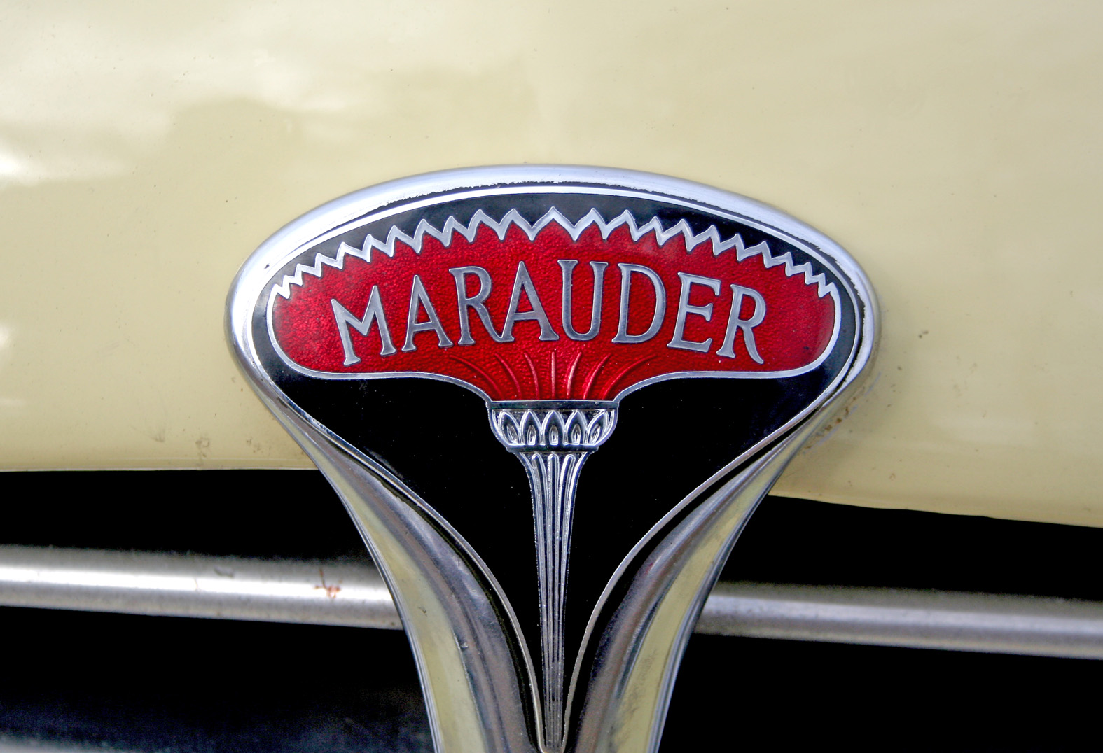


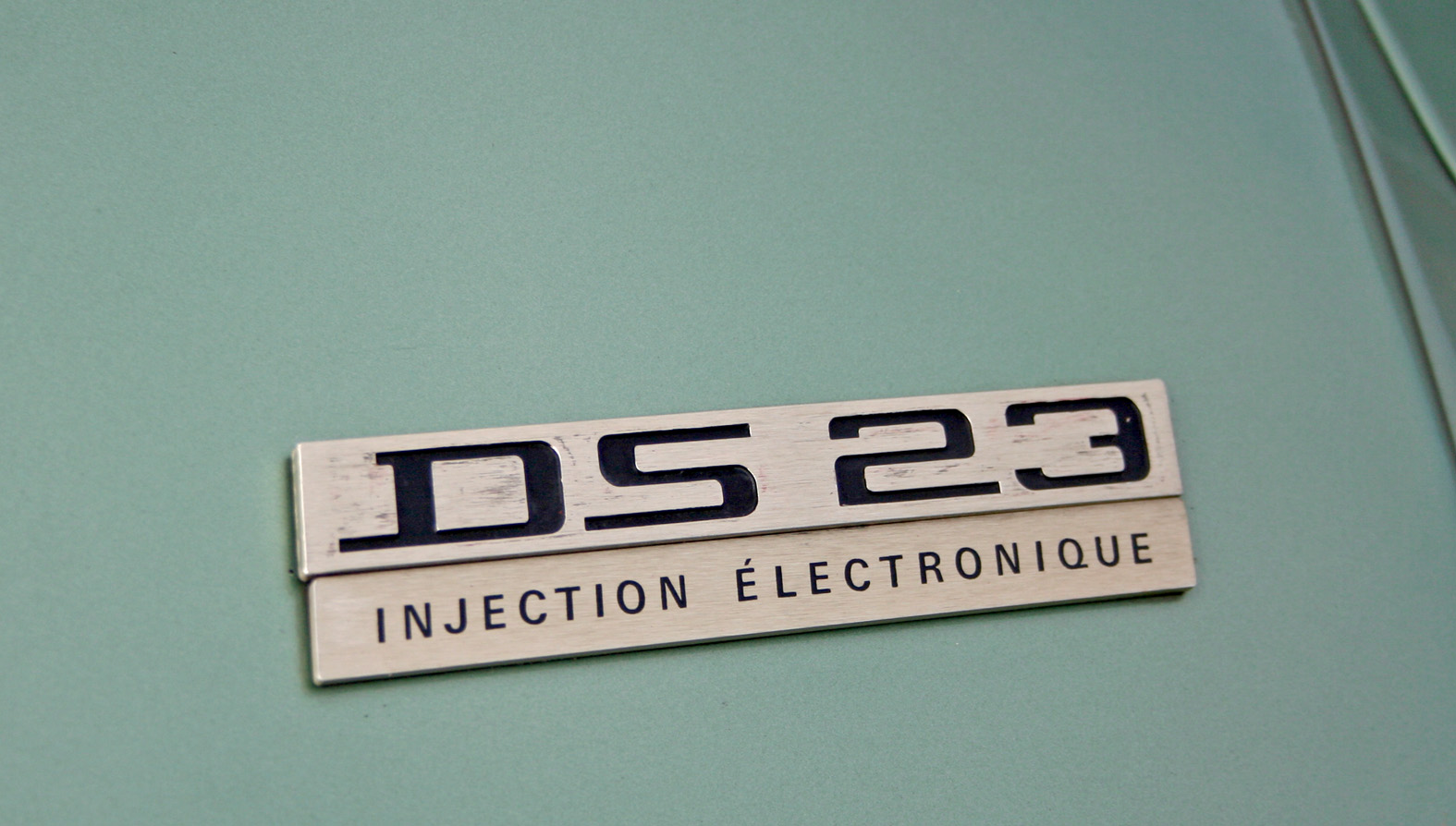


Auto Type XI - more fabulous Auto Type, taken on Sunday at the first Goodwood Breakfast Club of the year. The sun was shining and as you can see it brought out some mighty fine automobiles.
See lots more Auto Type and Automobilia here.
https%3A%2F%2Fwww.deliciousindustries.com%2Fauto-type-xi
Delicious+Industries%3A+Auto+Type+XI
Otl Aicher's Munich 1972 Olympic Graphics


What a lovely way to start the week - looking through a collection of Otl Aicher's, Munich 1972 Olympic graphics!
We're all familiar with the bright and colourful Munich 1972 Olympic branding, but it's rare to see so much of it in one place. This website has a huge range of items designed by Aicher and his team including memorabilia, posters, programmes, pin badges, match books, medals, publications and stationery. It really is a fantastic resource, the items above are only a small selection.
All images copyright 1972 Munich Olympics.
Via Wanken.
https%3A%2F%2Fwww.deliciousindustries.com%2Fotl-aichers-munich-1972-olympic-graphics
Delicious+Industries%3A+Otl+Aicher%26%23039%3Bs+Munich+1972+Olympic+Graphics
The AT Open House

Each weekend throughout the Festival artists around the city open their doors to the public creating, "a great opportunity to view unique work in artists’ homes and studios and to buy directly from the artist or maker".
AT Open House (April and Tim's lovely 3 storey home and garden) will be open weekends 12-6 showing a feast of textiles, knitted jewellery, prints, paper ephemera, vintage fashion and art from the likes of Jonny Hannah, Winsome & Saucy, Mark Pavey and Alice Pattullo.
There'll be something for everyone, from a vintage tea shop, to a knitting room, outdoor poetry readings, and even a vintage boudoir. It's very exciting and we're thrilled to be involved.
The AT Open House blog will be up and running very shortly for regular updates, but in the meantime you can see the full list of participants, join the mailing list and find out more here.
https%3A%2F%2Fwww.deliciousindustries.com%2Fthe-at-open-house
Delicious+Industries%3A+The+AT+Open+House
From the reference box #100!!

#100 - Make Do and Mend, WWII booklet. I promised something special for number 100, and I don't think this will disappoint. It's an original Board of Trade, booklet published in 1943 as part of their 'Make Do and Mend' campaign.
The Board of Trade produced many leaflets and booklets during WWII. This one was specifically designed to:
• Keep clothes looking trim as long as they have to last
• Renovate children's outgrown clothes so cleverly that none is ever wasted
• Turn every scrap of good material you possess to advantage
• Keep your household linen in good repair
• Make do with things you already have instead of buying new
Clothes rationing was introduced in June 1941 and originally allocated 66 coupons per person. By 1943 the number of coupons had been reduced to 60 per person and emphasis put on the maintenance and care of clothing and household linens - cue the Make Do and Mend campaign.
There are 29 illustrations throughout the booklet including these lovely section headings...


I was lucky enough to pick up this original booklet for 50p!! But if you would like one, the Ministry of Information have published reproductions of all their wartime information publications in the, 'Historic Booklet Series'. This one can be purchased here. Also there's a great article about clothing rations during WWII here if you would like to know more.
https%3A%2F%2Fwww.deliciousindustries.com%2Ffrom-the-reference-box-100
Delicious+Industries%3A+From+the+reference+box+%23100%21%21
Welcome

Welcome to the Delicious Industries blog. We're an independent design studio based in Brighton, UK and this is our scrapbook packed full of design, illustration, photography & typography inspiration. Check out our work here.
Links
DELICIOUS FRIENDS
DELICIOUS FAVOURITES
- 50 Watts
- Acejet 170
- Grain Edit
- It's Nice That
- National Geographic Found
- Notcot
- Pretty Clever
- Retronaut
- So Much Pileup
- We Love Typography
- Another Mag