Blog: September 2010
From the reference box #89


#89 - Philips 'Philishave' instruction booklet. Such a great little 2 colour booklet and as you would expect from a Philips instruction booklet, the design is functional, clean and simple. For such a tiny booklet there are loads of illustrations and photos too, but I bought it purely for the arrows on the cover!
I'm guessing it's circa 1960 - according to the Philips website, the 'Philishave' shaver was first introduced in the 50's and as this one has new 'floating head' technology I would think it came slightly later.
For more random ephemera, have root around our reference box here.
https%3A%2F%2Fwww.deliciousindustries.com%2Ffrom-the-reference-box-89
Delicious+Industries%3A+From+the+reference+box+%2389
Auto Type VIII


A few lovely additions to my Auto Type collection, taken at Goodwood Revival last weekend. I love the mix of the super rare and the more everyday cars - the 'Tourino Superleggera Milano' crest and badge has to be a favourite.
To see more Auto Type, check out previous posts here or view our Flickr set here.
https%3A%2F%2Fwww.deliciousindustries.com%2Fauto-type-viii
Delicious+Industries%3A+Auto+Type+VIII
HOWDOOS in Stylist Magazine
Huge thanks to Stylist magazine for featuring our HOWDOOS in 'The Style List' of their latest issue (no.46, 22 September 2010).
HOWDOOS are hand letter-pressed business cards with a greeting on the front and 3 blank spaces on the back ready for your personal details. Available in 2 designs; 'hello' in hot pink and 'nice to meet you' in black.
Get yours now from our Etsy store.
https%3A%2F%2Fwww.deliciousindustries.com%2Fhowdoos-in-stylist-magazine
Delicious+Industries%3A+HOWDOOS+in+Stylist+Magazine
Gastrotypographicalassemblage at Kemistry Gallery
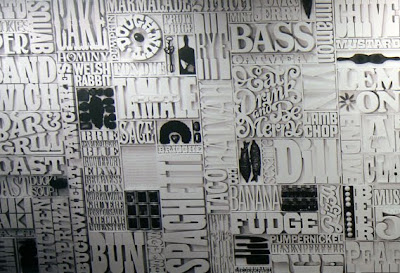
Well not the actual wall panels we posted about here, but a half-size photographic reproduction of this a 35 x 8ft typographic masterpiece. Gastrotypographicalassemblage was created by Lou Dorfsman for the wall of the CBS cafeteria circa 1966 and included the names of every food item available in the cafeteria at that time.
"We were allowed to have all the spreads and, a 10x8 black and white negative of the entire wall taken on the day it was unveiled. From this we worked with a company called VGL and printed it up at half scale (we couldn't fit full scale in the gallery) and had it stretched by AP Fitzpatrick. For a 45 year old negative the quality we have got from the blowup without any retouching is fantastic."
Gastrotypographicalassemblage: The Designs of Lou Dorfsman is an exhibition at Kemistry Gallery, London celebrating the print and advertising work Dorfsman produced during his time at CBS (1946 - 1987) originally as an art director and later as senior vice president and creative director for marketing communications and design.
The exhibition runs until 30 October 2010 and includes more than 60 original pieces as well as a short film about the Gastrotypographicalassemblage narrated by Dorfsman himself.

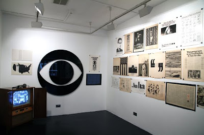
Images copyright Kemistry Gallery, taken by Christian Carlsson.
Via CR Blog.
https%3A%2F%2Fwww.deliciousindustries.com%2Fgastrotypographicalassemblage-at-kemistry-gallery
Delicious+Industries%3A+Gastrotypographicalassemblage+at+Kemistry+Gallery
From the reference box # 88

#88 - Getaway Peak Miles Check. It's been a while since I've bought a vintage dial, but I found this beauty at the weekend and couldn't resist.
It was produced by National (a petrol station chain) and BP as a useful conversion guide. On the front the yellow dial helps drivers calculate the average speed required to achieve a certain number of miles in a specific time. Whilst on the reverse it gives a 'see-at-a-glance' list of conversions from metric and English stocking sizes to Gallons and Litres, to help you 'cruise your way through the metric system'.
I'm not sure of the exact date, but an educated guess would be late 70's when the UK announced it was to drop the use of non-metric measures. Although it wasn't mandatory until the mid 90's I imagine the announcement created widespread panic with companies using it to their advantage for their marketing.
If vintage dials and auto ephemera are your cup of tea, there are lots more examples nestled away in our reference box - check it out here.
https%3A%2F%2Fwww.deliciousindustries.com%2Ffrom-the-reference-box-88
Delicious+Industries%3A+From+the+reference+box+%23+88
Julia Trigg at Castor + Pollux
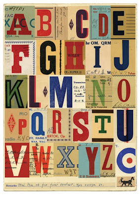
"These amateur hams could have been the first 'techno geeks', making contact with each other through radio, long before telephone was accessible.
They sent each other signals using a type of morse code called Quebec Sign Language and developed their own shorthand - a kind of early text language. They would send each other these letterpress printed 'QSL' cards via post to confirm receipt of the signals - eventually all over the world."
The exhibition previews on Friday and will be open to the public from 18 September to 17 October 2010.
Images copyright Julia Trigg.
https%3A%2F%2Fwww.deliciousindustries.com%2Fjulia-trigg-at-castor-pollux
Delicious+Industries%3A+Julia+Trigg+at+Castor+%2B+Pollux
Warning - Sensory overload!


These matchbook labels from Kindra Murphy's (kindra is here) wonderful collection of uncut Czechoslovakian matchbox labels have just been uploaded to Flickr.
It's so great to see full sets totally unmolested and as new - the graphics are absolutely fantastic. I love the little vegetable characters. Thanks for sharing these Kindra, we can't wait to see more!
Images copyright Kindra Murphy.
Via the always inspiring World Famous Design Junkies.
https%3A%2F%2Fwww.deliciousindustries.com%2Fwarning-sensory-overload
Delicious+Industries%3A+Warning+-+Sensory+overload%21
When Beans were Bullets
"Combining the eye of a graphic designer with the research skills of a historian, curator Cory Bernat highlights the dramatic differences in style and content that emerged between the two wars. She displays copies of over seventy posters on fence panels instead of in frames to highlight their mass-produced quality. She uncovered the posters over the last two years among unprocessed holdings within NAL’s Special Collections, where the originals are still held."
There's something charming and homely about wartime posters and it's funny how the same slogans to reduce wastage and grow our own food are still topical today.
View whole exhibition online here or if you're lucky enough to live close by, you can see it in person at the National Agricultural Library until 10 September and then at the USDA South Building in Washington, D.C. from 6 October until 10 November 10, 2010.
Images copyright Cory Bernat.
Via Sell! Sell!
https%3A%2F%2Fwww.deliciousindustries.com%2Fwhen-beans-were-bullets
Delicious+Industries%3A+When+Beans+were+Bullets
Muhammad Ali: The Champ

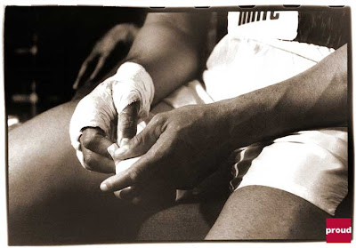
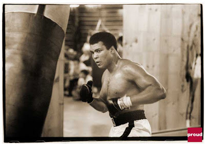


Muhammad Ali: The Champ is a fantastic exhibition currently running at Proud Chelsea gallery until 3 October 2010. Taken by award-winning photographer, Michael Gaffney, the collection documents the public and private life of Muhammad Ali from 1977 to 1978 when he worked as Ali's personal photographer.
"the result of this phenomenal year will reveal Ali the fighter, the friend, the father and the inspiration through the eyes of a true confidant".
It's a rare opportunity to see natural images of such an iconic figure, but if you can't make it down there to see them in person don't despair, you can view the full exhibition online here.
Images copyright Michael Gaffney, taken from Proud Gallery website.
https%3A%2F%2Fwww.deliciousindustries.com%2Fmuhammad-ali-the-champ
Delicious+Industries%3A+Muhammad+Ali%3A+The+Champ
Flickr updates


We've finally got organised and updated our Flickr sets with more Auto Type, Matchbook labels and Racing numbers as well as adding a Vintage stamp set. Check them all out here.
https%3A%2F%2Fwww.deliciousindustries.com%2Fflickr-updates
Delicious+Industries%3A+Flickr+updates
Charley Harper Federal Building Mural


I've read about the Charley Harper mural in the Federal Building Cincinnati, but had no idea it was still in existence until I saw these pics on Visualingual.
The mural illustrates American wildlife in Harper's unique style, easily recognisable even when created in mosaic tiles. In fact his style seems to really lend itself to this discipline.
It's so great to see it in such detail, so huge thanks Visualingual for going down there and then sharing your pics.
PS. Tomorrow is the last day to catch the Charley Harper exhibition at Castor + Pollux, Brighton.
Images copyright Visualingual.
Via NOTCOT.
https%3A%2F%2Fwww.deliciousindustries.com%2Fcharley-harper-federal-building-mural
Delicious+Industries%3A+Charley+Harper+Federal+Building+Mural
Auto Type VII


Auto Type VII - more fabulous typography and graphics from a selection of very worthy vehicles.
See Auto Type I-VI here or check out our Flickr set here.
https%3A%2F%2Fwww.deliciousindustries.com%2Fauto-type-vii
Delicious+Industries%3A+Auto+Type+VII
Welcome
Welcome to the Delicious Industries blog. We're an independent design studio based in Brighton, UK and this is our scrapbook packed full of design, illustration, photography & typography inspiration. Check out our work here.
Links
DELICIOUS FRIENDS
DELICIOUS FAVOURITES
- 50 Watts
- Acejet 170
- Grain Edit
- It's Nice That
- National Geographic Found
- Notcot
- Pretty Clever
- Retronaut
- So Much Pileup
- We Love Typography
- Another Mag


