art direction, design + typography
Blog: August 2010
From the reference box # 87


#87 - British Discovery First Day Cover Stamps. Issued on 19 September 1967 this set of stamps commemorates, "four aspects of British discovery which have changed the course of modern living".
4d - Designed by Clive Abbott depicts a radar screen to pay tribute to Sir Robert Watson-Watt and his discovery and development of radar.
1/- Also designed by Abbott, celebrates Sir Alexander Fleming's discovery of penicillin and shows spores of penicillin.
1/6d - Designed by Richard Negus and Philip Sharland this stamp illustrates 2 jet engines on a VC10 aircraft to commemorate the invention of the jet engine by Sir Frank Whittle.
1/9d - Also designed by Richard Negus and Philip Sharland the final stamp in this set celebrates the work of John Logie baird and an invention we all enjoy - the television!
I always find it odd when different people design stamps in the same set as they always appear disjointed when put together with no consistency of type sizes, fonts, size of the Queens head or even overall layout/style.
Here's the First Day Cover Envelope (designed by David Gentleman) showing portraits of the inventors...


There are many more First Day Covers and stamps in the reference box - check them out here.
https%3A%2F%2Fwww.deliciousindustries.com%2Ffrom-the-reference-box-87
Delicious+Industries%3A+From+the+reference+box+%23+87
Jay B Sauceda Photography


Great photos of traditional sign writing by Texan photographer, Jay B Sauceda - I love that feeling of faded glory they portray.
"Before there was vinyl printing there were big brick walls and craftsmen who covered said walls with their commercial artwork. This is my ever growing collection of those that I find while on the road."
Check out more of Jay's images here.
Via Oh Joy.
Images copyright Jay B Sauceda.
https%3A%2F%2Fwww.deliciousindustries.com%2Fjay-b-sauceda-photography
Delicious+Industries%3A+Jay+B+Sauceda+Photography
From the reference box # 86

#86 - Vintage Catarrh Pastilles packaging. I love the colour combo of this Boots packaging, not what you would expect for throat sweets.
I had thought it was circa 50's/60's but after looking at the Boots timeline I think it's more likely to be from the early 70's as it has both the original name 'Boots Pure Drug Company' and 'The Boots Company' (which it became in 1971) on it?? Still not convinced, but it's a great example never-the-less.
See more fabulous packaging and items of ephemera here.
https%3A%2F%2Fwww.deliciousindustries.com%2Ffrom-the-reference-box-86
Delicious+Industries%3A+From+the+reference+box+%23+86
Vintage Milk Bottles
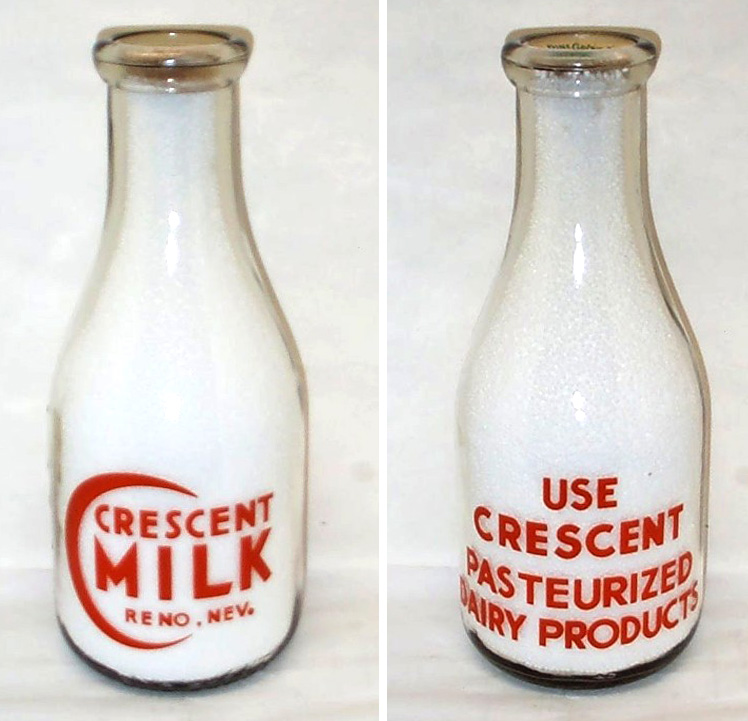


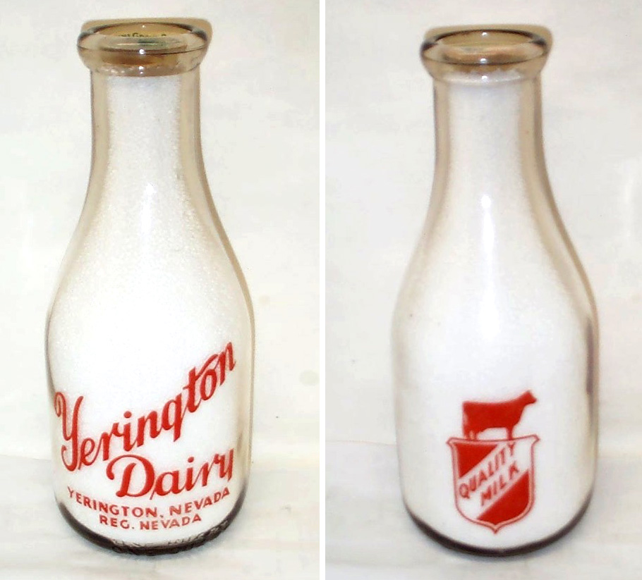


Who knew milk bottles could be so gorgeous, this lovely collection belongs to milk bottle collector and member of The National Association of Milk Bottle Collectors, Bill Kaiser. He has pages of bottles, the ones above are just a selection.
All the bottles have great graphics and decorative type, my personal favourites are the Crescent Milk graphic and the United Dairy type. It must have been lovely to start the day with one of these fine bottles on the table and don't forget how fabulous the bottle tops also used to be.
All the bottles above are available for sale on Got Milk Bottles. There is no mention of date, but my guess would be that they're from the 40's and 50's (I could however be very wrong!).
All images copyright Bill Kaiser.
https%3A%2F%2Fwww.deliciousindustries.com%2Fvintage-milk-bottles
Delicious+Industries%3A+Vintage+Milk+Bottles
Holiday Magazine Covers


The fabulous Gono have all the covers from 1946 - 1968, many are photographic, but there are quite a few graphic ones as above - check them out here.
Holiday was a US travel magazine from 1928 - 1977, first published by the AAA (American Automobile Association) until the mid 40's when it was sold to Curtis Publishing Company who ran the magazine until 1977 when it was sold to Travel magazine who merged it with their publication to form Travel Holiday.
Via Covenger + Kester.
https%3A%2F%2Fwww.deliciousindustries.com%2Fholiday-magazine-covers
Delicious+Industries%3A+Holiday+Magazine+Covers
PROSIGN - traditional signwriters


I've known of Prosign (Neil and Mandy Melliard) for a few years now and even been lucky enough to have my car signwritten by Neil! They're renowned in car and racing circles for their amazing work hand painting and pinstriping hot rods, race cars and promotional vehicles (above).
But I wasn't aware until today when I checked out their blog that they also do shop facias and window signage. In fact Neil has been working on window signage for Adidas in their Carnaby Street store earlier this month.
There's something lovely about a real hand-painted sign that other more modern techniques can never replicate. Here are some of the fabulous shops he's painted recently...


All images copyright Prosign.
https%3A%2F%2Fwww.deliciousindustries.com%2Fprosign-traditional-signwriters
Delicious+Industries%3A+PROSIGN+-+traditional+signwriters
An Open Letter to All of Advertising and Marketing

Very funny post over on Sell! Sell! - I couldn't agree more with Brian.
https%3A%2F%2Fwww.deliciousindustries.com%2Fan-open-letter-to-all-of-advertising-and-marketing
Delicious+Industries%3A+An+Open+Letter+to+All+of+Advertising+and+Marketing
Found Type #5


Some lovely found type from around the Delicious studio (top to bottom; 50's 'break glass' fire alarm, 'D' marked weight, vintage 'Halfords' oil can, vintage metal 'Shell' sign and nameplate from 50's/60's Vandome & Hart Ltd. scales)
See more found type posts here.
https%3A%2F%2Fwww.deliciousindustries.com%2Ffound-type-5
Delicious+Industries%3A+Found+Type+%235
Lillian Bassman at The Wapping Project Bankside

Some work from the ionic fashion photographer, Lillian Bassman will be showing as part of 'Group Show' (a collection of work from all the artists represented since the award-winning gallery opened it's doors in October 2010) at The Wapping Project Bankside.
Lillian, now 93, is renowned for her stylised black and white fashion photography (above and below) that graced the pages of Harper's Bazaar during the 60's and early 70's.


During the 70's she left Harper's and fashion photography altogether, it was only when a stash of her images was found in the 90's that interest in her work grew and Lillian returned behind the camera after a 20 year break.
Her images are beautiful and feminine, yet strong and contrasty - a combination that works perfectly, they're exaclty the kind of images I love. The exhibition starts on the 17 August and runs until the 4 September. There isn't anything about it yet on their website, but I found more information here.
Images copyright Lillian Bassman.
Via Cool Hunting.
https%3A%2F%2Fwww.deliciousindustries.com%2Flillian-bassman-at-the-wapping-project-bankside
Delicious+Industries%3A+Lillian+Bassman+at+The+Wapping+Project+Bankside
Tiny Sellotape® Tins


The bottom one is of the same era as my others but the top one is much earlier - the logo has an outline so you can actually see how the Sellotape® logo started out (made up from a ribbon of tape). The logo/brand name 'Sellotape' has not yet been registered as a Trademark and the company name on the side of the tin is Adhesive Tapes Ltd., not Sellotape Products Ltd. as it is on the later ones. I love how it describes what Sellotape® does too, again indicating that it is an early tin, "No moistening" and "Adheres at touch".

If you're craving more information about Sellotape®, there's a brief history of the brand here.
https%3A%2F%2Fwww.deliciousindustries.com%2Ftiny-sellotape-tins
Delicious+Industries%3A+Tiny+Sellotape%C2%AE+Tins
Crisp Packet Exhibition at the De La Warr Pavilion


You may have read in the press this week about Dave Valentine and his £10,000 crisp packet collection! Well those of you lucky enough to live near Bexhill-on-Sea will have the opportunity to see the collection in it's entirety at the De La Warr Pavilion's, Collectors' Corner this Sunday (15 August).
Dave has been collecting the empty crisp packets since 1984 when he was 6 years old. Now 32, he has a collection of over 250 different examples (according to the dlwp, but 2 other sources say over 500!) many of which are no longer produced.
"The designs are so retro and cool. Crisp bags these days are a bit boring in comparison. People love the nostalgia of looking at the old packets - it takes them back in time and they get a real kick of that."
The collection will be available to view from 2.30pm onwards along with local artist Louise Kenward's collection of charity shop sourced ceramic figures.
"Louise has been collecting ceramic figurines for a number of years. For her, the significance of the figurines is their association with times past, commonly referencing the Victorian era and notions of nostalgia."
Some of their previous Collector's Corner exhibits can be seen here and if you have a collection you want to share find out how to appy here.
The De La Warr Pavilion in all it's modernist glory is worth a visit anyway on a sunny weekend, but add in an exhibition and their fabulous cream teas and it's a no brainer!
Top images copyright dlwp from their blog. Other images screen grabs from CBBC footage.
https%3A%2F%2Fwww.deliciousindustries.com%2Fcrisp-packet-exhibition-at-the-de-la-warr-pavilion
Delicious+Industries%3A+Crisp+Packet+Exhibition+at+the+De+La+Warr+Pavilion
From the reference box # 85

These gorgeous diagrams (below) are very detailed and printed on a fold out flap that can be veiwed at the same time as the written instructions.


https%3A%2F%2Fwww.deliciousindustries.com%2Ffrom-the-reference-box-85
Delicious+Industries%3A+From+the+reference+box+%23+85
From the reference box # 84


#84 - New Zealand First Day of Issue stamp set, 'Family Life'. Issued in April 1981 this set of stamps depicted various activities of family life:
20c - Family life: At Play
"Participation of the whole family in some recreational activity whether it be an organised sport or a carefree game, as well as being fun, can help to develop good relationships between family members."
25c - Family life: Young and Old
"Despite the difference in age, strong feelings and bonds usually spring up between the young and old. The relationship between the grandparents and grandchildren of the family can be beneficial to both. It usually helps them to understand different values and opinions."
30c - Family life: At Home
"Reading is an enjoyable pastime and when all the family are involved it can stimulate conversation, ideas and for the younger ones, learning."
35c - Family life: At Church
"Family life revolves around permanence and sanctity, personal growth, commitment, mutual understanding and inter-dependence."
They were designed by A Derrick, Invercargill and in the bottom right, "Each of the four stamps incorporated the Maori word "Whanau", which is universally known in Maoridom to mean the extended family".
I can't find any information about an illustrator so I assume derrick did the wonderful illustrations. I like the negative use of the white space to create the trees, lamp, bird cage and statue amongst bright backgrounds and really like the thick bold outlines that surround the family unit - very subtle emphasis of the theme.
There are lots more fabulous stamps in our reference box, have a rummage here.
Quotes taken from the New Zealand Post.
https%3A%2F%2Fwww.deliciousindustries.com%2Ffrom-the-reference-box-84
Delicious+Industries%3A+From+the+reference+box+%23+84
LA TImes 50: Cigar Bands


From the LA TImes 50, these Cigar Bands "Gilded momentos of pre-revolutionary Cuba" are fantastic. I love the bright colours and detailed designs, it's great to see all the specialist print on such small labels. There's some really nice type on some of them too.
Other LA TImes 50 collections worth a look at are Matchbooks, Soda Pops, Crime Rags and LAPD Badges.
Images copyright LA TImes.
Via The Silver Lining Blog.
https%3A%2F%2Fwww.deliciousindustries.com%2Fla-times-50-cigar-bands
Delicious+Industries%3A+LA+TImes+50%3A+Cigar+Bands
Welcome

Welcome to the Delicious Industries blog. We're an independent design studio based in Brighton, UK and this is our scrapbook packed full of design, illustration, photography & typography inspiration. Check out our work here.
Links
DELICIOUS FRIENDS
DELICIOUS FAVOURITES
- 50 Watts
- Acejet 170
- Grain Edit
- It's Nice That
- National Geographic Found
- Notcot
- Pretty Clever
- Retronaut
- So Much Pileup
- We Love Typography
- Another Mag