Blog: August 2009
Country Fair: A monthly journal of the open air
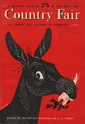
I found these Country Fair magazines a couple of weeks ago at a boot fair and bought them purely for the bright coloured covers and sweet little illustrations. The lady selling them had about 30 issues and I'm now wishing I'd bought the whole lot!
Out of the three I bought, one is from February 1954 (red donkey cover - illustration by John Hanna), one from August 1962 (orange pigeon cover - illustration by D Shannon) and one from May 1963 (pink bird cover - illustration by D Shannon). The pink one is my favourite - I love the illustration of the cherries and the little bird in his beret.
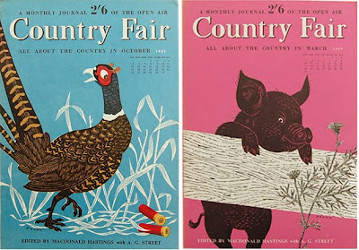
Here are a few more of the John Hanna illustrated covers I found over on Automatism:



If you like these you might also like my collection of Which? covers.
https%3A%2F%2Fwww.deliciousindustries.com%2Fcountry-fair-a-monthly-journal-of-the-open-air
Delicious+Industries%3A+Country+Fair%3A+A+monthly+journal+of+the+open+air
Polaroid Limited Edition

Urban Outfitters have collaborated with The Impossible Project to, 'bring instant photography back to life'. The special edition Polaroid camera and 10 pack of type 779 instant film are available instore and online, but in limited numbers so don't wait too long if you want one. The 10 pack of instant film is also sold separately for those who already have a Polaroid camera.
Images copyright Urban Outfitters.
https%3A%2F%2Fwww.deliciousindustries.com%2Fpolaroid-limited-edition
Delicious+Industries%3A+Polaroid+Limited+Edition
Opus International


Remember the post last week about Roman Cieslewicz's Ty I La covers? Well here are some designs he created for the French international art review, Opus International in the late 60's.
In true Cieslewicz style, they're loud, bright and graphic. Unfortunately, I can't find out very much about the publication itself, only that it was published in Paris by Georges Fall.
Images copyright Roman Cieslewicz.
Images from 'Roman Cieslewicz: Master of Graphic Design' by Margo Rouard-Snowman. Published by Thames & Hudson Ltd. London, 1993.
https%3A%2F%2Fwww.deliciousindustries.com%2Fopus-international
Delicious+Industries%3A+Opus+International
Know Your States!
The dial reveals each US state, what it's noted for, it's flower, population, area in square miles, it's capital and it's nickname. Very informative. Until today I had no idea that Delaware was known as the Diamond state, that Minnesota's flower is the Moccasin or that the capital of Wyoming is Cheyenne!
If like me, you have a thing for dial/wheel contraptions take a look at some of my collection here, here, here and here.
https%3A%2F%2Fwww.deliciousindustries.com%2Fknow-your-states
Delicious+Industries%3A+Know+Your+States%21
From the reference box # 52
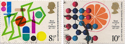

#52 - Centenary of Royal Institute of Chemistry stamps, 1977 celebrating British Achievement in Chemistry.
Designed by Jerzy Karo, each stamp commemorates a different Nobel prize winning achievement from the last 100 years; Steroids - Conformational Analysis (8 1/2p), Vitamin C - synthesis (10p), Starch - Chromatography (11p) and Salt - Crystallography (13p).
I love the Steroids one with the overprinting and really bright colours - it's a great stamp.
https%3A%2F%2Fwww.deliciousindustries.com%2Ffrom-the-reference-box-52
Delicious+Industries%3A+From+the+reference+box+%23+52
The Impossible Project - Re-inventing Instant Film
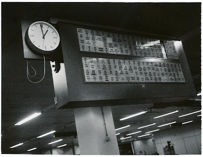
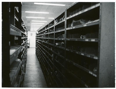

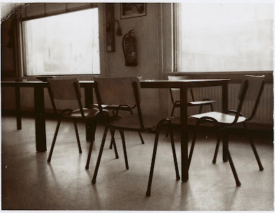


These gorgeous photos are of the currently disused Polaroid factory in the Netherlands, the once home of Instant Integral production. Unfortunately the production of Polaroid Instant Film came to an end in June 2008 with the closure of the above factory and the Mexican, Instant Pack-film factory. It was sad news too many of us who still had, and loved our Polaroid cameras.
However, there maybe light at the end of the tunnel. A team of ex-Polaroid employees, engineers, chemists and technical specialists have embarked on 'The Impossible Project' to re-start the production of analog Integral Film for vintage Polaroid cameras by 2010!
They've already, "acquired the complete film production equipment in Enschede (NL) from Polaroid, has signed a 10-year lease agreement on the factory building; and has engaged the most experienced team of Integral Film experts worldwide". Their aim, "is NOT to re-build Polaroid Integral film but (with the help of strategic partners) to develop a new product with new characteristics, consisting of new optimised components, produced with a streamlined modern setup. An innovative and fresh analog material, sold under a new brand name that perfectly will match the global re-positioning of Integral Films."
What the team need now is the support of the Polaroid loving public to help fund the research and development. Click here to see how you can help.
Images copyright The Impossible Project.
https%3A%2F%2Fwww.deliciousindustries.com%2Fthe-impossible-project-re-inventing-instant-film
Delicious+Industries%3A+The+Impossible+Project+-+Re-inventing+Instant+Film
Ty i Ja


More great vintage covers, this time, Ty i Ja or 'You and I' magazine, a 64 page Polish publication first published in Warsaw in May 1960.
Ty i Ja was devoted to literature, science, design, poetry, fashion and graphic art and was the only monthly cultural review in Poland at that time. The wonderful Roman Cieslewicz was art director between 1960 - 1963 and comissioned top Polish designers like Lipinski and Tomaszewski to create these striking and graphic covers. Even after leaving the publication he continued designing covers for it until the mid 70's. Unfortunately, due to constant censorship Ty i Ja ceased publishing in the late 80's.
Images from Pan Tu Nie Stal.
https%3A%2F%2Fwww.deliciousindustries.com%2Fty-i-ja
Delicious+Industries%3A+Ty+i+Ja
From the reference box # 51
https%3A%2F%2Fwww.deliciousindustries.com%2Ffrom-the-reference-box-51
Delicious+Industries%3A+From+the+reference+box+%23+51
From the reference box #50

#50 - British Technology Stamps, September 1966 depicting the Jodrell Bank Radio Telescope, British Motor Cars, the SR N6 Hovercraft and Nuclear power (Windscale reactor).
When I first saw this set of stamps I really loved the top two because of how graphic and simple they are, but was confused why the bottom two seemed to be in a totally different style. These days a set of stamps is normally designed by the same people or company, but it seems in the 60's at least, it was common practice for two designers/illustrators to work on two stamps each. In this case, D Gillepie created the 4d and 6d (top two) and J Andrew Restall designed the 1/3 and 1/6 (bottom two).
I find it funny that no attempt was made to keep consistency through the set - the Gillespie ones have no description and have quite large Queen's heads in white compared to Restall's ones, which do have a description and have smaller Queen's heads in black. Even the typefaces they've used are different.
For more stamps, ephemera and random bits of inspiration, take a delve into our reference box.
https%3A%2F%2Fwww.deliciousindustries.com%2Ffrom-the-reference-box-50
Delicious+Industries%3A+From+the+reference+box+%2350
Fortune Magazine Covers


I just came across these great cover designs for Fortune magazine on Covenger + Kester and had to find out more...
Fortune magazine was, and still is a business publication founded by Time founder Henry Booth Luce in 1930. Luce's vision was to create a bold new business journal that would stand out from the dull and uninspiring competition (at the time business periodicals and journals were black & white and full of facts & figures). Fortune had a luxury stock, striking photography and illustrations, it was alive with colour and was written by a team of up and coming writers keen to impress.
The covers I'm most drawn to are the ones above, mostly designed by the late Walter Allner - a German born, student of the iconic Bauhaus school, where he studied typography, design and painting under tutors Paul Klee and Wassily Kandinsky among others.
Allner moved to the US in the late 40's and worked as the art director of Fortune from 1962 - 1974, during which time he personally designed 79 of the covers (his signature is on some covers before this date though, so I can only assume that he was commissioned as a freelance artist prior to his employment). His Modernist style and Bauhaus principles helped him transform Fortune into a contemporary and sophisticated publication.
If you want to see more, there's a huge collection of Fortune covers throughout the decades here.
Images copyright Gono.
Via Ffffound!
https%3A%2F%2Fwww.deliciousindustries.com%2Ffortune-magazine-covers
Delicious+Industries%3A+Fortune+Magazine+Covers
Harper Haute Couture!


French fashion house Celine, famous for their luxury clothing, handbags, accessories and footwear have created a 'resort wear' collection using the wonderful work of Charley Harper, as a tribute to the late illustrator.


Unfortunately the Celine website is under going a facelift at the moment, but I've found some of the items online here, here, here and here.
Images copyright Celine.
Via Charley Harper Blog.
https%3A%2F%2Fwww.deliciousindustries.com%2Fharper-haute-couture
Delicious+Industries%3A+Harper+Haute+Couture%21
From the reference box #49

#49 - Energy stamps, 1978. These stamps were issued on 25 January 1978 to highlight the importance of Energy in modern life, "our industrial strength and high standard of living depend on it's certain supply", to encourage, "greater efforts in the efficient use of energy and the elimination of wasteful practices" to preserve the resources we have and give, "scientists and technologists time to develop alternative and acceptable energy supplies".

The set of stamps and the First Day Cover (above) were designed by the great British designer, Peter Murdoch FSIAD - known Internationally for his wonderful cardboard furniture designs, his role as Special Projects Director for the 1968 Mexico Olympics (which included designing the collapsible, cardboard display systems, souvenirs and the newspaper kiosks) and for his many collaborations with fellow designer, Lance Wyman (Camino Real Hotel logo /signage and The Red Lion Disco logo in Mexico, Creative Parks Playground in Boston).
Our full collection of reference box items can be rummaged through here.
https%3A%2F%2Fwww.deliciousindustries.com%2Ffrom-the-reference-box-49
Delicious+Industries%3A+From+the+reference+box+%2349
Paul Thurlby Alphabet prints

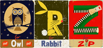
Remember our post about illustrator Paul Thurlby and his gorgeous alphabet prints? Well Paul has been in touch to tell us the alphabet is now complete. The new prints are every bit as good as the earlier ones - more great colour combos, the same vintage/retro feel and some fun typography!
Each print is a signed and numbered limited edition of 200, and at the minute you can get 3 for the price of 2, so check out the Alphabet Shop.
Images copyright Paul Thurlby.
https%3A%2F%2Fwww.deliciousindustries.com%2Fpaul-thurlby-alphabet-prints
Delicious+Industries%3A+Paul+Thurlby+Alphabet+prints
Richard Hogg: Of the Wall


Big thanks to Anna Fidalgo for letting us know about Richard Hogg's first solo show, Of the Wall at Concrete Hermit, London. The show opened last night and runs until the 29 August.
"Of the wall is a simple story about happiness, freedom, rebellion and its consequences, told across three pictures. Like a kind of triptych or a very simple comic. It forms the centerpiece of this show."
There will also be a large selection of new prints and drawings by Mr Hogg on display and a chance to get a sneaky peak at his forthcoming book, 'Car Boot Sale'.
https%3A%2F%2Fwww.deliciousindustries.com%2Frichard-hogg-of-the-wall
Delicious+Industries%3A+Richard+Hogg%3A+Of+the+Wall
Oil!


Who would of thought that a mundane object like an oil can could be so cool?
The cans above are from '83's Flickr group, Oil! A collection of vintage oil cans belonging to his dad. The typography, graphics and colours on each can are great and together they make a really interesting collection. This is only a portion of the full collection too, so I'm looking forward to seeing this set grow.
Images copyright '83.
Via Bad Banana.
https%3A%2F%2Fwww.deliciousindustries.com%2Foil
Delicious+Industries%3A+Oil%21
Welcome
Welcome to the Delicious Industries blog. We're an independent design studio based in Brighton, UK and this is our scrapbook packed full of design, illustration, photography & typography inspiration. Check out our work here.
Links
DELICIOUS FRIENDS
DELICIOUS FAVOURITES
- 50 Watts
- Acejet 170
- Grain Edit
- It's Nice That
- National Geographic Found
- Notcot
- Pretty Clever
- Retronaut
- So Much Pileup
- We Love Typography
- Another Mag


