art direction, design + typography
1950's Geigy Advertising


Geigy where a world-famous pharmaceutical and chemical company in the 50's and 60's who joined with Ciba in 1970 to form Geigy-Ciba who in turn merged with Sandoz in 1996 to form the pharmaceutical giant Novartis still going strong today.
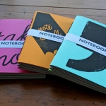
Back in the 50's though Geigy, a Swiss company, where pioneers in the pharmaceutical industry with their bold, typographic advertising and design style. Their advertising adopted the current trends in Swiss typography and design such as using predominantly sans serif faces (Berthold's Standard Bold being a favourite) and maintaining a minimal, 'clinical' feel to the layout design.
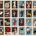
In a somewhat conservative industry, this was a brave step, but very successful, creating an instantly recognisable brand. During the mid 50's they started advertising in the UK using the same design and typographic style (above are a selection of the first British leaflets). The article below, from Print in Britain, January 1958, discusses this wonderful house style, how they introduced it in Britain and how it was received.


https%3A%2F%2Fwww.deliciousindustries.com%2F1950s-geigy-advertising
Delicious+Industries%3A+1950%26%23039%3Bs+Geigy+Advertising
Welcome

Welcome to the Delicious Industries blog. We're an independent design studio based in Brighton, UK and this is our scrapbook packed full of design, illustration, photography & typography inspiration. Check out our work here.
Links
DELICIOUS FRIENDS
DELICIOUS FAVOURITES
- 50 Watts
- Acejet 170
- Grain Edit
- It's Nice That
- National Geographic Found
- Notcot
- Pretty Clever
- Retronaut
- So Much Pileup
- We Love Typography
- Another Mag