Metro Maps of the World

I saw the Washington DC underground map on So Much Pileup the other day and it reminded me of a great book I bought a few years ago, Metro Maps of the World by Mark Ovenden. I know it sounds dull, in fact the guy in the book shop actually laughed when I took it to the counter, but it's a fantastic book full of information and pics about underground (and some overground) maps, their history and who created them.
Above right is the very map that started this train (sorry!) of thought and to it's left the 1962 version, which shows on it proposed sections for expansion that are only this decade being constructed! The current Washington map is one of very few Worldwide to have introduced thick lines, copied only by Baltimore.
The most famous underground map is of course that of our very own London Underground. Designed originally by Harry Beck in 1932 and published in 1933 (below right) it replaced Fred Stingemore's 1925 version (below left) which itself was meant to have improved legibility.

Beck's design is iconic. It uses only horizontal, vertical and 45 degree lines joined with uniform curves and bends to create a simplistic and very easy to follow map - a style still used today (see below) and one that has been copied all over the World.

Another well-known underground map is that of the New York City Subway. The first version emerged in the early 1900's (below) and focused only on Manhattan, but showed all the train operators at the time in a very clean and detailed design, very much based on the grid-like NYC street plan.

By 1948 (below left) the whole of NYC had been added. This was one of the first attempts to show all the individual networks on the same pocket map. Previously each service had produced their own maps. Throughout the late 50's and 60's clearer, more stylistic versions of the combined map developed - a style that remained and is hugely successful in one of my favourite versions, the 1972 design (below right).
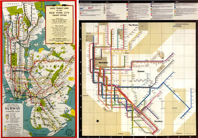
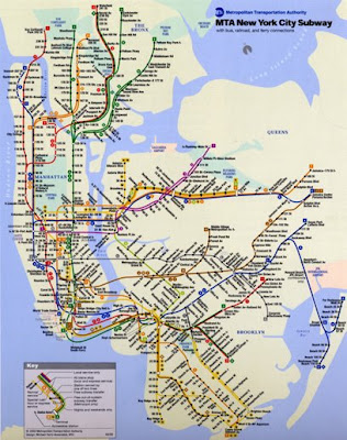
Throughout this decade though, NYC seem to have moved away from this design and returned to a version (below) very similar to that of the 1948 pocket map.
Looking through the book, it was Moscow's fantastic subway maps that stood out the most for me. Early versions (below left) were in black and white due to the restrictions on materials and they were actually designed by Fred Stingemore, the pre-1933 London Underground designer.

Eventually though, the Russians began producing colour maps and with it the design became more European and stylised as seen above right in this 1967 version.
For me though, it's the 80's versions (below) that are the most inspiring and interesting. I love that they have a 50's feel and at a glance look like diagrams of the solar system with their different sized circles and dotted lines.

The dotted lines actually referred to outer stations and the coloured circles indicated station interchanges. The current version developed throughout the 90's and is much more European and as so many others uses the principals demonstrated in Beck's London Underground map, which might be more legible but certainly doesn't have the charm of the 80's ones.
Click on images to view larger versions.
Images copyright Metro Maps of the World.
https%3A%2F%2Fwww.deliciousindustries.com%2Fmetro-maps-of-the-world
Delicious+Industries%3A+Metro+Maps+of+the+World
Welcome

Welcome to the Delicious Industries blog. We're an independent design studio based in Brighton, UK and this is our scrapbook packed full of design, illustration, photography & typography inspiration. Check out our work here.
Links
DELICIOUS FRIENDS
DELICIOUS FAVOURITES
- 50 Watts
- Acejet 170
- Grain Edit
- It's Nice That
- National Geographic Found
- Notcot
- Pretty Clever
- Retronaut
- So Much Pileup
- We Love Typography
- Another Mag


