Blog: stamps
London Underground 150 year anniversary stamps
To celebrate this 150 year milestone Royal Mail have released a set of 6 commemorative stamps (above) that illustrate the tube's timeline with lithographs, illustrations and photographs. They also give a nod to the design of the iconic tube map.
However, it's these miniature stamps each showing 3 classic London Underground advertising posters that I found the most interesting/inspiring...
Images copyright Royal Mail.
Stamps designed by Hat-Trick.
Miniature stamp sheets designed by NB Studio.
https%3A%2F%2Fwww.deliciousindustries.com%2Flondon-underground-150-year-anniversary-stamps
Delicious+Industries%3A+London+Underground+150+year+anniversary+stamps
The official Roald Dahl stamps – Gloriumptiously collectable
Roald Dahl and Quentin Blake fans alike will be lapping up these 'Wonkalicious. Whizzpopping. Swizzfiggling' new Royal Mail stamps launched, 'in tribute to one of the world’s greatest storytellers, this unique collection celebrates his most famous works, his best-loved characters and tales of his extraordinary life'.
The set of 6 stamps feature original illustrations of some of Dahl's best-loved characters; Charlie and the Chocolate Factory, Fantastic Mr Fox, James and the Giant Peach, Matilda, The Twits and The Witches. Buy yours here!
https%3A%2F%2Fwww.deliciousindustries.com%2Fthe-official-roald-dahl-stamps-gloriumptiously-collectable
Delicious+Industries%3A+The+official+Roald+Dahl+stamps+%E2%80%93+Gloriumptiously+collectable
United Nations Postage Stamps
These gorgeous UN postage stamps are my favourites from Aqua Velvet's post, 'United Nations Postage Stamps - Part 1' showcasing some of their collection. I love the bright colours and bold graphics, especially the big silver arrow on the one above. Really looking froward to seeing part 2!
Images copyright Aqua Velvet.
Via Notcot.
https%3A%2F%2Fwww.deliciousindustries.com%2Funited-nations-postage-stamps
Delicious+Industries%3A+United+Nations+Postage+Stamps
From the reference box # 87


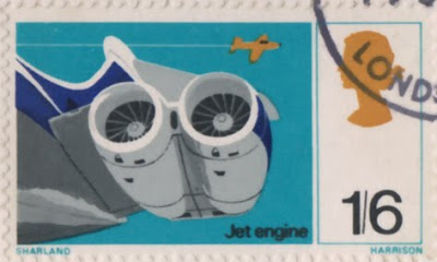

#87 - British Discovery First Day Cover Stamps. Issued on 19 September 1967 this set of stamps commemorates, "four aspects of British discovery which have changed the course of modern living".
4d - Designed by Clive Abbott depicts a radar screen to pay tribute to Sir Robert Watson-Watt and his discovery and development of radar.
1/- Also designed by Abbott, celebrates Sir Alexander Fleming's discovery of penicillin and shows spores of penicillin.
1/6d - Designed by Richard Negus and Philip Sharland this stamp illustrates 2 jet engines on a VC10 aircraft to commemorate the invention of the jet engine by Sir Frank Whittle.
1/9d - Also designed by Richard Negus and Philip Sharland the final stamp in this set celebrates the work of John Logie baird and an invention we all enjoy - the television!
I always find it odd when different people design stamps in the same set as they always appear disjointed when put together with no consistency of type sizes, fonts, size of the Queens head or even overall layout/style.
Here's the First Day Cover Envelope (designed by David Gentleman) showing portraits of the inventors...


There are many more First Day Covers and stamps in the reference box - check them out here.
https%3A%2F%2Fwww.deliciousindustries.com%2Ffrom-the-reference-box-87
Delicious+Industries%3A+From+the+reference+box+%23+87
From the reference box # 84


#84 - New Zealand First Day of Issue stamp set, 'Family Life'. Issued in April 1981 this set of stamps depicted various activities of family life:
20c - Family life: At Play
"Participation of the whole family in some recreational activity whether it be an organised sport or a carefree game, as well as being fun, can help to develop good relationships between family members."
25c - Family life: Young and Old
"Despite the difference in age, strong feelings and bonds usually spring up between the young and old. The relationship between the grandparents and grandchildren of the family can be beneficial to both. It usually helps them to understand different values and opinions."
30c - Family life: At Home
"Reading is an enjoyable pastime and when all the family are involved it can stimulate conversation, ideas and for the younger ones, learning."
35c - Family life: At Church
"Family life revolves around permanence and sanctity, personal growth, commitment, mutual understanding and inter-dependence."
They were designed by A Derrick, Invercargill and in the bottom right, "Each of the four stamps incorporated the Maori word "Whanau", which is universally known in Maoridom to mean the extended family".
I can't find any information about an illustrator so I assume derrick did the wonderful illustrations. I like the negative use of the white space to create the trees, lamp, bird cage and statue amongst bright backgrounds and really like the thick bold outlines that surround the family unit - very subtle emphasis of the theme.
There are lots more fabulous stamps in our reference box, have a rummage here.
Quotes taken from the New Zealand Post.
https%3A%2F%2Fwww.deliciousindustries.com%2Ffrom-the-reference-box-84
Delicious+Industries%3A+From+the+reference+box+%23+84
From the reference box # 80

#80 - BOAC First Day Cover, celebrating the their first flights between London and Mexico back in April 1966.
The stamps are not that spectacular, but the graphic on the envelope is great and caught my eye. The orange and blue are really strong and I love the BOAC logo.
I didn't realise when I bought it, but inside there's a card with information about the first flight and cover. Apparently all the First Day Covers travelled 6246 miles on a Boeing 707 for 14 hours 55 mins during the inaugural flights. What a well travelled First Day Cover!

See more items from our wonderful reference box here.
https%3A%2F%2Fwww.deliciousindustries.com%2Ffrom-the-reference-box-80
Delicious+Industries%3A+From+the+reference+box+%23+80
Energy Conservation stamp, 1974
The stamp was designed by Robert W. Bode and issued on 23 September 1974 to promote the importance of Energy Conservation and to coincide with the 9th World Energy Conference: 'The Economic and Environmental Challenges of Future Energy Requirements', held in Detroit, Michigan from 23-27 September.
I love the big, bold pink 'ENERGY' type (pink & orange are one of my favourite colour combos) - what's not to like!
Whilst doing some research I found a cool 70's poster on Etsy that features this stamp.
Image copyright Karen Horton. Via Vintage Postage Stamps.
https%3A%2F%2Fwww.deliciousindustries.com%2Fenergy-conservation-stamp-1974
Delicious+Industries%3A+Energy+Conservation+stamp%2C+1974
From the reference box #72


#72 - Danish Industry or 'Dansk Industri' Stamps from 1968. From what I have discovered, they were designed by R. Nellemann and engraved by Polish born, Czeslaw Slania - apparently the world's most famous engraver!
"Engraving is an art process where lines, dots and dashes are cut into a soft metal plate with a tool called a burin. The engraving is done life size and in mirror reverse. Up to 10 lines per millimeter are cut at depths varying from 0.01 to 0.08 mm to give the effects of shadows, highlights and contours. Because engraving requires long years of study and an extended apprenticeship, it is used for high security documents such as postage stamps and banknotes."
You can actually see the dots and lines if you look closely at the stamps. I love the contrast between the graphics on the stamps (above) which are very simplistic and minimal next to the illustrations on the First Day Covers which are very sketchy and detailed...


The quote above is taken from Collecting the works of Czeslaw Slania a site dedicated to Slania's work. Check it out for more information about his career or about engraving.
https%3A%2F%2Fwww.deliciousindustries.com%2Ffrom-the-reference-box-72
Delicious+Industries%3A+From+the+reference+box+%2372
From the reference box #70


#70 - Commemorative, sailing themed stamps from the UK designed by Andrew Restall MISA and released on June 11 1975
These bold, colourful stamps illustrate Sailing Dinghies (7p), Racing Keel Boats (8p), Cruising Yachts (10p) and Multihulls (12p).
Below is the First Day Cover that my set came on...

See more Andrew Restall designed stamps from the reference box here, here and here.
https%3A%2F%2Fwww.deliciousindustries.com%2Ffrom-the-reference-box-70
Delicious+Industries%3A+From+the+reference+box+%2370
From the reference box # 68
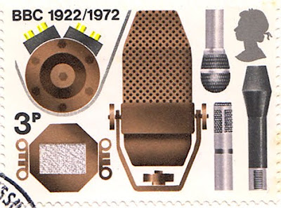

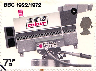

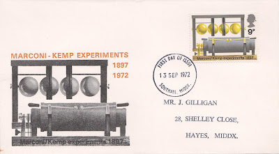
#68 - set of 4 stamps celebrating 50 years of the BBC (1922 - 1972).
Designed by David Gentleman and released on 13 September 1972, these stamps have great illustrations of equipment significant in the history of broadcasting; 3p - Microphones, 5p - Horn Loudspeaker, 7 1/2p - TV Camera and 9p - Oscillator and spark transmitter (Marconi/Kemp experiments 1897).
Here are the first day covers for each stamp, which are also pretty cool...

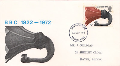

See more David Gentleman designed stamps from the reference box here.
https%3A%2F%2Fwww.deliciousindustries.com%2Ffrom-the-reference-box-68
Delicious+Industries%3A+From+the+reference+box+%23+68
From the reference box # 66


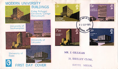
#66 - Modern University Building UK stamps, September 1971. A really striking set of stamps designed by Nicholas Jenkins.
They each utilise large blocks of colour and simple, geometric illustrations to showcase four amazing 'modern' university buildings:
3p - Physical Sciences Building, Aberystwyth University College
5p - Faraday Building, University of Southampton
7 1/2p - Engineering Department, University of Leicester
9p - Hexagon Restaurant, University of Essex
Mine came on this lovely First Day Cover from Middlesex with the stamps images also printed on the envelope...
See more First Day Covers and wonderfully designed stamps in our reference box here.
https%3A%2F%2Fwww.deliciousindustries.com%2Ffrom-the-reference-box-66
Delicious+Industries%3A+From+the+reference+box+%23+66
From the reference box #63

#63 - Set of six Nederlandse Antillen stamps - 12c to 50c. I bought these stamps because I liked the simplicity of the illustrations and really loved the flamingos in my favourite colour combo (pink and brown) on the 50c one (above).
I knew nothing about Nederlandse Antillen (formerly known as the Netherlands West Indies), which I now know to be 2 groups of islands in the Caribbean Sea forming part of the Kingdom of the Netherlands. The 2 groups are the 'Leeward Islands', - Bonaire & Curacao and the 'Windward Islands' - Saba, Sint Eustatius and Sint Maarten.
This set of stamps includes one with 'Aruba' on it and 2 stamps of different face value for Sint Eustatius. I'm not convinced this is a full set and I wonder if each island had a different stamp for each denomination? - that would explain why there are 2 for St Eustatius here??
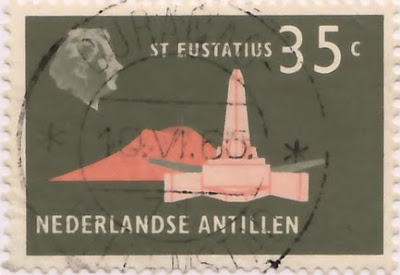
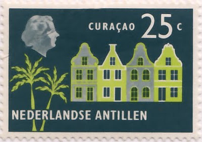
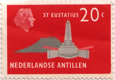


It's quite frustrating really. I've been able to find loads of information about the history of the islands, of which there is lots, including the fact that the Windward Islands were discovered by Christopher Colombus in 1493), but I haven't been able to source the designer/illustrator of any of these stamps or find a definitive issue date - one source suggests 1965 and another 1958. If I do find out any more information I'll be sure to post it up.
https%3A%2F%2Fwww.deliciousindustries.com%2Ffrom-the-reference-box-63
Delicious+Industries%3A+From+the+reference+box+%2363
From the reference box #61
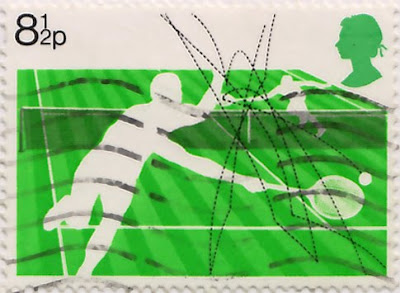

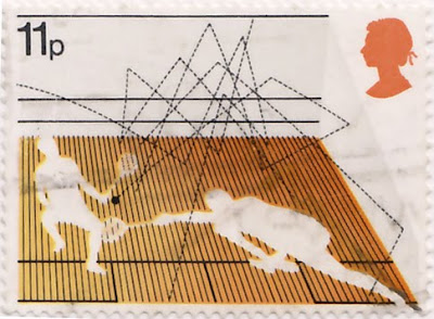

#61 - 4 British stamps commemorating Racket Sports; Lawn tennis (8 1/2p), Table tennis (10p), Squash (11p), Badminton (13p). Issued on the 12 January 1977, this set was designed by Andrew Restall, but in a totally different, much bolder illustration style to this set he designed in 1983. I personally prefer this more graphic style with the silhouetted figures and bright, blocks of colour, although I'm not sold on the colour combinations.
The best thing about these stamps for me though, is how they show the paths of the balls and the shuttlecock - it's really interesting to track their movements throughout a game and to see which games are faster as their paths are more direct with less curves and more bounces.
Take a look at more reference box items here.
https%3A%2F%2Fwww.deliciousindustries.com%2Ffrom-the-reference-box-61
Delicious+Industries%3A+From+the+reference+box+%2361
From the reference box # 60
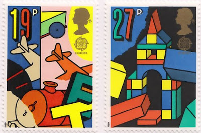

#60 - Europa, Games and Toys - set of 4 commemorative, Royal Mail Stamps first issued on 16 May 1989.
I know, more stamps, but they are very nice ones. I seem to have been buying loads of them recently - I can't help myself!
This bold and colourful set were designed by Dan Fern. Each stamp celebrates a different types of toys or games; 19p - ToyTrains & Airplanes, 27p - Building Blocks, 32p - Dice & Board Games, 35p - Toy Robots & Doll's Houses.
I really love the geometric illustration style combined with the really bright colours and thick black outlines - how cute is the robot face peeking out of the last one?
One thing on these stamps that I haven't come across before is the 'Europa' graphic under the Queen's head. It turns out that 'Europa' stamps are produced once every year and have been since 1956. They are stamps designed around a common theme in a number of countries at the same time. Originally they represented the 6 founding members of the European Coal and Steel Community (ECSC), then from 1959 the European Conference of Postal and Telecommunications Administrations (CEPT) and since 1993, PostEurop. Occassional issues, have seen all the countries involved issue the same stamp design, for example in 1984 to celebrate the 25th Anniversary of CEPT and in 2000 to celebrate the new millenium.
More stamps and wonderful pieces of ephemera can be found here.
https%3A%2F%2Fwww.deliciousindustries.com%2Ffrom-the-reference-box-60
Delicious+Industries%3A+From+the+reference+box+%23+60
From the reference box #59
Issued on 5 October 1983, they're not very old, but the illustration style and colours really caught my eye. They were designed by Andrew Restall DA to illustrate the different kinds of local 'fairs'; Merry-go-round (16p), Big wheel, Helter skelter and Performing animals (20 1/2p), Sode-shows (28p) and Early produce fairs (31p).
The contrast between the 3 fairground/circus style ones in the bright oranges and pinks and the produce fairs one in natural greens and browns is great, but it's the details I'm drawn to in these particular stamps - the little cat in the foreground of the 31p one and the little pelican in the foreground of the 20 1/2p one.
For more wonderful stamps and items of vintage ephemera you might like to have a dig around in here.
https%3A%2F%2Fwww.deliciousindustries.com%2Ffrom-the-reference-box-59
Delicious+Industries%3A+From+the+reference+box+%2359
Welcome

Welcome to the Delicious Industries blog. We're an independent design studio based in Brighton, UK and this is our scrapbook packed full of design, illustration, photography & typography inspiration. Check out our work here.
Links
DELICIOUS FRIENDS
DELICIOUS FAVOURITES
- 50 Watts
- Acejet 170
- Grain Edit
- It's Nice That
- National Geographic Found
- Notcot
- Pretty Clever
- Retronaut
- So Much Pileup
- We Love Typography
- Another Mag


