Blog: Books
Dick Bruna Book Covers

Present & Correct have a set of 3 Dick Bruna designed books available in their online store. The graphics are great - big and bold - exactly what you would expect from Mr Bruna!
See more Dick Bruna items here and here.
https%3A%2F%2Fwww.deliciousindustries.com%2Fdick-bruna-book-covers
Delicious+Industries%3A+Dick+Bruna+Book+Covers
The Art of Penguin Science Fiction
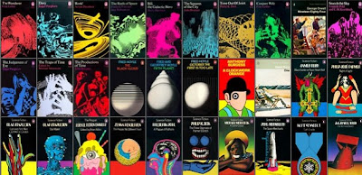
The Art of Penguin Science Fiction is the website of James Pardey showcasing a collection of over 150 Penguin Science Fiction covers.
James explains, "The purpose of the website is to complement a series of articles I've written for the Penguin Collector's Society on the history and cover art of science fiction published by Penguin Books from 1935 to 1977".
See the full collection here - it really is impressive to see them all together.
Images copyright Penguin books.
Via Noisy Decent Graphics.
https%3A%2F%2Fwww.deliciousindustries.com%2Fthe-art-of-penguin-science-fiction
Delicious+Industries%3A+The+Art+of+Penguin+Science+Fiction
Damn Everything But The Circus

Sister Mary Corita Kent became a nun in the Order of the Immaculate Heart of Mary, LA in 1936. She first exhibited her work in the early 50's and became a prominent artist in the 60's often creating subversive and political pieces.
"I am not brave enough to not pay my income tax and risk going to jail. But I can say rather freely what I want to say with my art."
Damn Everything But The Circus was her 6th book and was published after she left the Order to pursue her love of art. The book is full of gorgeous large type and bright colours used to illustrate the inspirational quotes chosen by Corita which run throughout.


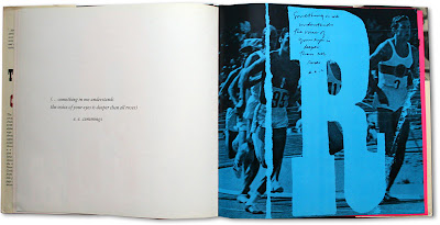

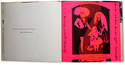
I've never seen this book or Corita's work before, but I'm hooked - I think it's fantastic. Those of you with cash burning a hole in your pockets might be interested to know that there's currently a copy available here.
Find out more about Sister Mary Corita Kent here.
Images copyright Watson Bookworks.
Via Hi + Low.
https%3A%2F%2Fwww.deliciousindustries.com%2Fdamn-everything-but-the-circus
Delicious+Industries%3A+Damn+Everything+But+The+Circus
Golden Gems
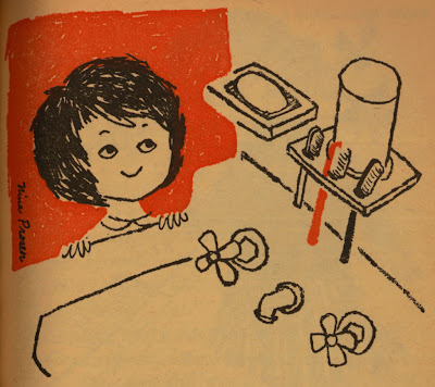
I discovered Golden Gems quite recently and I love it! It's an inspirational blog packed full of modern & vintage illustration along with a selection of Little Golden Books.
All the books have been lovingly scanned for our pleasure. I really love the illustrations from the 1961 'Humpty Dumpty's Magazine' (above and below), especially the animals with their speech bubbles.
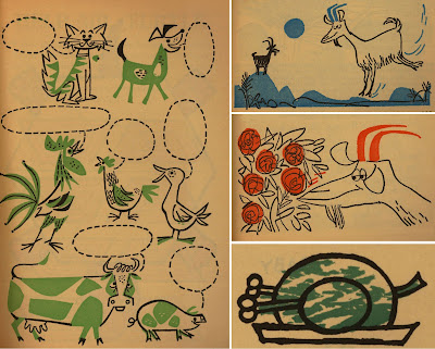
Check out the rest of this book and many, many more here.
Images copyright Golden Gems.
https%3A%2F%2Fwww.deliciousindustries.com%2Fgolden-gems
Delicious+Industries%3A+Golden+Gems
Andy Smith Book Covers

We're big fans of illustrator Andy Smith's work, so when he added us as a new contact on Flickr we had a good old snoop around his photostream and look what we found - a fantastic collection of all the book covers he's designed.


There's quite a few and they make a great set, bursting with bold colours and fun type - these are just a few of my favourites.
All images copyright Andy Smith.
https%3A%2F%2Fwww.deliciousindustries.com%2Fandy-smith-book-covers
Delicious+Industries%3A+Andy+Smith+Book+Covers
Classic Logos
The classic Penguin logo we all know and love was originally designed by 21 year old office worker, Edward Young in 1934. He was sent to London Zoo by the publisher, Allan Lane to sketch penguins, which formed the early logo. It was 15 years later (in 1949) that the Jan Tschibold version was created.
British brewery, Bass boast that their red triangle is, 'The World's most famous trademark' and although there is no proof of this, it was the first British Registered Trademark.
Guinness first used the O'Neill harp (or Brian Boru harp) alongside their signature in 1862. It originally had 27 strings, but for design reasons this number was reduced over time first to 18, in the 50's and finally to 10 in the 60's.
When Ireland became an independent nation in 1922 they chose the O'Neil harp as the official Irish symbol, however because of copyright issues they had to reverse their version.
The winged-foot synonymous with Goodyear was originally inspired by a statue of Mercury in founder, Frank A Seiberling's childhood home. It has been their trademark since 1900.
You know how hard it is to come up with names for things, well, French petrol company Elf turned to a computer to choose their name. Elf was chosen from 8,253,000 three, four and five-letter combinations. Their simple, bold logo was then designed by Jean-Roger Rioux in 1966.
For more information about the history and background to classic logos and trademarks, have a look at Marks of Excellence: The history and taxonomy of trademarks. It really is a great book.
All information from Marks of Excellence.
https%3A%2F%2Fwww.deliciousindustries.com%2Fclassic-logos
Delicious+Industries%3A+Classic+Logos
It's a Stamp World
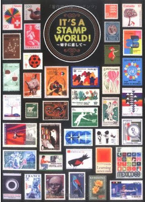
Viewers Like U have come across a few copies of this great out-of-print Japanese book, It's a Stamp World an amazing collection of stamps from around the world including designs by Aicher, Bruna.


These very kind people are selling off their spare copies here for $50 including postage (not sure if this includes to the UK), hopefully they have some left!
Images copyright Viewers Like U.
https%3A%2F%2Fwww.deliciousindustries.com%2Fits-a-stamp-world
Delicious+Industries%3A+It%26%23039%3Bs+a+Stamp+World
The Indoor Noisy Book
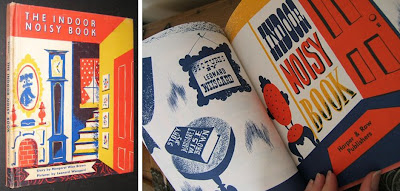
I just saw this gorgeous little book on Etsy, 'The Indoor Noisy Book' written by Margaret Wise Brown in 1942 and illustrated by Leonard Weisgard.
It's a story about a dog called Muffin that has to stay in all day with a cold and hears all kinds of strange noises. The illustrations are fabulous - detailed, yet bold and bright and there's even a bit of beautiful, big typography!
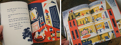
There are also some copies here and a re-printed edition available here from 1994.
Images from WhimseyHouse.
https%3A%2F%2Fwww.deliciousindustries.com%2Fthe-indoor-noisy-book
Delicious+Industries%3A+The+Indoor+Noisy+Book
Metro Maps of the World

I saw the Washington DC underground map on So Much Pileup the other day and it reminded me of a great book I bought a few years ago, Metro Maps of the World by Mark Ovenden. I know it sounds dull, in fact the guy in the book shop actually laughed when I took it to the counter, but it's a fantastic book full of information and pics about underground (and some overground) maps, their history and who created them.
Above right is the very map that started this train (sorry!) of thought and to it's left the 1962 version, which shows on it proposed sections for expansion that are only this decade being constructed! The current Washington map is one of very few Worldwide to have introduced thick lines, copied only by Baltimore.
The most famous underground map is of course that of our very own London Underground. Designed originally by Harry Beck in 1932 and published in 1933 (below right) it replaced Fred Stingemore's 1925 version (below left) which itself was meant to have improved legibility.

Beck's design is iconic. It uses only horizontal, vertical and 45 degree lines joined with uniform curves and bends to create a simplistic and very easy to follow map - a style still used today (see below) and one that has been copied all over the World.

Another well-known underground map is that of the New York City Subway. The first version emerged in the early 1900's (below) and focused only on Manhattan, but showed all the train operators at the time in a very clean and detailed design, very much based on the grid-like NYC street plan.

By 1948 (below left) the whole of NYC had been added. This was one of the first attempts to show all the individual networks on the same pocket map. Previously each service had produced their own maps. Throughout the late 50's and 60's clearer, more stylistic versions of the combined map developed - a style that remained and is hugely successful in one of my favourite versions, the 1972 design (below right).
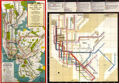
Throughout this decade though, NYC seem to have moved away from this design and returned to a version (below) very similar to that of the 1948 pocket map.

Looking through the book, it was Moscow's fantastic subway maps that stood out the most for me. Early versions (below left) were in black and white due to the restrictions on materials and they were actually designed by Fred Stingemore, the pre-1933 London Underground designer.

Eventually though, the Russians began producing colour maps and with it the design became more European and stylised as seen above right in this 1967 version.
For me though, it's the 80's versions (below) that are the most inspiring and interesting. I love that they have a 50's feel and at a glance look like diagrams of the solar system with their different sized circles and dotted lines.

The dotted lines actually referred to outer stations and the coloured circles indicated station interchanges. The current version developed throughout the 90's and is much more European and as so many others uses the principals demonstrated in Beck's London Underground map, which might be more legible but certainly doesn't have the charm of the 80's ones.
Click on images to view larger versions.
Images copyright Metro Maps of the World.
https%3A%2F%2Fwww.deliciousindustries.com%2Fmetro-maps-of-the-world
Delicious+Industries%3A+Metro+Maps+of+the+World
Visual Aid

Visual Aid: Stuff You've Forgotten, Things You Never Thought You Knew and Lessons You Didn't Quite Get Around to Learning.
I'm a big fan of information graphics and I love all those books full of facts and information you'll never ever need to know, so when I came across this book the other day I was thrilled.
It's packed full of simple and colorful charts, diagrams and illustrations; "Visual Aid provides the answers to the little questions in life in a simple colourful and engaging way. This eclectic collection of illustrations and diagrams will get you up to speed on life's basics".


Learning about science is great, but this book also gives information about the more important things in life, like how to make popular cocktails and how to make shadow animals - now we're talking...


Images from Amazon.
https%3A%2F%2Fwww.deliciousindustries.com%2Fvisual-aid
Delicious+Industries%3A+Visual+Aid
24 Delicious Days of Advent - #22

Number 22 - The amazing ABC3D pop-up book by Marion Bataille.


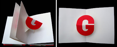
I think this one is probably on every designer and typographers Christmas list (unless they have it already!) but it's far too wonderful to leave out.
I first posted about this book back in March when a mock-up version was demonstrated in a short video on Youtube. The finished book was released in October this year and is every bit as great as I imagined.
At the minute it's only £6.49 on Amazon (although there is also one listed for £110.60!! - surely that must be a typo?). It would be a great addition to any coffee table - so grab yourselves a bargain.
Images from Amazon.
https%3A%2F%2Fwww.deliciousindustries.com%2F24-delicious-days-of-advent-22
Delicious+Industries%3A+24+Delicious+Days+of+Advent+-+%2322
24 Delicious Days of Advent - #19

A nostalgic number 19 - Catalog: The Illustrated History of Mail-Order Shopping by Robin Cherry.
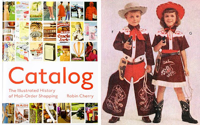

I love old catalogues - the models, the clothes, the poses and the photos, they're so kitsch and fun. This book is a collection of ads and pages from American mail-order catalogues like L.L.Bean and Sears, organised into categories like clothing, food, animals etc... It traces a timeline through American history of fashions and trends through the products available in the catalogues.
Catalog is available to buy in the UK from here and here and in the US from here. A definite on my Christmas list!
Images copyright Robin Cherry.
https%3A%2F%2Fwww.deliciousindustries.com%2F24-delicious-days-of-advent-19
Delicious+Industries%3A+24+Delicious+Days+of+Advent+-+%2319
24 Delicious Days of Advent - #16

Sweet 16 - the fabulous Vivienne Westwood Opus! A "startling insight into Vivienne Westwood, her manifesto and her stunning designs, which reflect the passion of her collections".
It's an amazingly luxurious 90 x 64cm, 200 page publication, filled with 97 giant (80 x 64cm) polaroids of her unique designs and each one is hand-signed by Dame Vivienne Westwood herself.

There are only 900 copies available worldwide in nine cover designs (100 copies per design). The most expensive of these covers - the Union Jack (£2100) has already sold out, but the remaining editions can still be bought here for £1400.


Images copyright Vivienne Westwood.
https%3A%2F%2Fwww.deliciousindustries.com%2F24-delicious-days-of-advent-16
Delicious+Industries%3A+24+Delicious+Days+of+Advent+-+%2316
24 Delicious Days of Advent - #13

Number 13 is a wonderful book, Signs & Emblems by Erhardt Steibner and Dieter Urban, published in 1984.

I have only ever seen it on blogs and Flickr groups, but it looks like a great source of inspiration. There's just something nice about a book full of mono graphics and symbols.

I have found a few copies of this one for sale here and here, but none are what I would call cheap, but I bet it's worth every penny.
https%3A%2F%2Fwww.deliciousindustries.com%2F24-delicious-days-of-advent-13
Delicious+Industries%3A+24+Delicious+Days+of+Advent+-+%2313
24 Delicious Days of Advent - #2

Number 2! A wonderful design book that has been on the most-wanted list for a while now, 'Schweizer Industrie Grafik (Graphic Design in Swiss Industry)', Hans Neuberg, 1965.
It's packed full of great typography and graphic diagrams, many of which look like they could have been designed now - not 43 years ago!


These images are from Aisle One's Flickr Group where you can see a large selection of pages from the book. They do come up on Ebay every now and again, so maybe one day it will be mine!
https%3A%2F%2Fwww.deliciousindustries.com%2F24-delicious-days-of-advent-2
Delicious+Industries%3A+24+Delicious+Days+of+Advent+-+%232
Welcome
Welcome to the Delicious Industries blog. We're an independent design studio based in Brighton, UK and this is our scrapbook packed full of design, illustration, photography & typography inspiration. Check out our work here.
Links
DELICIOUS FRIENDS
DELICIOUS FAVOURITES
- 50 Watts
- Acejet 170
- Grain Edit
- It's Nice That
- National Geographic Found
- Notcot
- Pretty Clever
- Retronaut
- So Much Pileup
- We Love Typography
- Another Mag


